


 Arguments


West Antarctica warming more than expected
Posted on 25 December 2012 by John Hartz
This is a reprint of a news release posted by the National Center for Atmospheric Research (NCAR) on Dec 23, 2012.
In a finding that raises further concerns about the future contribution of Antarctica to sea level rise, a new study finds that the western part of the continent’s ice sheet is experiencing nearly twice as much warming as previously thought.

Researchers have determined that the central region of the West Antarctic Ice Sheet (WAIS) is experiencing twice as much warming as previously thought. Their analysis focuses on the temperature record from Byrd Station (indicated by a star), which provides the only long-term temperature observations in the region. Other permanent research stations with long-term temperature records (indicated by black circles) are scattered around the continent. On this map, the color intensity indicates the temperature correlation with the measurements at Byrd Station. (Image by Julien Nicolas, courtesy of Ohio State University.)
The temperature record from Byrd Station, a scientific outpost in the center of the West Antarctic Ice Sheet (WAIS), demonstrates a marked increase of 4.3 degrees Fahrenheit (2.4 degrees Celsius) in average annual temperature since 1958. The rate of increase is three times faster than the average temperature rise around the globe for the same period.
The study was published Sunday in the journal Nature Geoscience. It was conducted by scientists at Ohio State University (OSU), the National Center for Atmospheric Research (NCAR), and the University of Wisconsin-Madison, with funding coming from the National Science Foundation, which is NCAR’s sponsor.
"Our results indicate that temperature increases during the past half century have been almost twice what we previously thought, placing West Antarctica among the fastest warming regions on Earth,” says NCAR scientist Andrew Monaghan, a co-author. “A growing body of research shows that the West Antarctic Ice Sheet is changing at an alarming rate, with pressure coming from both a warming ocean and a warming atmosphere.”
This study reveals warming trends during the summer months of the Southern Hemisphere (December through February), notes co-author David Bromwich, professor of geography at Ohio State University and senior research scientist at the Byrd Polar Research Center.
“Our record suggests that continued summer warming in West Antarctica could upset the surface mass balance of the ice sheet, so that the region could make an even bigger contribution to sea level rise than it already does,” Bromwich says. “Even without generating significant mass loss directly, surface melting on the WAIS could contribute to sea level indirectly by weakening the West Antarctic ice shelves that restrain the region’s natural ice flow into the ocean.”
Researchers consider the WAIS especially sensitive to climate change because the base of the ice sheet rests below sea level, making it vulnerable to direct contact with warm ocean water. Its melting currently contributes 0.3 millimeters to sea level rise each year. This is second only to Greenland, whose contribution to sea level rise has been estimated as high as 0.7 mm per year.
Filling in the data gaps
Due to its location some 700 miles from the South Pole and near the center of the WAIS, conditions at Byrd Station are an important indicator of climate change throughout the region.
In the past, researchers haven’t been able to make much use of the Byrd Station measurements because of incomplete temperature observations. Since its establishment in 1957, the station has not been occupied continuously. A year-round automated station was installed in 1980, but it has experienced frequent power outages, especially during the long polar night when its solar panels can’t recharge.
The new study fills in the data gaps with a powerful computer model of the atmosphere and a numerical analysis method
In addition to offering a more complete picture of warming in West Antarctica, the new study shows for the first time that significant melt is occurring during summer. Monaghan says the summertime warmth is particularly troubling because that is the season in which enhanced surface melting could most affect the WAIS and potentially weaken the ice shelves that buttress it.
“We've already seen enhanced surface melting contribute to the breakup of the Antarctic’s Larsen B Ice Shelf, where glaciers at the edge discharged massive sections of ice into the ocean that contributed to sea level rise,” he says. “The stakes would be much higher if a similar event occurred to an ice shelf restraining one of the enormous WAIS glaciers."
“West Antarctica is one of the most rapidly changing regions on Earth, but it is also one of the least known,” says Bromwich. “Our study underscores the need for a reliable network of meteorological observations throughout West Antarctica, so that we can know what is happening—and why—with more certainty.”
Subject Paper: Central West Antarctica among most rapidly warming regions on Earth,
Authors: David H. Bromwich, Julien P. Nicolas, Andrew J. Monaghan, Matthew A. Lazzara, Linda M. Keller, George A. Weidner, and Aaron B. Wilson
Publication: Nature Geoscience(2012,)doi:10.1038/ngeo1671
Received 02 May 2012, Accepted 15 Nov 2012, Published online 23 Dec 2012
Note: The University Corporation for Atmospheric Research manages the National Center for Atmospheric Research under sponsorship by the National Science Foundation. Any opinions, findings and conclusions, or recommendations expressed in this publication are those of the author(s) and do not necessarily reflect the views of the National Science Foundation.


 0
0  0
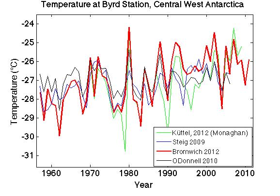
0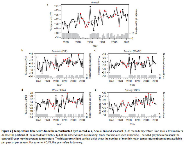 Also of interest, from Real Climate, is this comparison of this reconstruction of Byrd Station temperatures with prior reconstructions:


Comments