


 Arguments


SkS Analogy 22 - Energy SeaSaw: Part II
Posted on 27 May 2021 by Evan, jg
Tag Line
Illustrating periodic, apparent GW pauses.
Climate Science
We previously described events that cause energy to cycle between the oceans and the atmosphere at time scales on the order of years, to decades, and longer. To illustrate how the energy SeaSaw creates periodic, apparent pauses in global warming (GW), we combine two simple functions to show how they predict short-term, atmospheric cooling trends that are not indicative of long-term, GW trends.
A sine wave describes the motion of many waves, such as those moving across a body of water. Imagine you are sitting stationary in a rubber boat on the ocean. The waves pass under you causing you to rise and fall in a pattern called “sinusoidal”. This is the approximate motion that represents the up-down pattern when two people use a teeter-totter.
The elevator motion is represented by an upward angled line, which shows the vertical position at a given time. If the elevator is rising with a constant speed of 1 m/s, then after 1 sec it will be 1 m above the ground, after 2 sec it will be 2 m above the ground, etc. Plotting the vertical position of the elevator (which can also be interpreted as the temperature anomaly) on one axis and time (i.e., current year) on the other axis produces an upward, slanted line. Figure 1 shows what the individual sinusoidal (SeaSaw) and constant-vertical motion (Elevator) traces look like, plotted as vertical position (temperature anomaly) vs. time (year).
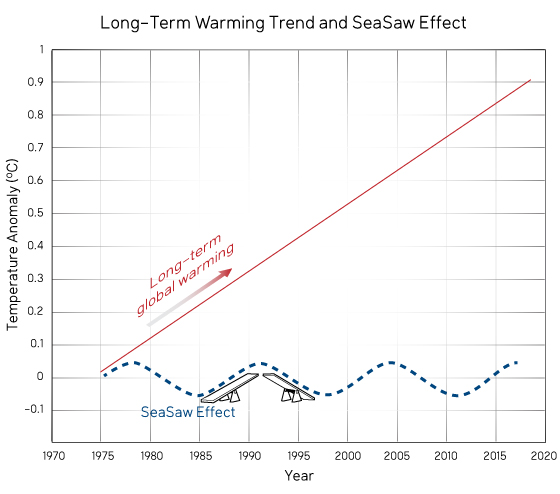
Figure 1. Sinusoidal function (dotted line) plotted together with a constantly increasing function (solid line).
If we superimpose the SeaSaw and Elevator motions, the combined motion varies up and down relative to the Elevator-only line. This produces the motion shown in Fig. 2.
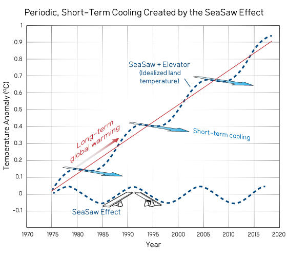
Figure 2. Idealized atmospheric temperature obtained by combining the sinusoidal and constant function shown in Fig. 1 to illustrate the oscillating, upward trend. Notice the short-term, periodic cooling followed by rapid temperature increase.
Figure 2 shows an interesting effect. Even though the elevator is going up, during some short-term intervals the vertical position of one end of the seesaw goes down, not up! This is comparable to short-term trends when atmospheric temperatures decrease, even though the long-term trend clearly shows warming. However, these short-term cooling trends are followed by rapid warming, so that the overall motion over a sufficiently long time is given by the long-term, upward trend.
As you might expect, we cannot hope to model atmospheric temperatures using a single sinusoidal function combined with a single upward trend. Earth’s land-ocean interactions are far more complicated, and include many variations with intervals both shorter and longer periods than shown in Figs. 1 and 2. However, just to see how close we come to approximating the varying global warming signal by using a single, simple sinusoidal function, Fig. 3 shows measured land temperatures superimposed on top of the combined SeaSaw signal. The comparison shown in Fig. 3 indicates that a single sinusoidal function combined with a single upward trend does a very good job of explaining the temporary up’s and down’s of the measured land temperatures.
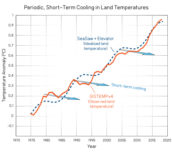
Figure 3. Observed land temperatures (GISTEMPv4) superimposed on top of the idealized land temperature from Fig 2.


Evan and jg,
Excellent brief and clear supplement to the See-Saw Part 1.
My only recommendation is a minor one. Try to improve the wording of the explanation of the production of Figure 2. My suggestion is:
"If we super-impose, or add together, the teeter-totter and elevator motions the combined result will vary up and down from the elevator line as the elevator continues to go up over time producing the motion shown in Fig. 2."
I am not brilliant regarding commas so my suggestion with few commas may not be the best presentation.
OPOF, thanks for your suggestion. I modified the text according to your suggestion, not word for word what you suggested, but in that spirit.
Evan. The revised wording is better than my suggestion.
Wow! The power of collaboration. :-)
Good post, Evan.
The idea that a complex variation (in this case, temperature versus time) is the sum of components of predictable simple variations is fundamental to science and statistical analysis. A very useful technique.
In this case, you have used a linear trend versus time, summed with a sinusoidal variation over time, and it is clear from figure 3 that this simple variation of two types can closely match observations.
There are still squiggles left, and these could be "matched" by adding more cycles. You don't want to go to far without some physical reasons to expect cycles at different intervals, though.
Although it is purely curve-fitting, you can do a sine that repeats once in the time period, then add a sine that repeats twice in the time period, then a sine that repeats three times, then four, then five, etc. Keep adding cycles, and you can match a very complex set of observations.
Sound odd? No, it's called a Fourier series, and by comparing the amplitude of all those cycles you can use it to identify the important frequencies/periods of repeating patterns in your data.
Overuse it, and you can always say "it's cycles". Read How Curve-fitting can ignore physics. A common thread in the Anything But CO2 crowd is to fit cycles and claim you don't need CO2 to explain recent global temperature trends. (Spoiler alert: they are wrong.)
Where else do we see this? Ptolemy's geocentric model of planetary motion used cycles this way. But it wasn't based in physics, just math. A better model - simpler, and more in tune with our knowledge of the physics - is the Heliocentric model.
Cyckes are a very useful tool for exploring data, and helping us see what is there. Physics is an even more useful tool for explaining data, helping us understand why it is there. A good scientist uses it all.
Thanks for the comments Bob and for the explanation of Fourier series and how fitting can be used to ignore physics. For those not familiar with Fourier series, this is the same Fourier who, in the 1820's started the field of climate science. Fourier was not only well known for his mathematical developments, but he was also well known for his advancement of the science of radiation heat transfer, which led to his discovery of the greenhouse effect.
Bob's comments are right on the money in explaining how complex functions can be used to hide/ignore the physics. Because these analogies are designed to teach climate science to a wide audience, one of the challenges in communicating is to demonstrate how simple, easily grasped concepts explain much of what we observe. There are certainly climate scientists who have done a much better job of matching the observed warming trend with complex models that include more physics, but the point here, of course, was to show how observed trends can qualitatively be explained by the combination of a simple perturbation superimposed on a general trend.
Of course, the other key point of the analogy is to show that temporary downturns in the temperature record do not mean that the basic long-term upward trend is no longer there.
Just as Evan has created a fitted curve by adding a linear trend and a sine wave together, you can think of the observed temperature observations in the opposite direction. The observations are a complex curve, and you can subtract a sine wave from it reveal a much straighter line that makes the trend easier to see.
This "start with the full signal, subtract known oscillations" is the technique used in the paper by Foster and Rahmstorf (2011), which was blogged about over at Tamino's. They did not use just a simple sine curve - they used statistical methods to remove short term variations due to El Nino and volcanic activity, leaving a clear warming signal in the underlying trend. More sophisticated - with stronger physical reality - than just a sine curve, but the same "add the parts up, subtract them out" principle is at work.
Figures from Tamino's blog post:
To beat Fourier's drum just a little bit more, it's the same Fourier that created Fourier's Law of heat conduction. Quite a talented fellow.