Climate Science Glossary

Term Lookup

Enter a term in the search box to find its definition.

Settings

Use the controls in the far right panel to increase or decrease the number of terms automatically displayed (or to completely turn that feature off).

Term Lookup

Settings


All IPCC definitions taken from Climate Change 2007: The Physical Science Basis. Working Group I Contribution to the Fourth Assessment Report of the Intergovernmental Panel on Climate Change, Annex I, Glossary, pp. 941-954. Cambridge University Press.

Home Arguments Software Resources Comments The Consensus Project Translations About Support

Bluesky Facebook LinkedIn Mastodon MeWe

Twitter YouTube RSS Posts RSS Comments Email Subscribe


Climate's changed before
It's the sun
It's not bad
There is no consensus
It's cooling
Models are unreliable
Temp record is unreliable
Animals and plants can adapt
It hasn't warmed since 1998
Antarctica is gaining ice
View All Arguments...


Username
Password
New? Register here
Forgot your password?

Latest Posts

Archives

DMI and GISS Arctic Temperatures: Hide the Increase?

Posted on 17 October 2010 by Peter Hogarth

SkS Note: Peter Hogarth has done us a great service by writing three level of rebuttals for the skeptic argument "DMI measurements show a cooling Arctic". This blog post is the Intermediate Version. However, if you want to ease yourself into the subject, you might want to kick off with the Basic Version first. Then if you're stout of heart, you might be ready to sink your teeth into the Advanced Version which features the trademark Hogarth detailed approach.

A recent WUWT article by Frank Lansner, August 5th 2010 has the heading “DMI polar data shows cooler Arctic temperature since 1958”. Peter Berenyi also posted a similar chart here on SkS (which sparked my interest). Frank Lansnser goes on to show data from Goddard Institute of Space Science (GISS) July polar views and compares this with graphics of Danish Meteorological Institute (DMI) data for July 2010 to cast doubt on the validity of the GISS gridded values in the Arctic region. This follows on from similar points made by Steve Goddard, and another article by Harold Ambler which tries to show how DMI is based on more data measurements than GISS, again providing a setting to raise questions about the reliability of GISS gridded values in the Arctic.

Similar claims that the DMI data shows Arctic “cooling” or highlights problems with other temperature data sets (eg from GISS, which mostly interpolates over the Arctic ice) appear on other websites. It appears that such sites regard the DMI data as a standard.

This post seeks to correct the public misunderstandings that these articles may cause, primarily about the claim of arctic “cooling” but also about comparisons between the DMI 2m Arctic absolute temperature time series and GISS temperature anomaly data from the Arctic region.

The Danish Meteorological Institute (DMI) Arctic temperature data is the output of the latest operational model as used for weather forecasting by the European Centre for Medium-Range Weather Forecasts (ECMWF). At present this output is an average of all model points at 2m height on a 0.5 degree grid over the most northerly part of the Arctic, above 80N. Because the number of land stations in the World Meteorological Organization (WMO) list above 80 degrees North is very small indeed (a handful), data inputs for the model must be supplemented by other sources for high resolution meteorological work. The models assimilate inputs from weather stations, drifting buoys, radiosondes, aircraft, vessels and since the 1970s, high coverage infra-red and microwave satellite based sensors. The models allow this high resolution satellite data to be used to interpolate between the sparse but very accurate observations from land stations, which form a network of absolute temperature value “tie points” - allowing calibration of the fine scale overall satellite derived relative changes.

DMI recommend that the 2m air temperature data should not be compared with overall Arctic temperature estimates from other data sets, which generally cover a wider area (usually above 65N) where more land station data is available.

We will now examine the claim of cooling “melt season” temperatures. Most of the area above 80N is (currently) still covered in permanent sea ice. In the Arctic Summer when the surface ice is melting, it is known that the air temperature close to the surface is limited by this ice melt temperature to just above zero degrees C, (Rigor 2000). This is why the Summer air temperatures have not varied much over the entire instrumental period. This maximum temperature “clipping” effect is clearly seen on all arctic data sets from Arctic buoy data to individual station data to satellite data.

Clearly high Arctic Summer surface temperatures just above zero are not really an indication of anything except proximity to a melting ice surface. To claim that the Arctic is cooling is misrepresenting the data.

It is also evident from these High Arctic data sets that the average temperatures in the Winter, Spring and Autumn periods have generally increased over the measurement period. It appears that the overall seasonal cycle is riding on a gradually warming average value, but peak positive excursions are being limited by the ice melt temperature in Summer.

It would be intuitive that such seasonal warming patterns would show up clearly in the overall DMI temperature anomaly trend, and this is the case. If we plot the entire daily DMI temperature data, and then a 365 day rolling average, we end with a positive trend of 0.383 degrees C per decade.

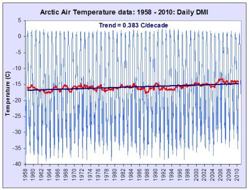
Figure 1: DMI daily temperature values, annual average and linear trend over the entire record period

Thus the reality is that the annual average Arctic surface temperature as indicated by DMI has risen at rates around twice the global average over the past 50 years, which is entirely consistent with other Arctic data sets, including the data from GISS. This annual temperature anomaly trend (red) gives clearer context to the Lansner chart (green).

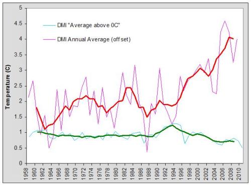
Figure 2: DMI summer melt season temperatures and annual DMI temperature anomaly as well as five year running averages

The Goddard Institute of Space Science (GISS) global surface temperature anomaly time series is based on observations from publicly available observational data sets rather than models. Its primary usefulness is as an indicator of global or large scale regional temperature changes. The measurements used by GISS are gridded at either 1200km or 250km resolution, with appropriate weighting in grid cells containing both land and ocean. The SST data where available is used up to 100km from any coast, but data from any source is extended to a maximum radius of 1200km if no other measured data points are present within this range.

For the high Arctic, we have already noted that there are relatively few land stations, (a handful above 80N), and most of this area is currently still covered by permanent sea ice. A study using data from Polar drifting ice buoys showed that near surface air temperatures over the pack ice are relatively homogenous, with a CLS (correlation length scale) of 900-1000 km, see (Rigor 2000). Obviously SST can not be used in this region, as the sea surface is frozen. In open Ocean SST tracks variations in Air temperature, but this is not the case near the transitional and mobile ice “boundaries”. This is one reason why GISS does not currently use SST data in the seasonal ice region above 75N, even when this data is seasonally available (as is increasingly the case due to diminishing trends in ice extent and better coverage due to satellite data).

This means in the Arctic region, GISS data is relatively coarse grained, as individual grid cells above 80N may include station data interpolated out to as much as 1200km, and are likely to show the higher short term variability which is characteristic of data from individual Polar stations.

However, given all of the above, and the significant differences in horizontal resolution, and methodology, and the caveats and cautions from both DMI and GISS, how do annually averaged time series compare? The DMI data is the official data (not extracted from DMI graphics as Lansner and others have done).

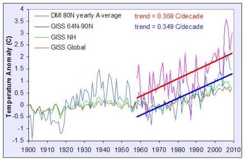
Figure 3: Annual DMI and GISS Arctic temperature anomalies and trends

Here the annual average values for each year have been plotted for both the polar “zonal” GISS data (64-90N) and the DMI Arctic data, and the trends calculated for both data sets for the full DMI period. At this resolution the correlation is reasonable, and the 50 year gradients are statistically indistinguishable. These trend figures also match those from a recent comprehensive surface station based study of the Arctic which gives 0.364 degrees C/decade from 60-90N over this same period (Bekryaev 2010).

The Lansner article is thus misleading. On average relatively strong Arctic warming has occurred (rather than cooling) as indicated both by the GISS and DMI data. The GISS zonal Arctic temperature trends are consistent not only with the DMI Arctic trends but also the trends from other recent Arctic surface temperature studies (see the advanced version for more details).

0 0

Printable Version  |  Link to this page

Comments

Prev  1  2  3  Next

Comments 51 to 100 out of 140:

  1. Frank, The impacts of the UHI are taken into consideration, see Tamino's recent post on Tokyo's temperatures. Anyhow, I am not sure what your argument is. Is it that the warming may be less than observed b/c of the alleged impact of the UHI? If so, then that can be discussed on the appropriate thread. There are very few skeptics even who consider the various SAT records and satellite records to be compromised-- that argument is usually made by "conspiracy" theorists. Anyhow, the Arctic is warming. ERA-interim data show warming, GISS shows that, and satellite data to 82.5 N show that. There is no reason to believe that there would be some rapid change or discontinuity in the temperature anomalies north of 82.5 N-- especially give that we know the correlation length-scale of anomalies is on the order of hundreds of km. I have a huge issue with people (including you) claiming that the "Arctic" is not warming when they are not even talking about temperatures north of the Arctic circle, but rather north of 80 N. The Arctic, of course, starts at the Arctic circle, which is much further south than 80 N, and that is an important difference. Do you disagree with the excellent agreement between GISS and DMI shown in Ned's post @31? So I'm not sure what kind of glasses you are wearing when you look at that graph. I also find it odd that "skeptics" ridicule the models, except that is when they think the output supports their point of view. Well, in this case the ECWMF reanalysis data do not support the claim that the Arctic has been cooling since 1958. Increase in mean near-surface temperature (°C) from (1989-98) to (1999-2008) "The lower figure is the ECMWF analysis which uses all available observations, including satellite and weather balloon records, synthesised in a physically- and meteorologically-consistent way, and the upper figure represents the same period from our HadCRUT record. The ECMWF analysis shows that in data-sparse regions such as Russia, Africa and Canada, warming over land is more extreme than in regions sampled by HadCRUT. If we take this into account, the last decade shows a global-mean trend of 0.1 °C to 0.2 °C per decade. We therefore infer with high confidence that the HadCRUT record is at the lower end of likely warming." DMI really needs to generate a product that is representative of the Arctic circle, not just north of 80 North.
    0 0
  2. Something else to consider. Here are surface temperatures (not air temperatures) for northern high latitudes derived from satellite data between 1981 and 2003. Sourced here.
    0 0
  3. Can someone fill me in on a question that bothers me about air temperatures above ice/snow? The heating of surface is radiative and from AGW point of view the interest is LW radiation. For ice-free land/sea then I would expect the air temperature 2m above ground to reflect this warming of the ground surface. But above ice/snow? Unless there was evaporation/sublimation going on, how much heat transfer is there into the air above? If surface warms from say -20 to -10, is that going to be reflected in the cold dry air above it?
    0 0
  4. @FLansner: "We have only the choice between data measured in the area (DMI) or data projected from land far away. I think you need biiiig globalwarming glasses not to see what data source is most reliable." You seem to be missing the obvious: the DMI data shows a dramatic warming trend. In fact, as I indicated at the beginning of this comment trend, the DMI agrees with the dramatic warming of the arctic over the last decades. Who should I trust on what the DMI data says? Web contrarians or the DMI itself?
    0 0
  5. archiesteel writes: You seem to be missing the obvious: the DMI data shows a dramatic warming trend. In fact, as I indicated at the beginning of this comment trend, the DMI agrees with the dramatic warming of the arctic over the last decades. To be precise, the 50-year trend in DMI's temperature is just slightly higher than the trend in GISS (0.37C/decade vs 0.35C/decade), though this difference may be accounted for by the slightly different areas included in the two. See Peter Hogarth's excellent Figure 3 from the top of this thread.
    0 0
  6. Peter Hogarth: I was linking to Dr. Hansens' web site to defend the GISS data. My position is that both DMI and GISS are good records and can be used for the purpose you use them in this article. I dislike people who choose one record and distort another, especially since they cite blogs (or personal opinion) and not peer reviewed papers. I am glad to see you back. Your carefully researched postings really raise the level of discussion.
    0 0
  7. Your [Peter's] carefully researched postings really raise the level of discussion. Yes. This is a really nicely done post. Like michael sweet, I really look forward to new comments or posts by Peter Hogarth.
    0 0
  8. Hi all: Thankyou for very good argumenting. My problem is that "there are too many of you" :-) so it will take time to answer all. So far, its my impression that Peter Hogarth himself actually sees where im getting at at some points. If you have the patience, i will answer you all, so please keep coming back to this discussion later. Many of you gives many opinions of which I totally disagree and I will take it in the order they came in. I wish i was full time oil payed to have all the time in the world :-). But I think that your tone and seemingly wish to make honest debate is SUPER, and that why I will answer all. Coming soon :-) K.R. Frank
    0 0
  9. Hi Bibliovermis. For all subjects in the climate debate one can find a link with any viewpoint. But you just bring the links and I have to figure out myself WHY you think that this link has the best answers, WHAT arguments you where thinking of when bringing the links. So for now, I will just bring you a short description of why i believe that UHI is a very important part of the rising "global" temperature measured mostly from cities and airports. In my viewpoint, the best and biggest UHI research was made by Thomas Carl in 1984. Like it or not, but there are different opinions on the temperature adjustments done after 1984, and therefore the early dating of Thomas Carls work - 1984 - simply omits the claimed problem of temperature adjustments that makes UHI harder to see in data. Thomas Carl used 4-500 pairs from USA of rural vs. city measurements, and since USA holds around half(?) of the worlds temperature series all the way back from year 1900, then a total USA study is a very good approach. Thomas Carl Finds a systematic strong relation ship between city size and artificial UHI heat in data: http://hidethedecline.eu/media/city%20heat%20IPCC/aau.jpg What could Thomas Carl have done wrong?? Its so simple, compare rural with not rural. I have to trust these results. Many other results suggests UHI, here from all over the world, this list isnt even updated: http://hidethedecline.eu/pages/posts/urban-heat-island---world-tour-155.php Then, the global warming side came up with Petersons results. He found just 0,05 K UHI, but when finally Steve McIntyre got his hands on Petersons data to see how on Earth Peterson could get this result, something quite else turned up. When Steve did a simple check of Petersons calculations, he found 0,7 K... and not 0,05K And worse: It turned out, that Peterson had put city stations in the rural category and vice versa. In another study - pro global warming - a guy (parker??) had NOT done the obvious and simply compared the temperatures of city vs. rural. For some unexplained reason, this guy had chosen not to do the obvious. This lack of explanation itself casts a shadow over the study. In stead he had done some rules of what he expected to find when looking at winds from cities. And then a team (wang ??) had examined UHI in China, getting again practically no UHI, but when they where asked to deliver their data, they failed to fully explain how they got their result. As far as I know they are actually under official accusation for faul play. Then later a new team including P.Jones came with the result that UHI in China actually accounts for 0,5 K of the warming. Then the CRU approach to UHI: As we saw in Carls data, practically all cities show UHI warming polution in data. But to come around this, CRU has simply omitted i think 30 - 35 cities in the world, and used the rest without any UHI correction. Again, there is not much in the warmists approach to UHI that gives me the impression that they treat UHI as it should be treated. ANd then i showed you guys, that UAH satellite measurements fully agree with conventional SST, but do NOT match temperatures from land, that is, temperatures from cities: http://hidethedecline.eu/media/PERPLEX/fig78.jpg I think this last argument is very strong. Unless of course UAH satellite temperatures only work over the oceans :-) K.R. Frank
    0 0
  10. And again about UHI: Im sorry to say it, but one of the WORST arguments I have seen against UHI is here from Skeptical science, im sorry. I saw an article where they have chosen a little area where the whole area is a UHI area, and then compared the data! In places like southern california, Rhein Ruhr in Germany, and central England, there are so many big cities, that these regions as a whole are affected but the UHI from the cities. There fore the WORST place to make a comparison between "rural" and city is in such an area. But this is im afraid what skeptical science did, they used south central England. And worse: UHI shows up because cities normaly changes size radically from 1900 till today. And there is very very few cities in the world that where already multi million cities in year 1900, and a such is London... Skeptical science shows a "Non-UHI" argument by comparing London temperatures with its sorrounding subburbs to London in the southern England. I simply dont know why anyone with an wish to study UHI would do like this. K.R. Frank Lansner
    0 0
    Response: You are probably looking at the Basic Version of the UHI page. That's the problem when you try to explain things simply - there's always the danger of oversimplification (which I was warned about when we embarked on the basic rebuttals). In the Intermediate Version of the UHI page, we begin by looking at the London area but then point out, just as you do, that we need to look at developing areas. So we compare rural to urban trends in China which has shown much economic growth over the last 30 years with a dramatic increase in its city areas. And what we find is, well, I don't want to spoil the ending, check it out for yourself...
  11. #45 Albatross at 08:41 AM on 21 October, 2010 the MSU satellite data are not calibrated against the surface temperatures Stop propagating this miserable myth, please. It's the onboard sensors that are not calibrated against external sources. However, they do not measure atmospheric temperatures, but radiances in several narrow em radiation bands. If both atmospheric temperature and humidity distributions are given below the satellite, radiance can be calculated for a steric angle, at least in theory. In practice it requires a painstaking line-by-line calculation, but even if you have the computer power to do that, the result depends on the emissivity/absorptivity model used. In frequency bands with low emissivity proper lab measurements are pretty difficult to perform (you need extremely long path lengths). Therefore this calculation is only expected to yield approximate results and to speed up things even the algorithm applied is usually an approximate one. But in case of satellite temperature measurements this is not the problem to be solved, but the inverse of it, that is, if radiances are given, what is the atmospheric temperature and humidity distribution that could produce them. This problem does not have a unique solution, not even in theory. Meaning a great many temperature and humidity distribution profiles generate the very same radiances and there is no way to pick the "right one" based solely on the dataset measured by satellites. All we can do is to choose a profile from this huge subset whose members are all consistent with measurement and make this choice optimal in some sense. This "some sense" is the comfy place where the devil is hiding. Fortunately to see the basic problem clearly, one does not need much else but common sense. Satellite radiance measurements are done in frequency bands where the atmosphere is almost, but not quite transparent. Below 50 km there is LTE (Local Thermodynamic Equilibrium) in the atmosphere, that is, air is dense enough to have many molecular collisions between individual photon absorption/emission events, so radiative energy absorbed gets thermalized (distributed evenly among available degrees of freedom) before re-emission. Under such circumstances Kirchhoff's law of thermal radiation holds. The upshot is if you want to have radiation in a narrow frequency band from a specific layer of the atmosphere at your satellite's sensors, emissivity should be high at that frequency to produce ample radiation, but absorptivity (whose value is the same according to Kirchoff) should be low to let the radiation through, therefore you should hit the right balance in choosing your frequencies. If all the GHGs (GreenHouse Gases, those having some absorptivity in thermal IR) were well mixed in the atmosphere, calculation of temperature profile from radiances at frequencies with increasing absorptivity would be a straightforward business. However, there is a major greenhouse gas, water vapor which is not well mixed at all. In fact most weather reports are about the haphazard movements and distribution of moisture, for water is the actual working fluid of the heat engine called climate system. Now, it is quite easy to see that absorptivity of an atmospheric layer does not only depend on specific absorptivity of a substance at a certain frequency, but also on its density. If the latter one keeps changing, so does the former. If atmospheric radiance increases in a frequency band, it can mean two things. Either average temperature of the atmosphere is increasing or the upper layer is getting increasingly transparent while lower layers keep or increase their opacity. This is so, because on average the lower the layer the higher its temperature is (due to adiabatic heating) and as soon as it gets "visible" to the satellite, measured radiance increases as well (emissions increase as the fourth power of absolute temperature). With water vapor it would mean upper atmosphere is getting dryer. In fact this is what's measured in situ by radiosonde balloons, a multi-decadal drying trend in upper troposphere, but the dataset is dismissed by mainstream climate scientists as wacky. Anyway, in order to increase average transparency of an atmospheric layer, you don't even have to decrease its average moisture contents, it is perfectly enough to make water vapor distribution a bit more uneven. Opacity is a nonlinear (concave) function of absorber density, so average of opacities is always smaller than opacity of averages. Let's get back to the inverse problem. This "some sense" in which the choice of moisture and temperature distribution profiles should be optimal while consistent with measurement can be broken down to the following pieces.
    1. The profiles considered should be consistent with physics. It sounds fine, but for each profile you need a considerable amount of computation to decide if it was reasonable from that point of view. Even more worrisome is the fact time tested first principles of physics only give a weak constraint, leaving still too many candidates in the subset to be searched. Further problems enter with the recognition it is not enough to specify water vapor distribution (that is, the gas phase of stuff), but you also need information on liquid and solid water (droplets and ice crystals). Radiative properties of these phases depend heavily on particle or droplet size distribution as on trace amounts of pollution as well. Dispersion (on top of emission/absorption) also enters the picture. And above all, cloud formation and precipitation events (along with turbulent flows) are among the least well understood processes of meteorology, their handling is very far from first principles.
    2. Intractability is to be avoided. The reasonable subset of atmospheric states producing the measured radiances is huge and it is absolutely out of the question to evaluate each member of a representative (dense enough) subset of it. Even God's computers would use up eternity and some more to finish that job. The standard solution is to introduce some structure to the problem, making exhaustive search unnecessary. For example it would take some time and much walking for a blind person equipped with an altimeter having a Braille output device to find the highest spot on a large estate. However, if the estate is flat with a slight slope in a single direction and its shape is convex, she can go there immediately by taking the direction of the highest slope, even at the fences. In the same spirit inversion problems like the one above can be transformed to tractable problems in multiple ways, by transforming or restricting the problem domain and/or the objective function. Linearization or a probabilistic approach (when we only look for good enough solutions with high probability) are among such techniques. However, we should always remember the problem actually solved this way is not the original one. If you can't shoot at the guy behind the corner, aim at those in plain sight.
    3. The objective function has to be determined somehow. The most straightforward way is to have a test set and an objective function of some reasonable form with several open parameters, then tuning the parameters until the objective function takes the highest value on each element of the test set of all the other possibilities producing the same radiances. The process can be considered "teaching". There are several techniques to accomplish this goal, including murky neural network approaches. The test set itself can be obtained by measurement (preferable) or as an output of some model (rife).
    So. There is plenty of playground to fit the performance of the inverse transformation to your needs. If you need to suppress rising trends in upper troposphere transparency and enhance warming, that can be done as well. But either you crave for such an exploit or not, satellite derived data are never independent of surface temperatures (or in a wider sense from in situ measurements), for the transformation algorithm itself should be validated (in a sense also calibrated) against such datasets. To get a taste of what level of complexity goes into recovering atmospheric temperatures from satellite measured radiances, read the following proposal please. Advances in Atmospheric Sciences 2008, Volume 25, Number 5, 897-904 DOI: 10.1007/s00376-008-0897-4 A three-dimensional satellite retrieval method for atmospheric temperature and moisture profiles Lei Zhang, Chongjian Qiu & Jianping Huang "However, the satellite radiance observations do not contain sufficient information to permit direct retrieval of some features of meteorological significance, therefore some additional information, in the form of the statistics of the atmospheric profiles, must be supplied to the retrieval equations." Unfortunately not even this improved 3D method can make-do without reference to a dense set of in situ measurements and/or the output of computational weather models. "A problem that needs to be pointed out is that this method requires a spatially dense observation network for the atmospheric temperature-humidity profiles to construct the historical ensemble samples for the EOF's. The radiosonde measurements are hardly sufficient to satisfy this requirement. Maybe the high-resolution numerical weather predication (NWP) model output or the assimilation data can be used to construct the ensemble sample. This is a topic for further study."
    0 0
  12. Hi Skeptical science! Response to your response above: I then followed your link and see that you still use London and the suburbs from the big UHI region in Southern England. So still, when I start reading your UHI examples, I get the feeling that the writers either has no idea about ehat UHI is or that something else is wrong. Then I sea your graphic from the China. Heres the Jones China Article: http://www.agu.org/pubs/crossref/2008/2008JD009916.shtml Quote: "Urban-related warming over China is shown to be about 0.1°C decade−1 over the period 1951–2004" So UHI just from 1951 to 200 is around + 0,53 K . Please explain why this strong UHI does not appear from you China graphic? And why this "UHI-exmaple" from London is still there ;-) K.R. Frank Lansner
    0 0
  13. BP @61, "Stop propagating this miserable myth, please. It's the onboard sensors that are not calibrated against external sources. However, they do not measure atmospheric temperatures, but radiances in several narrow em radiation bands." Thanks, but I do not need to be lectured by you BP. I know very well that the AMSUs on board the satellites measure radiances from layers in the atmosphere. And from Roy Spencer's web-site: "Contrary to some reports, the satellite measurements are not calibrated in any way with the global surface-based thermometer record of temperature. They instead use their own on-board precision redundant platinum resistance thermometers calibrated to a laboratory reference standard before launch." Also, isn't it odd that Lansner here is trying to argue that the recent "divergence" over land between lower tropospheric temperatures derived from AMSU data is evidence of UHI effect contaminating the SAT records-- that is that the MSU data are not affected by the UHI/SATs. The incoherence and contradictory nature of the arguments used by "skeptics" continues. Regardless, despite all your objections BP, there is excellent correspondence between the satellite-derived temperatures (RSS) and those from radiosondes, see Fig. 12 here. If you think that you know more than Dr. Roy Spencer and the RSS team on this. Please go ahead and argue with them rather than lecturing us. Also, according to you BP the surface data are not to be trusted, nor are the temperatures derived using the MSU and AMSU data. Do you trust temperature trends from the GUAN BP? The Arctic is warming, accept it and move on. PS: If the radiance data from satellites is so unreliable, why then has their assimilation been shown to improve NWP forecasts? See here for examples, and more here. More information on TOVS here. So when you are done arguing with Spencer, please argue with the leading meteorological agencies around the world that they are wasting their time using the AMSU-derived temperatures.
    0 0
  14. Albatros, you write “There is no reason to believe that there would be some rapid change or discontinuity in the temperature anomalies north of 82.5 N” I wont judge that, maybe you are correct, maybe not, I am humble to other natures surprises. I just present data, and when data - like you indicate – does not meet expectations, it is as though some people think it is wrong of me to even present data. Lets get one thing straight: in large areas of the Arctic a bit longer south has been still more ice free and thus the open waters obviously has a huge impact on the temperatures in these areas. The open water effect is not directly happening still in the 80N-90N area, and so, some kind of difference is not that surprising. IF or example solar low activity leads to more cloud formation and thus perhaps more fresh snow on the remaining ice 80N-90N or some other effect should lead to more snow, well then we would have a situation where the 80N-90N locally would get a little colder. But this is PURE speculation, fictive examples of how nature sometimes can surprise us. I dint know exactly the answers, I just know, that the only data actually taken in the area shows decline in temperature. I would wish for a little more humility and scientific curiosity towards these data :-) Got to go, ill be back .. K.R. Frank Lansner
    0 0
  15. FLanser, Could you please stay on topic (i.e., please go to the appropriate thread to discuss your UHI hypotheses)and tell us whether or not you disagree with this statement made by Peter Hogarth derived using the same DMI data: "Thus the reality is that the annual average Arctic surface temperature as indicated by DMI has risen at rates [0.376 C/decade] around twice the global average over the past 50 years, which is entirely consistent with other Arctic data sets, including the data from GISS." I agree with Hogarth when he says "The Lansner article is thus misleading." I would add, "grossly misleading". Might I politely also suggest to you the following: "The Arctic is warming, accept it and move on"
    0 0
  16. @FLansner: "I dint know exactly the answers, I just know, that the only data actually taken in the area shows decline in temperature." It doesn't. In fact, it shows temperatures have risen at about twice the global rate. This is according to the DMI data and the DMI's own evaluation of their data.
    0 0
  17. Flanser, ""I dint know exactly the answers, I just know, that the only data actually taken in the area shows decline in temperature." Now you seem to be talking about observations ("data actually taken in the area"). Bekryaev et al. (2010), would also vehemently disagree with you. See the main post above for the link. Oh, and yet again, what archiesteel said @ 66.
    0 0
  18. Albatros, the ERA-40 is as far as I can see one of the absolutely largest collections of data, quite impressing. And i showed that DMI data including ERA-40 for the melting season showed a very significant dive 1991-2010. Then you just continue saying that the annual trends shows something else. I know, i never said anything about the anual trend. many of you guys are very interested in Arctic SUMMER conditions, but in this case we suddenly cant talk about summer cponditions in the Arctic. Not a veru interesting dialog, honestly. K.R. Frank
    0 0
  19. @FLansner: define "very significant dive," please, then compare that to the annual temperature increase rate. Or, you know, you could check out Figure 2 in the article above. Simply put: the summertime cooling is *dwarfed* by the annual warming. Please acknowledge this before continuing the discussion any further. Let me put this in another way: why are you so focused on summer temperatures?
    0 0
  20. FLasner - The problem is that you are focusing on only the summer temperatures, which are clipped to just above 0 degrees C by the presence of ice, while ignoring the rise in average yearly temperatures. The summer temps in the DMI model and data have indeed varied a little, and do show a slight decline. In my opinion this may be partly to natural variability, partly due to the model change DMI underwent. But with the average temps going up at 0.376 degrees/decade (see Fig. 2 at the top of the page), and minimum temps rising at about the same rate, the summer melt season is increasing in duration, and total melt is increasing as well. Your narrow focus on summer implies some incorrect conclusions - that Arctic temps are declining, that the icecap isn't shrinking. This turns into the Hasty Generalization, or Argument By Generalization logical error. Not surprisingly, this implication is popular on WUWT. Neither is true - the icecap is shrinking, Arctic temps are rising twice as fast as global temps. And the ~0.06 deg. C/decade decline in summer peak temperatures you spend so much attention upon makes very little difference overall. If you are surprised by the incorrect conclusions people might draw from your article, well, they've now been pointed out to you by a number of people. If you intentionally focused on a small part of the data to convey those impressions, your article was intentionally misleading - I sincerely hope that wasn't the case.
    0 0
  21. Hmmm. I've not really had a dog in this fight, but on the one hand I see what might be an increase of temperature in some slice of the atmosphere in the upper 10 degrees of latitude of the Arctic, on the other a massive, extended plunge in volume and extent of Arctic sea ice. From a scientific perspective, the DMI data for summer seems quite interesting but from another it seems quite irrelevant. This tension is evident in WUWT's treatment of the summer DMI data, where a failed attempt is made to change everything we know about successive melt seasons so as to be coherent with the DMI data. The struggle to do this leads to depressingly familiar dark mutterings about "adjustments," etc Also, somebody's probably already pointed this out but purely as a matter of geometry it's worth thinking about how the area of the upper 10 degrees of latitude compares with the roughly 24 degrees remaining before hitting the Arctic Circle.
    0 0
  22. Frank @68, Whoosh, look at those goal posts move. You mention the ERA-reanalysis data. Actually the ERA-interim is superior to the ERA-40. Anyhow, here is a paper on polar amplification using the ERA-interim data. Their Fig. 1c shows a warming trend North of the Arctic circle for summers between 1989 and 2008 (trends significant at the 99% confidence level), with a peak warming trend near 80 N. You can also find a discussion here on SS. A previous study by Graversen et al. (2008) looked at ERA-40 data over the Arctic between 1979 and 2001. They too found a warming trend over the high Arctic in the summer months (see their Fig. 1c) over that time. Bekryaev et al. (2010) looked at temperature data poleward of 60 N and calculated trends by season and annually. Here is what they found: Trends from 1959-2008 (C/decade)north of 59 N: Annual: +0.364 Winter: +0.381 Spring: +0.467 Summer: +0.234 N. Hemisphere annual: +0.232 Also look at their Fig. 6 for trends in temperatures in the latitude band 65-75 N since circa 1958. Is the rate of warming during the JJA period over the Arctic slower than observed for the other seasons? Yes, no argument there. But the data from multiple sources agree that there has most definitely not been a cooling trend during the summer as you keeping trying to mislead people into thinking. Why do you choose to ignore the data for the rest of the year Frank, and ignore the rate of change in annual temperatures over the Arctic? I think I know why-- but John or the moderator would probably not let my post through.
    0 0
  23. Come to think of it, this issue reminds me of the choice of whether to buy a large or small pizza. Purveyors of pizza have good reasons to flog small pies while purchasers should give serious consideration to larger sizes. Use method acting to play both roles while imagining you're also Euclid. In this case, leaving aside the "value proposition" of an 8" versus 16" pie, we're not even sure how much cheese or sauce we're getting. Caveat emptor.
    0 0
  24. FLansner at 03:30 AM on 22 October, 2010 In the DMI data, the ERA-40 data series stops in late 2002. It is replaced by an operational model with slightly higher resolution, T511. There are two more subsequent changes to newer models, the most recent in Jan 2010. These changes are discussed briefly in the advanced article. Here is a zoomed plot of the actual ERA-40 and T511 model data from DMI in the overlap period of Summer 2002. There is a small bias difference. This will cause a small downwards step in the "Summer values above zero degrees C" (zero is dotted line) in 2002. I do not have overlap data for the other transitions. This is one possible cause of small changes in Summer values at around this time.
    0 0
  25. FLansner at 20:27 PM on 21 October, 2010 If the moderators will forgive a small diversion on UHI: See chart below on Central England Temperature trend compared with "rural" Armagh temperature trend. Since 1900 the measured 100yr temperature trends are indistinguishable, which casts doubt on claims on some skeptical websites that UHI may have affected the Central England record. These same websites suggest Armagh is unaffected by UHI.
    0 0
  26. "archiesteel at 03:56 AM on 22 October, 2010 @FLansner: define "very significant dive," please, then compare that to the annual temperature increase rate." Archiesteel: The summer temperatures 80-90N in 1991 was at all time highest since 1958. there after ther summer temperatures trended down to all time minimum 2010. So the trend dive is the largest possible for this data type. What more do you want? Then some of you guys compare the oscillations in summer melt temperatures with the HUGE oscillations that occur when we have much colder temperatures. Obviously temperatures are kept within a small margin when we have melting consitions in summer time, so to compare just like that with the big oscillations for - 20, 30, 40 Ceisius nonsense. The years back to 1958 shows what oscillations we normally see under melt conditions, and the dive 1991-2010 is as big as anyone could possiblly demand (!!!!!!) Its so funny, all the time we hear you warmies say we have to focus on SUMMER conditions in the Arctic, but then a data set comes by that tells a colder story for the 80N-90N area in summer time. And bingo, you demand FULL YEAR FULL YEAR. You may not see the humor, but I do :-) K.R, Frank
    0 0
  27. KR you write: "Your narrow focus on summer implies some incorrect conclusions - that Arctic temps are declining, that the icecap isn't shrinking." No i certainly dont. The icecap HAS been shrinking, obviosuly, and the shrinking icecap has opened waters that has to be accompanied by heat released to the atmosphere and thus warmer temperatures in large areas. I wrote exactly about the ice covered area 80N-90N in the melt season, no more no less. NO ONE can say that the Arctic ice cap hasnt been shrinking. (honestly, its only some of you alarmist that for some reason reads my words that way, as far as I have seen). K.R. Frank
    0 0
  28. # 76 FLansner "Very significant dive" should be presented as a trend estimate with uncertainty, and maybe also t-value. So what is the trend (and uncertainty) in the DMI summer data since 1991? If the time series is online I could easily do this. And actually, if I understand you correct, the trend was positive until 1991, and negative since 1991. I.e. there is a changepoint. Is that changepoint statistically significant?
    0 0
  29. Albatross, you write "Anyhow, here is a paper on polar amplification using the ERA-interim data." Look, There is no doubt that polar amplification happens. But this polar amplification happened around 1925-45 too - before humans CO2 emissions exploded - and there fore I think it is relevant to compare todays Arctic conditions with the almosr "human-CO2-free" period 1925-45 with todays conditions. For instance, the 20 year period 1990-2010 has NOT yet reached an average temperature on Greenland that matches the average temperature on Greenland 1925-45. 1925-45 was warmer than 1990-2010 on greenland. And yet some scientists screeeeeems about the warm Greenland. And the present ice melt as though heat in 1925-45 did not melt ice. But Albatross, perhaps you think that because of the polar amplification, then there physically cannot be an area 80N-90N that is cooling one degree Celsius while far larger areas of the Arctic warms several degrees in the summer. As I wrote: I dont know. But I think its obvious that the areas of Ice retreat that has suddenly open waters releasing heat directly op in the air must have a far warmer trend than the ice coveres areas, for example 80N-90N. And all over the world, there has been more precipitation in later years (perhaps due to Solar minimum + warmer temperatures) and more precipitation in the Arctic ONLY has an albedo/cooling effect in areas with no open waters like 80N-90N. But buttom line: I just presented the data, and then you can considder them or not, its a free world :-) K.R. Frank
    0 0
  30. FLansner at 07:58 AM on 22 October, 2010 I have looked again at your “cooling” chart, and I hope you do not mind me reproducing it below. I have double checked and compared with the chart below generated from the official DMI numerical data (the dark line is 5 year average), and though I have not yet updated through 2010, I am concerned that there appear to be significant discrepancies in the period you say shows cooling. Is it possible that your pixel counting process is introducing bias? There is something not quite right here.
    0 0
  31. SRJ: Heres the data in question. Due to melting conditions in summer time the temperatures are kept within a more narrow range than the rest of the year. the 1991-2010 dive is a few times bigger than the general noise: http://hidethedecline.eu/media/GlobalIceExtend/fig1.jpg To me this supports the NASA finding that the ice retreat after year 2000 is to some degree result of special wind pattern rather than only warming. K.R. Frank
    0 0
  32. Hi Peter, its hard to say, but I did several checks. What value do you get for 2010? K.R, Frank
    0 0
  33. # 81 FLansner What I meant, is the data online in file format? Eg. as txt, csv, xls or whatever. The numbers. Then I can calculate the trend with errorbars. Or you could do it yourself.
    0 0
  34. FLansner at 07:49 AM on 22 October, 2010 I think you are comparing concern about ice extent minimum or summer ice melt, which requires thermal energy but not necessarily localised temperature rise (the ice is melting, but it stays at zero degrees C) and summer temperatures, which don't vary much for the same reason. The trends indicate that the Arctic sea ice is also reducing in extent for any given month of the year and and the temparature is rising on average throughout the year. I am also just presenting the data, just more of it.
    0 0
  35. FLansner at 08:47 AM on 22 October, 2010 At the moment I only have DMI data through beginning of Summer 2010. ERA Interim I can get more easily but this runs a few months behind anyway.
    0 0
  36. @FLansner: "Archiesteel: The summer temperatures 80-90N in 1991 was at all time highest since 1958. there after ther summer temperatures trended down to all time minimum 2010." I'm interested in the actual temperature delta. According to figure 2 above this is about 0.5C over 14 years, or 0.36C per decade. "So the trend dive is the largest possible for this data type." How do you know this? Are you arguing the fact that, because this is the largest dive in the instrumental record, then it's the largest *possible*? Think about it. "What more do you want?" A sense of perspective would be nice. Compare the 0.36C/decade cooling with the annual warming of about 2.5C over the same 14 years, or 1.8C/decade. Note that this is an *annual* trend, so it includes the colder melt season temperatures. To claim the Arctic is cooling, as is often done on WUWT and other such sites, is simply wrong, even if there has been a slight cooling melt season trend in the past decade. "Its so funny, all the time we hear you warmies say we have to focus on SUMMER conditions in the Arctic" Two things here: using the term "warmies" doesn't make you very convincing. To the contrary it tends to decrease your credibility. Second: who among us "warmies" said we had to focus on summer temperatures? What we check in summer is not temps (since it's relatively stable above the melting point, as explained above), rather we check sea ice extent and volume. The only ones focusing on summer temperatures are the "skeptics" at WUWT and such. "but then a data set comes by that tells a colder story for the 80N-90N area in summer time. And bingo, you demand FULL YEAR FULL YEAR." It's always been about full year for temperatures. "You may not see the humor, but I do :-)" I guess it's good to be able to laugh at oneself.
    0 0
  37. @FLansner: do you have a link to the data you used for your graph? The link you provided pointed to the graph again. "To me this supports the NASA finding that the ice retreat after year 2000 is to some degree result of special wind pattern rather than only warming." I thought that was a Russian research? Do you have a link to the NASA study?
    0 0
  38. Frank, Talking of humor, funny that you seem to have completely ignored the data and content of the papers that I presented in my post #72. I say that that because I provided data for all seasons and annual, and all the seasons show warming during the summer going back to 1979, and most of the ice loss has occurred during that time. Anyhow, despite your unsubstantiated allegations, no-one is trying to ignore or "hide" temperature changes over the the summer period as evidenced by the three papers that I cited. You are the one who chose to focus on the short summer period and ignore the rest of the year. In the interests of clarity and honesty, please insist that Anthony Watts change the title of you post at WUWT to: "DMI polar ECMWF reanalysis data shows cooler suggests little change in Arctic summer temperatures north of 80 N since 1958" Although to be honest, I would even contest the validity of that statement until seeing the results Peter's latest analysis. Frank "and there fore I think it is relevant to compare todays Arctic conditions with the almosr "human-CO2-free" period 1925-45 with todays conditions." I am not going to let you detract from the misleading title and content of your WUWT post which is under discussion here. Please take your discussion about the 1925-1945 window to a more the appropriate thread.
    0 0
  39. I attempted to download the DMI data, in order to determine how many days of >= 0C there are on a yearly basis (to look at the length of the summer melt season), but can't seem to get access to it. I would be curious to find out if the length of such a nominal 'melt season' increases over the years since 1958. Is anyone with access to the data willing to take a look?
    0 0
  40. Peter @84, If I may make a humble suggestion. I would be interested to see the results of your calculation of the trend in temperatures north of 80 N from 1958-2009 (or 2010) for the period JJA, and/or JAS. I think important to consistently use the same time window (rather than the variable melt season) and to us all the grid points N of 80 N (i.e., "Is it possible that your pixel counting process is introducing bias"). One can then try and fit a OLS model to the data (if appropriate) and test the null hypothesis for zero slope (beta=0). I agree, something does not add up, there are some pretty major differences between your analysis and that of Frank's. Sorry, no ideas as how to deal with the "jumps" in the records when they changed products. kdkd or someone else more familiar with stats might be able to offer to ideas as to how one can homogenize the data.
    0 0
  41. KR @89, I would if I had the time ;)
    0 0
  42. Hi Peter Heres grid for 2010. average just under 0,4 C. vertical lines are days, i have estimated each day and summed up. What do you get for 2010? K.R. Frnak
    0 0
  43. Wops, heres the grid: http://hidethedecline.eu/media/BLANDET/dmi2010.jpg
    0 0
  44. Frank, On Nevins blog we had a discussion earlier this summer about the Polar Hole (the unshaded area at the center of ice pictures) having an unprecedented amount of open water this year. See nevins polar hole image. This area roughly corresponds to your above 80 degree area. Perhaps you can explain why there is so much open water at the pole when the temperature seems to be "cooling". Since the water is about -2C, while the surface of ice floes is closer to 0C, that would acount for the decrease in temperature that you observed. The ice was insulating the atmosphere from the colder water. With the ice now melting, the atmosphere is exposed to the cold water and gets slightly cooler. Do not worry, once the ice is completely gone the water will heat up and the air will go up too. It is interesting to find instances where warming results in transient cooling for odd reasons like the exposure of cold water to the air. Cryosphere Today adjusts their sea ice area for open water at the polar hole. Does anyone know how to get a record of how much they have had to adjust for that and how much this year was over the average?
    0 0
  45. Hi Peter, superbe illustration of ERA-40 vs. T511. It IS a possibility that DMI´s data stich is not perfect, but remember that around 80% of the dive after 1991 actually happens before 2002, that is, before the stich. I agree with everyone that a strong cooling in the 80N-90N is surpricing, even though we cant say its impossible, but i understand fully why its tough to swallow. But the alternative is, that DMI´s data are useless. If the Peak temperature in 1991 (Far warmer than the DMI average) is NOT warmer in real life than the peak cold in 2010 (Far colder than the DMI average), then these melting DMI data are says absolutely nothing. is not that correct? If when DMi say "far colder than normal" doenst mean far colder than normal etc... Then DMI are close to useless. - and thats hard to swallow too :-) And as I said, 80% of the dive happens 1991-2002 in pure ERA-40 data. So these should be junk too? Hard to swallow - it just doesnt sound correct. K.R. Frank PS: Peter, its as though the few data from rather populated areas of Europe (UK + Holland) means more to you than 4-500 hundred rural-city pairs i showed you from all over USA... isnt it? And then data from the whole world i showed you: http://hidethedecline.eu/pages/posts/urban-heat-island---world-tour-155.php And the 0,53K from 1951 to 2004 from china... ...
    0 0
  46. @FLansner: "I agree with everyone that a strong cooling in the 80N-90N is surpricing," It's not surprising, because it's not a strong cooling. It's about half a degree, and might be due (as others have suggested) to more open water bringing down averages. As we've noted before, however, it is disingenuous to say "the Arctic is cooling" when what you're really talking about is the relatively small decrease in *melt season* temps. The fact is that, overall, the Arctic is warming up at an alarming rate. The DMI data makes that clear, which is why the DMI itself agrees. Discussion about the UHI effect is off-topic on this thread. Try this one.
    0 0
  47. Archiesteel, in the article I dont just write "the Arctic is cooling" as you imply. And if i somewhere in the comments did so(???), im sure most peoble here knows by now that we are talking about DMI summer melt season 80N-90N trends (!) But im happy you dont think the ½ degree cooling trend 1991-2010 summermelt 80N-90N is surpricing.
    0 0
  48. correction: "is not surpricing"
    0 0
  49. I don't find a trend of melt season cooling during an annual warming trend surprising either. The "missing" heat can reasonably be concluded to be going into the enthalpy of fusion of the increased melting rate.
    0 0
  50. Franks says @97, "in the article I dont just write "the Arctic is cooling" as you imply." Really? This is what the title of Frank's post is at WUWT (and that sets the stage in the reader's mind): "DMI polar data shows cooler Arctic temperature since 1958" Nowhere in the title does he mention that he is only discussing melt season temperatures, or that he is focusing only north of 80 N. He uses the word "Arctic", that technically means north of ~66.56 N. The title is misleading. Yes, and I know what the first sentence says, but many people do not get beyond the title, and if they do, the title pre-conditions them as to how they will interpret the content. "But im happy you dont think the ½ degree cooling trend 1991-2010 summermelt 80N-90N is surpricing." As I have cited previously (and as John Cook has discussed here on SS ), the ERA-interim data (a continuous record with no splicing issues) analysis presented by Screen and Simmonds (2010) shows statistically significant warming north of 80 N during the summer (JJA) over the lower troposphere between 1989 and 2008. Interestingly, it is evident in their Fig. 1c. that the strongest warming during the summer (JJA) is not at the surface but concentrated between 850 and 950 hPa; a small region of statistically significant warming does, however, extend to the surface. One possible explanation for this warming signature/feature is that warmer (less dense) air from surrounding areas having much more open water is overrunning a shallow and relatively cooler (more dense) dome of air which is present above the more persistent ice. Given the stable stratification of the low-levels, it is difficult for the warmer air to mix down, thereby resulting in a slower rate of warming immediately at and above the surface during the summer. Additionally, as others have noted here, Screen and Simmonds (2010)state: "The near-surface warming is modest in summer [JJA] because energy is used to melt remaining sea ice and warm the upper ocean" So, I remain unconvinced that summertime temperatures north of 80 N have cooled since circa 1990-- the ERA-interim data (which is the best currently available) just do not support that assertion. I'm beginning to suspect that the "cooling" trend is an artifact of the analysis method used by Frank, for example, using the melt season (noting also that melt seasons differ from year-to-year). As I suggested to Peter earlier, it is more appropriate to look at all the data within a certain area for a fixed window of time each year. The "skeptics" are rapidly running out of ways and data sets to show cooling in the Arctic.
    0 0

Prev  1  2  3  Next

You need to be logged in to post a comment. Login via the left margin or if you're new, register here.


The Consensus Project Website

THE ESCALATOR

(free to republish)


© Copyright 2024 John Cook
Home | Translations | About Us | Privacy | Contact Us