


 Arguments


Lindzen Illusion #2: Lindzen vs. Hansen - the Sleek Veneer of the 1980s
Posted on 29 April 2011 by dana1981

 In 1988, Hansen et al. published a global temperature projection which thus far has turned out to be quite accurate, and yet which numerous "skeptics" have widely criticized and misrepresented. As brought to our attention by Skeptical Science reader Jimbo, noted "skeptic" climate scientist Richard Lindzen gave a talk at MIT in 1989 which we can use to compare to Hansen's projections and see who has been closer to reality over the past two decades. Although to our knowledge Lindzen has never made any specific global temperature projections, he did make some statements in this talk which we can use to extrapolate what his temperature predictions might have looked like.
For example, Hansen and colleagues at NASA Goddard Institute for Space Studies (GISS) began compiling a global surface temperature record (GISTEMP) in 1981. As of 1988–1989, their temperature record showed that the average surface temperature had risen approximately 0.5 to 0.7°C since 1880, when the record begins. Lindzen, however, disputed the accuracy of GISTEMP:
"The trouble is that the earlier data suggest that one is starting at what probably was an anomalous minimum near 1880. The entire record would more likely be saying that the rise is 0.1 degree plus or minus 0.3 degree....I would say, and I don't think I'm going out on a very big limb, that the data as we have it does not support a warming. Whether it contradicts it is a matter of taste"
It turns out that Lindzen's first statement here was incorrect. According to the slightly longer temperature record of the Hadley Centre, 1880 was closer to a local maximum than a minimum. But more importantly, he is claiming here that the average global surface temperature trend between 1880 and 1989 is approximately 0.1°C. Lindzen proceeds to effectively assert that any greenhouse gas warming signal is swamped out by the noise of natural internal variability.
"I personally feel that the likelihood over the next century of greenhouse warming reaching magnitudes comparable to natural variability seems small"
As we recently discussed, natural variability rarely results in more than 0.2 to 0.3°C warming on decadal timescales, so Lindzen is clearly predicting a very small amount of greenhouse warming over the next century. Using these quotes, I reconstructed what I think are two reasonable approximations of global temperature projections based on Lindzen's belief of the small warming effects of greenhouse gases. I want to be explicit that these projections are my interpretation of Lindzen's comments, not Lindzen's own projections.
In both reconstructions, I used the 1880 GISTEMP temperature anomaly (-0.3°C) as the baseline and added some random noise with an amplitude consistent with internal variability (approximately 0.4°C). In the first reconstruction, I then simply added in a linear trend of approximately 0.1°C warming per century.
In the second Lindzen reconstruction, I first calculated, assuming Lindzen's purported 0.1°C warming between 1880 and 1989 were accurate and was caused by CO2 (since the net non-CO2 forcing has been approximately zero), what the climate sensitivity would be, using the following formula and the CO2 levels in 1989 (353 ppm) and pre-industrial (280 ppm):
For a temperature change of 0.1°C, this results in a climate sensitivity parameter (λ) of 0.08 Kelvin per Watts per square meter, or 0.3°C for a doubling of atmospheric CO2. For comparison, the IPCC most likely climate sensitivity value is ten times larger, at 3°C for doubled CO2.
I then used this sensitivity in the same formula above with the annual CO2 levels to add the annual CO2 temperature change to the 1880 baseline plus random noise for Lindzen reconstruction #2.
Alongside these reconstructions I also plotted Hansen et al. (1988) Scenarios A, B, and C. As discussed by NASA GISS's Gavin Schmidt, Scenario B was the closest to the actual radiative forcing changes since 1998, but was approximately 10% too high in this regard. Thus I also created an "adjusted" Scenario B to reflect what Hansen's data would have looked like had he correctly projected the greenhouse gas increase.
In the first figure below, these projections are compared to the average of GISTEMP's land and land-ocean temperature records, which may be the most relevant for comparison to Hansen et al. 1988. As in Hansen's original 1988 paper, we begin plotting the data in 1957, and of course as we have previously discussed, GISTEMP is consistent with all the other surface and satellite temperature data sets.
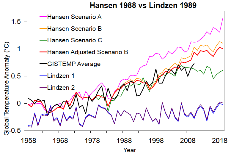
As you can see, Hansen's Scenario B is not far from reality, with a warming trend since 1984 (0.26°C per decade) approximately 30% too high (compared to our average GISTEMP trend of 0.20°C per decade), and the adjusted Scenario B even closer, with a warming trend just 17% higher than observed.
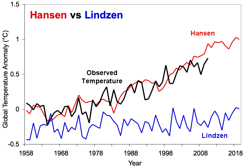
Our reconstructions of Lindzen's projections, on the other hand, increasingly diverge from reality. His warming trend of approximately 0.01°C to 0.02°C per decade is 90 to 95% too low. This is further illustrated in the figure below, which isolates the adjusted Scenario B, our second Lindzen reconstruction, and the GISTEMP average (we have also added this figure to the high resolution climate graphics resource page).
Additionally, Dr. Hansen's 1988 climate model was a bit more sensitive to greenhouse gas changes than the models used by climate scientists today, with a sensitivity of 4.2°C for a doubling of CO2. We can further adjust his Scenario B to reflect the IPCC climate sensitivity of 3°C to determine what today's climate model projections would have looked like in 1988.
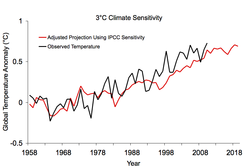
As you can see, the projection matches up very well with the observed temperature increase. This supports the IPCC most likely climate sensitivity value of 3°C for doubled CO2.
This analysis demonstrates that Hansen has a record of highly accurate climate projections over the past two decades, while Lindzen has a record of inaccuracy. Indeed, Lindzen continues to argue for low climate sensitivity to this day (not quite as low as 0.3°C, but he continues to argue it's below 1°C for doubled CO2 [i.e. Lindzen and Choi 2009]).
Given all the heat "skeptics" have directed towards Hansen for his projections' slight overestimate of the subsequent warming, one can only wonder what they must think about the massive underestimate of this warming based on Lindzen's 1989 comments.


Dana addressed this problem with his 2.7°C sensitivity Scenario D and achieved good results. However, this change is not "minor". It has resulted in the 2019 temperature projections plummeting from 1.57°C/1.10°C in Hansen (1988) to 0.69°C in Dana (2011).
This is a dramatic drop of either 0.88°C or 0.41°C depending on which version of Hansen 1988 you prefer.
The use of aerosols was my suggestion for getting Scenario B to work if you wished to use a sensitivity greater than the 2.7°C used in Dana's Scenario D.
Regarding your statement that I am trying to convince myself that "equilibrium sensitivity in not near +3°C." This is patently untrue. I stated @81 and @103 that Dana's Scenario D with a sensitivity of 2.7°C gives good results.
I fully understand your "ad nauseum" reasoning that two errors may be cancelling each other out to give the correct answers in Scenario C. This is why I suggested Hansen's aerosol strategy to correct Scenario B. I am willing to wait for a few years (but not ad infinitum) to determine if real-world temperatures will start to follow real-world emissions again or if they will continue to bump along the commitment trajectory. The date of 2015 suggested by Hansen (2006) seems as good a time as any to determine which trajectory real-world emissions are following.
You may wish to consider Sir Arthur Conan Doyle, "When you have eliminated the impossible, whatever remains, however improbable, must be the truth."
I clicked on the links to try to find Lindzen's temperature predictions shown in the figures, but they just led to some notes from a Mallove talk - no charts or data. Are those predictions published anywhere? If so, I think it would be very helpful. Thanks.
JME @111, the relevant quotes are:
1)
2)
3)
4)
From (4) you can project Lindzen's estimated trend temperature increase since about 1850. Strictly for comparison purposes, this requires that you use either HadCRUTv4 of the Berkely Earth LOTI both of which extend back to 1850. The GISTEMP LOTI only extends back to 1880, a time of which Lindzen says "... probably was an anomalous minimum ...". Using a GISTEMP decadal or multidecadal average starting in 1880 to establish the baseline for Lindzen's predictions would underestimate his predicted temperature. It also, however, overestimates his trend in that the 0.1 C rise is taken to be over a 30 year shorter interval.
Further, for Lindzen to consider there to be an "anomalous minimum", he obviously considers there to be more natural variability (see (1)) than that generated by the ENSO cycle, plus volcanism and other short term effects. That, however, is what is portrayed in the OP above. Ergo, arguably the graph understates the prediction for global warming.
To see to what extent this is true, I made a comparison between the Lindzen prediction and the BEST LOTI:
Comparing this graph to those above, it appears that the errors made worked in Lindzen's favour. That is primarilly because 1880 was not "...an anomalous minimum..." relative to 1850, contrary to Lindzen's claim. Consequently the increased trend generated by using an 1880 start date brings the Lindzen prediction closer to observations than do the graphs above. The only thing better for Lindzen in this more accurate comparison is the better fit with long term variability. On the other hand, the complete failure to capture the continuation of the temperature trend from the 1970s to late 1980s by Lindzen makes his prediction absurd, if the overall under prediction of temperatures throughout the 20th century had not already.
Lindzen commented on the observational record, saying:
These were fair comments in 1989, when the GISS temperature record was based on meteorological stations only. Now, however, the GISS LOTI and BEST LOTI include ship and bouy data for Sea Surface Temperatures. What is more, BEST does not adjust for station moves, but rather treats any such move as resulting in a different station. BEST also relies on far more meteorological stations than GISS even now, and certainly in comparison to the GISS product of 1989.
Further, rather than "the corrections [being] of the order of the effects", as claimed by Lindzen in 1989, in the modern LOTI temperature series, the corrections reduce the effects:
(See here)
There is, therefore, no reason to doubt the essential accuracy of the modern observations. Ergo, Lindzen was wrong - calamatously wrong, in his implied prediction of 1989.
(Small note: Lindzen predicts future warming as being small in terms of natural variability. I took that to mean less than half of a standard deviation of the 1850-1950 temperature data, taken for the excercise as being entirely natural or nearly so. That exagerates Lindzen's natural variability as anthropogenic forcing was a significant factor over that period. Base on that yardstick, Lindzen's prediction for the trend from 1990-2100 is a trend of 0.008 C/decade, or 111% of his retrodiction of the observed trend from 1850-1989. That is, his predicted trend rises by only 11% from his retrodicted trend.)