Guest post by Michael Sweet
The Arctic melt season is starting to get into gear. The ice really starts to melt in June and it'll be interesting to see what develops this year. This post is to describe some web sites I've found to be useful to monitor the summer ice melt in the northern hemisphere. They can also be used to track the Antarctic ice. I'm not an ice scientist so I will limit commentary about the web sites. In general, the data and the web sites speak for themselves.
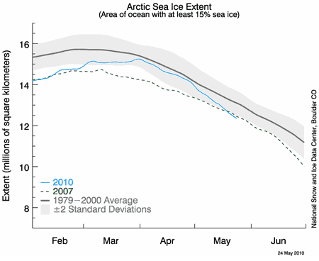
These people are the real deal in anything to do with ice and snow. The linked page shows the sea ice extent and is updated most days. If you click on the map it gives the day the data was last updated. Sea ice extent is defined as the area of sea covered by at least 15% ice. They use a 20 year average for their graphs. They have new comments monthly (usually about the 5th of the month) and additional comments as they see fit over the melt season. They often refer to other useful web sites. This site is generally user friendly and has a good frequently asked questions section. There are interesting stories about the scientists and their recent publications. They have a huge data library if you are interested in checking raw data.
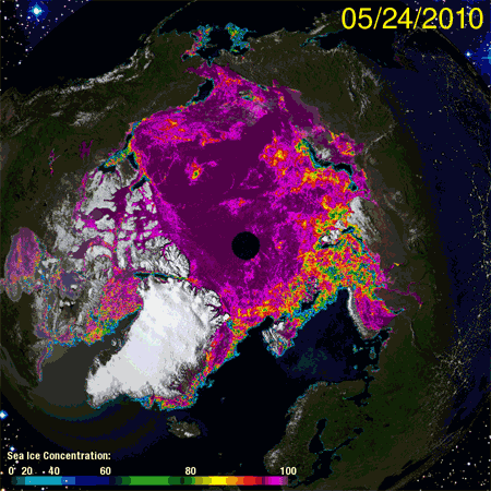
This site has a lot of interesting and historic data. It's good for putting data in a long-term context. They offer little or no commentary on the data. The graphs on the main pictures come from the University of Bremen (via NSIDC) and are updated most days. Cryosphere Today uses a very high contrast in the images so small changes are evident. Don’t read too much into these small changes - the sensor sometimes has trouble telling melt ponds on top of the ice from open sea. Wait a week and see how the image changes. Their images use a different sensor from NSIDC and the contrast is different so the images are not directly comparable. It is best to compare a Cryosphere Today image to another CT image and an NSIDC image to another NSIDC image.
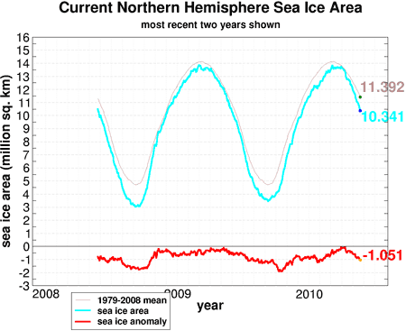
This graph shows ice area. The anomaly just went over 1 million km2, after being close to normal in March. Those changes are caused by the weather. The important data is the end of the melt season. To determine ice area they take the sea ice extent and subtract out the area of open sea. NSIDC likes sea ice extent. This is an example of good scientists who disagree on the most useful measure of the ice. The difference is small, for long-term trends they are essentially the same, but the graphs are not directly comparable. CT uses a 30 year baseline for their graphs.
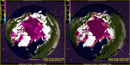
CT has an interesting comparison app to compare any two single days of ice extent (and snow for recent years). You can compare to today’s date in 1980 or 2007 if you want. They also have 30 day animations for their main pictures if you want to see the last months’ changes.
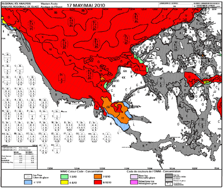
The Canadian Ice Service has interesting data for the North American Arctic. The weekly regional maps (shown above) show detailed ice extent and give the last weeks climatology. The climatology puts the data in more context. They also have ice forecasts every two weeks and a detailed summer forecast will come out the beginning of June. They have daily ice maps if you want to really see the detail. It was interesting to me to see how much detail the scientists measure and know about - much more than I had expected.
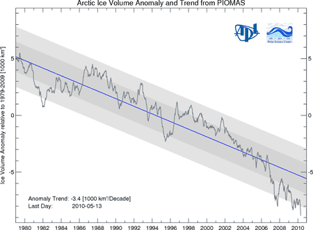
This is a new site that tracks ice volume. They seem to update about every two weeks. It will be interesting to compare to ice area this summer. Many scientists feel that the volume of ice is the most important measure of the health of Arctic Ice. The ice volume has not recovered in the last two years like ice area has.
The University of Bremen has a daily ice map (used the next day on CT). They have a few close-ups if you want more detail. Daily changes are related to weather and not climate so don’t get too excited about what you see.
This site has current and historic snow data. This is a good site for data if you want to make graphs. They only update about once a month.
Posted by michael sweet on Friday, 28 May, 2010
 |
The Skeptical Science website by Skeptical Science is licensed under a Creative Commons Attribution 3.0 Unported License. |