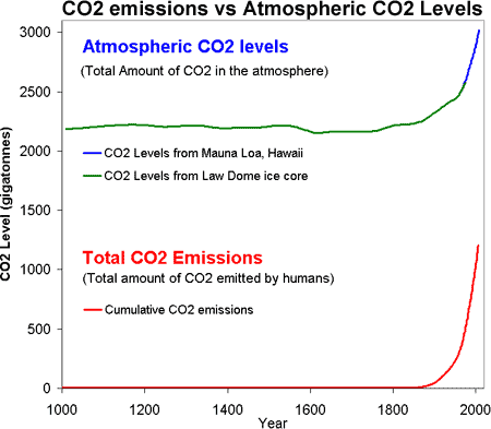
Figure 1: CO2 levels (Green Line - Law Dome, East Antarctica and Blue line - Mauna Loa, Hawaii) and Cumulative CO2 emissions in gigatonnes of CO2 (Red Line - CDIAC).
In an earlier post on the human contribution to CO2 levels, cbrock suggested integrating CO2 emissions to obtain the cumulative CO2 emissions. This would allow a direct comparison between the amount of CO2 in the atmosphere and the amount of CO2 we've emitted into the atmosphere. Now I never pass up the opportunity to plot new graphs and this was no exception. The only problem was the data available for CO2 emissions (gigatonnes carbon) used different units to the data for CO2 levels (parts per million by volume).
To compare the two time series, I decided to convert both sets of data to gigatonnes of CO2. The CO2 emissions data is expressed in gigatonnes carbon (GtC). This means they've only included the carbon element of the carbon dioxide molecule. The atomic mass of carbon is 12, while the atomic mass of CO2 is 44. Therefore, to convert from gigatonnes carbon to gigatonnes of carbon dioxide, you simply multiply 44 over 12. In other words, 1 gigatonne of carbon equals 3.67 gigatonnes of carbon dioxide.
Atmospheric CO2 levels are expressed in parts per million by volume (ppm). To convert from ppm to gigatonne of carbon, I consulted the conversion tables of the Carbon Dioxide Information Analysis Center. 1 part per million of atmospheric CO2 is equivalent to 2.13 Gigatonnes Carbon. Using our 44 over 12 rule, this means 1ppm = 7.81 Gigatonnes of Carbon Dioxide.
Figure 1: CO2 levels (Green Line - Law Dome, East Antarctica and Blue line - Mauna Loa, Hawaii) and Cumulative CO2 emissions in gigatonnes of CO2 (Red Line - CDIAC).
So putting it all together, Figure 1 is a plot of the total amount of CO2 in the atmosphere (top) versus the total amount of CO2 humans have emitted into the atmosphere (bottom). Several features jump out. Firstly, the similar shape of the curves (dare I say hockey stick shaped). We have correlation but do we have causality? Could it all be just a coincidence? It isn't too much of a stretch to imagine the amount of CO2 we put into the atmosphere might have a causality link with the amount of CO2 that remains in the atmosphere (but if you're still not convinced, there's always the isotope fingerprint for confirmation).
Lastly, it's worth noting that the amount of CO2 emitted exceeds the amount that CO2 levels have risen. Not all the CO2 we emit remains in the atmosphere but some is taken up by carbon sinks such as the ocean. There's nothing new in this - it was all well covered in the previous post on CO2 levels. This was just an opportunity to plot a new graph with lots of shiny colours.
For more info about downloading and converting CO2 data, I recommend you check out CO2: Emissions & Changes in Atmospheric Levels by Climate Charts & Graphs - a very useful resource if you're interesting in climate data.
Posted by John Cook on Tuesday, 13 October, 2009
 |
The Skeptical Science website by Skeptical Science is licensed under a Creative Commons Attribution 3.0 Unported License. |