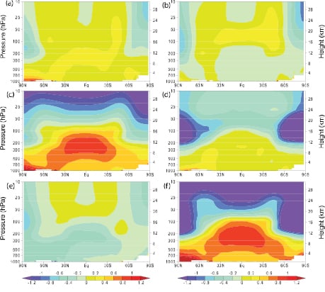
Figure 1: Atmospheric temperature change from 1890 to 1990 from (a) solar forcing, (b) volcanoes, (c) greenhouse gases, (d) ozone, (e) sulfate aerosols and (f) sum of all forcing (IPCC AR4).
What The Science Says:
Satellite measurements match model results apart from in the tropics. There is uncertainty with the tropic data due to how various teams correct for satellite drift. The U.S. Climate Change Science Program conclude the discrepancy is most likely due to data errors.
Climate Myth: There's no tropospheric hot spot
The IPCC confirms that computer modeling predicts the existence of a tropical, mid-troposphere “hot spot” about 10km above the Earth’s surface. Yet in the observed record of the Hadley Centre’s radiosondes, the predicted “hot-spot” signature of anthropogenic greenhouse warming is entirely absent (source: Christopher Monckton)
The tropospheric hot spot is due to changes in the lapse rate (Bengtsson & Hodges 2009, Trenberth & Smith 2006, Ramaswamy 2006). As you get higher into the atmosphere, it gets colder. The rate of cooling is called the lapse rate. When the air cools enough for water vapor to condense, latent heat is released. The more moisture in the air, the more heat is released. As it's more moist in the tropics, the air cools at a slower rate compared to the poles. For example, it cools at around 4°C per kilometre at the equator but a much larger 8 to 9°C per kilometre at the subtropics.
When the surface warms, there's more evaporation and more moisture in the air. This decreases the lapse rate - there's less cooling aloft. This means warming aloft is greater than warming at the surface. This amplified trend is the hot spot. It's all to do with changes in the lapse rate, regardless of what's causing the warming. If the warming was caused by a brightening sun or reduced sulphate pollution, you'd still see a hot spot.
There's a figure in the IPCC 4th Assessment report that shows the "temperature signature" expected from the various forcings that drive climate. This figure is frequently misinterpreted. Let's have a close look:
Figure 1: Atmospheric temperature change from 1890 to 1990 from (a) solar forcing, (b) volcanoes, (c) greenhouse gases, (d) ozone, (e) sulfate aerosols and (f) sum of all forcing (IPCC AR4).
The source of the confusion is box c, showing the modelled temperature change from greenhouse gases. Note the strong hot spot. Does this mean the greenhouse effect causes the hot spot? Not directly. Greenhouse gases cause surface warming which changes the lapse rate leading to the hot spot. The reason the hot spot in box c is so strong is because greenhouse warming is so strong compared to the other forcings.
The hot spot is not a unique greenhouse signature and finding the hot spot doesn't prove that humans are causing global warming. Observing the hot spot would tell us we have a good understanding of how the lapse rate changes. As the hot spot is well observed over short timescales (Trenberth & Smith 2006, Santer et al. 2005), this increases our confidence that we're on track. That leaves the question of the long-term trend.
What does the full body of evidence tell us? We have satellite data plus weather balloon measurements of temperature and wind strength. The three satellite records from UAH, RSS and UWA give varied results. UAH show tropospheric trends less than surface warming, RSS are roughly the same and UWA show a hot spot. The difference between the three is how they adjust for effects like decaying satellite orbits. The conclusion from the U.S. Climate Change Science Program (co-authored by UAH's John Christy) is the most likely explanation for the discrepancy between model and satellite observations is measurement uncertainty.
Weather balloon measurements are influenced by effects like the daytime heating of the balloons. When these effects are adjusted for, the weather balloon data is broadly consistent with models (Titchner et al. 2009, Sherwood et al. 2008, Haimberger et al. 2008). Lastly, there is measurements of wind strength from weather balloons. The direct relationship between temperature and wind shear allows us to empirically obtain a temperature profile of the atmosphere. This method finds a hot spot (Allen & Sherwood 2008).
Looking at all this evidence, the conclusion is, well, a little unsatisfying - there is still much uncertainty in the long-term trend. It's hard when the short-term variability is nearly an order of magnitude greater than the long-term trend. Weather balloons and satellites do a good job of measuring short-term changes and indeed find a hot spot over monthly timescales. There is some evidence of a hot spot over timeframes of decades but there's still much work to be done in this department. Conversely, the data isn't conclusive enough to unequivocally say there is no hot spot.
The take-home message is that you first need to understand what's causing the hot spot. "Changes in the lapse rate" is not as sexy or intuitive as a greenhouse signature but that's the physical reality. Once you properly understand the cause, you can put the whole issue in proper context. As the hot spot is due to changes in the lapse rate, we expect to see a short-term hot spot. We do.
What about a long-term hot spot? With short-term observations confirming our understanding of the lapse rate, that leaves spurious long-term biases as the most likely culprit. However, as observations improve, if it turns out the long-term hot spot is not as strong as expected, the main question will be why do we see a short-term hot spot but not a long-term hot spot?
Intermediate rebuttal written by John Cook
Update July 2015:
Here is a related lecture-video from Denial101x - Making Sense of Climate Science Denial
 |
The Skeptical Science website by Skeptical Science is licensed under a Creative Commons Attribution 3.0 Unported License. |