Climate Science Glossary

Term Lookup

Enter a term in the search box to find its definition.

Settings

Use the controls in the far right panel to increase or decrease the number of terms automatically displayed (or to completely turn that feature off).

Term Lookup

Settings


All IPCC definitions taken from Climate Change 2007: The Physical Science Basis. Working Group I Contribution to the Fourth Assessment Report of the Intergovernmental Panel on Climate Change, Annex I, Glossary, pp. 941-954. Cambridge University Press.

Home Arguments Software Resources Comments The Consensus Project Translations About Support

Twitter Facebook YouTube Mastodon MeWe

RSS Posts RSS Comments Email Subscribe


Climate's changed before
It's the sun
It's not bad
There is no consensus
It's cooling
Models are unreliable
Temp record is unreliable
Animals and plants can adapt
It hasn't warmed since 1998
Antarctica is gaining ice
View All Arguments...


Username
Password
New? Register here
Forgot your password?

Latest Posts

Archives

What has global warming done since 1998?

What the science says...

Select a level... Basic Intermediate

Every part of the Earth's climate system has continued warming since 1998, with the ten record temperature years all occurring since 2010.

Climate Myth...

It hasn't warmed since 1998

For the years 1998-2005, temperature did not increase. This period coincides with society's continued pumping of more CO2 into the atmosphere. (Bob Carter)

At a glance

This date-specific talking-point is now something of a historical curiosity, but we'll leave it in the database for now because it's such a good illustration of the simplistic yet reckless mindset of the serial climate change misinformer. And indeed, we could (out of sheer mischief) have revised this myth by replacing "1998" with "2016". In fact, that's what we started to see in the climate change misinformation stream, © the Usual Suspects. But 2023's record temperatures put a stop to that.

Anyway, as first predicted over a century ago, Earth's surface, oceans and atmosphere are all heating up. That's due to our increasing greenhouse gas emissions, but over the years the warming has occurred at varying rates. This should in no way come as a surprise. Other physical phenomena periodically act either to suppress or enhance temperatures.

A prime example of such a phenomenon is the effects of La Nina and El Nino. This natural climatic oscillation features variations in winds and sea surface temperatures over the tropical eastern Pacific Ocean. The cycle can at times strongly influence temperature and rainfall patterns right around the world.

In a La Nina year, temperatures are suppressed, whereas an El Nino year sees them enhanced. This is noise on the long-term upward trend. That's why climatologists work with multiple decades, not just a few years in isolation, in order to get a grasp on what is going on.

The year 1998 featured a massive El Nino. The temperature spike it caused was a huge outlier, like a pinnacle towering over the landscape of the temperature record. In the following years there was a return to more typical conditions, with an erratic but upward warming pattern. That sequence of events gave deniers a brief opportunity to insist that global warming had “paused” or had even stopped.

You only need to remember one thing here. Those who create and spread misinformation about climate change don't care about reality. Public confusion is their aim. In this instance, the misinformation exercise involved deliberately selecting a limited block of years starting with the massive El Nino of 1998 and using that very warm starting-point to insist that global warming had stopped. They knew this would likely work for a few years and that the public would quickly forget why that was the case. Mother Nature had handed them a gift. It was an irresistible bunch of low-hanging fruit to exploit: little wonder the tactic is known as 'cherry-picking'.

Talking about reality, what actually happened? Well, as of 2024, a couple of decades down the line, the top ten warmest years have all been since 2010, whatever observation-based dataset you choose, with eight of them being in the 2015-2023 period. 1998 is nowhere to be seen any more. By modern standards, it simply wasn't warm enough.

Please use this form to provide feedback about this new "At a glance" section, which was updated on May 27, 2023 to improve its readability. Read a more technical version below or dig deeper via the tabs above!


Further details

Even if we ignore long term trends (something deniers often do in order to make a point) and just look at the record-breakers, as of early 2024 the top ten warmest years have all been since 2010, whatever dataset you choose, with eight of them being in the 2015-2023 period. In this top ten grouping, 1998 is nowhere to be seen any more. It was not warm enough.

The myth of no warming since 1998 was largely based on the satellite record estimates of the temperature of the atmosphere.  However, as discussed in the video below by Peter Sinclair, even that argument is no longer accurate.  The satellites show warming since 1998 too.

There's also a tendency for some people just to concentrate on atmospheric or surface air temperatures when there are other, more useful, indicators that can give us a better idea how rapidly the world is warming. More than 90% of global warming heat goes into warming the oceans, while less than 3% goes into increasing the atmospheric and surface air temperature.  Records show that the Earth has been warming at a steady rate before and since 1998 and there is no sign of it slowing any time soon (Figure 1). 

Fig 1

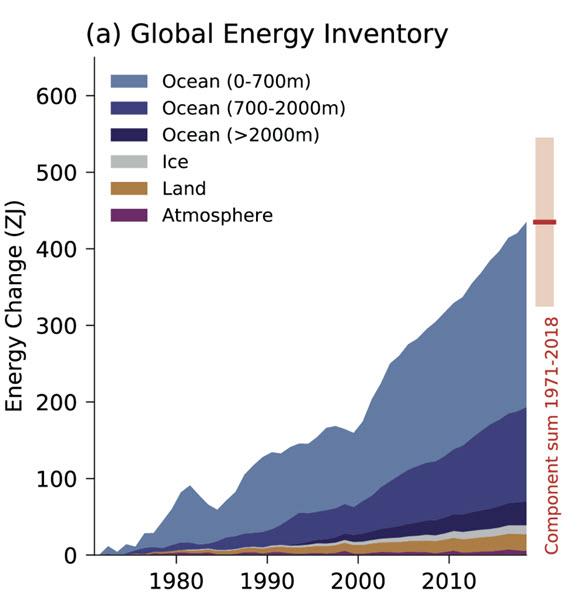
Figure 1:  Global Energy Inventory: observed changes in the global energy inventory for 1971–2018 (shaded time series) with component contributions as indicated in the figure legend. Cross-Chapter Box 9.1 Figure 1 (part a) - From IPCC AR6 WGI Chapter 9.

Even if we focus exclusively on global surface temperatures, Cowtan & Way (2013) shows that when we account for temperatures across the entire globe (including the Arctic, which is the part of the planet warming fastest), the global surface warming trend for 1997–2015 is approximately 0.14°C per decade.

Ultimately, every part of the Earth's climate system is warming, and has continued warming since 1998.

Last updated on 8 March 2024 by John Mason. View Archives

Printable Version  |  Offline PDF Version  |  Link to this page

Argument Feedback

Please use this form to let us know about suggested updates to this rebuttal.

Further reading

Tamino further explores the warming trend since 1998 in Garbage is Forever and Wiggles.

I've kept my original treatment of the subject as other websites hotlink to the images. My original treatment uses similar arguments to Fawcett and Jones 2008 although their analysis is much more rigorous (as you'd expect in a peer-reviewed paper).

Further viewing

Comments

1  2  3  4  5  6  7  8  9  10  11  12  13  14  15  16  17  Next

Comments 1 to 25 out of 407:

  1. While I don't disagree with the statement that the overall warming trend continues, the line-of-best-fit-graph is a bit disingenuous. You should show the 2 sigma bounds on the fit line, which would likely show that the probability of no increase in the last 10 years is not unreasonable. Further I presume that you used least-squares to fit the line. This assumes that temperature anomalies are normally distributed. Glancing at the graph, this doesn't seem to be the case (several major excursions from the mean trend line), so the outliers will unduly influence the line of best fit. Least squares is extremely non-robust to non-normal data. The second graph doesn't help your argument much, and might actually hinder it some. If you could send me or point me to the raw data, I'd be happy to do a different analysis on it and see if there is a meaningful trend in the data.
    Response: Good question, the data comes from GISS Temp, using the Global-mean monthly land-ocean temperature index.
  2. These posts are useful. plfreeman, there's enough data from monthly, weekly, or daily summaries, that the regression and correlation are both statistically significant, even after correcting for autocorrelation and using various methods. Here's a good link to check it out, by a mathematician specializing in time series analysis: http://tamino.wordpress.com/2007/08/31/garbage-is-forever/ The strong version of Carter's claim that warming stopped in 1998 requires the slope to be zero or negative since then. It isn't, therefore the strong version is proven false (and the 60 individuals who signed that have demonstrated their commitment to ideology over data). Even the weak version ('no significant warming') is shown false.
  3. According to Carter the slope is indeed negative since then. However, I believe he is quite clear in saying the amount is not really significant. The data above does not match the data set he is using.
    Response: I have corresponded with Bob Carter about the data he uses - in articles where he states the temperature trend is negligible or even cooling, he's erroneously using upper troposphere data. See the footnote of Satellites show no warming.
  4. Has it warmed over the past decade? Based on the global surface record compiled by the Hadley Centre and the global UAH satellite record there has been warming over the past decade. http://www.cru.uea.ac.uk/cru/data/temperature/hadcrut3vgl.txt http://vortex.nsstc.uah.edu/data/msu/t2lt/tltglhmam_5.2 Plotting the two temperature records for the last 10 years shows that: · The surface record showed a linear increase of 0.062 degrees C per decade · The satellite record showed a linear increase of 0.059 degrees C per decade The two warmest years during this period were 1998 (a strong ENSO year) and 2005 (a somewhat weaker ENSO year). Both of these rates of increase are considerably lower than the average rate of increase over the past 28 years, when satellite readings first became available: · The surface record showed a linear increase of 0.171 degrees C per decade · The satellite record showed a linear increase of 0.142 degrees C per decade
  5. Bob Carter’s article is almost 18 months old now, and we now have temperature records for both 2006 and 2007. Interestingly, both years were predicted to be “record warm” years, with the usual media hype about this being additional proof of alarming global warming caused by man. Both turned out to be rather normal years, but there was not much media hype, since (as we all know) “good news is no news”. But as I showed earlier, if we compare the past decade we see that there is still warming, but that the rate has slowed down considerably in comparison with the earlier record. Sure, there are two ENSO years in the record, 1998 and 2005 (which also turn out to be the two warmest years). But, then again, there will always be ENSO years and scientists have been unable to predict when these will occur or explain exactly why they occur when they do. The question that this site raised should not have been whether or not it has warmed since 1998 but rather whether or not the rate of warming has decreased since 1998 as compared to earlier decades, and if so, whether or not this indicates a trend of slowdown in temperature increase or just an anomaly caused by individual ENSO years.
  6. Good evening. Maybe this discussion could be enriched with comments from the IPCC chairman Rajenda Pachauri and the United Kingdom's Meteorological office (Royal, I presume). From a recent Reuters' piece: "Rajenda Pachauri, the head of the U.N. Panel that shared the 2007 Nobel Peace Prize with former U.S. Vice President Al Gore, said he would look into the apparent temperature plateau so far this century. "One would really have to see on the basis of some analysis what this really represents," he told Reuters, adding "are there natural factors compensating?" for increases in greenhouse gases from human activities." Source: http://tinyurl.com/3doxvc And then the Met office. They recently issued a forecast for 2008, stating this much: "The forecast value for 2008 mean temperature is considered indistinguishable from any of the years 2001-2007, given the uncertainties in the data." Source: http://tinyurl.com/2ezepk So, the IPCC is looking into "the plateau", and the Met Office says it persists into its' eight year, and who knows, after another eight years it may be very very cold again. Over at Tamino's Open mind there was some discussion about whether we should set 2015 as the year when the science could be declared settled;-). But the details seem to take some time to agree upon. The problem with outliers!
  7. Not that one month means much, but the RSS temperature reading for Jan. 2008 has arrived. It was the coldest month since 2000, enforcing the current decadal cooling trend.
    Response: The cool temperatures of Jan 2008 are due to an unusually strong La Nina effect (the strongest in a decade).
  8. With no major volcanic outbreak since 1991, current temperatures are the same as before that major outbreak (Pinatabu). (Actually, current temperature is lower than then but it is fair to allow for a lower average temperature the years before Pinatabu and we need to keep in mind that current temperatures are a bit lower than previous years.) Anyhow we can conclude than since prior to Pinatabu there has been no statistically significant warming trend (its all within error bounds). Now how much was the upper projection of the IPCC? +6°C to the year 2100. From now on that roughly means at least five times the warming rate we've seen so far since satellite measurements began and more than ten times the warming rate since we started to increase our CO2 emissions (around 1940-45). That anyone can believe this without the IPCC presenting any evidence at all is flabbergasting to be honest. I'll admit that there is a risk (albeit minor IMHO) for a two degree warming, but such a risk you handle differently and you certainly won't scare children nor keep people in poverty because of it.
    Response: You can read the IPCC projections versus observations here.
  9. OK, so now we have the data from the ARGO measuring system, and they show that the oceans have not warmed at all since 2003. So there is more than just one La Nina behind the flattening of global temperatures, wouldn't you agree? Sulphur aerosols from China?
  10. I've analyzed the data used by Christopher Monckton in a recent essay where he claims a cooling trend, and the results may be surprising. Or possibly not, for the readers of this website... http://jhubert.livejournal.com/181274.html
  11. Hadley's own analysis for the trend 1998 - 2007 concludes; "A simple mathematical calculation of the temperature change over the latest decade (1998-2007) alone shows a continued warming of 0.1 °C per decade." http://www.metoffice.gov.uk/corporate/pressoffice/myths/2.html
  12. Hadley's own analysis for the trend 1998 - 2007 concludes; "A simple mathematical calculation of the temperature change over the latest decade (1998-2007) alone shows a continued warming of 0.1 °C per decade." http://www.metoffice.gov.uk/corporate/pressoffice/myths/2.html
  13. Hadley's own analysis for the trend 1998 - 2007 concludes; "A simple mathematical calculation of the temperature change over the latest decade (1998-2007) alone shows a continued warming of 0.1 °C per decade." http://www.metoffice.gov.uk/corporate/pressoffice/myths/2.html
  14. Compared to the average 1998 through 2007: The average for the first 5 months of 2008 is 0.16°C colder according to Hadley's HADcrut3, and 0.10°C colder according to NOAA while the atmospheric carbon dioxide level continues its rise. Climate history shows that added atmospheric carbon dioxide has not had any significant influence on average global temperature. See graphs of NOAA and other credible data (all with source websites given) at http://www.middlebury.net/op-ed/pangburn.html at four different time scales up to 150,000 ybp.
  15. I apologise in advance ........... " they strain out gnats and swallow camels..." THE current estimated GMT (actual) is 14C. The anomaly 1970 -2008 is around +0.55C which as a linear trend is +0.18/decade. If that trend continues in a linear fashion, then by 2108 the GMT will be 15.8C assuming all other things remain equal. Not impressed.
  16. It is unclear how the calculation at 15 was made. NOAA data is available at LINK and Hadley data at http://www.cru.uea.ac.uk/cru/data/temperature/hadcrut3gl.txt . These both show a trend of about +0.1 degree per decade. Although short term trends can be misleading, like the 22 year run up from 1976 to 1998, the dramatic drop of global average temperature in 2008 may be indicative of a change in character of the climate. The current UAH satellite numerical data (these data consist of the differences of lower atmospheric temperature from the 1979 thru 1998 average) is at http://vortex.nsstc.uah.edu/data/msu/t2lt/uahncdc.lt . According to these data, the AVERAGE GLOBAL TEMPERATURE for the first 9 months of 2008 is LOWER than the average from 2000 thru 2007 by an amount equal to 43.1% of the total linearized increase (NOAA data) during the 20th century. Since 2000, the CARBON DIOXIDE LEVEL HAS INCREASED by 14.4% of the total increase since the start of the Industrial Revolution.

  17. Dan: I just did a simple linear calc 0.18/decade for 10 decades = + 1.8c rise. Totally wrong I know but it was to illustrate a point that even if the 30 year trend continues in a linear fashion ( which it can't as the real effect is logarithmic) we would only see GMT rise to 15/16C by 2008.
  18. PS: that should be 2108 of course!!
  19. This one certainly is true now. There has been no warming for the past 11 years. Here is the chart for RSS, UAH, HadCrut3 and GISS. http://reallyrealclimate.blogspot.com/2008/10/updated-11-year-global-temp-anomoly.html Double click the chart to enlarge it. Also, when we correct for ENSO, the temperature trend remains virtually flat. Here is a chart comparing raw HadCrut3 with ENSO corrected HadCrut3. http://reallyrealclimate.blogspot.com/2008/07/gavin-schmidt-enso-adjustment-for.html As you can see, there is virtually no difference. The period in question had 7 ENSO event. 4 were El Ninos and 3 were La Ninas. Taken together they had almost no effect on the trend line.
  20. Interesting that only GISS still indicates a +ve trend whilst the other three show negative. roughly a +1C for GISS and -0.5C for the rest.
  21. Mizimi Yes and it's always GISS data used by the alarmists.
  22. A few points: 1. I am intrigued by the slant, depending on the POV. Ie, if the temp is trending up, it is the result of manmade causes. However, a cold year (2008) is the result of natural causes (La Nina). Hmmm... 2. I'd be interested to see the variation in measuring points over the years, to confirm or reject the notion that some of the warming is due to the removal of Siberian monitoring stations after the USSR disintegration. 3. Looking at the charts for the last 10 or so years, it seems the warming is mostly concentrated in the far northern hemisphere. Would be interesting to see how that is explained.
  23. Two out the three graphs show defenite tempurature rises. That always seems to be ignored by the deniers.
  24. Lee: have a look at the site posted by Saluki...it shows 2 out of 3 graphs indicating a temperature decline. Also theWags has a valid point I raised some time ago...namely that the number of stations collecting data has declined alarmingly over the last 20 years, so we should be asking whether these graphs are truly representative of the global condition. See http://www.uoguelph.ca/~rmckitri/research/nvst.html for a graph of stations vs temperature. It also appears that too many of the remaining stations are in the US for a realistic sampling.
  25. Hi, Thanks again for a great site. I think it is a bit disingenuous to use surface based temperature graphs rather than sattelite based ones. There is a new paper from one Arno Arak who claims that hte sattelites show no warming when measured to Dec 08. Is there anywhere this is refuted. Shane

1  2  3  4  5  6  7  8  9  10  11  12  13  14  15  16  17  Next

Post a Comment

Political, off-topic or ad hominem comments will be deleted. Comments Policy...

You need to be logged in to post a comment. Login via the left margin or if you're new, register here.

Link to this page


The Consensus Project Website

THE ESCALATOR

(free to republish)


© Copyright 2024 John Cook
Home | Translations | About Us | Privacy | Contact Us