Climate Science Glossary

Term Lookup

Enter a term in the search box to find its definition.

Settings

Use the controls in the far right panel to increase or decrease the number of terms automatically displayed (or to completely turn that feature off).

Term Lookup

Settings


All IPCC definitions taken from Climate Change 2007: The Physical Science Basis. Working Group I Contribution to the Fourth Assessment Report of the Intergovernmental Panel on Climate Change, Annex I, Glossary, pp. 941-954. Cambridge University Press.

Home Arguments Software Resources Comments The Consensus Project Translations About Support

Bluesky Facebook LinkedIn Mastodon MeWe

Twitter YouTube RSS Posts RSS Comments Email Subscribe


Climate's changed before
It's the sun
It's not bad
There is no consensus
It's cooling
Models are unreliable
Temp record is unreliable
Animals and plants can adapt
It hasn't warmed since 1998
Antarctica is gaining ice
View All Arguments...


Username
Password
New? Register here
Forgot your password?

Latest Posts

Archives

Not so Permanent Permafrost

Posted on 26 October 2011 by Riduna

Introduction

Permanently frozen ground or permafrost occurs and persists where the mean temperature above ground is 0°C or less, resulting in soil, rock and their content being frozen and remaining frozen for at least 2 consecutive years. Permafrost is most common in higher latitudes of the northern hemisphere where it occurs over 24% of the landmass. It commonly has a depth of 0.6 to 150 metres, though depths of 1,500 metres are known.  Soil temperature below 5 metres tend to remain stable even though surface temperature may seasonally thaw the active zone where limited plant growth is possible.

The content of soil affected by permafrost often includes water, accumulated organic matter (biota) and methane produced from biota decay when temperatures were warmer.  The presence of permafrost prevents such decay and methane emission.  Water contained in the soil is present in the form of ice which binds composite material together.  The presence of ice, often close to the surface, prevents water flow so land affected by permafrost tends to be poorly drained and to be swampy or peatland when the active layer thaws briefly in summer.  Thawing usually occurs from the surface downwards and in the Arctic seldom penetrates more than 1 metre.

In the Arctic and adjacent lands, where sub-surface temperature is lower than -5°C, permafrost is continuous, ice in the soil is near the surface but is sensitive to temperature and within a degree or so of thawing.  Where sub-surface temperature is between -2°C and -4°C, permafrost is discontinuous, is present in 50% to 90% of the land area and ice near the surface is within a fraction of a degree of melting.  Partial permafrost can form where sub-surface land temperature is 0°C to -2°C and occurs in 10% to 50% of the land area though ice is usually not found close to the surface, permitting more diverse flora and fauna to flourish.

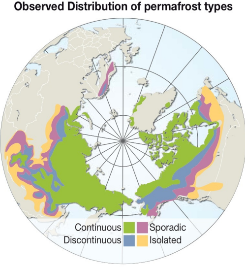
Fig. 1  Distribution of permafrost.  Continuous occurs in 100% of land area, Discontinuous occurs in 50-90% of land area, Sporadic occurs in 10-50% of land area.  Courtesy Riccardo Pravettoni, UNEP/GRID-Arendal 

Permafrost thaws when the land surface is disturbed or when temperature above the surface exceeds 0°C.  Anthropogenic activities have now elevated CO2 in the atmosphere causing warming to levels where on-shore permafrost is beginning to thaw, enabling decay of biota to resume and stored CH4 to be emitted into the atmosphere at an accelerating rate. In 2005 Shakhova et al (2010) measured methane entering the atmosphere from the East Central Siberian (ECS) continental shelf at 8 million tonnes per annum.  It is estimated that onshore emissions from thawing yedoma and biota are presently ~4 million tonnes per annum.

Greenhouse gas emissions

Yedoma is a Pleistocene permafrost rich in organic material and loess bound together by ice which makes up 50 to 90% of its content.  It is most commonly found in Eastern Siberia where it covers ~1 million km2 and can be >20 metres thick. Because of its high ice content, thawing and refreezing produces a thermokarst landscape of ponds and lakes (Fig 3) permitting biota to resume decay and emit greenhouse gases. Yedoma contains about 2% methane by volume and Siberian deposits, estimated to contain over 500 gigatonnes, are a major source of this gas.

All of the gas escaping from these sources enters the atmosphere as CH4 with a Global Warming Potential ~72 times greater than CO2 over a 20 year time horizon during which CH4 oxidizes to CO2.  It therefore has an immediate and powerful warming affect on the Arctic and contributes to temperature amplification in this and sub-Arctic regions.  It is estimates that annual methane emissions in the Arctic will increase to 1.5 billion tonnes of carbon per annum before 2030 and Shakhova predicts that emissions from the ECS alone could rise to >3 billion tonnes per annum later this century.

Releases of this magnitude are predicted to increase average global temperature by at least 4°C to 6°C, and by 6°C to 10°C in the Arctic before 2100.  Importantly, combined with loss of Arctic sea ice, it will also produce considerable warming of ocean water.  Inevitably, melting of permafrost, already evident, will accelerate significantly in coming years, both onshore and on the seabed.  Assessment of the effects this will have is important so that we are aware of the consequences and, where possible, can plan and institute remedial or mitigating action.

The Arctic tundra covers an area of ~10.360 million km2 and is covered by continuous permafrost.  It is estimated that this area contains an incredible 1.5 trillion tonnes of CH4, some stored in clathrate far beneath the surface, much of it in frozen biota at near surface depth, covered in permafrost insulating and stabilizing that material.  Surface permafrost has probably been slowly melting since CO2 concentration in the atmosphere rose above 280 ppm and has been releasing progressively larger CH4 amounts each year.


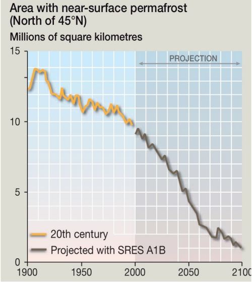
Fig. 2  Actual Modeled and projected loss of permafrost.  By 2100 permafrost will have thawed to a depth of 3 meters producing slope instability in mountain areas.  Courtesy UNEP/GRID-Arendal  Updated 10/12/11

Since 1988 when CO2 reached 350ppm, the rate and extent of permafrost thaw has increased significantly, and, combined with reduced albedo, elevating temperature – a feature known as Arctic amplification, speeding-up carbon feedback.  The effects of this are evidenced by Landsat and other data sources, showing coastal erosion over the 20 years 1986-2005 was double that of the preceding 30 years.

Arctic warming, consequential thawing of permafrost and associated carbon feedback are expected to accelerate the rate of thawing throughout the 21stcentury.  As permafrost thaws it permits biota to resume decay, producing methane and emitting it at a much increased rate.  Wickland et al (2006) find that poorly drained peat soils in Alaska emit 15 to 28 times more greenhouse gas when free of permafrost than do soils where permafrost is present.

Lawrence et al (2005) estimate that permafrost covering ~9.5m km2 will have thawed to a depth of 3 meters by 2100.  This thawing will make sediments wet, plastic and unstable producing change to the land surface through formation of wetlands, gullies and sinks.   It results in land subsidence and expansion causing land surface distortions, reducing its load bearing capacity and producing instability of mountain slopes.   The latter is exacerbated when permafrost refreezes, producing massive slides of rock, gravel and other material.


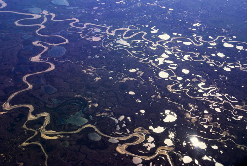
Fig 3.  Wet Tundra in the Russian Arctic.  Thawing of surface permafrost creates poor drainage causing them to turn into soggy bogs in summer which re-freeze in winter, a typical thermokarst landscape.  Courtesy UNEP/GRID-Arendal 

Flora and Fauna

Over the 21st century, extensive melting of permafrost will produce geomorphology substantially changing the existing environment.  Tundra plants are limited to grasses, sedges, lichens and mosses which have specialized to withstand the harsh Arctic climate and limited hours of sunshine.  They are being displaced by sub-Arctic flowering plants, small shrubs and trees.  The tree-line is predicted to move north encroaching on tundra at rates of up to 6 kilometres a year in some places, though generally slower advance is predicted. 

Animal species which are well adapted to tundra flora and climate are highly susceptible to environmental change.  It is likely that many could be faced with extinction unless they can adapt to a rapidly changing environment.  Rising temperatures and spread of flora found south of the tundra will limit food availability for grazing animals such as moose, caribou, reindeer and musk ox. Melting permafrost will cause development of extensive swamps, likely to impede migrating animals and their vulnerable young.  Reduction in their number will in turn threaten predator species such as wolves and Arctic fox.

Coastal erosion

Expectations are that erosion of the coastline will occur where there is a rise in sea level.  Bruuns Rule states that on average each 1cm of sea level rise results in about 1m of coastal recession.  In other words, for each meter of sea level rise, the coastline is eroded, over time, by 100 meters.  While this Rule has global application, coastal erosion in the Arctic is occurring at a much faster rate than predicted because of permafrost thawing and exposure of shorelines to wave action.

Around 60% of the Arctic Ocean shoreline is stabilized by permafrost binding silt, gravel and other material together.  Until recently they have been protected by sea ice from ocean wave action, however coastlines are remaining ice-free for longer periods each year.  Shorelines are now seasonally exposed to relatively warm seawater, the erosive action of waves and autumnal storm surges.  The result is that binding permafrost is being melted and shorelines are being eroded by wave action by up to 20 meters per annum in some parts, particularly at river deltas.  This threatens human settlements, salinates fresh water sources and damages other habitat.  The entire Arctic coastline has become labile, markedly so along shorelines of the Laptev, East Siberian and Beaufort seas.

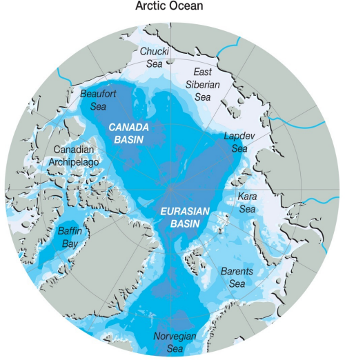
Fig 4.  Coastal erosion is extensive along Arctic Ocean shorelines, particularly of the Laptev, East Siberian and Beaufort Seas.  Courtesy Riccardo Pravettoni,UNEP/GRID-Arendal

Global average sea level rise is presently 3.3mm per annum so, according to Bruuns Rule we should be seeing average coastal erosion ~33cm per annum.  In the Arctic we find average erosion along 100,000 km of coastline is 1-2 meters per annum.

Socio-economic effects

All of the Arctic landmass, generally defined as the area contained by the 10°C thermoline, is affected by permafrost.  The Arctic has a population of 4-5 million(half living in Russia), several sizeable cities and major extractive industries - particularly oil and gas.

These are supported by an extensive transport infrastructure including roads, railways, bridges, airports, pipelines, dams and port facilities.  Cities and smaller settlements comprise dwellings, schools, hospitals, industries and businesses, as well as water and sewage treatment facilities.  Many of these assets are built on what were solid permafrost foundations often less than 3 metres deep.

Vast sums of money and decades of human endeavour in creating these assets will be at increasing risk where the foundations on which they rest, permafrost, begin to melt.  This melting has already started and is expected to accelerate and become more extensive throughout the 21st century.  It can be slowed by reducing CO2emissions but it can no longer be stopped, except by the onset of an ice age and there is no known defence against its ruinous effects

It is likely that in a decade or so, many more structures will be at risk of collapse or becoming unusable due to instability of the ground on which they are built.  The load bearing capacity, alignment and stability of roads and bridges may be adversely affected and ground traversed by gas and oil pipelines may no longer be able to support their weight.

The socio-economic impact of these developments is likely to be significant over the next 50 years.  The largest industries throughout the Arctic involve mineral, oil and gas production.

  • In the Russian Arctic, they are particularly important, accounting for 11% of GDP, 75% of the oil and all of the gas needed for domestic consumption and ~22% of Russia’s exports.
  • In the Canadian Arctic, diamond mining is presently the largest industry though gold tungsten and other minerals are also produced.  Considerable oil and gas reserves are planned to be developed.  Apart from Yellowknife (19,000) there are no towns of any size.
  • In Alaska, oil and gas production are the largest component of the State economy while zinc mining in the north-west makes an important contribution. The Alaskan Arctic has no major cities, though Fairbanks (35,000) is built on permafrost affected land.

Commercial activities in the Arctic are large, important to national economies and for the viability of local population centres.  Monitoring of permafrost melting and associated greenhouse gas emissions is undertaken by ground instruments and satellites.  However, unless technology able to replace melting permafrost with an affordable, durable load bearing foundation can be applied, it should be accepted that virtually all existing buildings and structures located on permafrost with foundations less than 5 metres deep are likely to be damaged or destroyed before 2100.

Conclusions

Permafrost is an immense CH4 reservoir and although present levels of emission are low, they are expected to substantially increase this century, accelerating warming in higher latitudes and globally.   This is a major concern since it will produce growing feedback resulting in gradual increase of the speed, depth and extent of permafrost thawing further increasing CHemissions.  The result will be on-going and more extensive land destabilization, distortion of surface and subsurface material and development of swamplands.

These will have profound impacts on flora and fauna, particularly species which have adapted to tundra conditions.  Because of the speed and extent of permafrost thawing, they may have insufficient time to adapt to these changes and could face extinction.  At the same time, warming and other changes to the environment are resulting in northward movement of species.

Permafrost loss combined with retreat of sea ice is producing very rapid coastal erosion in the order of 5-6 times faster than that caused by rising sea level.  It is affecting some coastal communities, causing them to move to more stable land.  More significant will be the damage to buildings and infrastructure now becoming evident as a result of land movement caused by loss of permafrost.  This damage is expected to increase over the next 50 years, and have substantial adverse effects on the Arctic economy.

These outcomes may be slowed by rapid reduction of anthropogenic greenhouse gas emissions but they can not be stopped or reversed.  Without application of technology countering the effects of permafrost thawing on existing buildings and infrastructure, damage to them can not be prevented.  Nor can a dangerous increase in the venting of CH4 into the atmosphere.

0 0

Printable Version  |  Link to this page

Comments

Comments 1 to 41:

  1. Ah so that where this 3gt figure from Shakova came from, long term (late century) figures. Someone got their hands on it and was trying to tell all who would listen that this was the current measured figure and spinning all kinds of woe from that figure.
    0 0
  2. If humans currently emit 29 gt of CO2 http://www.skepticalscience.com/human-co2-smaller-than-natural-emissions.htm CO2 has an atomic mass of 44 while CH4 is 16, that would decompose into 8 gt of carbon, so it would actually be a pretty significant addition to the CO2 in the atmosphere given its relatively short life as CH4? Sorry thnking out loud.
    0 0
  3. Should have read "8 gt of carbon dioxide"
    0 0
  4. Just a note: All of the links in this article (Not so Permanent Permafrost) appear to be broken to me. The external links seem to have had skepticalscience.com prepended to them.
    0 0
    Response:

    [DB] Fixed links (all of them, I think).  Made all graphics expandable (if larger scale available).

  5. In Figure 2, the reduction in "area with near-surface permafrost North of N45" is about 2 million sq km between 1915 to 1925 decade. That is about the same loss from the entire 1925 to 2000 period. What happened back in 1915-1925 to cause the rapid loss of 2 million sq km?
    0 0
    Response:

    [DB] Figure 2 is derived from this study.

  6. dorlomin Data gathered 2003-08. See Shakhova et al 2010. Methane has a global warming potential of ~70 over 10-15 year period during which time it normally oxidises in the atmosphere.
    0 0
  7. In the interglacial before this one, the Eemian, temperatures in Northern lattitudes reached temperatures higher than they have so far. I would expect considerable amounts of permafrost to have melted and released methane. Since the temperature change was slower than what we are experiencing I would expect methane might have been oxidized quickly enought to prevent any major spikes in its concentration. Still knowledge of what happened then should give us some idea of what is required before methane release reaches a tipping point. I would think that any tipping point depends not just on the temperature reached but on how quickly it is reached. I was not reached in the Eemian. What contraints does this put on the requirements for a tipping point now?
    0 0
  8. Agnostic Typo in the para just below figure 2 ? "showing coastal erosion over the 30 years 1986-2005"... presumably either 20 yrs, or 1976? Nice post - but I wonder if there is enough clear emphasis on the frighteningly high GHG effect of CH4 before it oxidizes.. DaveW
    0 0
  9. KeenOn350 20 years. No - but I wanted to concentrate on the effects of permafrost degradation rather than the magnitude and effects of CH4 emission. Wakening the Kraken (http://www.skepticalscience.com/Wakening_the_Kraken.html) warns of that danger and I have another essay (may be published soon) which looks at the likely role of CH4 in bringing about Abrupt Climate Change.
    0 0
  10. Charlie: "What happened back in 1915-1925?" I'm only guessing here, but the second figure on this page might contain a clue. Look at 60N from 1900-1920.
    0 0
  11. @7. You are exactly right. The rate at which temperature is increasing now will affect the magnitude of the final temperature deviation. So comparing Eemian and now, the ratio of maximum global temperatures are a higher-than-linear order function of the ratio of the forcing.
    0 0
  12. The caption of Figure 2, "Actual and projected loss of permafrost." is incorrect. The source of Figure 2 is not the UNEP show by SkS, but is from a non-peer reviewed report by the World Wildlife Fund. The 20th century "actual" appears to be simulated data rather than observational estimates. SkS shows the source of that figure as UNEP. UNEP gives as a source "WWF Arctic Feedbacks Report". That link leads to another WWF reference (I assume this is World Wildlife Fund, not the World Wrestling Federation). Following back another step leads to another WWF graph with 4 sections. The section with the graph used by SkS has the caption "Time series of simulated global permafrost area (excluding glacial Greenland and Antarctica)." http://maps.grida.no/go/graphic/area-with-near-surface-permafrost-north-of-45-n In the inline comment in #5, moderator DB gave this paper as the source, but that paper also has only graphs of simulated permafrost area. The only observations estimate in that referenced paper is table 2, which shows an estimate of 11.2-13.5 million sq km for the 1970-1989 period while the simulations for that period range from 8.5-10.7 million sq km. Please clarify what is actually shown in the bottom half of Figure 2 of this article, and the source for that data.
    0 0
  13. Charlie @5, Yes, when it warms ice, including permafrost, tends to melt. Base don your comment a@5, you seem to agree then that as the planet warms, especially the land area in the northern high latitudes, the permafrost will melt and/or the active layer will deepen. By accepting the decrease in the early 20th century, you then also by default accept the modelling results of Lawrence at al. (2008), as their simulations captured the decline in permafrost response to the early 20th century warming. AGW is about where we are heading, the past is telling us that permafrost is sensitive to relatively small amounts of warming (at least relative to what awaits us). So the fact that the permafrost is melting on account of the observed warming does not bode well for the future does it? Especially when said permafrost contains CH4, a strong greenhouse gas (e.g., Schuur et al. 2008 and Tarnocai et al. 2009). Is that what you are hoping to try and distract people from here? As for your questions about the source. Agnostic actually says "Courtesy UNEP/GRID-Arendal ", not "Source UNEP/GRID-Arendal". Regarding the caption for Figure 2, "Actual and projected loss of permafrost" is probably referring to the following in the paper, "The original CCSM3 20th century simulation was forced with observed natural and anthropogenic forcings (greenhouse gases, sul- fate aerosols, volcanoes, ozone, solar variability, halocar- bons, and black carbon aerosols), whereas the 21st century simulation was forced with the midrange SRES A1B emission scenario. Regardless, the data presented in Figure 2 do appear to be based on data from a peer-reviewed paper in Journal of Geophysical Research by Lawrence et al. (2008). I agree though that the caption should be more specific and clearer. "The only observations estimate in that referenced paper is table 2, which shows an estimate of 11.2-13.5 million sq km for the 1970-1989 period while the simulations for that period range from 8.5-10.7 million sq km." You are not accurately reflecting the work of Lawrence et al. (2008). The focus of their paper was an improved model version, they say in their abstract (and show in Table 2 that): "When forced off-line with archived data from a fully coupled Community Climate System Model (CCSM3) simulation of 20th century climate, the revised version of CLM produces a near-surface permafrost extent of 10.7 X 10^6 km^2 (north of 45°N)" Their improved model agrees much better with the observed estimates for continuous and discontinuous permafrost area (11.2- 13.5 x 10^6 km^2). They conclude that: "The rate of near-surface permafrost degradation, in response to strong simulated Arctic warming (∼ +7.5°C over Arctic land from 1900 to 2100, A1B greenhouse gas emissions scenario), is slower in the improved version of CLM, particularly during the early 21st century (81,000 versus 111,000 km2 a−1, where a is years). Even at the depressed rate, however, the warming is enough to drive near-surface permafrost extent sharply down by 2100." Hardly encouraging news or reason to keep emitting GHGs.
    0 0
  14. @13: the long post by Albatross that doesn't address basic questionw of what Figure 2 of this article is supposed to be showing, and the provenance of that data. Perhaps the author of the article can comment on the following points. 1. Figure 2 of this article is from a WWF report, not a peer reviewed article. More specifically, the source appears to be Figure 5d from chapter 5 of Arctic Climate Feedbacks: Global Implications , Correct? 2. Although the caption of SkS Figure 2 is "Fig. 2 Actual and projected loss of permafrost.", both the 20th century data and the 21st century data are computer simulation rather than actual data. The caption in the WWF report is "(d) Time series of simulated global permafrost area (excluding glacial Greenland and Antarctica)" Please confirm whether Figure 2 is actual data or simulated data. 3. Although the World Wildlife Fund report includes references to peer reviewed articles, the relevant reference (see inline response to comment #5 for link) has significantly different data for near-surface permafrost north of N45. See figure 1B of that article. The difference is around 2 million sq km for most years, and the projected graph shows decelerating loss in 21st century whereas the SkS/WWF graph show accelerating loss for the 21st century. 4. My comment on this article was in regards to the very rapid rise and fall of near-surface permafrost in the early 20th century. If the graph were what SkS says -- "actual" -- then we could learn much by looking at these past variations. In further research though, it appears that early 20th century variations are artifacts of how the model was initialized.
    0 0
  15. Charlie @14, Sorry my post is too long for your liking, but please read my post again, you seem to have missed a couple of important points that I made. But I'll reiterate. The data in Figure 2 above are in all likelihood from model simulations presented in Lawrence et al. (2008). Specifically from their Figure 5 for one of the traces for SOILCARB simulations (which they find are superior than the control), most likely SOILCARB_DS125, the most 'optimistic' simulation. I am willing to bet that Figure 2 above is a digitized version of the SOILCARB_DS125 trace shown their Figure 5. "The difference is around 2 million sq km for most years, and the projected graph shows decelerating loss in 21st century whereas the SkS/WWF graph show accelerating loss for the 21st century." No, both Fig. 2 above and Figure 5 (SOILCARB simulation) in Lawrence et al. (2008) show a deceleration in the rate of loss after ~2060, with the greatest loss shown to occur between about 2040 and 2060. Also, both show an expected decrease from near 10 million km^2 circa 2000 to about 1 million km^2 circa 2100. That is what is important here, and something you seem intent on avoiding accepting. I have already stated that I agree the caption needs amending, perhaps you missed that. Agnostic will fix the caption, once they have heard back from UNEP and have confirmation. So some patience please. "In further research though, it appears that early 20th century variations are artifacts of how the model was initialized." It would help everyone a great deal if you back up such assertions with a citation. You also now appear to be giving excuses to dismiss the model data. The early 20th century peak and subsequent decline (associated with the warming in the early 20th century), is evident in all traces shown in their Figure 5 and in their Figure 1b. It is unlikely anything to do with how the model was initialized, as it is a robust feature in all versions of the model output. Additionally, all versions of the model used the same forcing in the 20th century, what changed (what was improved) was the land-surface scheme as is explained in the paper. None of your attempts to undermine the post changes the fact that we are losing permafrost. I understand that fact is unsettling, but that is not an excuse to bury ones head in the ground or try to wish it away or dismiss reality.
    0 0
  16. I feel that the last paragraph in your response to Charlie is totally inappropriate. He raises a valid question about using figures from an activist organization in a supposedly scientific post. Given the flack generated recently from the use of such information in other supposedly scientific reports, I would think that extra care would be taken to avoid such actions. The use of WWF information is perfectly appropriate for other political or activists purposes. However, scientific accounts should relie on the most accurately available, peer-reviewed data. If this was not intended as a scientific review of the permafrost issue, then please forgive my rantings. Trying to focus on scientific research, rather than activist postings, does not equate to "burying ones head in the sand."
    0 0
  17. I do not totally agree with you Hans. First, because the aggressivity and ruthlessness of the so-called skeptics mandate a tone that's very firm. The time for being nice is over. From FOIA abuse to hacking to relentless accusations of fraud, to abuse of judicial powers, to lies and distortions, the war is on and it's very real. The source, whether original or intermediate, of the graph matters less than the data quality itself. I doubt that WWF came up with that graph, since there is so much ongoing study of the permafrost loss. Even if they did and the data are accurate and reviewed, then it is acceptable. It is a common pet peeve at SkS that data used by skeptics are presented out of context or distorted to suggest the opposite of what they actually show. Where the data come from is not nearly as much of a concern than where a certain interpretation will come from, as the data are often fine by themselves. I will add that many have presented here stuff as poor as opinion pieces from think tanks and equated their value with real factual information. The loss of permafrost and its relation to climate change in the Arctic is so far beyon doubt that quibbling about data sources is just that. I guess it is flattering in a way. SkS is being scrutinized for adherence to the strictest standards, which means that it has become a reference influential enough that skeptics will try to discredit it by all possible means. Meanwhile of course the "skeptic" outlets go on merrily misleading their audiences with the usual outrageous lies and distortions. Oh well. Perhaps Agnostic yielded to the convenience of graphs that showed most of the information in an at-a-glance format. Nonetheless, if we really want to consider the question of permafrost loss and climate change, there is so much info available: Interesting take here on a regional influence of snow cover: http://maps.grida.no/go/graphic/permafrost-loss-in-peatlands-of-northern-quebec-1957-2003 Model results here: http://www.mendeley.com/research/permafrost-zonation-and-climate-change-in-the-northern-hemisphere-results-from-transient-general-circulation-models/ Vladimir Romanovsky certainly is an expert in the matter, here is take at NOAA, with a wealth of further references: http://www.arctic.noaa.gov/reportcard/permafrost.html
    0 0
    Response:

    [DB] "Perhaps Agnostic yielded to the convenience of graphs that showed most of the information in an at-a-glance format."

    Something that most authors do on a fairly regular basis - myself included.

    A request for clarification has been sent.

  18. Hans, "If this was not intended as a scientific review of the permafrost issue, then please forgive my rantings." I'm sorry you feel my firm response to Charlie is over the line-- perhaps you are not aware of his posting history here at SkS. Philippe hits the nail on the head with his assessment. I would not assume that that the above challenges are necessarily sincere and have scientific integrity in mind. Charlie is very clearly trying awfully hard to figure out a way to dismiss or cast doubt on the findings presented here. As I stated above, I am confident that the figure in question was indeed based on a peer-reviewed paper by respected scientists specializing in permafrost modelling (i.e., Dr. Lawrence and his colleagues). Charlie has been told that three times now, and I do not see how you failed to notice that when reading my post @ 15 that you took offense to. Please follow the link provided by Daniel above, look at their figure 5, specifically the trace for SOILCARB_DS125 and compare that with Figure 2 above. The fact that WWF and UNEP chose to use those peer-reviewed data/findings by Lawrence et al. (2008) is not relevant (ands since when is it a crime for WWF to reproduce scientific information?), what is relevant is that the graphic in question is in all likelihood based on a peer-reviewed scientific paper. So the post is still very much a scientific review as evidenced by the scientific citations included therein. Agnostic has contacted UNEP and we are waiting for them to get back to us. So before judging me and my response, please first wait until we have confirmation from UNEP. If the graphic is indeed based on the Figure 5 from Lawrence et al. (2008) (which will be evident if you make the comparison as suggested) will you agree that the argument is moot?
    0 0
  19. Indeed, Philippe. Google scholar lists 3760 articles published since 2009 when queried for "permafrost" and "global warming." Charlie, develop a research-based position on permafrost and permafrost melt simulation, and then bring it. In addition to Philippe's suggestions, you might look at the work of Oleg Anisimov and others who tend to focus on Asian permafrost. This quibbling with WWF crud is goofy when there's a very large collection of existing research on the subject. It suggests ad hominem: because one is associated with the WWF, one is immediately uselessly biased.
    0 0
  20. #19 DSL says "This quibbling with WWF crud is goofy when there's a very large collection of existing research on the subject." Is it "goofy" to try and determine whether what SkS portrays as "actual" 20th century near-surface permafrost area is indeed based upon actual observations? Perhaps in that very large collection of existing research on permafrost there is a time series for near-surface permafrost area north of 45N, but I have not yet been able to find such a time series or graph. If anyone knows of such data, it would be helpful to compare simulations and observations. Only by following the trail back from UNEP to WWF to Lawrence et al 2008 was I able to determine that the "actual" graph is most likely the result of cascaded simulations. My current understanding of the method used to generate the data for Figure 2 is: a) Some estimated forcings for 1870 were used repeatedly to spin up a coupled climate model. b) Estimated forcings for the next 30 years were used to move the coupled model forward to 1900. c) The year 1900 output for one particular model run was then used repeatedly for 200 or 400 years to initialize a land model. d) After this initialization of the land model to one particular state the output of one particular run of a coupled model was used to generate forcings such as precipitation, air temperature, and specific humidity for the period after 1900. e) This new set of simulated forcings were then used to drive the initialized land model. The output from the cascaded series of models (which do not even attempt to use observed 20th century temperatures and precipitation) are what are called "actual" by this SkS article. My initial interest was caught by the strange variations in the "actual" near-surface permafrost graph of Figure 2 in the early 20th century, and my initial comment, #5, was about this oddity. This has become a moot point since it has become clear that the data is not what the SkS article claims it is -- "actual".
    0 0
    Response:

    [DB] "Is it "goofy" to try and determine whether what SkS portrays as "actual" 20th century near-surface permafrost area is indeed based upon actual observations?"

    You have been told that verification is being sought.  Your continued intransigence in not patiently awaiting a reply speaks volumes.

    "Only by following the trail back from UNEP to WWF to Lawrence et al 2008 was I able to determine that the "actual" graph is most likely the result of cascaded simulations."

    "Likely"?  "able to determine"? You speak as if this was some mythic revelation revealed only to you. Everything you surmise after this is mere supposition by you.

    Again, confirmation is being sought.  Patience is counseled.

    "This has become a moot point since it has become clear that the data is not what the SkS article claims it is -- "actual"."

    Now you pass from tedious through tepid to inflammatory.  Do not presume malfeasance when mere human error is far more likely.  And said error is not yet revealed to be on the part of SkS.

    Further intimations of impropriety will be deleted outright.

  21. 20, Charlie A, The figure appears to come from Vulnerability of permafrost carbon to global warming. Part II: sensitivity of permafrost carbon stock to global warming. Tellus 60B: 265–275. (Khvorostyanov DV, Ciais P, Krinner G, Zimov SA, Corradis Ch, Guggenberger G 2008). Unfortunately, I don't have access to the paper to confirm. It didn't seem all that hard to find, though. I'm not sure what the problem is here.
    0 0
  22. While I've a great respect for the work of SkS, I'm puzzled by a critical gap in the article above, concerning the rate of CH4 emissions from permafrost. Last February's report from NOAA/NSIDC included a graph showing a curve of carbon output from ~2000 to 2200, peaking at around 1.6GTC/yr at ~2100. This projection excluded the enhanced melt effect of the warming due to its own output, and that due to sundry other mega-feedbacks, and that due to the loss of the sulphate parasol as anthro GHG outputs are controlled, but critically, it also failed to give a CO2e output for the permafrost carbon outputs it projected. Given that just 13.9MT CH4 equates to 1,000GT CO2 GWP on a 20yr horizon, this puzzled me for the same reason as the above article. From my own calculation, the NOAA/NSIDC graph's ~0.51GTC output in 2020 equates to a CO2e output of ~21% of present annual anthro-CO2 if only 10% of the carbon is emitted as CH4, and around 80% if half is output as CH4. - Even the lesser of these equates to a new America's-worth of GHG emissions in just 9 years time. Given that permafrost emissions' threat has been recognized for at least several decades, surely there are credible data available as to roughly what fraction of permafrost carbon has been, is being, and will be emitted as CH4 ? I can well accept that the degree of water saturation now occuring (and thus excluding oxygen and enforcing the anaerobic decomposition yielding CH4) may have made past projections controversial, but perhaps the sheer urgency of this issue would justify publishing the current 'best estimates' for this critical feedback effect ? Regards, Lewis
    0 0
  23. My apologies for a typo: para 3 above should start :- "Given that just 13.9MT CH4 equates to 1.0GT CO2 GWP on a 20yr horizon, . . ." Regards, Lewis
    0 0
  24. Re #s 7/11: AIUI, high northern latitude Eemian warming resulted fairly directly from Milankovitch forcing. That's not the case now, and in particular warmth carried to the Arctic by warming currents (originating in e.g. the Agulhas) is a big factor. Also, the current temperature rise is much faster than during the Eemian, which seems likely to result in somewhat different melting effects (and much greater forcing per unit time). But the main lesson from the Eemian seems to be that a relatively mild push (compared to what we're doing) resulted in a lot of melt, although mostly of land-based permafrost rather than the much nastier stuff that lurks off the coast. A point I wanted to add that may have been mentioned in one of the prior related articles here but IMO doesn't get mentioned enough, is the geologic uniqueness of the yedoma and the shallow ESS permafrost/clathrate deposits. Their presence requires, variously, a shallow Arctic Ocean, a deep freeze (noting that this is only the third such of the Phanerozoic), an extensive Arctic coastal area that doesn't glaciate, and finally major rivers that dump large amounts of carbon-rich sediment into the shallow coastal zone. I haven't seen a scientist address this exact point, but the uniqueness of this combination of factors (leading to immense amounts of CO2 and methane mobilizable by us) seems clear enough. It's a whole nest o' Krakens, and we're stepping in it.
    0 0
  25. Figure 2 of this article has the caption "Fig. 2 Actual and projected loss of permafrost. .." As I noted 3 weeks ago, all of the data in the figure, including the "actual" permafrost areas for the 20th century appear to be simulations. Although the caption says "Courtesy UNEP/GRID-Arendal ", the original graphic appears to have been generated by the World Wildlife Fund. Has SkS been able to determine the actual source of Figure 2 and the source of the "historical" data?
    0 0
  26. Hi Charlie, Not yet i'm afraid. I know that a couple of groups have been emailed but, to my knowledge, they have not replied yet. Having to wait this long for them to reply is a little annoying.
    0 0
  27. Charlie @ 25 Fig. 2 in this article was taken from UNEP/GRID-Arendal which in turn, as you point out, took it from WWF. The WWF Librarian advises that their graph was derived from Lawrence, David M. and Slater, Andrew G. 2005. A projection of severe near-surface permafrost degradation during the 21st century. GEOPHYSICAL RESEARCH LETTERS (32):L24401, doi:10.1029/2005GL025080, downloaded 11/8/2011 from http://www.ggr.ulaval.ca/Cours/GGR-7011/fichiers-7011/Cours/Lawrence,%20Projection%20pmf%20degradation-2005.pdf. “we used the data from Lawrence & Slater, 2005, but created our own figures directly from the data, rather than reproducing the figures from the paper.”
    0 0
  28. My very basic question of "actual vs. modeled" has not been answered. Is the 1900-2000 permafrost area in Figure 2 of this article based upon observations or is it the result of a model? @27 Agnostic -- to which figure in Lawrence & Slater 2005 does your figure 2 correspond? 1. I could not find any graph in that paper that has the same data as shown in your Figure 2. Your/WWF's figure 2 does have some similarity to the upper bound of the ensemble of models, but it doesn't really match even that. 2. The only actual area data presented in Lawrence and Slater 2005 is a mean area of 10.69 million sq km for 1980-1999. No times series of actual/observed/estimated area is given. The reference WWF supplied, Lawrence and Slater 2005 does not have any information on actual or estimated permafrost area for the period 1900-2000. But your graph shows "actual area" plot going back to 1900. Please explain your Figure 2. 1. Source? 2. Actual or model output?
    0 0
  29. Charlie A @28, the data is clearly sourced from Lawrence and Slater 2005, and specifically their figure 1 (d), which is reproduced below: A detailed comparison shows that the UNEP version differs primarily in showing the SRES A1B scenario, rather than the B1 and A2 scenarios shown in the paper. As only the B1 and A2 scenarios were modeled in the paper, and the graph shown matches very closely the A2 projections, it is likely that the UNEP graph has been mislabelled in error. Further, the UNEP graph mislabels the modeled 20th century extent as observed extent. In Lawrence and Slater, the observed continuous permafrost (figure 1C, and figure 1 above) matches well the modeled permafrost for the 20th century (figure 1).
    0 0
  30. Agnostic, Charlie A has been told several times on this thread that the data are based on model data. With that said, the caption for Fig.2 needs to be changed to reflect that. But this all detracts form the fact that the permafrost is melting and is expected to continue doing so, especially if emissions follow the A2 scenario. It would help greatly if someone could digitize the curves, or even better contact Lawrence and/or Slater and request the actual data. we can then generate our own hi res graphic. I wonder if that would appease the contrarians? But those data are now outdated. Lawrence et al. (2011) have a new paper out on this subject. They say: "Near-surface permafrost (NSP) and seasonally frozen ground (SFG) area is projected to decline substantially during the 21st century (RCP8.5: NSP – 9.0x10⁶ km2, 72%, SFG – 7.1x10⁶, 15%; RCP2.6: NSP – 4.1x10⁶, 33%, SFG – 2.1x10⁶, 4%). The permafrost degradation rate is slower (2000-2050) than in CCSM3 by ~35% due to improved soil physics. Under the low RCP2.6 emissions pathway, permafrost state stabilizes by 2100, suggesting that permafrost related feedbacks could be minimized if greenhouse emissions could be reduced."
    0 0
  31. I believe the relevant graphic from Lawrence 2011 Albatross references above is then that of Figure 6 (Click to enlarge): Figure 6: Time series of Northern hemisphere near-surface permafrost extent for CCSM3 and CCSM4 for historical and projection periods. Near-surface permafrost extent is the integrated area of grid cells with at least one soil layer within the top 10 soil layers (3.5m in CCSM3, 3.8m in CCSM4) that remains frozen throughout the year. Frozen ground underneath glaciers is not included in the near-surface permafrost extent. The greenhouse gas concentration in CO2-equivalents (ppm) for the year 2100 are listed in parentheses for each SRES and RCP scenario. Shading indicates the ensemble spread.
    0 0
  32. Daniel @31, Thank you. Yes, that is the one.
    0 0
  33. #30 Albatross says "Charlie A has been told several times on this thread that the data are based on model data." Other commenters have agreed with me that Figure 2 appears to be the output of a simulation, but the author does not appear to agree, since Figure 2 caption still claims that it shows actual observed permafrost areas for the 20th century. The author now agrees that FIgure 2 of this article was generated by WWF, but unfortunately it is still not clear what data WWF used. Although Agnostic reports that WWF told him that WWF generated the graphic based upon Lawrence and Slater 2005, even a cursory comparison shows that this is incorrect. ------------- As I said back in comment #20 "My initial interest was caught by the strange variations in the "actual" near-surface permafrost graph of Figure 2 in the early 20th century, and my initial comment, #5, was about this oddity. This has become a moot point since it has become clear that the data is not what the SkS article claims it is -- "actual"." (-snip-)
    0 0
    Response:

    [DB] "unfortunately it is still not clear what data WWF used"

    What part of

    we used the data from Lawrence & Slater, 2005, but created our own figures directly from the data, rather than reproducing the figures from the paper.

    did you not read or understand?

    "even a cursory comparison shows that this is incorrect"

    Eyecrometers lack scientific accuracy.  FYI.

    "This has become a moot point since it has become clear that the data is not what the SkS article claims it is"

    Actually, it has become moot due to being superceded by the graph from Lawrence et al 2011, which you appear to have not yet read either.

    Tedious moderator trolling snipped.

  34. @Daniel Bailey #31 - a figure that might be even more relevant is Figure 13. There is a known warm bias of about 3 degrees Celsius in the ground temps generated by the CCSM4 20th century simulation. Figure 13 shows one model run of the CCSM4 model both with and without bias adjustment. Caption: "Figure 13: Time series of Northern Hemisphere near-surface permafrost extent for a single CCSM4 20th century and RCP8.5 (solid lines) and RCP2.6 (dashed lines) ensemble member and for offline CLM4 simulations forced with climate bias corrected data from the same CCSM4 simulation (see text for details)." Note that either with or without the bias correction, these latest simulations are both significantly different than the 20th century permafrost areas of Figure 2. The projections are also significantly different, even for the RCP8.5, which corresponds to It would be interesting to compare these various simulations with the best guess on actual permafrost area. Unfortunately, although I have found some ALT data for Russia from 1930-1990 I have been unable to find any time series for permafrost area. It is unclear to me how the models have been validated. As noted above, a comparison of simulated vs actual borehole temperatures for one specific decade shows a warm bias of about 3 C by the latest model.
    0 0
  35. #33 inline moderator comment by DB "Eyecrometers lack scientific accuracy. FYI." My eyecrometer is sufficiently accurate that I am able to see the difference between "SRES A1b" on the WWF/SkS Figure 2, and the SRES A2 and B2 labels on Lawrence and Slater 2005 (see graph posted by Tom Curtis in comment #29. OTOH, Lawrence 2008 ran simulations using A1B, and the WWF/SkS Figure 2 is similar to (although differing in detail) Figure 5. I did not realize that asking for the source of data for Figure 2 would cause such controversy.
    0 0
    Response:

    [DB] "I did not realize that asking for the source of data for Figure 2 would cause such controversy."

    You asked a fair question and were given a fair answer.  No controversy at all.

  36. Charlie A @35, on reviewing the information and discussion, I can point out that: 1) The original source for the data in the figure is Lawrence et al, 2008 as indicated by DB inline at 5. 2) Contrary to my 29, the original source of the data shows only one projection for the 21st century, and that projection is for the SRES A1B emissions scenario, so that the original labeling of the graph is correct. That means that the WWF librarian made an error in their advise to agnostic. As a side note, in that WHO reproduced the graph from original data, the very slight differences between the their graph and that of Lawrence et al. are probably due to the in vertical and horizontal scale, and possibly also to smoothing. 3) If you had followed the link in the graphic to the version used by Agnostic, you would have found a link to the WWF report, from which you would have found an endnote (17) detailing the source of the graph. Ergo, all the information above was available for two clicks of a mouse and a google search, or for three clicks of a mouse after DB made his inline comment. 4) All of the information above plus relevant analysis was available from post 13 by Albatross. Your unwillingness to do a simple trace back on the data; and your unwillingness to accept the correct the correct information is noteworthy, and unsurprisingly has led to some frustration with your post from other commentators. Note, that is frustration, not controversy. There is nothing controversial about the fact that graphics should be labelled correctly, or that where possible the best (which often means the most recent) data should be used. 5) The primary use of the figure 2 was in support of the statement:
    "Lawrence et al (2005) estimate that permafrost covering ~9.5m km2 will have thawed to a depth of 3 meters by 2100. This thawing will make sediments wet, plastic and unstable producing change to the land surface through formation of wetlands, gullies and sinks."
    Nothing you have adduced shows this statement to be in anyway inaccurate or misleading. The most that can be said is that the figure should now be revised to ~6.5 km^2 based on an accepted (in Sept 2011), but not yet published paper. 6) As you have obviously looked up and read these papers, comments suggesting that the WWF did not base their graph on a peer reviewed source (despite the clear footnote), or that certain papers did not contain equivalent graphs (when clearly they did), not to mention the inability to follow three mouse clicks, shows a certain obtuseness on your part which is hard to credit. Searching for knowledge is a cooperative endeavour. Perhaps you ought to try that sometime, instead of wasting your time and ours in a desperate search for "gotcha" moments in a futile attempt to ignore the clear implications of available evidence.
    0 0
  37. @Tom Curtis #36. I agree with your analysis on the provenance of the data for Figure 2, although it appears the WWF introduced some errors/interpretations when taking the data from Lawrence 2008. Indeed, if you look back at comments #12 and #20 you will see that I long ago came to the conclusion that the original basis of the graph was Lawrence 2008. (-Snip-) The more substantive question, considering the wide variances between modeled permafrost areas in both the 20th century hindcasts and the 21st century projections is "How accurate are the models". I have looked at some length for historical data on permafrost, and unfortunately have not found any more than a couple of decades.
    0 0
    Response:

    [DB] "How accurate are the models"

    Off-topic on this thread.  See Most Popular Skeptic Argument #6 on the left, Models are unreliable.

    You have been warned previously about complaints about moderation and being off-topic.  Please note that posting comments here at SkS is a privilege, not a right.  This privilege can and will be rescinded if the posting individual continues to treat adherence to the Comments Policy as optional, rather than the mandatory condition of participating in this online forum.

    Moderating this site is a tiresome chore, particularly when commentators repeatedly submit offensive, off-topic posts or intentionally misleading comments and graphics or simply make things up. We really appreciate people's cooperation in abiding by the Comments Policy, which is largely responsible for the quality of this site.
     
    Finally, please understand that moderation policies are not open for discussion.  If you find yourself incapable of abiding by these common set of rules that everyone else observes, then a change of venues is in the offing.

    Please take the time to review the policy and ensure future comments are in full compliance with it.  Thanks for your understanding and compliance in this matter, as no further warnings shall be given.

  38. Charlie A, why don't you spend your time looking for the provenance of the great many more egregious errors in data and interpretation that can be found in articles on climate science from the supposedly "skeptical" community? Not only are these errors easy to spot, they are also all-too-regularly significant enough to demolish the arguments made by the so-called 'skeptics'. Nothing you have written here alters the point or the outcome of the above post (Tom Curtis' 5th note in #36). Try a similarly skeptical approach with some of the fare served up elsewhere on the Intertubes...
    0 0
  39. Charlie A @37, you have been doing far more than inquiring about a possible error in the description of the graph. I have been ignoring this series of comments as more or less irrelevant, until I saw your claim at 28 that:
    "1. I could not find any graph in that paper that has the same data as shown in your Figure 2. Your/WWF's figure 2 does have some similarity to the upper bound of the ensemble of models, but it doesn't really match even that."
    On investigation I found that to be a direct falsehood, as was easily shown by publishing figure 1 d of Lawrence and Slater, 2005. Earlier you had purported that the data was from the WWF, ignoring their direct reference to the source of the data. Had you in your initial post merely followed the data trail back (to mouse clicks and a google search), then pointed out that in the original source, the 20th century data is reconstructed from a model, the error would have been corrected quickly and without fuss. Instead you have made the primary issue the source of the data, requiring an inquiry to the WWF and a delay for the response. On being advised of that delay, you made further fuss about the lack of information about the source, even though you knew inquiries where being made. All in all, your responses have given every appearance of an attempt to inflate the significance of this issue rather than to correct the error. What you are missing in your attempt to blow up the issue is that inquiries take time, and that the author of the post is not online at SkS everyday. Indeed, to my knowledge his last comment was over a week ago. Some people have lives outside of SkS. I have no doubt that when Agnostic is next online at SkS for more than a brief moment, he will correct the sole error in question, by substituting the word "modeled" for the word "actual". He may even have time to update the graph to that from Lawrence et al, 2011. In the meantime some patience from you would not be out of order. Unless, of course, you want us to apply your standard to you and interpret the direct falsehood quoted earlier in this post, not as an error, but as a deliberate lie.
    0 0
  40. For the record, I want to note that Agnostic has corrected the caption on figure 2. He has also advised me privately that he is consulting with John Cook about how, and in what way it is appropriate to upgrade the caption. That consultation is necessary because of recent (and ludicrous) criticism of SkS for updating posts with more recent information.
    0 0
  41. Recommended supplemental reading:

    Arctic carbon cycle is speeding up by Esprit Smith, Vital Signs of the Planet, NASA's Jet Propulsion Laboratory, Aug 3, 2018

    0 0

You need to be logged in to post a comment. Login via the left margin or if you're new, register here.


The Consensus Project Website

THE ESCALATOR

(free to republish)


© Copyright 2024 John Cook
Home | Translations | About Us | Privacy | Contact Us