Climate Science Glossary

Term Lookup

Enter a term in the search box to find its definition.

Settings

Use the controls in the far right panel to increase or decrease the number of terms automatically displayed (or to completely turn that feature off).

Term Lookup

Settings


All IPCC definitions taken from Climate Change 2007: The Physical Science Basis. Working Group I Contribution to the Fourth Assessment Report of the Intergovernmental Panel on Climate Change, Annex I, Glossary, pp. 941-954. Cambridge University Press.

Home Arguments Software Resources Comments The Consensus Project Translations About Support

Bluesky Facebook LinkedIn Mastodon MeWe

Twitter YouTube RSS Posts RSS Comments Email Subscribe


Climate's changed before
It's the sun
It's not bad
There is no consensus
It's cooling
Models are unreliable
Temp record is unreliable
Animals and plants can adapt
It hasn't warmed since 1998
Antarctica is gaining ice
View All Arguments...


Username
Password
New? Register here
Forgot your password?

Latest Posts

Archives

Berkeley Earth Surface Temperature Study: “The effect of urban heating on the global trends is nearly negligible”

Posted on 21 October 2011 by Andy Skuce

A paper submitted for peer review by the Berkeley Earth Surface Temperature study (BEST) finds that urban heating has an influence on global temperature trends that is “nearly negligible” and that what effect has been observed is even slightly negative, which is to say that temperature trends in urban areas are actually cooler than the trends measured at rural sites, and that the Earth's land surface has warmed approximately 1°C on average since 1950.

The Urban Heat Island Effect

It has long been observed that temperatures in cities are higher than in the surrounding countryside, caused, in part, by human structures that reduce albedo and evapo-transpiration, as well as by the effects of waste heat emissions, McCarthy et al 2010. Even though most (99%) of the Earth’s surface is not urbanized, some 27% of the Monthly Global Historical Climatology Network (GHCN-M) temperature stations are located in cities having populations of more than 50,000. Since urbanization has grown dramatically over the past few centuries, it seems reasonable to ask how much of the observed rise in global temperatures is due to urbanization. For example, McKitrick and Michaels claimed in 2007 that about half of the recent warming over land is due to urban heat island effect, although this result  was disputed by Schmidt in 2009.

Several studies have looked in depth at possible heat island contamination of land temperature records. For example, Hansen et al in 2010 used satellite measurements of night lights to remove possibly affected urban sites from the temperature records. Allowing for urban effects reduced the global temperature trend over the period 1900-2009 by 0.01°C. Menne et al performed an analysis on US surface temperature records and found only very small effects due to poor siting of temperature stations. They reported that poorly-sited stations did show some small positive bias in recorded minimum temperatures but there was a small, but slightly larger, negative bias in recorded maximum temperatures, resulting in an overall small residual cool bias.

The BEST project

"Our aim is to resolve current criticism of the former temperature analyses, and to prepare an open record that will allow rapid response to further criticism or suggestions."

The BEST project has the goal of merging all of the world’s temperature data sets into a common data set and of using new algorithms to analyze and filter the data. The BEST archive has 39,300 stations, some five times the 7,280 stations incorporated in the GHCN-M data set.

Early results of the study were  released in March 2011:

"A preliminary analysis of 2% of the Berkeley Earth dataset shows a global temperature trend that goes up and down with global cycles, and does so broadly in sync with the temperature records from other groups such as NOAA, NASA, and Hadley CRU. However, the preliminary analysis includes only a very small subset (2%) of randomly chosen data, and does not include any method for correcting for biases such as the urban heat island effect, the time of observation, or other potentially influential biases."

The BEST study has been fiercely criticized for accepting funding from the Koch Foundation, for the allegedly biased views of the project’s founder Richard Muller and the choice of the controversial Judith Curry as the sole climatologist on the scientific team.

The 2011 BEST urban heating paper

The BEST paper reported on here focuses on urban effects on the temperature record . It was authored by Charlotte Wickham, Judith Curry, Don Groom, Robert Jacobsen, Richard Muller, Saul Perlmutter, Robert Rohde, Arthur Rosenfeld, and Jonathan Wurtele and is titled Influence of Urban Heating on the Global Temperature Land Average Using Rural Sites Identified from MODIS Classifications.

The temperature stations were sorted into two sets: a complete set and a set comprising only stations located far from urban areas.  The authors used a satellite-imagery derived map made by the MODIS project that can distinguish between urbanized areas and rural and undeveloped areas. In order to allow for the imprecise coordinates of some of the temperature stations compared to the fine resolution of the MODIS map, the BEST authors  defined the stations as either “very-rural” or not. Very-rural sites are located at least one tenth of a degree of latitude or longitude (about 11 km) away from the urban areas defined on the MODIS map.

The BEST study performed two analyses. The first looked at simple trend analysis on their raw temperature data, with the seasonal effects removed.

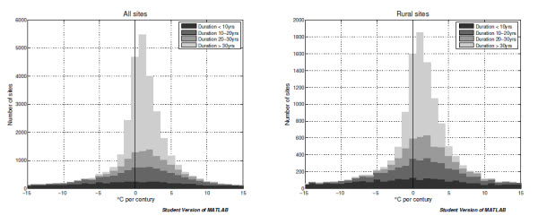
Figure 1: Temperature trends for all 39,028 temperature stations (left) and for the 16,132 “very-rural” sites (right). About one third of the stations showed cooling and the rest warming over their periods of record length.

The histograms all show similar average warming trends and the stations with the longest measurement durations show the least dispersion of temperature trends. The median trends for all the sites range from 0.98°C per century for sites with more than two months of observations and to 0.97°C per century for stations with record lengths greater than 30 years. The rural stations medians are 1.08 and 1.09°C per century respectively.  The rural stations therefore show more median warming, about one tenth of a degree Celsius per century, than the complete data set. This result is counter-intuitive and is at odds with previous studies that showed a small but positive urban effect in the range of 0.01 to 0.1°C per century. The BEST team offers no convincing explanation of why this should be so.

One third of the records lie to the left of the zero warming line. Figure 2 illustrates how the warming and cooling sites are distributed over part of North America.

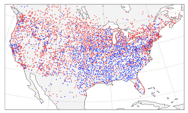
Figure 2: Locations of temperature stations with more than 70 years of data. Red dots show a warming trend and blue dots cooling. The map illustrates the importance of having multiple records to detect climate trends.

BEST’s first approach does not account for unevenness in station distribution, nor is consideration given to the different time periods over which the data were acquired. In their second approach, the BEST team performed a global land temperature reconstruction with their own methodology, using all the data and the very-rural sites only. The details of the methodology used are described in a draft paper by Robert Rohde and others

The results (Figure 3) show very little difference in the post-1950 period between the very rural stations and the rest. In fact, in the most recent few decades, the  rural sites have become slightly warmer than the full data set, and show a trend of -0.19 +/- 0.19°C per century over the 1950-2010 time period, roughly consistent with the trends reported in the first method. The observed warming since 1950 is 1.9 +/- 0.1°C per century, ten times larger than, and of opposite sign to, the urban-rural effects.

Figure 3: The Berkeley Earth global temperature averages, normalized to zero mean for the period 1950 to 1980.

Significance

The main result of this study, that the influence of urban areas on the global land temperature data set is very small, corroborates the consensus view among climate scientists, including, for example, the recent paper by Souleymane Fall and others. To the extent that the BEST work resolves "current criticism of the former temperature analyses" it succeeds, even if the results come as no surprise. Nevertheless, initial reactions from certain quarters indicate, also unsurprisingly, that they are unhappy with the outcome of this and other recently released BEST studies. For example, Roger Pielke Sr comments that: "The nearly identical trends is no surprise as they draw from mostly the same raw data!" The BEST studies however, as mentioned earlier, have used all available temperature data, 39,300 stations, some five times the 7,280 stations used in the GHCN-M data set. The results of the BEST study are indeed unsurprising because the previous data sets sampled all the data adequately.

Other objections have been raised that the BEST studies were released prior to peer-review. That is indeed true and it will be interesting to see if the methodology and conclusions in these draft papers are significantly modified during the review process.

It's worth emphasizing that the study looked at the effects of urbanization on the global land temperature trend. Once ocean temperatures are considered the small urban influence on temperatures will be further diluted.

The take-away points from this study are:

  • once again, the accuracy of the land surface temperature record is confirmed;
  • the BEST study used more data than previous studies but came to essentially the same result;
  • the influence of the urban stations on the global record is very small and, if present at all, is biased on the cool side.

0 0

Printable Version  |  Link to this page

Comments

Comments 1 to 46:

  1. When a skeptic like Muller does a 180 and starts publishing data like this and the confirmation of long term trends you know that the argument about climate change is over. Saw some fantastic new technologies are available for energy production. And the windfarm near our town has been running non-stop for a few months now.
    0 0
  2. What happened around 1865-1870 in figure 3 and where did the huge peak around 1880 come from?
    0 0
  3. Watts is not happy and is now trying to weasel out of his previous support for the study. This is final proof that (alongside his site's constant references to cold records and general lack of credible scepticism) he is indeed one of those whose doubt about global warming this project's results should silence - if he were truly sceptical. Reading him and his followers over on WUWT is to see the sort of hurt incomprehension evident from similar supporters of creationism. If Watts can't now accept reality, he deserves to be side-lined as an irrelevant anti-science pervayer. Pielke Sr isn't happy either, surpisingly enough...not. And Judith Curry is still trying to work out how to spin the results so she can still argue one way while trying to appear neutral, i.e. friendly to the so-called skeptics. "My hope is that this will win over those people who are properly sceptical," Richard Muller, a physicist and head of the project, said. "Some people lump the properly sceptical in with the deniers and that makes it easy to dismiss them, because the deniers pay no attention to science. But there have been people out there who have raised legitimate issues." Are any of those I have named "properly sceptical" ?
    0 0
  4. "...purveyor..."
    0 0
  5. Dr.Muller set Anthony Watts and the Koch empire up like a 'Science'. They where expecting a data conclusion far different then this. Perhaps now some of the skeptics can be marginalized even further.
    0 0
  6. I'm always ready to counter the "Its the Urban Heat Island effect" with the following. The Urban area of the Earth's surface is 1%. Average global temperature has increased by 0.8 degrees celsius. Do the math, urban areas need to have increased by 80 degrees celsius in order that 1% area to be responsible for the global temperature increase. Now, I'm sure that's an over-simplification please let me know if/how I've got things wrong.
    0 0
  7. Watts did say on his site when the BEST project was announced "It (BEST) may very well turn out to agree with the NOAA surface temperature record, or it may diverge positive or negative. We just don’t know yet." This was after giving a pretty strong approval of the project and its methodology. So if Watts doesn't accept the findings, he will have a hard time presenting a rational reason for doing so. Of course, the key word here is "rational". Watts' Urban Heat Island complaints, even the BEST project, is plain irrational. Do we not have 30 years of satellite records that already give independent confirmation of the surface temperature records?
    0 0
  8. @Lassesson writes: "What happened around 1865-1870 in figure 3 and where did the huge peak around 1880 come from?" The 'huge peak around 1880' was probably a legacy of Krakatoa or the sun's activity or some some other natural event at the time. Human-caused warming sits on top of any natural variation in temperature. @TScanlon. I don't believe this news is going to put the nail in the coffin of denial; it will just move denial on to the next -- and more difficult to prove to non-scientists -- argument. Namely, that "OK, the warming is real; but it's caused by natural processes". The argument is certainly far from over.
    0 0
  9. Muller is, no doubt, speaking of himself (and possibly others) when he describes those who were "properly sceptical". The problem is that there was nothing 'proper' about it. As MA Rodger notes, the idea that surface temperature anomalies were significantly off had been overwhelmingly disproven long before the BEST study even began. Multiple different organizations using different data and methodologies had found consistent results. Surface and satellite records were in close agreement. Numerous studies had conclusively shown that UHI effects were negligible. Yet Muller mouthed off that Anthony Watts was a 'hero' for showing the 'serious doubts' about these values. He went around spreading one obviously false claim after another (e.g. 'not a single polar bear has died due to global warming'). He was not 'properly sceptical'. He accepted pure nonsense at face value and promoted it as 'established truth' despite overwhelming evidence to the contrary. Muller deserves credit for not allowing his bias to infect his work and accepting reality once he had himself done the research to confirm it. This places him a step above many other 'skeptics' (e.g. Roy Spencer). However, the fact remains that Muller assumed things which were untrue and promoted them as 'fact'. The UHI and 'inaccurate surface temperature record' myths were not the only false claims Muller promoted. Maybe this experience will cause him to re-examine those biased assumptions and/or avoid making unsubstantiated claims in the future, but for him to now say that he was 'properly sceptical', rather than owning up to his false statements even after his own research has (again) disproven them suggests that the denial continues. Muller has shown that he still does actual science, and thus I'll look at his work in the future. However, his failure to accept responsibility for the misinformation he promoted will prevent me from considering anything he says on the subject of climate change until he has published research to support it.
    0 0
  10. [I just posted the following elsewhere and thought it worth posting here as it might trigger ideas.] Given that the BEST study uses the data gathered by other studies -- the results of which generally agree with one another -- to produce the 'graph of graphs', I'm at a loss to understand how the result could have turned out to be be anything other than a general confirmation of the previous studies. It could only have been different if all the original scientists had carried out their work fraudulently, or the BEST team had been fraudulent. Of course, neither had. I for one have enough trust in scientists to believe that whenever you put a large group of them together, they can't do anything other than arrive at an honest answer. Only the occasional individual scientist has ever been exposed as a charlatan. So, as sure as eggs is eggs, the denial argument will now turn to, "OK it's getting warmer -- but it's not caused by humans". As a response perhaps the sceptics should be asked to recommend/approve a large team of qualified climate scientists to answer that question. Then we can put that one to bed and move on to the next. A.s.a.p, please. Tempus fugit and climate change just ain't going away.
    0 0
  11. Surely now this issue can be put to bed. It would be nice to see Watts admit this and move on. I won't be holding my breath. Kudos to Muller and hopefully he has learned to keep his mouth shut until he has published papers to back up his claims. Extraordinary claims require extraordinary evidence one of the basic principals.
    0 0
  12. re: 10 and Muller's past Luke 15:3-7
    0 0
  13. For commentary on the various reactions to the BEST results, see the follow-up post to this one, The BEST Kind of Skepticism
    0 0
  14. Jim Hansen, head of NASA's Goddard Institute for Space Studies, said he had not read the research papers but was glad Muller was looking at the issue, describing him as "a top-notch physicist". "It should help inform those who have honest scepticism about global warming. "Of course, presuming that he basically confirms what we have been reporting, the deniers will then decide that he is a crook or has some ulterior motive. "As I have discussed in the past, the deniers, or contrarians, if you will, do not act as scientists, but rather as lawyers." “As soon as they see evidence against their client (the fossil fuel industry and those people making money off business-as-usual), they trash that evidence and bring forth whatever tidbits they can find to confuse the judge and jury." Source: “Global warming study finds no grounds for climate sceptics' concerns,” The Guardian (UK), Oct 20, 2011 To access the article, click here.
    0 0
  15. What's interesting to me is the finding of a slight cool bias in the not-very-rural station data. A similar kind of cool bias was found in the not-well-situated station data in Menne et al. 2010. As if everything else weren't enough, this should definitively rule out the idea that either microsite influences or UHI could have generated a significant part of the warming trend in the data, giving a false signal of warming. But as we're already seeing, it won't do that for the people committed to the fantasy that the temperature record is fraudulent or agenda-driven.
    0 0
  16. Is it really counter-intuitive that urban areas would show slightly less of a warming trend when compared to rural areas? Lots of urban areas have been urban for many hundreds of years, pre-dating the temperature records. As such they may have as their temperature record starting point a somewhat elevated temperature relative to rural areas. This would then tend to diminish the upward trend of temps slightly, because they start from a slightly elevated baseline.
    0 0
  17. Lassesson@2 What happened around 1865-1870 in figure 3 and where did the huge peak around 1880 come from? There were far fewer temperature stations in the mid 19th century and they were mostly concentrated in Europe and the eastern seaboard of N America. The higher global temperature variability observed at that time probably mostly arises from poor sampling.
    0 0
  18. Geo77@16 Yes, the negative sign of the UHI effect on global land temperatures, as noted by BEST, is counter-intuitive. Urban areas are unquestionably hotter than nearby rural areas and the growth of cities should, other things being equal, increase the contribution of the UHI effect on global temperatures over time. What's not surprising is that the UHI effect is very small, once the areal weighting of the urban weather stations is done properly. Urban areas, according to the MODIS analysis quoted in the BEST paper, only cover 0.5% of the the Earth's land area. And land only covers about 30% of the Earth's surface, so once ocean surface temperatures are included (which they are not, yet, in the BEST work), then we can expect even smaller UHI effects on global (land and sea) temperature trends.
    0 0
  19. Improved energy use? Removal of power generators from the cities?
    0 0
  20. @John Russell I'd say you're right on that. And when we have all forgotten all the previous debunkings they will return once again to the old chestnuts. I heard two the other day "peer reviewed by who?" and "but the Earth is only 6000 years old, there can't be a carbon cycle." Fortunately the later doesn't come up too often.
    0 0
  21. You all have GOT to be kidding. You expect climate change denial to dry up and blow away because of this one study? Rick Perry's still talking about the damn Birth Certificate!
    0 0
  22. +1 for CBDunkerson's observation at #9.
    0 0
  23. Why does the Figure 3 Reconstructed temperature shown in the intro here only start at 1850? The BEST data as released starts at 1800. http://www.berkeleyearth.org/analysis.php
    0 0
  24. lancelot, you'd have to ask the BEST team (the image is copied from image 5 of their 'Influence of Urban Heating on the Global Temperature Land Average' report) for a definitive answer, but I'd guess that 1850 was chosen because it is the earliest any of the previous temperature anomaly studies went back to. At that, the number of 'temperature stations' prior to 1850 is also vanishingly small... dividing (for example) three readings into 'rural vs non-rural' would be statistically meaningless.
    0 0
  25. lancelot @23, BEST shows a video showing global coverage of their data network for any given year. From that video we can see that in 1800, they rely on just 41 stations. By 1850, that rises to 196, covering all of Europe and Asia, most of North America, and parts of South America, Africa and Australia. Given the broad coverage, it is a safe assumption that in 1850, nearly all stations are at major centers of population. Some were not, of course, in that BEST shows "very rural" temperature from that period. It is dubious that the "very rural" network is spatially extensive enough to not suffer significantly from regional bias until about 1900, when the BEST coverage is global (excluding Antarctica) and incorporates 3413 stations.
    0 0
  26. Re 23, 24, 25: CBDunkerson: Yes, the 1850+ image used in the SkS intro is taken from the Influence in Urban Heating study, and is appropriate in that context. The full chart 1800 - 2010 is viewable in the Berkley Earth Data Set section at http://berkeleyearth.org/analysis.php. Perhaps getting off topic, but the 1800+ chart correctly shows a gradual and fairly uniform (if smoothed) global rise from at least 1800* to 1939, a total of 0.9 deg C over 140 years. That would not be evident from the 1850+ chart. *Central England instrumental measurements (HadCET http://www.metoffice.gov.uk/hadobs/hadcet/) also show a long term warming trend in CE from around 1780.
    0 0
  27. lancelot @26, your description of the graph is false: Where you say the graph rises smoothly, it clearly falls for the first 15 years, probably due to the Dalton Minimum. It rises sharply, then falls sharply before leveling of around 1850. From 1850 to 1910 it oscillates around a mean before rising sharply to 1940. Not much weight can be given to the early years (pre-1880) of the BEST temperature index. During that period, due to a low number of stations, and poor geographic coverage the calculated error margin is as high as +/- 0.6 degrees, or approximately 30% of the calculated fluctuations. Tamino believes this error is significantly underestimated because BEST ignored auto-correlation. The poor certainty, and in particular the limited geographical coverage is probably responsible for most of the large scale fluctuations relative to latter in the graph. Despite these flaws, however, it is still necessary to describe the graph as it is, not as we might desire it to be.
    0 0
  28. 26, lancelot, I think part of your misunderstanding resulted from treating the noise we see in shorter periods (the ups and downs in, say, the 1980-2000 period) the same as valid ups and downs in longer periods. The physical reasons for the ups and downs in the shorter periods are (a) not entirely predictable and (b) not entirely worth predicting, because they refer to very short term events with no lasting effect on climate beyond the affected year or years (ENSO events, volcanic eruptions, minor changes in solar activity, etc.). Put another way, there are so many factors that overwhelm the signal that in shorter periods you have to average things out and look at longer time periods to detect a trend. But when looking at a graph such as this one, there really are tangible reasons for the various, intermediate ups and downs (the Dalton Minimum, a long term increase in solar activity, a large series of major volcanic eruptions, anthropogenic aerosols, anthropogenic CO2). The point is, the rules you apply to interpreting the data (which is being done by most people -- not scientists -- simply by eyeballing graphs) must change depending on the time scale. The fact that two graphs look the same does not mean that you apply the same rules to their interpretation. The bottom line is that you need 17 to 30 years to determine a climate trend. That rule applies whether the hashmarks on the graph represent 1 year or 20 years. You don't need a number of hashmarks or a percent of a graph to identify a trend in climate... you need whatever span represents 17 to 30 years. As such, you can't look at a graph of temperatures from 1990 to the present and properly divide it into distinct, separate trends, but you do need to look at a graph such as this one and do so.
    0 0
  29. 27, 28: Nice to see the full graph at last! Well... I did say 'if smoothed'. Over 60 year periods, if smoothed on that basis the line is gradual (repeat gradual) and fairly (repeat fairly) uniform. I have done that on paper, that is how it looks. The total is a long term rise of about 0.9 deg C over 140 years. Tom Curtis - I totally agree however with your more detailed analysis. A rise 1800-50. A flat period 1850-1910. Then a sharp rise 1910-40. That actually illustrates my point. If you start the chart at 1850, you see a flat period until the start of the 20th century, then a prominent rise. So it looks as if warming started in 1910. It didn't. It started at least before 1800. Sphaerica: It is clear (even to a non-climatologist) that volcanic eruptions and solar irradiance variation will cause the visible intermediate ups and downs within the longer time scales. In that context you also referred to the Dalton minimum and 'solar activity', i.e. sunspots. Does that mean that you consider sunspots to be associated with forcing or with climate changes in general?
    0 0
  30. lancelot#29: "total is a long term rise of about 0.9 deg C over 140 years." Or you could say a rise of 1 deg C in the 40 years since 1970. Surely you don't believe that a single straight line will fit the entire dataset from 1800 on? Now that's a significant change in trend!
    0 0
  31. 29, lancelot, 1) Smoothing over 60 years is inappropriate for this purpose, because the time span is too long. It's like putting on foggy sunglasses to fix a watch. You use smoothing to eliminate noise. In this case you would be using smoothing to eliminate the signal, too. 2) Solar activity does not equal sunspots. This needs clarification in three ways. First, no one denies that the sun is involved in climate (it is the continuous source of virtually all energy on earth, for crying out loud!). But the fact is that the variations in total solar irradiance (TSI) are very, very small, but obviously over long time spans it can be a factor. Other factors (such as GCRs) are being researched, but there are currently more reasons to doubt their involvement in current warming than to give it any weight. Second, sunspots are a proxy for total solar irradiance and other relevant factors (such as magnetic field strength). There is some correlation between sunspots and these values, and there are sunspot counts going back 400 years, so they serve as a proxy for those important values, while direct measurements only exist since the modern instrument era and space age. But sunspots themselves are nothing more than visible blemishes on the sun which signal changes in solar activity. Sunspots themselves are nothing from that point of view. They are the greening leaves that tell you the warmth of spring has arrived, but they are not the warmth of spring themselves. Third, climate models have been successful at identifying the causes of short-term climate change (volcanic activity, solar variations, etc.) throughout the recent climate record. Basically, we can account for the forcings (including the sun) for the length of that graph, and within that the forcing which is causing the warming in the past 30 years is CO2. So to say that there has been constant warming since 1800 is misleading, because it implies that such warming is the result of one source, or some ongoing, mystical trend, when in fact there are periods of warming and cooling within that period, and more importantly the factors involved in each period of warming or cooling are known and quantified. There's no reason to think that they are all caused by something else, so CO2 is therefore off the hook.
    0 0
  32. Lancelot @29, you specifically ignore the first, and rapid decline from 1800 to 1815. To the extent that that represents a signal in global temperature rather than an artifact of the limited regional coverage, it is likely that that decline comes from an even higher peak prior to 1800. That is because the Dalton Minimum, the presumed cause of the decline, began in 1790, and followed a peak in solar activity (as determined by sunspots) greater than any in the 20th century other than 1950. Consequently, the presumption of your first post of "a gradual and fairly uniform (if smoothed) global rise from at least 1800* to 1939". The evidence from BEST is of a major temperature excursion early in the record followed by a gradual rise from 1850 to 1910, followed by a rapid rise to 1940, a steady declind to the 1970's, and then a still more rapid rise to the 2000's.
    0 0
  33. muoncounter 30: thanks for showing the pure BEST chart. Much clearer that way. I won't argue about the shapes of the lines. You can slice a salami any number of ways. I agree my 'gradual and uniform' was too thick a slice. Can we say longish rise of 0.9 deg 1800 - 1970, then steep rise of 0.9 deg 1970 - 2010, the latter very likely due to AGW? Sphaerica: I am perplexed! TSI varies only +/- 0.1%, agreed. But I have always considered the definition of solar activity (which includes many phenomena) to be distinct from simple irradiance (heat energy): IPCC uses the same distinction:= eg: Image and video hosting by TinyPic You write: "But sunspots themselves are nothing more than visible blemishes on the sun which signal changes in solar activity. Sunspots themselves are nothing from that point of view." Image and video hosting by TinyPic Image and video hosting by TinyPic Image and video hosting by TinyPic Perhaps getting into GCR territory..! But surely solar activity is much more general, complex and variable than simple irradiance.
    0 0
    Response:

    [DB] When posting graphics it is considered good form to also link to the paternity of the graphic.  Please provide such for your above graphics.  Else I will delete this comment as this is going too far off-topic.

  34. Just to clarify 33: The Reconstructed Temperature image is not from the IPCC, only the superimposed Solar Irradiance graph (bright yellow line).
    0 0
  35. 33, lancelot, Yes. That's why I said "and other relevant factors (such as magnetic field strength)." But it has to be something that affects earth's climate. If you can't come up with a mechanism, then the fact that it's happening is of no immediate relevance to climate science. The sun is a marvelously complex environment-system-thing, well worth studying, but of relevance here only where a real connection can be drawn. Note, too, that even minor changes in TSI which are relatively constant over the course of hundreds of years can result in climate change such as the 200 year descent into the "Little Ice Age." That descent amounted to a roughly 0.5 degree decrease in 200 years. The recovery appears to have been a roughly 0.5 degree increase in 100 years. Modern warming represents a minimum of a 0.6 degree increase in 30 years, and the climate has still not stabilized at its equilibrium level. Also note (I find this fascinating) that CO2 is implicated (not proven) as a possible factor (not sole cause) in the descent into the Little Ice Age. Basically, the Black Death killed 100 million people, so a lot of cleared fields turned back into forest. Not long after, small pox and other European diseases decimated 20 million or more Indians, and even more cleared land turned back into forest. This sucked CO2 from the atmosphere to grow the trees, and the drop in CO2 is measured in the ice cores. Just food for thought. Note that as DB (the moderator) pointed out, this has wandered far off topic. If you wish to continue on this, we can move the conversation to a more appropriate thread. But you have to pick a topic... rate of warming? natural causes? solar insolation? clouds? Just post your next comment some place appropriate. I'll see it.
    0 0
  36. Lancelot @33 and 34, the source of your first graph is trying to sell you falsehoods. Below is the IPCC graph from which the "irradiance" graph is derived (click on image for larger version): The caption reads:
    "Figure 9.4. Contribution of external forcing to several high-variance reconstructions of NH temperature anomalies, (Esper et al., 2002; Briffa et al., 2001; Hegerl et al., 2007, termed CH-blend and CH-blend long; and Moberg et al., 2005). The top panel compares reconstructions to an EBM simulation (equilibrium climate sensitivity of 2.5°C) of NH 30°N to 90°N average temperature, forced with volcanic, solar and anthropogenic forcing. All timeseries are centered on the 1500-1925 average. Instrumental temperature data are shown by a green line (centered to agree with CH-blend average over the period 1880-1960). The displayed data are low-pass filtered (20-year cutoff) for clarity. The bottom panel shows the estimated contribution of the response to volcanic (blue lines with blue uncertainty shade), solar (green) and greenhouse gas (GHG) and aerosol forcing (red line with yellow shades, aerosol only in 20th century) to each reconstruction (all timeseries are centered over the analysis period). The estimates are based on multiple regression of the reconstructions on fingerprints for individual forcings. The contributions to different reconstructions are indicated by different line styles (Briffa et al.: solid, fat; Esper et al.: dotted; Moberg: dashed; CH-blend: solid, thin; with shaded 90% confidence limits around best estimates for each detectable signal). All reconstructions show a highly significant volcanic signal, and all but Moberg et al. (which ends in 1925) show a detectable greenhouse gas signal at the 5% significance level. The latter shows a detectable greenhouse gas signal with less significance. Only Moberg et al. contains a detectable solar signal (only shown for these data and CH-blend, where it is not detectable). All data are decadally averaged. The reconstructions represent slightly different regions and seasons: Esper et al. (2002) is calibrated to 30°N to 90°N land temperature, CH-blend and CH-blend long (Hegerl et al., 2007) to 30°N to 90°N mean temperature and Moberg et al. (2005) to 0° to 90°N temperature. From Hegerl et al. (2007)."
    Assuming the creator of the graph has scaled one of the two reconstructed solar forcings (the green line and the dashed green line), then the uptick at the end of the graph as presented by you is incorrectly scaled. Indeed, for the dashed green line (the best fit on general shape), in the IPCC reconstruction the final values are lower than the initial value. Alternatively, the graph is based on the reconstructed temperature using all forcings (silver line, upper graph) which does indeed have the appropriate uptick, but is not a reconstructed solar irradiance. I will note that it is inappropriate to rescale one forcing as in the graph you presented without rescaling all forcings by an equal amount. Failing to show the other forcings cherry picks the data.
    0 0
  37. 33, lancelot, Please answer my question here, but continue any discussion of the sun itself on another thread. I'm curious. What is the source of your solar activity and irradiance graph in comment 33? I mean, any number of sources will show you a very, very different record of solar irradiance and solar activity. The author of that graph is clearly guilty of extreme misrepresentation of the data. FYI, here is the actual solar activity reconstruction that was almost certainly the source of the data (based not only on 14C, as stated, but also two sources of 10Be and Group Sunspot Number), from Solanki et al Nature 2004. Note the down-tick in solar activity at the very end, too, from actual sunspot counts. Pay attention to the years... 14C dating ended 1895. 10Be ended around 1950. The graph ends 11 years ago at 2000. The rise in solar activity is from roughly 1900 to 1950, and does not correspond to the recent, accelerated warming. Here is that graph overlaid and scaled to fit with the graph you supplied. Clearly, the creator of the graph took great liberties in choosing the 14C proxy when it suited him, or the 10Be proxies or GSN proxy when they looked better, and even then he shifted things left, right, up and down to better match the temperature record. And then he left off the down-ticks at the end. Doesn't this annoy you just a little? Solanki et al 2004 is available here. An intelligent discussion at Real Climate can be found here.
    0 0
  38. Sphaerica: It is my chart, originally done for my personal interest when I first became interested in the subject some time back. The base graph is from Wikipedia here The Solar Activity graph is traced off this Wikipedia graph here . It was reversed, to run the timescale L-R, compressed horizontally but uniformly in Powerpoint then overlaid, with as good a timing match to the start and end timeline points as possible by eye. The vertical scale is distorted simply to show the correlation of shape, and hence an implied causal correlation. No more than that. The Solar irradiance line is traced off the IPPC AR4, Ch 9, fig 9.4 Matching to the timeline as above. Again the vertical scale is stretched simply to check for correlation of shape. Apologies for any inaccuracies, reasonable effort was made to make an accurate trace and time fit within the limitations of Powerpoint. The purpose was simply to check for any broad historic correlation between global temperature, solar activity, and solar irradiance. The broad correlation does seem apparent. Nothing more than that is intended by the chart. No values are associated with the vertical scales of the traces. If it is considered misleading, please feel free to have it deleted. As for the other 3 images, they are all from NASA.
    0 0
  39. Correction, the the two sunspot images are my screen snapshots, taken from the J Kirkby talk on CERN CLOUD, about midway. http://www.youtube.com/watch?v=63AbaX1dE7I
    0 0
  40. 38, lancelot, Let that be a lesson to you! Do things with the numbers, and let applications generate entirely correct graphs. You'll find that the data for most things is readily available on the Internet (scientists share a wealth of data openly, if you know how to find it), and Excel is fine for pasting in the data and generating a graph [although I must shamefacedly admit that this is exactly what I did to do the overlay on your graph -- I quickly took the Solanki graph from the paper to lay it over yours]. It's way to easy to eyeball things incorrectly even when reading a graph, let alone creating one, let alone creating one by merging other graphs with uncertain sources. I'm not sure what to say about the Wikipedia graph. The source appears to be the data from IntCal04 Terrestrial Radiocarbon Age Calibration (Reimer et al, 2004) with the supplemental data available here. I'm unsure why this data does not match Solanki et al 2004, except for the obvious, which is that Solanki used the INTCAL98 dataset, while Reimer created the INTCAL04 dataset, although the two do not look that drastically different (except the 04 dataset obviously must go beyond 1895). But without digging into it, I'm unsure of why the INTCAL04 data (or, at least, the Wikipedia graph supposedly based on the data) puts the medieval maximum so close to the modern maximum when the Solanki graph clearly does not, or where the data past 1895 came from, or why it lacks the drops evident in the 10Be data. I do note that the Wikipedia graph rather incorrectly labels 1950 as the "Modern Maximum" (*laughs*). My gut tells me that the person who created the Wikipedia graph did not understand how the calibration data was represented (it represents a % deviation from the standard 1950 level) and so scaled it improperly, leading to the seeming match between the MWP and 1950 levels.
    0 0
  41. Sphaerica. Thanks. Not having the time to process data sets into Excel, I find visual tools useful to get a broad view, and as an architect, I tend to look for visual patterns first. Just to say, I made no adjustments to the actual form of the graphs. What is interesting is how compressing them horizontally accentuates rises and falls. I was surprised to see the steep lines up to 2000 in both solar activity and irradiance, roughly corresponding to the steep rise in global temperature. But I suspect that is no more than a visual impression. Tom Curtis I will more carefully check the solar trace of the IPCC graph, your point is noted.
    0 0
  42. Tom Curtis 36. I have checked the solar irradiance trace from the IPCC graph. it looks correct. There are two green lines, one solid, one dashed. I have used the solid line. It has an upturn to 2000 which is much higher than the 1300 level. I am not sure what the dashed line means. The only inaccuracy I can see is the placing of the end of the line, 1950 on the IPCC graph, which could be squeezed in a fraction on my chart. PowerPoint is not the best tool to use for all this. In due course I plan to redraw it using a proper CAD programme. Meanwhile, if you can point me to any better solar irradiance records than the IPCC chart, I would be grateful. I will also use the Solanki data for solar activity. No agenda here, just would be good to correct any misleading graphics.
    0 0
    Response:

    [DB] "No agenda here, just would be good to correct any misleading graphics."

    When you say "misleading graphics" do you refer to that of the IPCC...or yours?  FYI, "misleading" is a favorite toy of the fake-skeptic contingent, being used liberally like milk with cereal.  As such, it is a term that can contravene the Comments Policy here, depending upon the context used.

  43. 42 - lancelot "In due course I plan to redraw it using a proper CAD programme" Just a small point on methods. Drawing a graph with a CAD program is not really the thing to do - as is manipulating plots to compare them in this way... not to mention "looks correct" - the eyeball-o-meter. If you want to understand the data and compare different data sets, you need to get hold of the numbers and put them in something like Excel (if you must!) or better: R, matlab, octave, SciPy (others will have their preferred tools). Only in that way can you be sure plots are correctly scaled and aligned; and you'll have the tools to do stats etc.
    0 0
  44. DB response, MY misleading graphic! Goodness one has to be careful (smile).& Les you are quite correct on method, if graphs are supposed to be proving anything or quantifying anything. My chart was simply to check for any broad correlation. I think it serves that singular purpose. From that point on, I would certainly defer to (and insist on) the power of numbers if taking the investigation further.
    0 0
  45. Lassesson at 18:25 PM on 21 October, 2011
    What happened around 1865-1870 in figure 3 and where did the huge peak around 1880 come from?

    I don't see the answer posted.   The answer to your inquiry is almost certainly the very large, perhaps largest in recent history, El Nino Event, 1876-78.

    https://www.insidescience.org/news/historys-greatest-el-ni%C3%B1o-may-have-caused-severe-19th-century-famine 

    1 0
  46. YTeddy @45,

    You are correct in that there are no satisfactory answers posted for Lassesson @2.

    I'm not sure what is being asking regarding 1865-70 but the "huge peak arond 1880" was the 1877-78 El Niño which appears in the extended MEI record, its impact on the global temperature records (both BEST & HadCRUT cover back to 1850) being excentuated by the preceding and succeeding La Niñas.

    Extended MEI graph

    The article you link-to is describing the work presented at the 2017 AGU Fall Meeting ' El-Niño Grande and the Great Famine (1876-78) '. Looking at the citations the paper gained here, I don't see any response to the paper from climatologists although it does receive attention for its analytical method.

    0 0

You need to be logged in to post a comment. Login via the left margin or if you're new, register here.


The Consensus Project Website

THE ESCALATOR

(free to republish)


© Copyright 2024 John Cook
Home | Translations | About Us | Privacy | Contact Us