Climate Science Glossary

Term Lookup

Enter a term in the search box to find its definition.

Settings

Use the controls in the far right panel to increase or decrease the number of terms automatically displayed (or to completely turn that feature off).

Term Lookup

Settings


All IPCC definitions taken from Climate Change 2007: The Physical Science Basis. Working Group I Contribution to the Fourth Assessment Report of the Intergovernmental Panel on Climate Change, Annex I, Glossary, pp. 941-954. Cambridge University Press.

Home Arguments Software Resources Comments The Consensus Project Translations About Support

Twitter Facebook YouTube Mastodon MeWe

RSS Posts RSS Comments Email Subscribe


Climate's changed before
It's the sun
It's not bad
There is no consensus
It's cooling
Models are unreliable
Temp record is unreliable
Animals and plants can adapt
It hasn't warmed since 1998
Antarctica is gaining ice
View All Arguments...


Username
Password
New? Register here
Forgot your password?

Latest Posts

Archives

New Research Finds that Most Monthly Heat Records Today are Due to Global Warming

Posted on 30 January 2013 by dana1981

A new paper published in Climatic Change by Coumou, Robinson, and Rahmstorf (CRR13) examines the increased frequency of record-breaking monthly temperature records over the past 130 years, finding that these records are now five times more likely to occur due to global warming, with much more to come.

"...worldwide, the number of local record-breaking monthly temperature extremes is now on average five times larger than expected in a climate with no long-term warming. This implies that on average there is an 80% chance that a new monthly heat record is due to climatic change ... Under a medium global warming scenario, by the 2040s we predict the number of monthly heat records globally to be more than 12 times as high as in a climate with no long-term warming."

Fig 5 

Figure 1: Observed record ratio (the increase in the number of heat records compared to those expected in a world without global warming) for monthly heat records as it changes over time (thin red line is annual data, thick red line smoothed with half-width 5 years). This is compared with predictions from a simple stochastic model based only on the global mean temperature evolution (blue line with uncertainty band directly comparable to the smoothed red curve)

Data and Methods

CRR13 considers the formula for the probability of a record-breaking extreme in a Gaussian (bell curve) time series with a linear long-term warming trend, compared to the much more simplified version of the same formula when there is no warming trend.  The paper then examines the ratio of those two equations - the increased frequency of record-breaking extreme heat events in a warming world.

The study uses global surface temperature data provided by the NASA Goddard Institute for Space Studies (GISS) for 1880–2010, in 2° by 2° grids across the globe, excluding polar regions above 70° latitude due to the sparse temperature station coverage there  They examine the temperature data for each calendar month of the year. 

Results

CRR13 finds that the number of observed heat records is much larger than one would have expected in a climate with no long term warming, and many monthly heat records have been broken over the past decade.

In Figure 2 below, the increase in observed monthly heat records in the past decade over the most recent 40-year period of data (left column) are compared to the modeled results (right column) for northern hemisphere summer (top row), winter (middle row), and the whole year (bottom row).

Fig 3

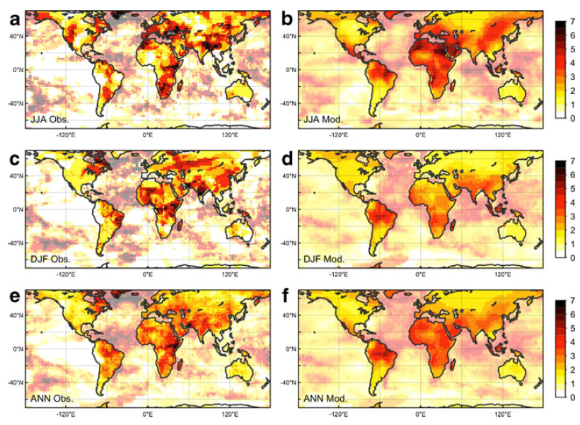
Figure 2: Global maps of the observed record ratio (the increase in the number of heat records compared to those expected in a world without global warming) as observed (left panels) and estimated by the model (right panels) using the 1971–2010 dataset. a and b show boreal summer results (June-July-August), c and d austral summer results (December-January-February) and e and f results for all months.

Figure 3 looks at the increase in heat records over the past decade as compared to the full 131-year dataset. The similarity between Figures 2 and 3 shows that over the past decade, the monthly records in the past decade as compared to the past 40 years are usually also records as compared to the past 131 years.

The bottom right panel (d) also shows the probability that a monthly heat record in a given location is due to global warming, with blue indicating 0% probability and red indicating 100%.

Fig 4

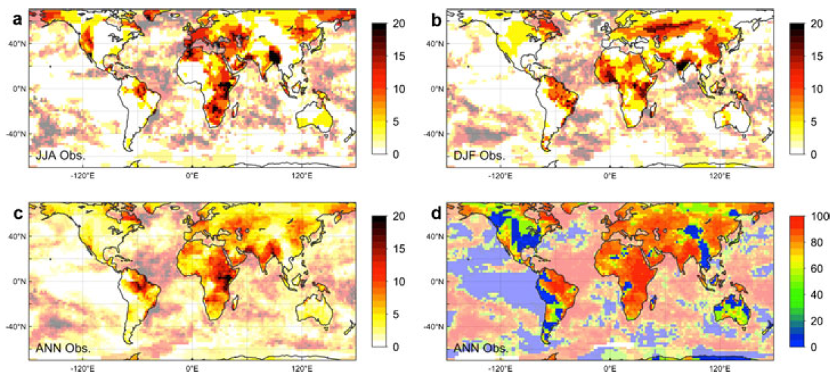
Figure 3: Global maps of the observed record ratio over the past decade (the increase in the number of heat records compared to those expected in a world without global warming) over the 1880–2010 dataset, for a boreal summers (June-July-August), b austral summers (December-January-February) and c all months. d Risk map showing the probability that a record-breaking event in the last decade is due to climatic change.

In Figure 1 above, CRR13 extends the model forward assuming global warming based on a moderate emissions scenario, Representative Concentrations Pathway (RCP) 4.5, in which human greenhouse gas emissions peak around the year 2040, ultimately causing a radiative forcing (global energy imbalance) of 4.5 Watts per square meter in 2100 (a doubling of atmospheric CO2 would cause a forcing of about 3.7 Watts per square meter).  This scenario would ultimately lead to about 3.6°C global surface warming above pre-industrial levels, which is a very dangerous and possibly catastrophic amount of global warming, but certainly not a worst case scenario.  It essentially represents a scenario where we take too-slow and gradual action to reduce human greenhouse gas emissions, and at the moment seems fairly realistic.

In this scenario, CRR13 finds that by 2040, monthly heat records will have become approximately 12 times more likely to occur than in a non-warming world,

"...approximately 80% of the recent monthly heat records would not have occurred without human influence on climate. Under a medium future global warming scenario this share will increase to more than 90% by 2040."

As lead author Coumou noted, this is even worse than it sounds, because breaking a heat record in 2040 will require much higher temperatures than breaking a record today.

"Now this doesn’t mean there will be 12 times more hot summers in Europe than today – it actually is worse.  To count as new records, they actually have to beat heat records set in the 2020s and 2030s, which will already be hotter than anything we have experienced to date.  And this is just the global average – in some continental regions, the increase in new records will be even greater."

The results of this research are consistent with those of Hansen et al. (2012), which found that global warming is shifting the temperature distribution to make extreme heat waves more likely to occur, similar to the findings of several other studies such as Donat and Alexander (2012) and Meehl et al. (2009).

Source: NASA/Goddard Space Flight Center GISS and Scientific Visualization Studio

Hot Times Ahead

To sum up the results of this study,

  • Record-breaking monthly temperature records are already occurring five times more often than they would in the absence of human-caused global warming. 
  • There is an 80% chance that any monthly heat record today is due to human-caused global warming.
  • Unless we take steps to significantly reduce human greenhouse gas emissions and global warming, by 2040 the frequency of monthly heat records will become 12 times the rate in a non-warming world, and we will be able to blame more than 90% of heat records on global warming.

This would of course be bad news.  For example, as shown by Hawkins et al. (2012), crops tend not to respond well to extreme heat, so these findings could pose a significant problem for global food production, as well as increasing heat fatalities, requiring costly adaptive measures to prepare people for more frequent extreme heat waves.  In January of 2013, Australia has been trying to cope with this sort of extreme heat, which has resulted in devastating wildfires and other nasty consequences. 

CRR13 presents a reality which we should try very hard to reverse, and a possible future we need to do our best to avoid.

0 0

Printable Version  |  Link to this page

Comments

Comments 1 to 9:

  1. Plotting Figure 1 as you've done leaves you open to the charge that the graph unfairly emphasizes heat records over cold ones. For example, a ratio of 1/2 is as much of an effect on the cold side as a ratio of 2 is on the warm side. But 1/2 barely shows up whereas 2 looks like a big effect. To get round this, the vertical axis should be a log plot.
    0 0
  2. If only I had a dollar for every time Skeptical Science was accused of bias for faithfully reproducing a graph from a paper under discussion (in this case our figure 1, which is to say, Comou et al's figure 5), I'ld be rich. In this particular instance, I cannot help but notice that the recommended solution (a log plot) is less easy for the general public to understand, and has the effect of deflating the very large ratios of heat to cold records seen at the end of the twentieth century and the start of the twenty first century. But I guess that would be the point, wouldn't it!
    0 0
  3. rab, may I suggest reading this? The Y-Axis of Evil
    0 0
  4. The NASA GISS video of the shifting distribution pattern of temperatures is fascinating. Not only is the whole thing obviously -- and perilously -- shifting to the right, towards positive temperature anomalies, but it seems that curve is also flattening. There's just less and less time spent in the middle. Even the "new normal" is becoming less normal. I'll try to find time to read the paper behind it, but can someone here answer: Is the "flattening" of the curve a consequence of changing temperature? In other words, if we do manage to stabilize climate at say, 2.5 degrees warmer, and it holds there for a while, will the peak of the curve perk back up? If so, that's a least one bright spot. The new normal may not be fun, but at least it could be consistently not fun.
    0 0
  5. On a related note, Donat has a new paper out with numerous co-authors from around the globe. They used an updated version of HadEX (a collation and analysis of the gridded land-based dataset of indices of temperature and precipitation extremes). Here is a key passage form their abstract: "Results showed widespread significant changes in temperature extremes consistent with warming, especially for those indices derived from daily minimum temperature over the whole 110 years of record but with stronger trends in more recent decades. Seasonal results showed significant warming in all seasons but more so in the colder months. Precipitation indices also showed widespread and significant trends, but the changes were much more spatially heterogeneous compared with temperature changes. However, results indicated more areas with significant increasing trends in extreme precipitation amounts, intensity and frequency than areas with decreasing trends." Yet more evidence indicating that we are in for tough times ahead.
    0 0
  6. @Tom "But I guess that would be the point, wouldn't it!" No it's absolutely not the point! You apparently don't know me, so please do not jump to conclusions. I'm one of Skeptical Science's biggest fans. Just trying to help. One fair way is to have a linear scale above 1 and the reciprocal, but also linear below 1. But that's mathematically ugly. Is it better if I give my complete name? Let's be civil, OK? --rick baartman
    0 0
  7. rab @6 I apologize for my imputation. Never-the-less, Skeptical Science should not second guess the presentation of data from scientific papers. If the scientists themselves, along with the editor (and presumably the reviewers) are happy with the presentation of data, we, as amateurs, should not be changing that presentation except in the face of a compelling reason to do so. And indeed, as changing the presentation requires obtaining the data either from the authors, or by digitizing, and then reprocessing it; time constraints provide a compelling reason to not do so. In this case there is no compelling reason. The ratio of warm records to cold records only falls to 0.5 or below in six out of 131 years of data; the last time being in 1922. It only falls to around 0.33 once, in 1907, and never falls to 0.25. The last time it was 1, or below was 1965, following the Mount Agung volcanic eruption. The last time it was below 2 was at the time of the Mount Pinatubo volcanic eruption. The five year mean has never fallen to 0.5, not fallen below 1 since 1922, and bit fallen below 2 since 1967. Given how little of the data falls below a ratio of 1, and how little below that ratio it falls, there is no gain in complicating the interpretation of the data by adopting any but a linear scale.
    0 0
  8. rab, if you are a regular reader of this blog, you'll likely know, and understand, that as concerned scientists and amateurs here, alike, we sometimes get *very* frustrated with the deliberate and IMHO, venal attempts by the misinformers to...well, misinform. I myself have gone off, half-cocked at someone who utilized some given denialists' meme, only to be pulled up by the person at whom I was lashing out. Please accept my apologies for any slight I may have imparted by suggeting the link I did. I think I speak for all the regular contributors here when I say we have no agenda, beyond that of trying to sound the alarm--yes, what is going is alarming--about what is an increasingly worrisome future we ALL share, utterly irrespective of political stripe, nationality,or ethnicity. We truly are all in the same sinking boat: Some are bailing, whilst others deliberately add water to the vessel: That's crazy-making, and sometimes, we all fall victim to the frustration. Thanks for your reasoned and rational response to that frustration.
    0 0
  9. photon wrangler @4, I take it you are referring to the video. In that case the flattening of the curve is partly due to variance in temperatures between regions. If you took the mean and distribution of summer temperature anomalies over the climate normal period, and compared them to temperatures in the past, the curve would shift to the left, and flatten on that basis. Partly the flattening is because different locations are warming at different rates. Most notably, land areas are warming faster than sea ares, and polar regions, particularly the Arctic, but also the West Antarctic Peninsular, are warming faster than tropical regions. These effects are both the result of comparison between regions. It is possible, and there is some evidence to suggest that the distribution is flattening for some regional temperatures as well. That, however, has not been established to my knowledge.
    0 0

You need to be logged in to post a comment. Login via the left margin or if you're new, register here.


The Consensus Project Website

THE ESCALATOR

(free to republish)


© Copyright 2024 John Cook
Home | Translations | About Us | Privacy | Contact Us