A couple of years ago I happened upon a German "climate contrarian" website called NoTricksZone run by Pierre Gosselin. While reading through one particular post I made an off-hand comment that I'd never found a skeptic who would put their money where their mouth is related to climate.
Well, Pierre took that as a challenge and we got together to create a gentleman's climate bet with proceeds going to a charity of the winner's choice. (Correction: As Tom points out in the commens the terms state, "...the charity organisation is yet to be chosen, but will (1) be one that both sides agree on, (2) help children in dire need (3) have low overhead and (4) be international.") That was back in early 2011. It became the Climate Bet for Charity, subtext: "Will the next 2011-2020 decade be warmer than the previous 2001 – 2010 decade?"
To date, climate realists have put up a total of $5200 and the climate skeptics have put up $2000. So, already, my original claim is holding true, that skeptics are generally not willing to put their money where their mouths are. (Yes, bets are meant to include a bit of taunting. I'm perfectly willing to keep with that time honored tradition.)
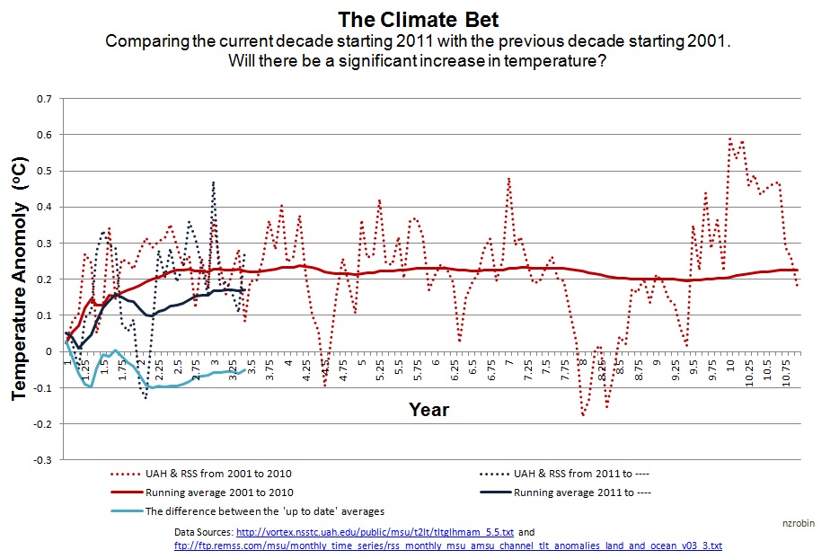
The other day I was surprised to find a third party had created a chart to track the progress of the bet, and even further surprised that they were gloating over the current decade running cooler than the last.
Fig 1 - Graph created by "KiwiThinker"
I had a hard time making out exactly what they were tracking here at first. Initially it looked like they were merely tracking the monthly average of the past decade relative to the current decade, which is not what the bet is. And I made several erroneous comments to that effect.
I pulled up the UAH and RSS lower tropospheric anomalies through WoodForTrees.org and did the calculations myself. Sure enough, the average of UAH and RSS for the 2001-2010 decade comes out at 0.226C. The current 2011-present decade is running at 0.173C. That's 0.053C below the last decade, based on, yes, three years of data. So, they actually do have this much correct.
When I dug deeper into the data I found this interesting tidbit. The monthly figure for Dec 2010 is 0.179C and the monthly figure for Jan 2011 is 0.052. So, right when we start their graph we have a large month-to-month temperature drop. That means all our initial running average data points are going to be heavily influenced.
As a test, I created by own graph. One data set I pulled the start point back 4 months to demonstrate the influence of the start point. This is not to suggest we change the start point, it's just to show that the start point is going to be misleading. In fact, since we're averaging so few data points in the early phase of the of the chart, it's going to be mostly just noise. It doesn't tell us anything meaningful at all.
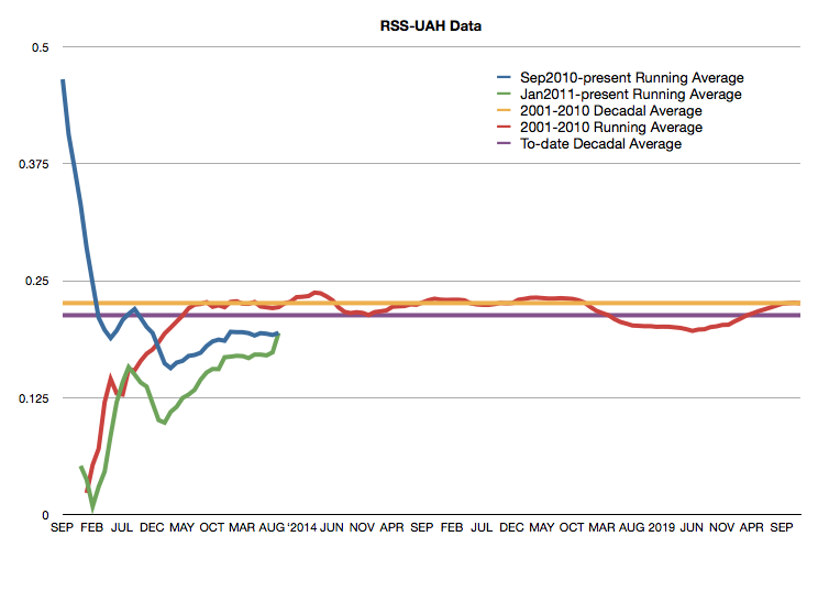
Fig 2 - Reworking the climate bet chart.
The blue line in this chart shows us what happens if we move the start point back just 4 months relative to the green line, which is the start of the actual bet. The red line is equally meaningless since it is also relying on only a small amount of data and is going to be highly influenced by the general month-to-month noise in surface temperature data. Each of these three are cumulative running averages. As such, since they rely on less data, everything to the far left of the chart is noise. As we move toward the right end of the chart we start to see the actual signal.
Probably the best way to watch the progress of this bet would be to compare the 2001-2010 decadal average to the "to-date" decadal running average (currently Oct 2004 2003 to Sept 2013). I've added this in as the purple line, where the difference is only 0.013C.
When we originally initiated this bet I was of the opinion that the satellite data was probably the most reliable data to use. Since then I've learned a few things about how the satellite data is compiled and the challenges that are involved.
For one, satellites are not thermometers. They're measuring a proxy of temperature by way of upwelling radiances collected by microwave sounding units (Uddstrom 1987). That data has to then go through significant processing to infer temperature. Even the two groups currently putting out satellite temperature data have data that disagrees, even though the data is coming from the same sources. And ironically, "skeptic" researcher, Roy Spencer's UAH data is current showing a higher rate of warming than RSS. Eventually that divergence has to be accounted for with an adjustment from one group of the other. Hopefully that will get resolved in a way that won't complicate the results of our bet.
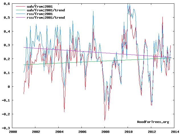
Fig 3 - Divergence between RSS and UAH data
SkS has an excellent primer on satellite temperature measurements here that I highly recommend. Again, the bet is set, so I wouldn't think to suggest changing the terms. I'm now of the personal opinion that GISS is likely the most accurate data set being that it has the greatest coverage for the Arctic, where we're seeing the greatest warming. A warming pattern that is, incidentally, consistent with AGW theory.
Since the "skeptics" seem so confident in their position I was thinking this would be great opportunity to double down on this bet, but that's when I realized, even if they doubled down they still wouldn't have put up as much as the realists already have in. All those $10 skeptics would have to pony up a whole $40 bucks to quadruple their bets to force the realists to double their bet.
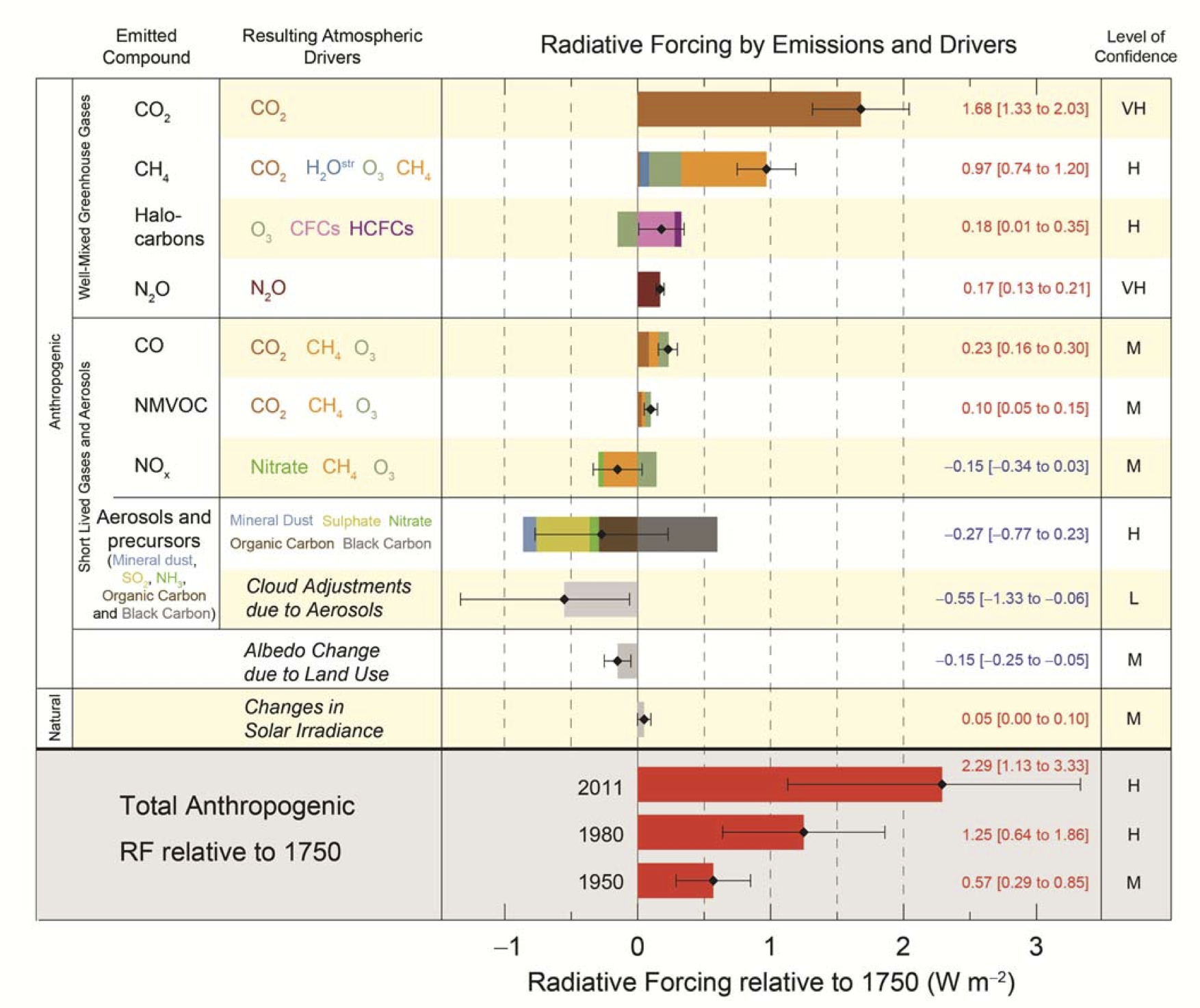
I'm, frankly, not at all concerned whether the climate realist side will win this bet. The bet is based on a full decadal average rather than where any given year falls. My own best guess is, barring a major low latitude volcanic event before 2020, there is a >95% chance that this decade will end up being warmer than the last. Physics is on our side. You just can't add 2.3Watts/m2 of man-made radiative forcing (source) to the climate system and believe the planet is not going to warm.
I've come to liken the "skeptic" position as suggesting we pop the turkey into the oven to keep it cool until Thanksgiving day.
- - - - - - - - - -
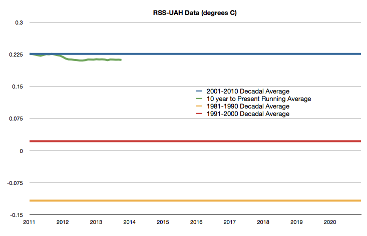
Just to clean things up a little, here is how I would suggest is the most accurate way to track the bet. The 2001-2010 decadal average is set in stone. That doesn't change, so I've just established it as the bar that determines the over or under outcome. The green line is the 10 year to present moving average temperature. If that green line is above the blue line come December 2020, then the climate realists win. If the green line is below the blue line, the "skeptics" win.
Note that the decade of 1991-2000 was 0.139C warmer than 1981-1990, and the decade of 2001-2010 was 0.204C warmer than 1991-2000.
The chart below is current as of September 2013.
Posted by Rob Honeycutt on Wednesday, 27 November, 2013
 |
The Skeptical Science website by Skeptical Science is licensed under a Creative Commons Attribution 3.0 Unported License. |