This is a re-post from My view on climate change
Our article on sea ice and polar bears proved to be a hot-button issue in the blogosphere. This was not entirely unexpected, of course. What is striking though, is that amidst all the criticism nobody has challenged our core finding: blogs on which man-made climate change and its impacts are downplayed are far removed from the scientific literature, at least regarding the topic of shrinking Arctic sea ice and the resulting future threat to polar bears.
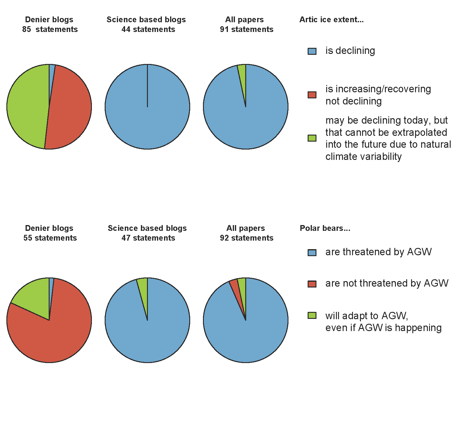
Even more so, alternative figures that have been prepared by some critics basically underscore this same message (see examples below). That’s not so strange of course, since the signal is so clear: there is hardly any overlap between contrarian blogs and the scientific literature on this topic. Take a look at the pie-charts below for the three statements on sea ice and those on polar bears, for the two different groups of blogs (termed denier and science-based blogs, respectively), and the peer-reviewed scientific articles that investigate both polar bears and Arctic sea ice. This is basically an extension of figure 1 in the paper, in which only the two blog categories were shown. Most scientific articles as well as science-based blogs assess Arctic sea ice extent to be shrinking and polar bears to be threatened as a result, and most denier blogs take a contrary view on both sea ice and polar bears. They are poles apart.
You may argue that it was overkill to use an elaborate statistical analysis such as PCA on this dataset. It was used mainly to visualize our results in one figure. All the criticism on the PCA and the details of how data were analyzed misses the forest for the trees: there is a clear distinction between blogs, where the group that accepts AGW appears to base their claims on peer-reviewed science, and the group that doesn’t accept AGW does not. The latter group appear to base their claims to a large extent on blogs written by one particular biologist, Susan Crockford, whose views run counter to the relevant ecological literature.
Our paper is first and foremost a characterization of the blogosphere, and how it compares to the scientific literature. We restricted our literature search to scientific articles that investigate both polar bears and sea ice, and that shed light on polar bear ecology and how it may or may not depend on the presence of sea ice. An article such as “Evolutionary roots of iodine and thyroid hormones in cell signaling” does not fit that bill, to name just one example of Crockford’s scientific articles that has been pointed out as evidence of her having published on polar bear ecology. She has not.
Even though it is not the main scope of our paper, we described the scientific context of polar bear ecology and explained how and why polar bears depend on their sea ice habitat (summarized in my previous blog post). As such, we argued that the scientific understanding of arctic sea ice decline and polar bear ecology is more credible than the viewpoints put forward on contrarian blogs. However, providing new ecological evidence was not the point of this paper. The point was to investigate how our current ecological understanding is conveyed and distorted in the blogosphere.
If some people think that our conclusion is wildly wrong, then they could at least show some evidence to prove their point, right? They probably realize that our conclusion is robust, so instead they try to nitpick on details and make it appear as if that undermines our conclusion. It does not.
Appendix: A collection of PCA graphs depicting our results, all basically underscoring the main conclusion that one group of blogs correctly conveys our current scientific understanding, while another group of blogs distort this understanding and promotes a very different viewpoint regarding sea ice and polar bears.


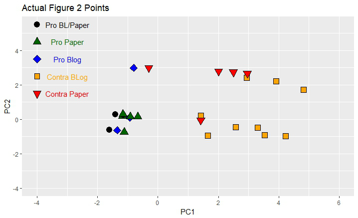
From top to bottom the following PCA figures are shown:
As mentioned in the supplemental information with our paper, jittering was applied to our PCA figure to gently offset data with the exact same entries from each other for graphical purposes. Tol uses an alternative method to provide information on sample size for specific data entries, namely via the size of the symbol used in the figure. Whatever your preference, the conclusion drawn from these figures is the same: there is a clear gap between the consensus in the scientific literature and science-based blogs on the one hand, and contrarian blogs on the other hand. We thank Roman Mureika and Richard Tol for underscoring the validity of our conclusion.
Posted by Bart Verheggen on Friday, 22 December, 2017
 |
The Skeptical Science website by Skeptical Science is licensed under a Creative Commons Attribution 3.0 Unported License. |