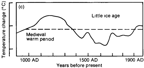
Figure 1 – IPCC First Assessment Report estimate of temperature changes in Europe from 900AD onwards.
The Hockey Stick is a climate celebrity and skeptics have their own graphs that ‘show’ it is wrong. One of the most common is from the 1990 IPCC report, showing the Medieval Warm Period or MWP.

Figure 1 – IPCC First Assessment Report estimate of temperature changes in Europe from 900AD onwards.
This is how it appeared in Durkin’s The Great Global Warming Swindle:
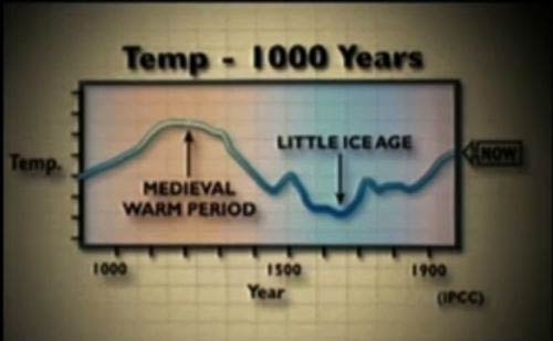
Figure 2 – Shot of the same IPCC graph slightly modified to be shown in The Great Global Warming Swindle
The conclusions of most recent studies are that the MWP was on average cooler than today, but The Great Global Warming Swindle, blogs and industry think tanks say otherwise, often based on graphs like this. It appears to be modified from Lamb 1965:
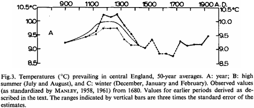
The data is for central England and from 1680 it uses the 50 year average of the HadCET thermometer record. Thankfully, the HadCET record has carried on since that graph finishes (around 1920), so we can find where ‘NOW’ really is. In Figure 4 we have HadCET with 10 year averages (dotted line) and 50 year averages (solid line). We continue the 50yr line and find that it’s now about 0.35C warmer than Lamb’s last point. However, global warming only really kicked off around 1980, so we’ve still got 20 years of no global warming in the 50yr average and it seems pretty fair to take a look at something that would catch suspected global warming – like the 10 year average. This has risen by just over 1 °C since Lamb’s last measurement.
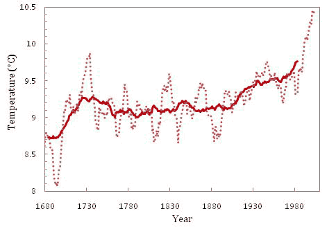
Figure 4 – HadCET data since 1680 reported as a 10 year running mean (dotted line) and as a 50 year running mean (solid line)
So when you see that graph with ‘NOW’ marked on the right hand side, they are telling you that the temperature now is the 50 year average centred on the 1920s. As someone living in the 2000s, you probably think that’s a bit silly. The temperatures of the 2000s would be the upper ‘NOW?’ on figure. The lower ‘NOW?’ is the latest 50yr average.

Figure 5 – Where are we now? The lower box and line is the latest 50 year average in HadCET to be consistent with the rest of the graph. This, however, misses much of the period thought to be associated with global warming. The the latest 10 year average captures this and is just off the chart.
The Great Global Warming Swindle and every other skeptical source that shows you this graph and claims it shows that the MWP was warmer than today is not giving you the full picture. They are showing you evidence that central England was warmer around 1200AD than it was around 1920. They are showing you that the last decade was warmer than any 50 year period on the graph including the MWP.
Many similar graphs are loved by skeptical sites, but this is a useful demonstration because it contains all 3 of the common ‘tricks to hide the incline’ of global warming. Firstly they change the temperature scale and/or hide the values. Next they pick a single region, and finally they either cut off or ignore instrumental evidence showing recent warming.
There appears to be plenty of evidence for some places being warmer than today in the MWP, and whilst most studies say that globally it wasn’t warmer it seems that scientists still want more data to be sure (and if it was warmer, that might suggest higher climate sensitivity). The important thing is being able to properly interpret the evidence that arrives – which involves spotting the misleading half-truths by the likes of Martin Durkin.
Posted by MarkR on Thursday, 29 April, 2010
 |
The Skeptical Science website by Skeptical Science is licensed under a Creative Commons Attribution 3.0 Unported License. |