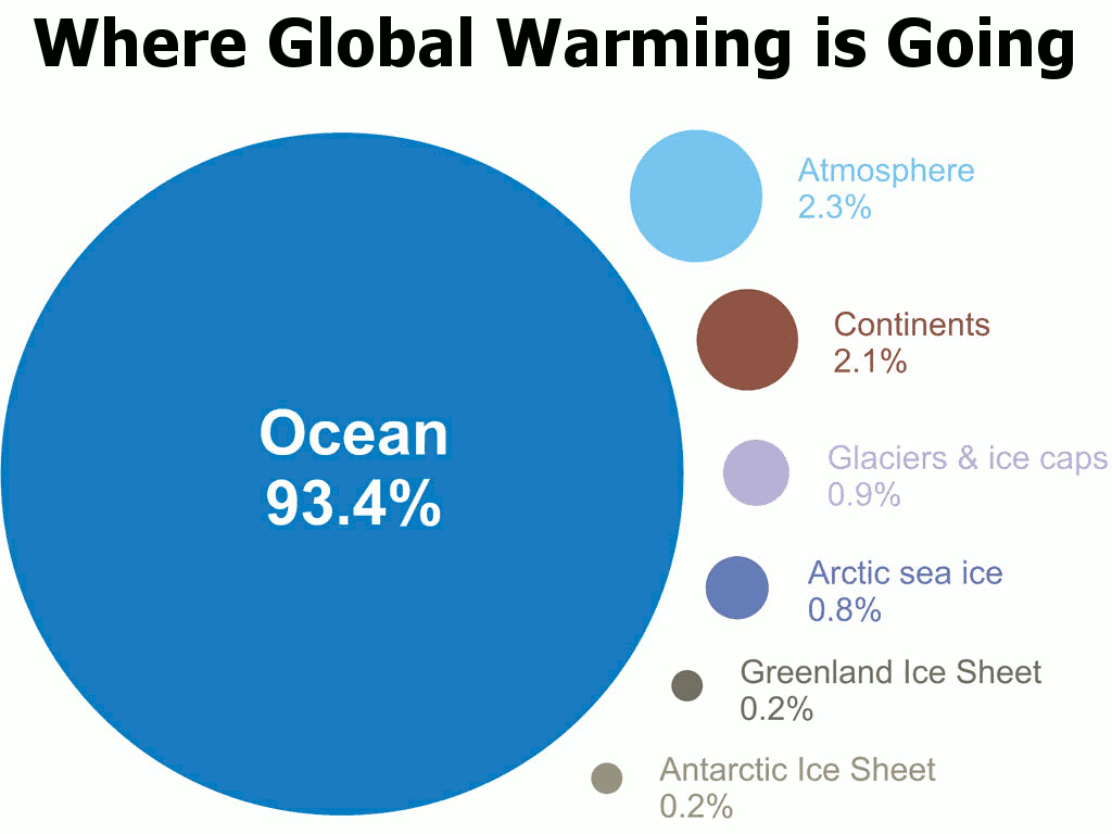
Figure 1 - A visual depiction of how much global warming heat is going into the various components of the climate system for the period 1993 to 2003, calculated from IPCC AR4 5.2.2.3 versus where skeptics/contrarians seem to think it's going. Note the graphic totals 99.9%, so 0.1% is unaccounted for.
In the 1993 comedy Groundhog Day actor Bill Murray portrayed an arrogant and self-absorbed individual who was forced live the same day over and over again until he learnt the error of his ways. David Rose of the tabloid The Daily Mail seems to be living in his own personal version of Groundhog Day. Unlike Bill Murray's character, however, David Rose's climate-based Groundhog Day is a committed personal choice.
Skeptical Science has already debunked his previous claims about global warming over the last 16 years, here, here and here. But rather than learn from the scientific literature, or reputable climate scientists, Rose has instead chosen to once again to repeat many of the same bogus claims. Every day may be Groundhog Day at the Daily Mail, but as we'll see the world is warming faster than ever.
Living and working on the Earth's surface it is very easy to get the wrong idea about global warming. Global surface air temperatures are indeed relevant to us surface-dwellers, but over 70% of the Earth's surface is actually ocean, and around 93.4% of global warming has gone into heating the oceans (See Figure 1). Global warming is therefore the story of ocean warming. Only by focusing on the 2.3% of global warming that goes into warming the atmosphere over a short time frame, and ignoring the remaining 97.7%, can David Rose maintain the illusion of little, or no, warming. In other words, this is an obvious cherry pick - one of the 5 characteristics of scientific denialism.
Since most of global warming goes into the ocean, and the ocean is the main source of atmospheric warming, it's clearly the first place we should check to see what's going on. A number of scientific publications, (Von Shuckmann & Le Traon [2011], Levitus [2012], Nuccitelli [2012] & Balmaseda [2013]) show the oceans, and notably the deep oceans (depths below 700 metres), have warmed. More importantly, the last three of these papers have demonstrated that not only have the oceans continued to warm, but an unprecedented warming in the deep ocean has contributed to an acceleration of overall ocean warming.
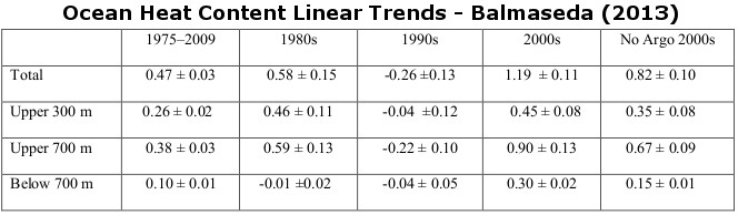
Table 1 - linear trends in ocean heat content. Values are per unit area of the global ocean plus and minus 1 standard error (in watts per square metre [W/m2]). To obtain the equivalent heat flux per unit areas of the total earth surface multiply by 0.708. Image adapted from Balmaseda (2013).
Clearly the last 16 years have seen much greater warming than the preceding 16 years, an observation which is broadly consistent with scientific expectations, given that planet-warming greenhouse gas emissions from industrial activity have accelerated over this period too. This should have led to an accelerated rate of global warming and indeed it has, it's just that much of this heat has gone into the ocean.
It is interesting to note that 'hiatus' decades (decades of little or no warming in surface air temperatures) are predicted in one climate model (Meehl [2011]) when anomalous heat is being deposited into the deep ocean during periods dominated by La Niña. We don't yet know whether other climate models exhibit the same behaviour, but if so the diminished surface warming observed over the last decade would be expected, because the latter part of the noughties has been dominated by La Niña.
So does this mean we'll see less surface warming in the future because more heat is going into the ocean than before? No. Global surface air temperature variations are simply short-term fluctuations (weather) about a long-term warming trend (climate).
So far I've concentrated on the main heat reservoir of the climate system, the ocean. If that is accelerating, then we should expect to see that reflected in the trends of the other heat reservoirs - and that is generally what we observe. The melt of the Arctic summer sea ice has greatly accelerated (0.8% of global warming based on the Intergovermental Panel on Climate Change (IPCC) assessment in Figure 1). The world's glacier and ice cap retreat (0.9%) has accelerated. Ice loss from the Greenland ice sheet (0.2%) has accelerated (Shepherd [2012]). Ice loss from the Antarctic ice sheet (0.2%) has accelerated (Shepherd [2012]). Heat uptake by the land surface (2.1%) has accelerated (up to 2004 at least - Huang [2006]).
In fact, all of the Earth's heat reservoirs have seen substantial warming, all that is apart from surface air temperatures (2.3% of global warming). Global surface air temperatures have warmed, but only slightly - which is why contrarians focus on them. Diminished surface warming is only temporary however.
With the relevant background context out of the way, it's time to look at the two main flawed claims made by David Rose. For instance he writes:
"We disclosed that although highly influential computer models are still estimating huge rises in world temperatures, there has been no statistically significant increase for more than 16 years."
As explained above, there is no mismatch between observations and theoretical expectations. Most of the heat has gone into the oceans, which is to expected. Indeed, as the emission of planet-warming greenhouse gases has accelerated so too has the rate of global warming. Rose is simply cherry-picking here. Although air temperatures do indeed track ocean temperatures over the long-term, they can deviate over short intervals due to ENSO (La Niña/El Niño). But this is only temporary, and is unlikely to persist much longer.
He further writes:
"Despite our revelation earlier this month, backed up by a scientifically researched graph, the Committee on Climate Change still clings to flawed predictions"
Rose is referring to the graph reproduced in Figure 3, which is based upon a graph by Ed Hawkins, a climate scientist at the University of Reading.
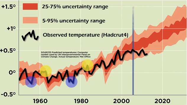
Figure 3 - Adapted image from the Daily Mail, an image itself adapted from work by Ed Hawkins. Orange-shaded areas are the range of climate model surface temperature projections (CMIP3) with the uncertainty range as indicated. Black line is the observed temperature (HADCRUT4) and the vertical blue line indicates when the simulations were carried out. Blue-shaded circles indicate when (hindcasted) temperatures were below the 5-95% range, and yellow-shaded circles indicate when it was above the 5-95% range.
Rose makes a big deal out the observed surface air temperatures (black line) about to drop out of the modelled range (light orange), but if you look at the hindcasts (model simulations of the past), that's not exactly new. There are two periods in the hindcast (circled in blue) where the temperatures do in fact fall below the range. This is what we should expect. The 5-95% interval (light orange) means this should happen 5% of the time (5% below and 5% above, giving 10% of the time outside the 5-95% interval). Notably, on both occasions, this occurs during multiple years of strong La Niña's - which is again consistent with the modelling of Meehl (2011). This suggests that the other climate models may simulate anomalous heat being deposited into the ocean during these dominant La Niña intervals, but perhaps not necessarily the deep ocean in this instance.
But why don't observed temperatures follow the centreline of the projections? The darker orange-shaded area represents the (25%-75%) average of the model runs - when they all have been aggregated together. If the Earth was able to run the same year over-and-over-again, like the models, it would probably do the same. But the Earth only gets one shot at this. One roll of the dice. So rather than being smoothed out - like the average of all the climate model runs - actual surface temperatures yoyo up-and-down - exhibiting large year-to-year variability. As they would if only one climate model run was carried out.
The point here, is that the graph which Rose reckons supports his claims, does nothing of the sort. If temperatures drop outside of the orange-shaded band and remain there, he would have a point that something might be amiss. But at the moment the graph simply reveals that the climate models used are demonstrating good skill - a point illustrated by Ed Hawkins himself.
When we look at the Earth as a complete system, considering all the reservoirs where heat goes, it is glaringly obvious that not only has global warming continued, but it has accelerated - along with accelerated fossil fuel emissions.
The surface temperature warming trend over the last 16 years has been small predominately due to natural variation in the rate of discharge of heat from the ocean, although other factors may have played a part. Based on past observations of this natural oscillation, however, we would not expect this to last much longer.
And finally, if David Rose truly wanted to understand the ramifications of climate model simulations presented by Ed Hawkins, he should have consulted Ed Hawkins himself. Had he done so, he would have been corrected.
Undoubtedly David Rose will have more to write about this in the future. But don't be surprised if he, and the Daily Mail, are still endlessly repeating the same myths over and over - forever wilfully stuck in their own version of Groundhog Day.
Posted by Rob Painting on Wednesday, 17 April, 2013
 |
The Skeptical Science website by Skeptical Science is licensed under a Creative Commons Attribution 3.0 Unported License. |