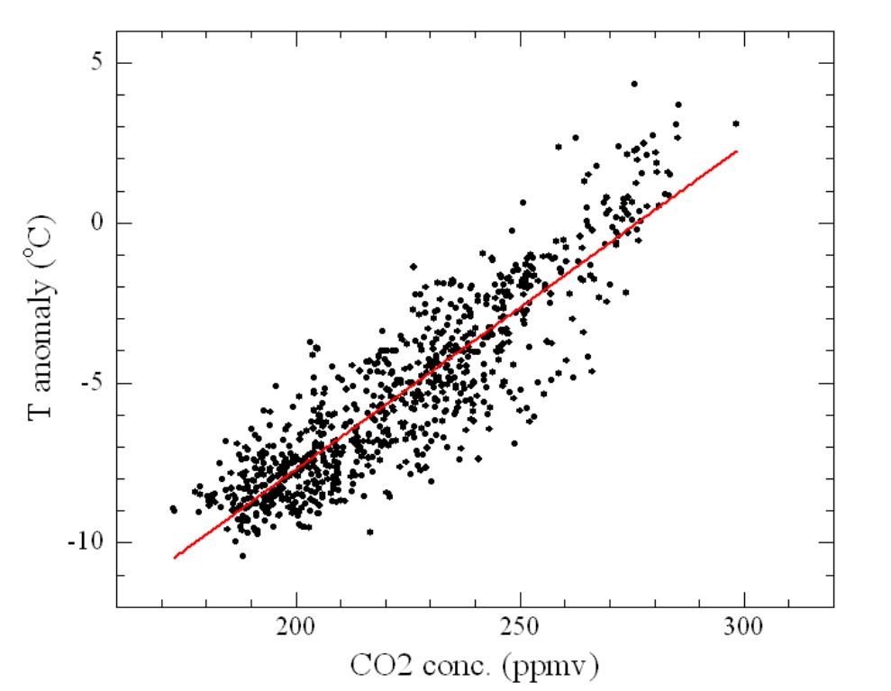
Fig. 1: Dome C temperature and CO2 concentration data (dots) with the best fit line (red line). To make the two series coherent in time, I spline-interpolated both to a common time step of one point each thousand years.
Guest post by Riccardo
One of the most famous paleoclimate graphs for "amateur climatologists" like me is the Vostok ice core reconstructions of temperature and CO2 concentration over the last 420 kyr. It shows how nicely the two follow each other and that our climate has overall "oscillated" within two relatively well defined limits. One may wish to look at this correlation a little better. So let's take the Dome C ice core data which cover 800 Kyrs and plot temperature versus CO2 concentration.
Fig. 1: Dome C temperature and CO2 concentration data (dots) with the best fit line (red line). To make the two series coherent in time, I spline-interpolated both to a common time step of one point each thousand years.
This graph shows how our climate system behaves naturally. The straight line is the fit to the data and in some way represents the correlation between the two quantities. Whatever the driver of these changes was, what we can say is the climate system finds its (quasi-) equilibrium with roughly defined values of temperatures and CO2 concentrations.
This concept is made explicit in a recent paper (Etkin 2010) where the author makes a state-space (or phase-space) analysis of ice cores and recent instrumental measurements. In the graph shown below, the data points, i.e. the (T,CO2) pairs, are connected with lines to show the temporal sequence of the various states.
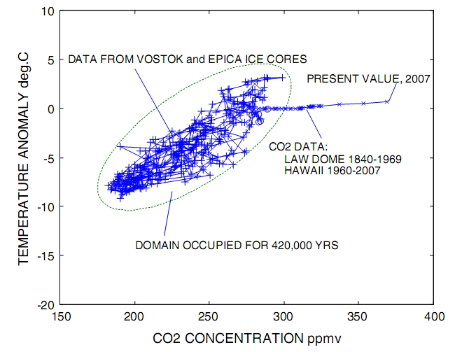
Fig. 2: State-space plot of the Vostok, EPICA and Law Dome ice core data and Mauna Loa direct measurements. (From Etkin 2010).
As expected, the system behaves chaotically; neverthless, T and CO2 concentration are definitely correlated with a correlation coefficient of 0.86, excluding Law Dome and Mauna Loa data. The green ellipse represents the domain inside which the climate system has naturally wandered for 420 Kyrs.
What the graph also shows is that, starting about a couple of centuries ago, the system has been suddenly pushed out of its shell and moved to a completely different domain. The slope of the curve is hugely different, indeed almost flat, which suggests that the driver of the climate is different from anything seen in half a million years.
Although we were able to come to some general qualitative conclusion from the analysis above, strictly speaking the correlation of temperature should be sought with forcing, not CO2 concentration. The extra energy trapped in our climate, more appropriately called forcing, by an increase in CO2 concentration may be approximated by the simple relation F=c*ln(C/Co) where c is a constant equal to 5.35 W/m2, C and Co are the actual and an arbitrary reference CO2 concentrations. In this way, the CO2 concentration axis may be readily converted into forcing.
Masson-Delmotte et al. 2010 did something similar (and much more!). They made a thorough analysis of the EPICA Dome C data and in their fig. 5b, reproduced below, they show a graph similar to the ones shown above. The difference is that temperature is shown vs. the sum of CO2 and CH4 forcings instead of concentration.
The straight line fit has a slope of 3.9 °C per W/m2, which represents a sort of local climate sensitivity defined as l=DT/F, i.e. the local temperature increase for each W/m2 increase in forcing.
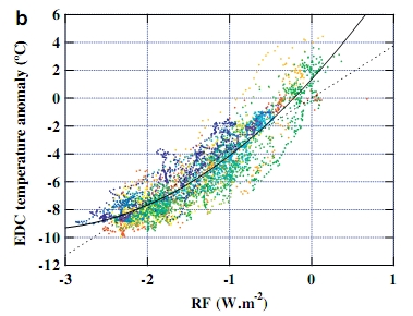
Fig. 3: EPICA Dome C data temperature anomaly vs. CO2 and CH4 radiative forcings (points) with straight line and quadratic best fit to the data. (From Masson-Delmotte et al. 2010).
The authors also added a quadratic fit, which gives a statistically significant improvement of the fit. The slope of the curve is related to the local climate sensitivity and then a non-constant climate sensitivity between glacial and interglacial periods may be inferred. In particular, during the warm periods the climate sensitivity is higher than average. In other words, the temperature increase produced by a forcing is higher when the system is in its warm phases. It's worth noticing that Hansen et al. 2008 also found a higher climate sensitivity in warmer past periods due to slow feedbacks.
The bottom line is that paleo data gives much important information on the way our climate works. They clearly show that we are already far outside the range of natural variability during the last half a million years and heading forward. The news along this path may well not be as good as anyone would like.
Posted by Riccardo on Saturday, 29 May, 2010
 |
The Skeptical Science website by Skeptical Science is licensed under a Creative Commons Attribution 3.0 Unported License. |