Global Warming in a Nutshell
Occasionally it's good to step back from the details of global warming science and offer non-technical visitors a "Global Warming 101" perspective, sort of like The Big Picture, but starting from the very beginning and touching on many aspects of this broad topic. This article was revised and re-posted from Larry's website. The figures supplement the main text with key data, but they are mostly independent and reading the figures is not necessary for understanding the text, and vice versa.
The Greenhouse Effect
The Earth is a giant rock, hurtling through space in its orbit around the sun. It would be a frozen lifeless rock like the moon if not for the thin layer of atmosphere that traps solar energy and insulates the Earth's surface, like a transparent blanket. The way the atmosphere traps solar energy is called (somewhat inaccurately) the Greenhouse Effect, because the effect is similar to a greenhouse or a closed car heating up in the sun. Sunlight comes in through a transparent window and is absorbed by whatever it hits, heating up the interior. Some of that heat is trapped inside, partly because glass is less transparent to heat than it is to light, and the temperature increases. In the atmosphere, sunlight is absorbed by the Earth's surface or rooftops or whatever, and that energy is radiated as heat (infrared energy) back toward space. Most of that heat doesn't make it to space, because it gets absorbed by certain gases in the atmosphere, mainly water vapor, carbon dioxide, and methane. Normally this is a good thing, because without the heat trapped in the atmosphere by "greenhouse gases", our planet would be frozen. But it turns out that too much of a good thing is a bad thing. If extra carbon dioxide that is not part of the natural carbon cycle is added to the atmosphere, then extra heat is trapped that would otherwise escape to space, and the atmosphere gets warmer. So in a nutshell, Global Warming is an increase in the Earth's overall average temperature caused by adding extra carbon dioxide and other greenhouse gases to the atmosphere that absorb and trap heat.
Average Global Temperature 1880-2009
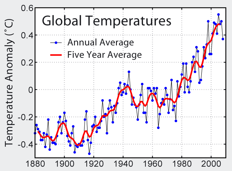
Figure 1: Average global temperature during the period 1880-2009, compiled from various data sources by NASA. Zero in this figure corresponds to the average global temperature for the period 1961-1990. The red curve is a 5-year average that smooths the year-to-year variability. All measurements are imperfect for a variety of reasons, including accuracy limitations of the instrumentation, and sampling uncertainty from incomplete data coverage. The uncertainty analysis for this dataset gives an estimated increase in the average global temperature over the 20th century of 0.57±0.17°C, where ±0.17°C is the uncertainty in the estimate at the 95% confidence level.
Figure created by Robert Rohde from published data for Global Warming Art, where references for the data sources and analysis methods are given.
Carbon Dioxide
Carbon dioxide (or CO2) is the familiar gas that bubbles out of carbonated beverages, and in its solid form it's called dry ice. Carbon dioxide is also a waste product of animal metabolism, after oxygen from the air is combined with carbon-containing compounds in food to produce the energy we need to live. In a beautiful carbon cycle, plants take in carbon dioxide and solar energy to live, and they "exhale" the oxygen that we need to live. For most of human existence, the amount of CO2 in the atmosphere has been stable at about 280 parts per million (ppm), meaning that out of every million molecules in the air, 280 of them are carbon dioxide. It's a pretty small fraction of the atmosphere (0.028%), but it's the right amount of carbon dioxide to absorb just enough heat so that the Earth has the overall average temperature that we and everything else have gotten used to.
Then came the Industrial Revolution, when we learned to make the great amounts of electricity and heat needed to build modern civilization by burning "fossil fuels", or coal, oil, and natural gas (methane). Fossil fuels are the remains of plants and animals that died millions of years ago and sank to the bottom of stagnant water that lacked the oxygen needed to decompose them, so they became buried under layer after layer of sediment and compressed into coal or oil. Today we mine that coal and drill for oil and then burn them in power plants and cars. Fossil fuels are mostly made of carbon, and burning them turns them into carbon dioxide that goes up the smoke stack or out the tailpipe and into the atmosphere. This is the extra carbon dioxide, beyond that nice amount we used to have when the carbon cycle was in balance, that is causing global warming. Carbon dioxide doesn't just go away, it builds up in the atmosphere and traps more heat and makes the planet warmer. The amount of carbon dioxide in the atmosphere in 2010 was 390 ppm (Fig. 2), which is up 39% from pre-industrial levels, and it's increasing at a rate of 1.9 ppm/year as more and more humans burn more and more fossil fuels. It's astonishing that humans can have such a large effect on the whole planet's atmosphere, but it's a fact that they do.
Direct CO2 Measurements 1958-2009
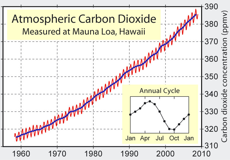
Figure 2: Concentration of atmospheric carbon dioxide measured at Mauna Loa, Hawaii from 1958 to 2009. The red curve shows monthly measurements of CO2 concentration in parts per million (ppm), and the blue curve is the annual average. The seasonal cycle is caused by the respiration (breathing) of all Earth's plants, where there is more plant activity in the northern-hemisphere summer to take in CO2 and reduce its concentration in the atmosphere. The 280 ppm CO2 concentration prior to the industrial revolution had increased to 315 ppm by 1958, and by 2010 it was 390 ppm and increasing, mostly in response to increased burning of fossil fuels and deforestation. Deforestation is linked with global warming because fewer plants on Earth means less CO2 is removed, so its concentration in the atmosphere remains higher. This graph is known as the Keeling curve, after Charles David Keeling who maintained this excellent record over the years. This is the first significant evidence of rapidly increasing CO2 levels in the atmosphere, and Keeling is often credited with first bringing to the world's attention the effect that human activity is having on the Earth's atmosphere and climate.
Figure created by Robert Rohde from published data for Global Warming Art.
Global Warming is about Climate, not Weather
Global warming is NOT about the daily weather, and there's no clear connection between global warming and any single hurricane or snow storm or drought. That's not the right way to think about it. Instead, adding energy to the whole Earth System leads to such things as more frequent severe weather events that on average are stronger and more damaging. That is, it's a statistical thing that has to do with averages and long-term trends, rather than one's own experience with the daily weather. There's a great deal of day-to-day and even year-to-year variability in the weather, and the 0.6°C (or 1.1°F) increase in the average global temperature over decades shown in Fig. 1 is a statistical trend that an individual can't really detect. However, scientific research brings to bear lots of measurements and data analysis and computer modeling and debate and discussion among thousands of experts who spend their careers studying this in great detail. That's what makes them experts, and why they deserve to be listened to with an open mind.
Global warming IS about an overall increase in the amount of energy in the whole Earth System caused by an increase in heat-trapping greenhouse gases. The experts are only talking about a few degrees of average temperature increase, which doesn't sound like much, but consider this example. Imagine a glass of water and ice cubes in a refrigerator whose temperature is set right at the freezing point of water, 0°C or 32°F. The mixture of ice and water will remain pretty much as it is, but if the temperature is raised by even 1 degree, the ice cubes will start to melt, and at 2 degrees they will melt faster. Everything was in balance at the old temperature, but at the slightly warmer temperature you eventually end up with all water and no ice, much like what is happening right now to Earth's Arctic sea ice (Fig. 3) and mountain glaciers (Appendix, Fig. A1).
Arctic Sea Ice Extent 1979-2005
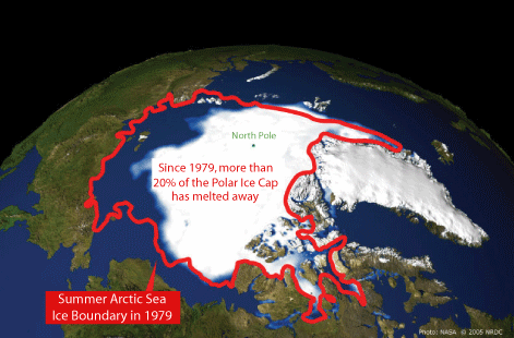
Figure 3: During the summer, Arctic sea ice melts at the edges and the polar ice cap shrinks, then during the winter there is freezing and growth at the edges. This figure compares the summer Arctic sea ice minimum in 1979 (red) with the sea ice minimum in 2005. Since 1979, more than 20% of the Polar Ice Cap has melted in response to warmer air and ocean temperatures. This melting does not contribute to a rise in sea level because it is ocean ice that was already contributing to the sea level before it melted. However, disappearing sea ice is causing the decline of the polar bears because they rely on having sea ice within swimming distance for hunting. Disappearing sea ice is also causing the loss of coastal villages to erosion that didn't previously occur because there was sea ice rather than open ocean on the coast. Land-based ice, including the Antarctic and Greenland ice sheets and mountain glaciers, does contribute to sea level rise when it melts because it is new water added to the oceans.
Source: NASA and the Natural Resources Defense Council (NRDC). Satellite data of Arctic sea ice minimums from 1979 and 2005 are from NASA and the National Snow and Ice Data Center.
Impacts of Global Warming
What happens when the planet gets warmer? More extreme weather, disappearing Arctic sea ice, and receding glaciers have consequences, such as less habitable coastal areas, decline of the polar bears, and disappearing fresh water supplies for billions of people. The current rate of sea level rise is 3.3 mm/year (Fig. 4), which is cause for concern in low-lying or hurricane-prone coastal areas like Bangladesh or certain disappearing Pacific islands or the U.S. Gulf coast. This becomes a national security and military concern when there are millions of "climate refugees" with nowhere to go. They will do what they must to survive, as we all would, and they'll go to China, Australia, the U.S., and elsewhere, and they probably won't be welcomed with open arms. Other consequences of global warming include extended droughts and encroaching deserts, increasing wildfires and insect infestations, and changing rainfall and agricultural patterns. The oceans and marine life are doubly affected by global warming: first by an increase in temperature, which intensifies hurricanes and melts sea ice, and second by increased acidity caused by dissolved CO2 (Fig. A2). And these aren't even the worst-case scenarios.
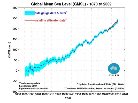
Figure 4: This record of the global mean sea level (GMSL) was derived from tide gauge measurements taken since 1870 (dark blue line). The light blue region is the range of uncertainty in the measurements. The tide gauge data are consistent with very accurate satellite measurements of GMSL since 1993 (red line). Sea level has increased by about 240 mm (24 cm, or 9.4 inches) since 1870. Since 1993, sea level has increased by almost 60 mm (6 cm, or 2.4 inches) at a relatively constant rate of 3.2 mm/year, which is over 50% faster than the average rate of sea level rise over the 20th century. The sea level increases when new water is added to the oceans from the melting of ice on land, and sea level decreases when evaporated water from the oceans is retained on land by the growth of ice sheets and glaciers (as during a glacial period). Sea level is also affected by the temperature of the water through "thermal expansion", where warmer water takes up more volume than cooler water, so the oceans expand in response to an increase in temperature. A warmer atmosphere from global warming leads to a warmer ocean and increase in sea level, after a time lag for the heat transfer and mixing to deeper levels to occur.
Figure prepared from published data by the Sea Level group at CSIRO (the Australian national scientific research organization).
Timescales, Positive Feedbacks, and Tipping Points
These three factors make confronting global warming both more difficult and more urgent. Natural processes that permanently remove CO2 from the atmosphere take place on a timescale of decades or longer, so we are already committed to a certain amount of additional warming even if humanity stopped burning fossil fuels today. When a system such as Earth's climate system is perturbed from a stable state, "positive feedback" processes can cause the system to move even farther from its previous state, while "negative feedback" processes tend to restore a perturbed system to its previous state. There are several positive feedbacks in the Earth's climate system that could lead to a "tipping point", which is a threshold condition that, once reached, leads to an irreversible change no matter what we do, because once it's done it's done.
One example of a positive feedback in the climate system concerns the decreasing Arctic ice cap shown in Fig. 3 (20% smaller since 1979). Ice is a very reflective surface with an albedo of 0.5-0.7, meaning that 50-70% of sunlight is reflected back to space and doesn't contribute (much) to global warming. Ocean is one of the least reflective surfaces with an average albedo of only 0.08 (only 8% reflected, 92% absorbed), so most of the solar energy hitting the ocean participates in global warming. As the size of the Arctic ice cap decreases from melting, a less reflective surface (the ocean) replaces a more reflective surface (the ice), so more solar energy is absorbed and the rate of global warming increases, leading to faster ice cap melting, leading to faster warming, etc., until all the ice is gone.
A second positive feedback in the climate system concerns the thawing of permafrost soil in northern latitudes. Vast stretches of permafrost contain vast quantities of CO2 and methane locked up in the frozen soil, which is released into the atmosphere when the soil melts, which traps more heat and increases the rate of global warming, which melts more and deeper permafrost, which further increases the rate of global warming, etc. These and other positive feedbacks could lead to a tipping point, where dramatic changes in the Earth System happen quickly and are permanent and irreversible no matter what we do about CO2 emissions.
Energy and Climate Policy
Climate science is enormously complex (see Fig. A4), yet sufficient progress has been made that we know the broad outlines of what is needed to avoid the worst consequences of global warming. We need to make major changes in the way we get and use energy, and we need to do it soon, or the world will change in ways we won't like and our children will like even less.
Having a specific goal can sometimes motivate progress, and some climate experts have suggested that we should aim to stabilize the atmospheric CO2 concentration at no more than 350 ppm. Recall that the pre-industrial CO2 level was 280 ppm, and we're currently at 390 ppm and increasing at a rate of 1.9 ppm/year, so we're already above the desired level and rapidly heading in the wrong direction. The target of 350 ppm originated with a paper by eminent NASA climate scientist Dr. James Hansen, which involved an analysis of past climate conditions and their associated CO2 concentrations. A commonly cited target for policy considerations is to limit global warming to 2°C (3.6°F), which gives us a chance to avoid positive feedbacks such as widespread melting of permafrost that could lead to a tipping point. The 2°C limit roughly corresponds to an 80% reduction in CO2 emissions by the year 2050, if substantial reductions begin immediately. Meeting such targets requires transformational energy policy that establishes clear requirements and a mechanism to meet them, and in one way or another puts a price on the emission of carbon to drive reductions. Right now there is zero cost for contributing to global warming, so there's no incentive to stop, and taxpayers will continue to pay for the effects of global warming.
Energy Choices, and Who to Trust
Energy choices made today will determine the climate in coming decades. Historically it has been difficult for human beings to get together to confront a major problem until some catastrophe occurs, which does not bode well for addressing global warming because we must act far in advance of any catastrophe due to the long timescale for removal of CO2 from the atmosphere. THE SOLUTIONS ARE CLEAR: We need to use energy more efficiently, as about half of it is just wasted by inefficient cars, appliances, buildings, electrical grid, etc., and we need to transition to clean and renewable (non-fossil fuel) sources of energy, which we already know how to do.
However, the forces opposing change are formidable and well funded, and frankly, very good at deceiving a poorly-informed public about a complex and long-term issue. Coal was great for powering the industrial revolution and electrifying civilization, but now we know there are long-term global consequences, and now we know how to make electricity in smarter ways than using fire to boil water to turn a generator. Oil has plenty of problems in addition to being a major contributor to global warming, including volatile prices, environmental damage such as the Gulf oil disaster or tar sands mining, and the loss of life, political destabilization, and enormous expense to taxpayers of protecting oil supplies. Even relatively "clean" natural gas (methane) is not really very clean unless much more is done to prevent leakage of this potent greenhouse gas into the atmosphere.
Confronting global warming will require a combination of strong legislation crafted by informed and courageous legislators, personal actions to reduce one's own energy use and to support renewable energy, and teaching others about the reality of global warming and what's at stake. One thing that any individual can do is to elevate the importance of strong clean energy and climate legislation when making voting decisions.
For me, this issue is way above politics, it's about the future of my daughter and my species. Regarding who to believe about global warming, consider this simple analogy. If I want to know how to fix my plumbing, I will call a plumber, not a climate scientist. But if I want to know if all the hoopla about global warming is real and should we do something about it, it seems like common sense to ask a climate scientist, not the Coal Lobby, or the American Petroleum Institute, or some (but not all) politicians.
Links to Additional Information
| NASA evidence page |
Observed climate change evidence from NASA. |
| Center for Climate and Energy Solutions |
Observed climate change impacts from C2ES (formerly the Pew Center on Global Climate Change). |
| National Snow and Ice Data Center |
Repeat photography showing the retreat of glaciers worldwide, and other information about changes happening in Earth's frozen regions. |
| Global Warming Art |
An excellent source of information and downloadable graphics that document the scientific data and analysis of global warming research. |
| The Risk Management Perspective |
Above I suggest that it makes more sense to trust the vast majority of climate scientists (that is, experts) than to trust representatives of the fossil fuel industies (that is, vested interests). This popular You Tube video presents another angle on how to think about global warming where you don't have to trust anyone, by putting it as a question of "risk management", which is how big and complicated questions are often approached in business, engineering, and elsewhere. |
| Climate and Clean Energy Advocacy |
One way that an individual can stand for reason-based decision-making in government is to join and donate to reputable advocacy organizations, to counter the very well-funded deception and denial campaign of the fossil fuel lobbies. My favorite such organization based on their long record of results is the Natural Resources Defense Council (NRDC). I also like the emphasis on scientific integrity and opposition to political interference in federally-funded research at the Union of Concerned Scientists. For decades I've been a fan of Amory Lovins' "soft energy path" and his "think and do tank" called the Rocky Mountain Institute. |
Appendix -- Additional Figures
Glacier Mass Balance 1980-2008
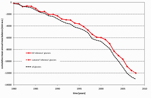
Figure A1: The mass of glaciers, which is the total amount of water they contain, is a combination of the area of the glacier and its average thickness. The World Glacier Monitoring Service oversees annual reporting on the "mass balance" of over 90 glaciers worldwide. Mass balance is the net gain or loss of mass in units of "mm w.e." (millimeters of water equivalent), which is the average thickness of ice that was gained or lost if that amount was melted. The figure shows the average mass balance for all reported glaciers (black) and for a subset of 30 reference glaciers (red) for 1980-2008. Over this time period the glaciers on average lost an amount of mass equivalent to a thickness of 12,000 mm (12 meters, or 39 feet) of water, and the loss rate (slope) has been increasing since the mid 1990s. This water ends up in the oceans and contributes to a rising sea level, although the contribution is small compared to that of the Greenland and Antarctic ice sheets. A particularly distressing aspect of disappearing mountain glaciers is that they are the source of water for billions of people in various parts of the world.
The loss of ice is uneven across a glacier, and the lower portion of glaciers has been disappearing, which is known as "glacial retreat". This is captured visually with repeat glacier photography, such as these examples at the National Snow and Ice Data Center and at Global Warming Art. The Extreme Ice Survey has documented the changes and the fascinating behavior of glaciers around the world with time-lapse video and photography. The PBS/Nova Extreme Ice documentary is very interesting and can be downloaded or purchased on DVD, and James Balog's TED talk is a good overview of the project and its conclusions.
Figure is from published data at the World Glacier Monitoring Service.
Dissolved CO2 and Ocean Acidity (pH)
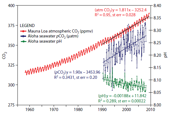
Figure A2: This figure shows the correlation between rising levels of carbon dioxide (CO2) in the atmosphere at Mauna Loa (red) with rising levels of CO2 dissolved in the ocean at nearby Station Aloha (blue), and the consequent increase in acidity of the ocean that is seen as a decrease in ocean pH (green, right scale). Global warming deals a double blow to the oceans because not only does the ocean warm by absorbing part of the atmospheric temperature increase, it also absorbs about one-third of the increase in CO2, which reacts with water to produce carbonic acid. So, the oceans help to decrease atmospheric CO2 and slow global warming, but with major negative consequences for the chemistry and biology of the oceans.
Many creatures in the ocean require a fairly narrow range of temperature and/or pH to survive. A warming ocean causes creatures that can move, like jellyfish, to move northward to cooler waters, while those that can't move, like coral, die of heat stress. Acidification interferes with the formation of shells made of calcium carbonate, because decreasing pH means decreasing availability of carbonate ions. Some of those shelled creatures are microscopic and are at the base of the food chain, so their demise affects all ocean life as well as we humans who depend on it. The acidity of the oceans has already increased by 30% (0.1 pH units) from pre-industrial times, and it will continue to increase as long as humans continue burning fossil fuels and adding more CO2 to the atmosphere. For more information about ocean acidification, see this report from the Center for Climate and Energy Solutions.
Source: Ocean Acidification by R.A. Feely, page 60 in Levinson, D.H. and J.H. Lawrimore, 2008: State of the Climate in 2007. Bull. Amer. Meteor. Soc., 89, S1-S179. Also: Feely, R.A., S.C. Doney, and S.R. Cooley, 2009: Ocean acidification: Present conditions and future changes in a high-CO2 world. Oceanography 22(4):36-47.
CO2 and Temperature from Ice Cores - 800,000 years
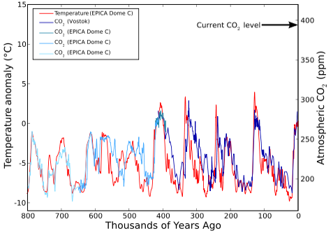
Figure A3: This is the long-term (800,000 year) record of atmospheric CO2 concentration (right scale) and reconstructed temperature (left scale) from analysis of air bubbles trapped in Antarctic ice cores acquired by EPICA (European Project for Ice Coring in Antarctica). The temperature scale is the difference from the average temperature over the last 100 years, so it is degrees difference from modern times. Over the last few hundred thousand years there has been a sequence of alternating glacial ages (mini ice ages) and "inter-glacial warm periods" (we've been in one for about 11,000 years). The data show that a glacial age corresponds to a global temperature that is lower than today's by 7-8°C (12-14°F).
The good correlation between CO2 concentration and temperature strongly supports the link that is predicted from basic global warming theory. On the timescale of this figure, the last few thousand years are squashed up against the right axis, where the CO2 concentration has been 270-280 ppm. The arrow shows the current CO2 level of 390 ppm that has occurred in only the last century, much faster and higher than anytime in the last 800,000 years. The atmosphere has begun to respond to the increased CO2 level with a temperature increase of about 0.6°C in the last century, and the figure gives no reason to doubt that warming will continue in response to the unprecedented increase in CO2. We are now conducting a grand experiment to see what happens to the planet when we increase the temperature, and since this is our one and only planet, some would say that it's not a very smart experiment.
Figure created by Leland McInnes from published EPICA data.
Some Physics Behind the Greenhouse Effect and Global Warming
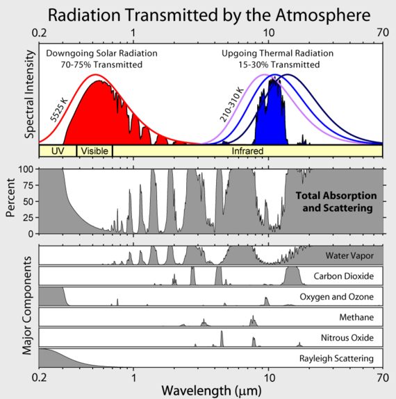
Figure A4: The Earth System and Global Warming are enormously complex, and their study involves many areas of scientific research. One area concerns the details of what happens to solar radiation (light) as it passes through the atmosphere and is either absorbed in the atmosphere or by the surface or is reflected back to space. A related concern is what happens to the heat (infrared radiation) that is emitted by the surface of the Earth and is either absorbed by greenhouse gases and clouds in the atmosphere or it escapes to space. This information-packed figure nicely summarizes what happens to sunlight (red) and heat (blue) as they pass through and interact with the atmosphere, but understanding it may require some background.
Sunlight is not one single thing, but rather it is composed of a "spectrum of colors", where "color" is the response of the human eye to different wavelengths or energies of light particles ("photons"). Our eyes are only sensitive to a small portion of the entire "electromagnetic spectrum", namely the wavelength region called "visible" in the top panel. Heat, or "infrared" radiation in the figure, has a longer wavelength (or lower energy) than visible light, and "ultraviolet light" (UV) has a shorter wavelength (or higher energy) than visible light. So, light and heat (and microwaves and radio waves and x-rays and gamma rays) are all different wavelengths or energies of the same thing (electromagnetic radiation), but each wavelength interacts differently with gas molecules in the atmosphere, or with the Earth's surface, or clouds, or human beings.
The red curve in the top panel is the spectrum of electromagnetic radiation emitted by the sun, which peaks in the visible portion of the spectrum but also contains both infrared and UV radiation. The filled-in red area is the spectrum of sunlight that actually reaches the ground after traveling through the atmosphere, where the missing radiation is either absorbed by one of the specific molecules shown in the lower panels, or it is scattered into a different direction by molecules in the air ("Rayleigh scattering", which is why the sky is blue). The middle panel shows the total percentage of each wavelength of radiation that is absorbed or scattered by the atmosphere, so wherever there is a "strong absorption band" for one of the molecules in the lower panels, that radiation will not reach the surface and contribute to the red area in the top panel. The top and middle panels are two complementary ways of showing the same thing, namely how much solar radiation of a given wavelength reaches the surface. After sunlight reaches the surface it is either absorbed by the surface or reflected back toward space for a second trip through the atmosphere. The figure shows that much of the UV radiation emitted by the sun is either Rayleigh scattered or is absorbed by oxygen and especially ozone. Thankfully we now have regulations against emitting chemicals that destroy the ozone layer in the upper atmosphere, which protects us from the most harmful "extreme UV" radiation from the sun. The other important molecule for absorption of solar radiation is water vapor, which absorbs a small amount of the visible light and a medium amount of the infrared light emitted by the sun. The chemical properties of a molecule determine which specific wavelengths of electromagnetic radiation it will absorb.
The other half of the Earth's radiation balance concerns the fate of infrared or thermal radiation (heat) that is emitted by the Earth's surface, atmosphere, and clouds. All objects emit a spectrum of infrared radiation whose peak is at a wavelength that depends on its temperature. The blue curve is the spectrum of infrared radiation emitted by the Earth as a whole as seen from space, at an effective temperature of about 250 K (-23°C or -9°F). This is colder than the Earth's average surface temperature of about 287 K (14°C or 57°F) because some of the outgoing infrared radiation is absorbed by greenhouse gases or cloud particles and is re-emitted from colder levels in the atmosphere (as nicely explained in the article Greenhouse Effect Basics: Warm Earth, Cold Atmosphere). The figure shows that 70-85% of the outgoing infrared radiation is absorbed by molecules in the atmosphere, and water vapor is the dominant greenhouse gas because it absorbs a large fraction of the infrared radiation. Carbon dioxide is the next most important greenhouse gas, followed by methane.
The average temperature of the Earth is the result of a balance between energy that is added to the Earth System by the Sun, and infrared energy that is emitted by the Earth System and escapes to space. Global warming is about increasing the concentration of greenhouse gases in the atmosphere, which absorb more of the infrared radiation that would otherwise escape to space. This adds energy to the Earth System, which increases its temperature, which causes the Earth to emit more infrared radiation at the higher temperature, until a new balance with the energy input from the sun is established.
Disclaimer: This is a super highly oversimplified description of one aspect of the complex climate puzzle, and this description doesn't do justice to even this one aspect of the current understanding of climate processes that are represented in modern climate models. For an excellent description of energy flows in the Earth System, see Trenberth on Tracking Earth’s energy: A key to climate variability and change.
Figure created by Robert Rohde, a physicist and mathematician who documents climate science as a hobby at Global Warming Art.
Postscript (17 April 2012): A few small changes to the original post have been made in response to the comments, as described in Comments #10 and #35.
Posted by LarryM on Sunday, 15 April, 2012
