 So I decided to make life difficult for myself and suggested having a circle for each year and introduced the idea of some interactivity. Graphic mockups were created and everyone agreed my idea was best (well that's how I remember it).
Today we launch a new data visualisation app to display The Consensus Project data in a graphical interactive format. This is the story of how it was achieved.
A long time ago... and actually still in the past. It was a time of global upheaval...
John Cook had set up a database containing the titles of thousands of climate science papers and wondered what on earth to do with it. Various projects had been developed, including a phone app and a firefox add-on allowing anyone to add or suggest new papers. It also let users view Skeptical Science myth busting information. Later Skeptical Science volunteers added more papers to the database.
Eventually it was suggested it would be a good idea to graphically represent this information so that it would be accessible to a wider audience, visually demonstrating the scientific consensus on anthropogenic global warming. How was it to be done, who was going to do it?
Foolishly I put my virtual hand up and volunteered to create something in Adobe Flash. However after some discussion and a lot of research into suitable software options, Flash was abandoned and the Raphael javascript/SVG/VML graphics library was chosen. HTML5/canvas was also an option, but at the time, some key browsers didn't support it to the degree that I was happy with.
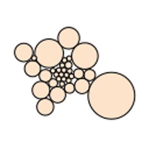
Ideas were discussed. John Cook wanted a simple circle for each categorisation, others suggested graphs and other ideas. But I was aware that each research paper entered in the database had a year or date. So I decided to make life difficult for myself and suggested having a circle for each year and introduced the idea of some interactivity. Graphic mockups were created and everyone agreed my idea was best (well that's how I remember it).
So the real work began and I had no idea how to implement the circle packing to make the clusters of circles that I had mocked up. More research!
The examples of circle packing I found all had problems when attempting to render more than one pack of circles. So after a lot of pondering over theory and ideas, fresh circle packing code started taking shape.
After many hours of work, a lot of emails and testing, the data visualisation was ready.
The app was tested on everything to hand, including mobile devices on display in shops! It worked particularly well on Apple iPads.
Next came the grand publishing day/week. To my surprise Dana, John and others were all emailing blogs and newspapers and before long the web-o-net was alive with reviews and articles about the visualisation. They included Climate Progress, Grist, DeSmog and WCAI, a Cape Cod radio station.
The Consensus Project created a new requirement for interactive graphics.
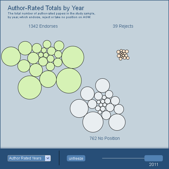
The new version of the data visualisation app includes a control panel allowing the selection of different data sets. The app also has the potential to display new sets of data.
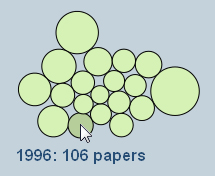
Currently you can view the quantity of papers per year, the author-rated or TCP-rated papers or just view the totals for all papers and years.
Moving the slider changes the year and adds or removes circles as appropriate. The freeze button stops the animation temporarily until the slider is moved again.
As in the 'Interactive History of Climate Science' application, if you click on a circle the list of papers for that circle will be displayed. This is limited to the charts that display multiple years.
It should be noted that although the majority of papers listed have links to the original publications, in some cases it is not possible to provide a link.
There are plans for other options including additional chart types, a play button and other improvements. You can access the visualisation app by clicking on The Consensus Project menu link at the top of the page and selecting Visualization.
Here is a screen shot of the new datavisualisation in action:
Posted by Paul D on Thursday, 20 June, 2013
 |
The Skeptical Science website by Skeptical Science is licensed under a Creative Commons Attribution 3.0 Unported License. |