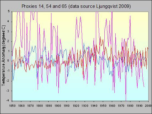
A zoomed in small selection of individual proxy records showing the high variance in many individual time series (note the wide temperature scale).
Guest post by Peter Hogarth
This article was inspired by Rob Honeycutts investigation into temperature reconstructions in Kung Fu Climate and follows on from previous posts on temperature proxies here and here. One gauntlet often thrown down at the feet of climate skeptics is “ok, if you are claiming the proxy reconstructions are fudged, fiddled, or wrong, then why not create your own?”
Well, the idea of collecting as many proxy temperature records as possible and then generating a global time series might seem daunting, but, as a novice in the gentle Martial Art of commenting on and hopefully explaining the science of climate change, I thought I’d follow this process of temperature reconstruction through a little way, break it down, and see what trouble it gets me into. I fear that both more specialised scientists and hardened skeptics will find much to criticize in the following simplistic approach, but from the comments on Kung fu Climate, I hope some readers who fit into neither category will find it illustrative and interesting.
There are all sorts of other common questions (some addressed briefly in the links above), for example about tree ring data, and about the Medieval Warm Period or “why can’t the proxy records be updated so as to compare with instrumental records?” Can we touch on these issues? Maybe a little…
First, which proxy data to use? I guess I need a few records, from as global a geographic area as possible, not so few as to be accused of cherry picking, and not so many that I have to work too hard… Also I didn’t want to pick a set of records where the final output reconstruction was already generated, as I could be accused of working towards a pre-determined outcome…In addition, I wanted as many records as possible which included very recent data, so that some comparison to the instrumental record could be made. What to do?
Fortunately, there is a recent peer reviewed paper that lists a manageable number of proxy records, and doesn’t try to generate a composite global record from them, Ljungqvist 2009 “Temperature proxy records covering the last two millennia: a tabular and visual overview”. This describes 71 independent proxy records from both Northern and Southern hemispheres, covering the past two thousand years, a fair proportion of which run up to year 2000, all of which have appeared in peer reviewed papers, and 68 of which are publicly accessible.
First we have to download the data. This is available here from the excellent folks at the NOAA paleo division. This can be loaded as a standard spreadsheet, but remember to remove any “missing data” (represented by 99.999) afterwards. Note that 50 of the records are proxy “temperatures” in degrees Celcius, and 18 records are Z-scores or sigma values (number of standard deviations from mean). The records are from a wide range of different sources, including ice cores, tree rings, fossil pollen, seafloor sediments and many others.
Next, we should have a quick look at the data. Ljungqvist charts each time series individually, and it can be seen that many of the charts provide ample fodder for those who wish to single out an individual proxy record which shows a declining or indifferent long term temperature trend.
A zoomed in small selection of individual proxy records showing the high variance in many individual time series (note the wide temperature scale).
The approach of taking one or a few individual time series in climate data (such as individual tide station records) is often used (innocently or otherwise) to question published “global” trends. A cursory glance at these charts has justified a few “skeptical” commentators citing this paper on more than one blog site. My initial thoughts on looking at these charts were simply that this would be, well, interesting.
We must also check the raw data, as at least one of the time series contains an obvious error which is not reflected in the charts (clue, record 32, around year 1320). This will be corrected soon. For now we can rectify this by simply removing the few years of erroneous data in this series.
Now, some of these records are absolute temperature and some are sigma values. We will put aside the Z-score values for now and look at the 50 temperature proxy records. We have to get them all referenced to the same baseline before attempting to combine them. To do this, we can simply subtract the mean of a proxy temperature time series from each value in this series to end up with an “anomaly”, showing variations from the mean. The problem here is that some records are longer than others, so one approach to avoid potential steps in the combined data is to use the same range of dates, using a wide range which most records have in common, to generate our mean values for each time series. This also works for anomaly data sets in order to normalize them to our selected date range. Here the range between year 100 and 1950 was selected, rather arbitrarily, as representing the bulk of the data.
Now we have a set of temperature anomaly data with a common baseline temperature. How do we combine them? At this stage we should look at missing data, interpolation within series, latitudinal zoning effects, relative land/ocean area in each hemisphere and geographical coverage, we should then grid the data so that higher concentrations of data points (for example from Northern Europe) do not unduly affect the global average, and bias our result towards one region or hemisphere, and also try to estimate the relative quality of each data set. This is problematic but is necessary for a good formal analysis. The intention here is not to provide a comprehensive statistical treatment or publish a paper, but to present an accessible approach in order to gain insight into what the data might tell us in general terms.
Therefore I will stop short and suggest a quick and dirty “first look” by simply globally averaging the 50 temperature results. I must emphasise that this does not result in a true gridded picture. However averaging is a well known technique which can be used to extract correlated weak signals from uncorrelated “noise”. This simple process will extract any underlying climate trend from the individual time series where natural short term and regional variations or measurement errors can cause high amplitude short term variations, and should reveal something like a general temperature record. Due to the relatively large number of individual records used here, we might expect that this should be similar to results obtained from a more comprehensive and detailed analysis. However we must accept that biases caused by the limited geographic sampling, unequal spatial distribution, or over-representation of Northern Hemisphere data sets will be present in this approach.
Given the caveats, is a result of any merit? as a way of gaining insight, yes. If we accept that any average is only a useful “indicator” of global thermal energy, we can cautiously proceed, and as we add the individual records to our average, one after the other, we see evidence that some data series are not as high “quality” as others, but we add them anyway, good, bad, or ugly. Nevertheless, the noise and spikiness gradually reduces and a picture starts to emerge.
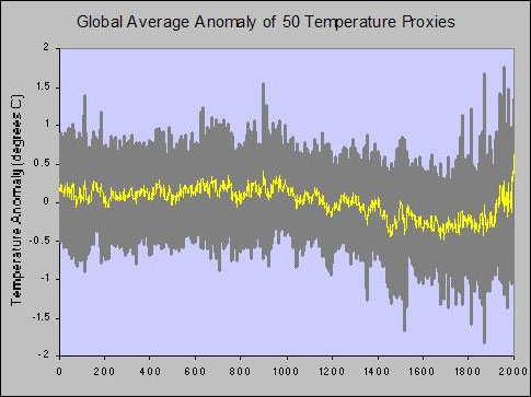
Average of 50 temperature proxy records, with one standard deviation range shown
Now, the fact that this resembles all of the other recent published reconstructions may (or may not) be surprising, given the unpromising starting point and the significant limitations of this approach. The Medieval Warm Period, Little Ice Age, and rapid 20th century warming are all evident. Remember for a second that these are proxy records which are showing accelerated recent warming. We have not hidden any declines or spliced in any instrumental data. We can remove data sets at will, and see what changes. If the number of removed series is small, and are not “cherry picked” we can see that the effect on the final result is small and that many of the features are robust. We can also look at correlating the dips with known historical events such as severe volcanic eruptions or droughts. This is beyond the scope of this article, but this topic is covered elsewhere.
There are many more proxy records in the public domain, which offer much better coverage allowing the data to be correctly gridded to reasonable resolution without too much interpolation. Adding more records to our crude average doesn’t change things dramatically for the Northern Hemisphere, but would allow higher confidence in the result.
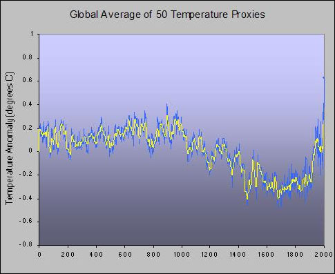
Average of 50 temperature proxies, annual values and ten year average with error bars omitted for clarity.
Now, to complete this illustration let us zoom in and look at the instrumental period. Not all of the proxy time series extend to 2000, although 35 extend to 1980. We would expect from our previous discussion that the variance would increase if less samples are available as we get closer to the year 2000, and this is the case. 26 of our proxy records cover the period up to 1995, 10 of which are sigma values. Only 9 records have values for year 2000, and 4 of these are sigma values. Can we make use of these sigma values to improve things? We could easily convert all of our records into sigma values and then compare them, but many readers will be more comfortable with temperature values. We could perhaps track down the original data, but in the spirit of our quick and dirty approach we could cheat a little and re-scale the sigma values given knowledge (or an estimate) of the mean and standard deviation…this isn’t clever (I do appreciate the scaling issues) but for now will give an indication of whether adding these extra samples is likely to change the shape of the curve. The original temperature derived curve from 50 proxies and the new curve derived from information in all 68 series are both shown below. There are some differences as we might expect, but the general shapes are consistent.
The versions of the zoomed proxy record again look vaguely familiar, they show a general accelerating temperature rise over 150 years, with a mid 20th century multi-decadal “lump” followed by a brief decline, then a rapid rise in the late 20th Century.
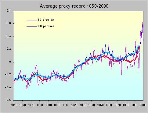
Proxy record 1850 to 2000. As not all records extend to 2000, the “noise” increases towards this date. If we use all of the available information we can improve matters, but the general shape and trends remain similar
We can compare this reconstruction with global temperature anomalies based on the instrumental records, for example HadCRUT3. In the instrumental record we have full information up to 2010, so our ten year average can include year 2000 showing the continuing measured rise. Given the standard deviation and tapering number of samples in our very preliminary reconstruction it appears to be reasonably representative and is surprisingly robust in terms of lack of dependence on any individual proxy series.
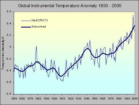
Global Instrumental temperature record, HadCRUT3, 1850 to 2000, annual average values and longer term average shown.
So, was the medieval warm period warm? Yes, the name is a clue. Was it warmer than the present? Probably not, especially given the last decade (after 2000) was globally the warmest in the instrumental period, but it was close in the higher latitude Northern Hemisphere.
Does the proxy record show natural variation? Yes. There is much debate as to why the Medieval Warm Period was warm, and over what geographical extent, but there is evidence (for example in all of the high resolution Greenland Ice core data) of a longer term general slow long term declining trend in Greenland, Arctic (Kaufman 2009), and probably Northern Hemisphere temperature believed to be due to orbital/insolation changes over the past few thousand years. This trend has abruptly reversed in the 20th century, and this is consistent with evidence of warming trends from global proxies such as increasing sea level rise and increasing global loss of ice mass.
Does the proxy record in any way validate the instrumental record, given some skepticism about corrections to historical data? To some degree, but I would argue that it is more the other way around, and it is the instrumental record which should be taken as the baseline, corrections and all. The proxy records are simply our best evidence based tool to extend our knowledge back in time beyond the reach of even our oldest instrumental records such as in Bohm 2010. Taken as a whole the picture that the instrumental records and proxy records present is consistent (yes, even including recent work on tree rings, Buntgen 2008)
For more comprehensive analyses, I will hand over to the experts, and point to the vast amounts of other data and published work available, some of which Rob cited. The more adventurous may want to examine the 92 proxies and other proxy studies that NOAA have available here, or look at the enormous amounts of proxy data (more than 1000 proxy sets), the processing methods and source code of Mann 2009, or see Frank 2010, which is also based on a huge ensemble of proxy sources. The weight of evidence contained in these collected papers is considerable and the knowledge base expands year on year. Simply put, they represent the best and most detailed scientific information that we currently have about variations in temperature, before we started actually measuring it.
Posted by Peter Hogarth on Tuesday, 6 July, 2010
 |
The Skeptical Science website by Skeptical Science is licensed under a Creative Commons Attribution 3.0 Unported License. |