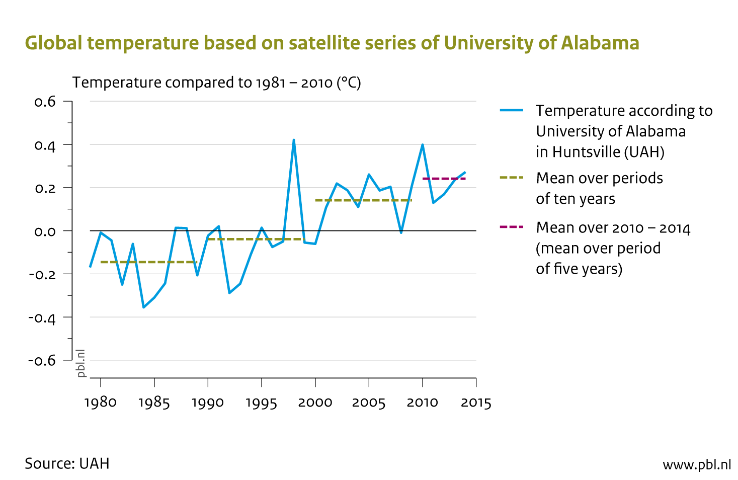
The UAH temperature series since 1979 (no satellites were available for the period before then). The green lines represent the mean over periods of 10 years. The purple line on the far right is the mean over the 2010–2014 period.
This is a re-post from My View on Climate Change
Guest post by Bart Strengers. Originally appeared as a news item on the PBL website.
Late 2009, in the run-up to the international climate conference in Copenhagen, PBL climate researcher Bart Strengers had an online discussion with climate sceptic Hans Labohm on the website of the Dutch news station NOS (in Dutch). This discussion, which was later also published as a PBL report, ended in a wager. Strengers wagered that the mean global temperature over the 2010–2014 period would be higher than the mean over 2000 to 2009. Hans Labohm believed there would be no warming and perhaps even a cooling; for example due to reduced solar activity.
At the request of Labohm, it was decided to use the UAH satellite temperature data set on the lower troposphere (TLT) (roughly the lowest 5 km of the atmosphere). These data sets are compiled by the University of Alabama in Huntsville. Satellites are used to measure radiation in the atmosphere, after which the temperature of the various layers of the atmosphere is derived using a complex algorithm.
According to the UAH today, temperatures appear to have been an average 0.1 °C warmer over the past five years than over the 10 years before that. Thus, Strengers has won the wager. The stakes: a good bottle of wine.
The UAH temperature series since 1979 (no satellites were available for the period before then). The green lines represent the mean over periods of 10 years. The purple line on the far right is the mean over the 2010–2014 period.
Precisely these UAH data, incidentally, show by far the most warming. The 4 other main global temperature series also show warming over the last 5 years, but one that is markedly lower (between 0.03 and 0.05 °C).
The table below shows the global warming, in °C, over the past 5 years, compared to the 10 years before that, for the five main global temperature series: the satellite series of the University of Alabama in Huntsville (UAH) and of the Remote Sensing Systems (RSS), and the surface temperature series of NASA, Climate Research Unit (CRU) and the National Climatic Data Centre (NCDC). CRU’s series are based on surface temperature measurements up to and including November 2014, as data on December were not yet available.

The large difference (by more than a factor of 3!) between the UAH and RSS satellite series is remarkable (also see the graph below). According to the UAH team, in which two well-known climate sceptics are involved, the difference is mainly caused by the fact that RSS partly bases its series on an old satellite (NOAA-15) with an increasingly lower orbit around the earth. This causes an error in measurements that is insufficiently corrected by RSS. All in all, it is a technical and complex issue, which possibly causes the differences, but it mainly shows how complicated the procedure is for determining global temperatures on the basis of satellite measurements. The three surface measurement series provide a much more consistent image of between 0.04 °C and 0.05 °C warming.
In addition, it is important to note that satellite and surface measurements are difficult to compare. This is due to the fact that satellite series are based on the temperature of the entire lower troposphere (the lowest 5 km of the atmosphere). The temperature of this atmospheric layer is, for example, much more sensitive to El Niños than surface temperatures are. This is illustrated in the graph below by the relatively high peak for the two satellite series at the time of the super El Niño in 1997–1998 and the less strong El Niño of 2010. The reverse is the case for La Niñas, such as the strong one of 2008; here, satellite series typically show a lower temperature.

Temperatures according to 2 satellite series (UAH and RSS). The purple line indicates the mean of the three surface temperature series. The satellite series show peaks in 1998 and 2010, as a result of El Niño, which are greater than those in the surface temperature series. The low satellite value for 2008 coincides with the opposite of an El Niño: La Niña. Note how the last 4 years in the RSS series are far below those in the other series. According to the surface temperature measurements, 2014 was the warmest year on record!
The graph shows that the last years in the RSS series clearly deviate from the other temperature series, with lower values of over 0.1 °C. This suggests that RSS rather than UAH is too low (as also claimed by the UAH team). The outcome of this discussion may lead to adjustments to one or both satellite series, as has been done in the past, particularly to the UAH series, on numerous occasions.
The surface temperature series further indicate that 2014 was the warmest year on record, even without an El Niño!
Strengers indicated at the time that ‘in light of the scientific uncertainties, I may lose, but this is not likely to happen’. He gave four reasons why a possible reduction in warming, or even a cooling could occur. Bold indicates that the related reason more or less became a reality over the past 5 years.
In addition, Strengers gave three reasons why he nevertheless expected to win:
The sum of all factors, thus, has led to continued warming. Below each of these factors is explained in more detail.
Continued (relatively) low solar activity
Over the past 5 years, the reduced solar activity has continued and, thus, likely also has slightly reduced global warming over that period. In the discussion at the time, Strengers wrote: ‘astrophysics […] cannot rule out the possibility of a long period of relatively low activity. This could lead to a reduction in warming of up to 0.4 °C (although 0.2 °C is more likely) over the coming 20 to 30 years.’ The past 5 years, therefore, are in keeping with the idea that such a period of relatively low activity is a fact, but the degree to which this reduction will actually continue over the coming years, or for how long it will go on, is still very uncertain.
Relatively high heat absorption by the (deep) oceans
Over 90% of the heat that is added to the climate system, particularly caused by the increase in greenhouse gases, ends up in the oceans. Only a few per cent is stored in the atmosphere. The remainder is absorbed by the land surface and ice sheets (which are therefore steadily melting). Variations in heat absorption can have a large impact on surface temperatures. According to a recent study by England et al., published in December 2013 in Nature, there has been increased heat absorption by the oceans since 2001, which since then has reduced warming by 0.1 to 0.2 °C. The added heat seem to be concentrated largely around the equator in the western part of the Pacific Ocean, at a depth of around 125 to 200 metres, which means it remains ‘hidden’ from the atmosphere. England and his team do not expect this heat storage effect to continue in this way and they project that, at a certain moment, temperatures at the surface level will begin to increase more rapidly. This could happen, for example, due to an El Niño with large amounts of heat being released suddenly, possibly causing temperatures to jump, as happened in 1997–1998 during the so-called super El Niño. Over the past months, a new El Niño seems to be developing. If this continues into 2015, this year may end up being even warmer than the record year of 2014.
A period of cooling due to incidental variations in the climate
The climate knows random variations. Strengers wrote that these may lead to longer periods of no warming or even cooling, even under a steady increase in greenhouse gas concentrations in the atmosphere. During the discussions, Strengers pointed to a study which shows on the basis of climate models that periods of up to 16 years of random cooling or non-warming may occur, even in an overall warming climate. Recent research shows that a combination of random factors likely has led to a reduction in temperature increases over the past 15 years (see the section below, ‘IPCC’s ‘best-estimate’ is that of a warming of 0.2 °C per decade’, for more details). However, this reduction in warming was not high enough for the past 5 years to be cooler than the decade before that.
Lower climate sensitivity than expected
The IPCC – the scientific body that inventories all knowledge on climate change every 5 to 7 years –stated in 2007 in its fourth assessment report (AR4) that climate sensitivity was likely (i.e. with a likelihood of 66%) between 2.0 and 4.5 °C, with a ‘best estimate’ of 3 °C. The fifth assessment report (2013) stated a range of 1.5 to 4.5 °C without giving a ‘best estimate’. The reason for the downward adjustment of the lower limit to 1.5 °C (at which it had been estimated since 1990) originated from a number of studies that pointed to the possibility of a low climate sensitivity. The ‘best estimate’ was not provided “because of a lack of agreement on values across assessed lines of evidence and studies” (i.e. based on all studies up to and including July 2012). All this, however, does not mean that climate sensitivity was ‘less than expected’. In fact, the only thing that can be concluded is that the value of climate sensitivity has become more uncertain.
Further increase in greenhouse gas concentrations in the atmosphere
Greenhouse gas concentrations in the atmosphere have steadily increased over the past 5 years. By late 2014, CO2 concentrations were at 399 ppm (399 molecules of CO2 per million molecules of air). Five years ago this level was 388 ppm. The increase is a direct result from an ever faster increase in CO2 emissions, particularly in countries such as India and China.
IPCC’s ‘best-estimate’ is that of a warming of around 0.2 °C per decade
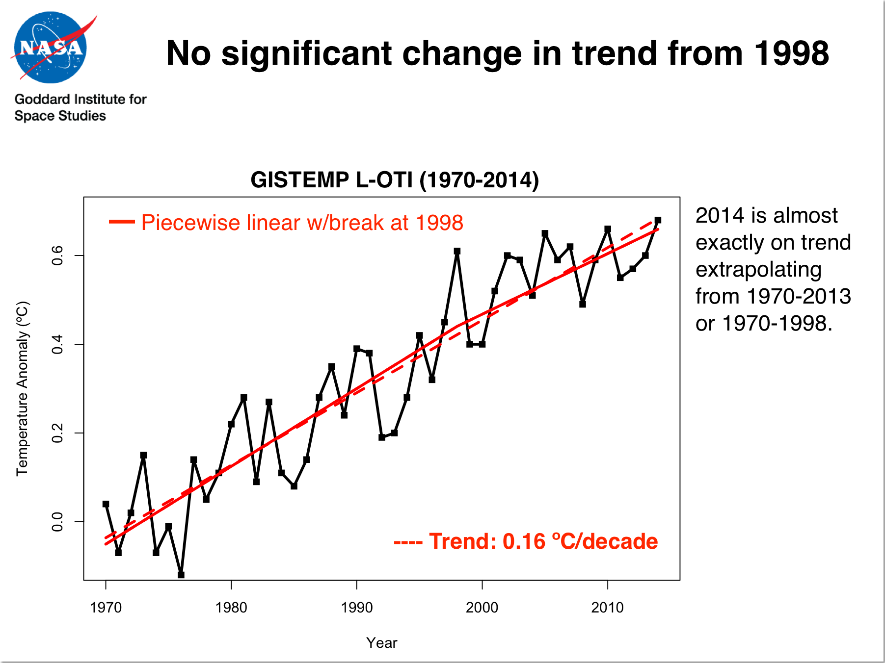
At the time of IPCC’s fourth assessment report, in 2007, a global warming of 0.2 °C was assumed for the current decade (2010–2019), particularly on the basis of climate model results. As discussed above, the degree of warming according to the UAH series, which is based on satellite measurements, was 0.1 °C over the last 5 years, compared to the mean of the 10 years before that. If this trend continues over the coming 5 years, our current decade will register a warming of around 0.15 °C – slightly less than the ‘best estimate’, but well within the projected range by the IPCC. However, all surface temperature series show a lower degree of warming, between 0.04 and 0.05 °C, over the past 5 years (see the section on ‘What causes the differences between the data series?’). Extrapolation over the 2010–2019 decade shows a total maximum warming of 0.08 °C [typo fixed]. This is in line with the discussion on the ´hiatus´ or the finding that the rate of warming over the past 15 years has been lower than in the 20 years before that, and also lower than the average outcome of many climate models. Note though that there is no significant change in trend from 1998. If climate model calculations take into account the ´random factors´ that cannot be predicted, such as the occurrence of El Niños, solar activity, and volcano eruptions, then models and observations seem much more in agreement.
The chances of overestimating climate sensitivity are smaller than those of underestimation
The IPPC’s fifth assessment report (2013) states that climate sensitivity is likely (66% probability) to be between 1.5 and 4.5 °C. It subsequently states that it is extremely unlikely (less than 5% probability) to be smaller than 1, and very unlikely (less than 10% probability) to be higher than 6. In other words, very low values are less likely than very high values, which substantiates the above statement.
Posted by Guest Author on Wednesday, 28 January, 2015
 |
The Skeptical Science website by Skeptical Science is licensed under a Creative Commons Attribution 3.0 Unported License. |