Note: the animated GIF in this post has been uploaded to the SkS Graphics Page, and used in the rebuttal to the myth Models are unreliable
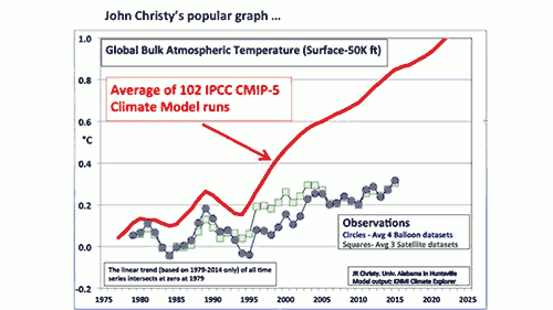
There’s a chart that’s become the favorite, go-to among those who distort climate science in order to justify opposition to climate policies. It’s shown up in many conservative media outlets like The Wall Street Journal and The Australian. It’s been presented by congressional Republicans’ favorite climate witness, John Christy, in recent hearings called by Ted Cruz and Lamar Smith.
The chart, which tries to compare estimates of the temperature of the Earth’s atmosphere to model simulations, is full of problems. Its purpose is clear – to make it appear that climate models are unreliable, and thus cast doubt on all of climate science and the tremendous risks posed by human-caused global warming. In other words, its purpose is to undermine climate policy efforts to reduce those risks by slowing global warming.
But as with all charts of such singular, unscientific purposes, it’s simply another example of cherry picked data being presented in a multiply misleading way, as the annotated version below illustrates.
To start, the observational and simulated model data are aligned at a single point at the start of the graph, in 1979. That choice serves to visually exaggerate any difference between the models and data. When doing this sort of comparison properly, climate scientists will average the data over a period called the “baseline,” usually between 10 and 30 years, so that any abnormally hot or cold single years in the data or model runs don’t throw off the alignment.
In fact, there was recently a paper published by Hawkins & Sutton showing that the choice of baseline can significantly impact how accurate the models appear in this sort of comparison, and thus it’s important to carefully choose an appropriate baseline period and perhaps test the comparison with multiple different periods. Christy didn’t even use a baseline period to begin with! NASA Goddard director Gavin Schmidt did the comparison using a baseline period of 1979–1988, and as you can see, the result looks quite different.
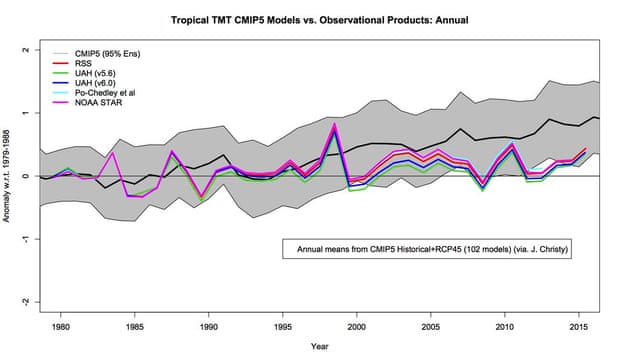
Temperature of the atmosphere to the mid-troposphere in the tropics, comparing model simulations (gray envelope) to observational estimates from satellites (colored lines). Illustration: Gavin Schmidt
Normally, climate contrarians love to harp on uncertainties. In fact, the whole argument against implementing climate policies to slow global warming hinges upon the backwards logic that we don’t know enough to take action.
However, in Christy’s chart, no uncertainty ranges are shown whatsoever. The difference this makes is clear in Schmidt’s version above, which shows the spread of individual climate model simulation runs (in grey), although doesn’t show the significant uncertainty in the observational data. When both are taken into account, the observations are consistent with the range of model projections.
Christy’s graph also averages together multiple different observational data sets, which aren’t in terribly close agreement. Gavin Schmidt shows some of these in his version of the chart. Christy’s version also somehow glosses over the fact that atmospheric temperature estimates from satellites and weather balloons diverge in recent years.
Another problem is that Christy doesn’t say which observational data sets he’s averaging together, but there are more than three groups that use satellite data to estimate the temperature of the atmosphere (Schmidt shows four of them in his chart). So he could be omitting some of the data that shows larger warming trends.
We don’t know because this is “blog science.” The analysis hasn’t been vetted by other experts, or published in a scientific journal after being subjected to peer-review. We don’t even know if Christy is accurately representing the climate models, because they don’t produce a simple “bulk atmosphere temperature” output. As such, Christy’s chart should be taken with a grain of salt.
The average elevation of the “bulk atmosphere” shown in Christy’s graph is 25,000 feet, which is just below the peak of Mount Everest, and not far below the elevation at which commercial aircraft generally fly. The temperature at such high elevations isn’t very relevant to humans.
We live on the Earth’s surface, so we care about the global surface temperature. And because we live at the surface, we have an easier time measuring the temperature here, so we know average global surface temperatures with more certainty than the atmospheric temperatures that Christy focuses on.
Atmospheric temperatures are just one of the many climate changes simulated by climate models. For example, climate models have done an excellent job predicting how much temperatures at the Earth’s surface would warm.
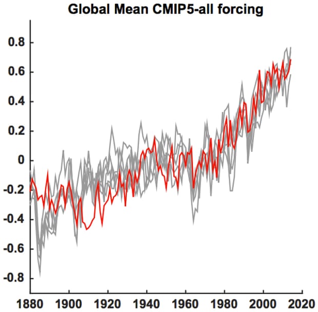
Global mean surface temperature series (red) along with five different Monte Carlo surrogates based on forced signal + ARMA noise realizations (gray) using CMIP5 all-forcing experiments. Illustration: Mann et al. (2015)
They’ve also done well predicting the rate of sea level rise.
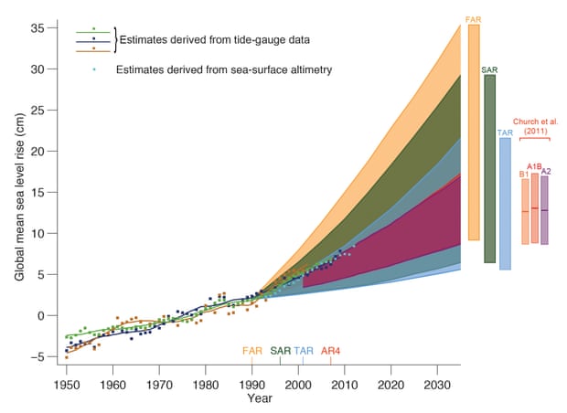
Estimated changes in the observed global annual mean sea level (GMSL) since 1950 relative to 1961–1990. Estimated changes in global annual sea level anomalies are presented based on tide gauge data and based on sea surface altimetry. The shading shows the largest model projected range of global annual sea level rise from 1950 to 2035 for the IPCC First Assessment Report (FAR), Second (SAR), Third (TAR), and for Church et al. (2011) based on the CMIP3 model results. Illustration: IPCC AR5
Arctic sea ice is actually declining a bit faster than models predicted.
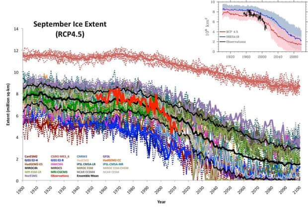
Projected vs. observed September Arctic sea ice extent. Illustration: Stroeve et al. (2012)
And then there’s ocean heating. Only about 1–2% of the energy imbalance causing global warming goes into warming the atmosphere, and only about 3% is used up melting ice. Over 90% of that energy goes into warming the oceans. And climate models are doing a very good job predicting the rate at which the oceans are heating up.
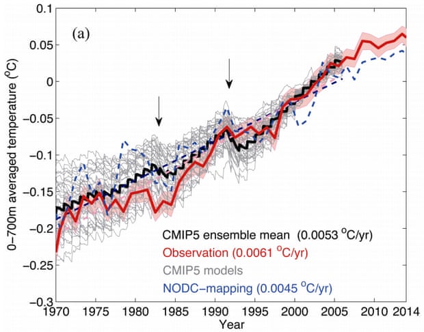
Observed (red) vs. CMIP5 model simulated (gray and black) ocean heat content. Illustration: Cheng et al. (2015)
As the statistician George Box said, “all models are wrong, but some are useful.” Climate models are certainly useful, and are doing a pretty darn good job predicting global warming. Their predictions have been far more accurate than those made by climate contrarians, who keep telling us that the Earth will start to cool any day now, as we keep breaking heat records.
Posted by dana1981 on Friday, 19 February, 2016
 |
The Skeptical Science website by Skeptical Science is licensed under a Creative Commons Attribution 3.0 Unported License. |