I started the “Global Warming Basics” posts specifically to help people who are interested in what’s going on, wondering whether we should do something about it and what, but want to keep things simple. My purpose isn’t to turn you into a scientist — it’s just to give you enough information to make sense out of what you hear about the subject. Alas, that can be all too difficult, because so many people, and politicians, are willing to distort the truth.
Perhaps the most basic question for a lot of people is “What has changed?” Has climate changed already? In what way? What have we seen in the last few decades that concerns us? What did we see last year? Last month? What’s been going on, really?
Let’s take a look.
The most obvious answer to the question “What’s Up?” is: temperature. Here’s the global average temperature each month from January 1880 through January 2016, according to data from NASA:
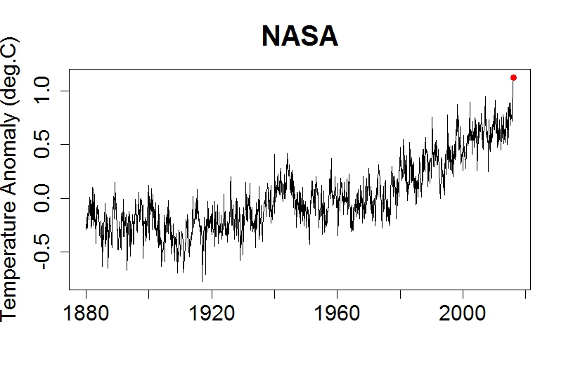
The red dot marks the most recent value, January 2016. It’s the hottest yet.
The graph actually shows temperature anomaly. That’s the difference between a given month’s average temperature, and what’s usual for that month. That way, we can remove the seasonal cycle. After all, a hotter-than-normal January isn’t going to be as hot as a colder-than-normal July — but it still means hotter than normal, i.e. that we’ve warmed up.
Here’s the same data from 1970 to now, a period during which Earth has warmed steadily:
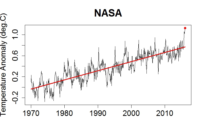
The red line is the trend. That’s extremely important because it helps us understand what to expect.
It’s obvious from looking at the graph that temperature fluctuates — a lot, and in mainly unpredictable fashion. But there’s more going on than just the fluctuations; there’s also a trend. On the planet we call Earth, that trend lately has been steadily upward. The fluctuations have most decidedly not been steady! And we can’t expect them to be, ever. But we have every reason to believe — from theory, from computer simulations, and from observations — that the trend will continue. Upward.
There’s a very powerful consensus among scientists, especially those who specialize in climate, that it’s really happening and it’s because of us. The world has already warmed 1C (degree Celsius, equal to 1.8 degrees Fahrenheit) above what it was before the industrial revolution, usually called “pre-industrial.” The prevailing view is that warming by 2C above pre-industrial means dangerous climate change, although lately many are coming to believe that even going 1.5C above pre-industrial is dangerous. Even less warming is trouble — but 1.5C or 2C is a real danger.
Even more than 2C is even more danger; some would warn that it brings disaster. But we’re already half-way there, and at the rate we’re going we’ll reach 2C before this century is out, well within the lifetime of people living today.
NASA isn’t the only organization that tracks global temperature. There’s also the National Climate Data Center, the Hadley Centre/Climate Research Unit in the U.K., a modified form from the Univ. of York in the U.K., independent data from a team organized by researchers from Berkeley Univ. in California, and the Japan Meteorological Agency, just to name the best-known. It would be redundant to show you data from all these organizations, because they all tell the same story: lots of fluctuation, record hottest recently, and most important: the trend is going up.
Those temperature estimates are for surface temperature, i.e. what’s happening near Earth’s surface. That’s particularly relevant because it’s where we live. But there’s also data, from both satellites and from balloon-borne instruments, of temperature in the atmosphere above the ground. Here’s the data for the lower atmosphere, called the troposphere (where most of our weather happens), from satellite data according to Remote Sensing Systems, an organization usually just called “RSS” (it’s the data for the middle-troposphere):

Again, the red dot is the latest value (February 2016), and it’s the hottest yet. Again, the red line is the trend, and it’s upward. Again, there’s plenty of fluctuation (a really big one in 1998, a really big one last month), lots of jiggling around, but again, the trend is a clue what’s to come.
The satellite data for temperature in the troposphere is what senator Ted Cruz likes to use when he claims global warming isn’t happening. But he doesn’t show all of it — just the part after 1997. That way, he can start his graphs with that big fluctuation in 1997-1998, so that fluctuation will look like it’s part of the trend. It isn’t. But Ted Cruz wants you to think it is, so he won’t show you what happened before that — proper context would reveal how shallow his argument is.
Of course, now that we’ve got another big fluctuation (the most recent month) it’s a lot harder to give the false impression of no warming. The fluctuation right now is big, about the same size as the fluctuation was in 1998. But the trendvalue is significantly higher than it was, so the temperature — trend plusfluctuation — is the hottest we’ve seen yet.
We’re seeing increased heat, not just at Earth’s surface and in the atmosphere, but in the oceans as well. Scientists don’t usually report deep-ocean temperature, instead they report the heat content itself, something called (appropriately) “ocean heat content.” Here’s what they get for the top 700 meters (about 2300 feet) of the ocean:
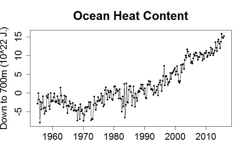
These aren’t averages for each month, they’re for each quarter-year. Again we see constant fluctuation, but again we see a trend — and it’s upward.
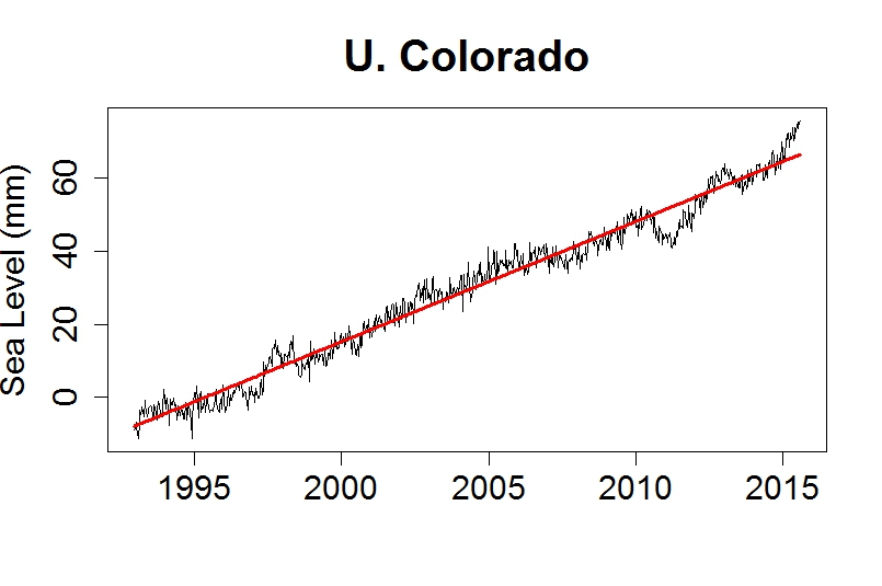
Yet another rising trend is of the height of the ocean itself: sea level. The melting of land-based ice puts more water in the oceans, and heating the oceans causes thermal expansion of seawater; both effects have caused the sea to rise. Here’s sea level since 1880, based on measurements by tide gauges around the world:

In a now-familiar story, you can see fluctuations but there’s also a trend. Upward.
Note that the trend doesn’t follow a straight line. Sea level has risen sometimes faster, sometimes slower, but it’s faster now, and in fact is faster than it has been for at least 2500 years (perhaps a lot longer). Since 1993 we’ve been measuring the height of the sea surface with satellites, which tell this story:
Fluctuations. Trend. Upward.
The effect of sea level rise is already being felt. Coastal cities are now prone to flooding, not just because of storms and torrential rainfall, but simply because of a very high tide. Miami has already spent hundreds of millions of dollars trying to combat it. They’re also threatened by seawater intruding into groundwater supplies, making them unfit for drinking and agriculture. And it’s not just Miami, flooding has increased all up and down the U.S. east coast, from Boston …
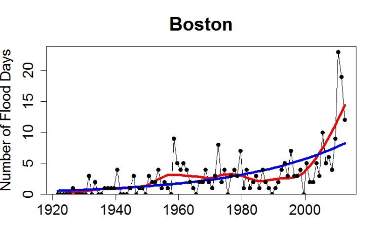
… to Atlantic City …

… to Texas.
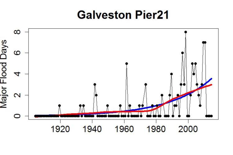
What’s more, when storms and torrential rainfall do happen, sea level rise makes the flooding at coastal regions worse. A lot worse. The folks who live near the coast in New York, New Jersey, New Orleans, know what I mean.
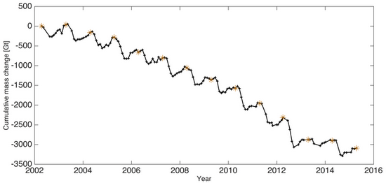
Not everything is up; some things are down. Most notable is the amount of ice in the world. Most of that is in the great ice sheets of Antarctica and Greenland, but they’ve been losing many billions of tons of ice each year. Here’s the change in the amount of ice in the Greenland ice sheet, measured by a satellite mission called “GRACE” (for “Gravity Recovery And Climate Experiment”):
It’s not just the great ice sheets that are melting, so are the world’s glaciers. Notall of them are wasting away, you can find a few that are actually growing … but the vast majority are disappearing right before our eyes. A recent survey by the world glacier monitoring service produced this summary for different regions of the world:
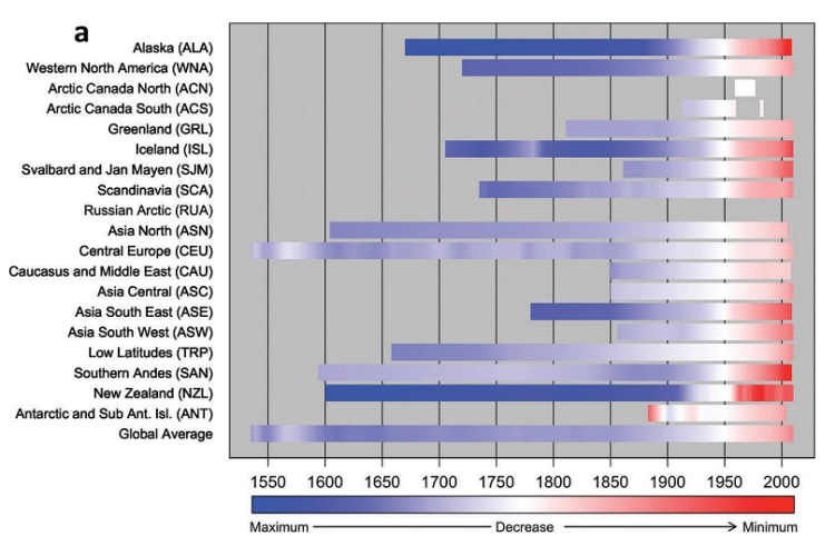
Not only are the vast majority of the world’s glaciers melting, they’ve recently been shrinking even faster.
Earth doesn’t just have ice in the great ice sheets and thousands of glacier, it also has sea ice, areas (mostly in the Arctic ocean and around Antarctica) in which the sea surface is frozen over (some places just during winter, in some places year-round).
Sea ice is one thing for which the seasonal cycle is obvious. Here’s the extent of sea ice in the Arctic:
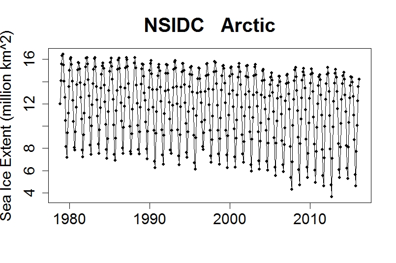
It peaks around March and bottoms out in September. Even with the seasonal cycle so obvious, it’s also obvious that Arctic sea ice is in decline. We can isolate the changes from the seasonal cycle by once again computing anomaly, the difference between each month’s value and what’s average for that month. That gives this:
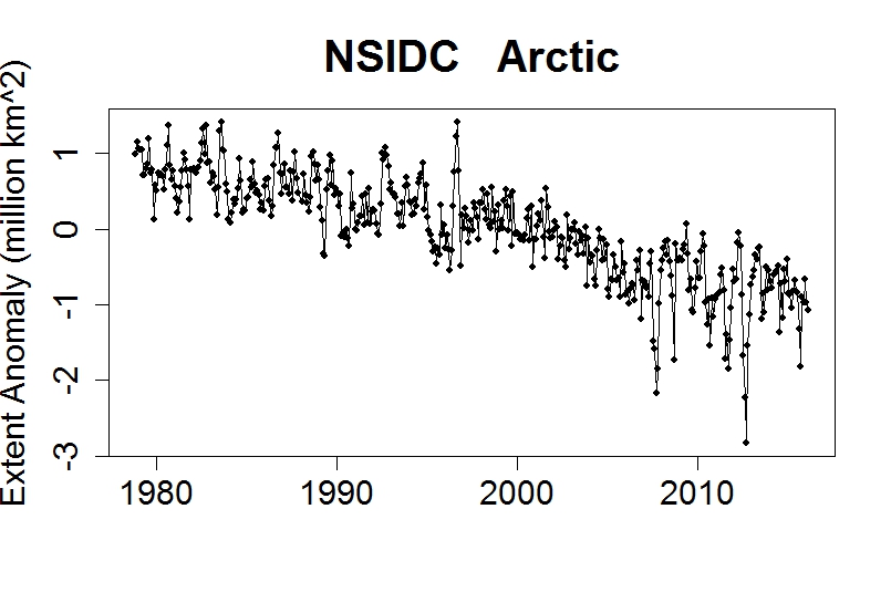
It makes the decline even more obvious. Lots of fluctuation, but also a sizeable trend, downward.
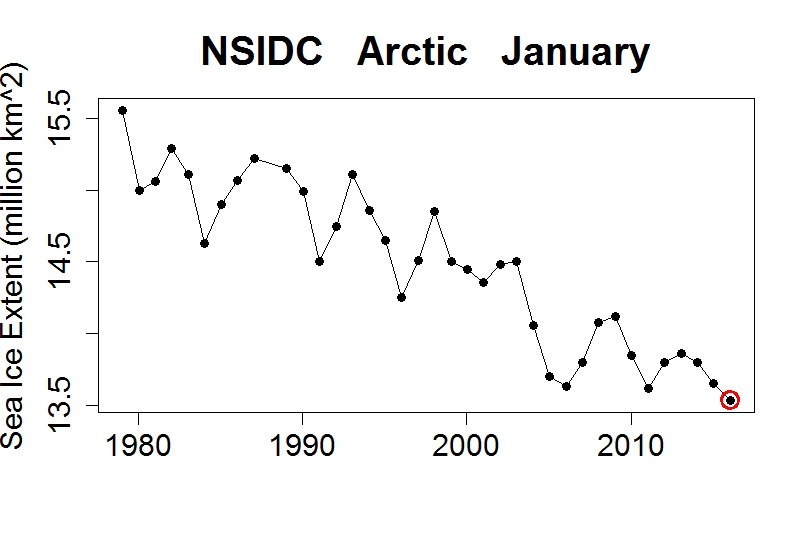
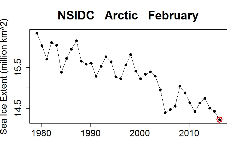
For many years the most startling thing was the end-of-summer decline in September Arctic sea ice. But it’s been declining year-round, and this year (2016) brought the lowest sea ice extent on record for the months of both January and February:
The southern hemisphere, Antarctic sea ice, tells a different story. If we plot sea ice extent anomaly (to shed the seasonal cycle), we can see that in the early 2010s it actually increased, although it has recently come back down:
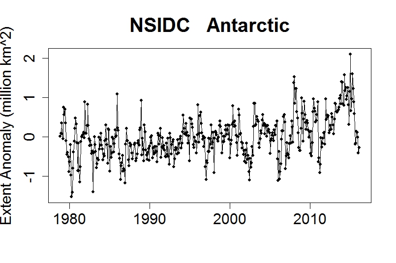
There are many theories about why this might be happening. One (probably at least part of the reason) is the melting of the Antarctic ice sheet! That dumps more fresh water into the ocean around Antarctica, and fresher water freezes more easily than saltier water. In any case, sea ice in the Antarctic has “bucked the trend” shown by the Arctic. It illustrates that, even in a rapidly warming world, things aren’t always quite so simple.
Many other changes have been seen. Species are migrating to higher latitudes and elevations because areas that used to be the right temperature for them, are no longer. Plants are blooming earlier than before. Heat waves have increased dramatically in some regions, too often exacting a heavy death toll. Some places have become more prone to severe drought, while others are more prone to severe flooding. The list goes on and on; the changes I’ve shown include many of the most important, but really only represent the “tip of the iceberg.”
In case you’re wondering why all these changes are taking place, there are many reasons. But the most important, by far, is the fact that we’re adding greenhouse gases to the atmosphere. The one we’re having the biggest impact on is carbon dioxide (CO2). Here’s the concentration of CO2 in our atmosphere, in “parts per million by volume” (ppmv), measured at the atmospheric observatory at Mauna Loa in Hawaii:
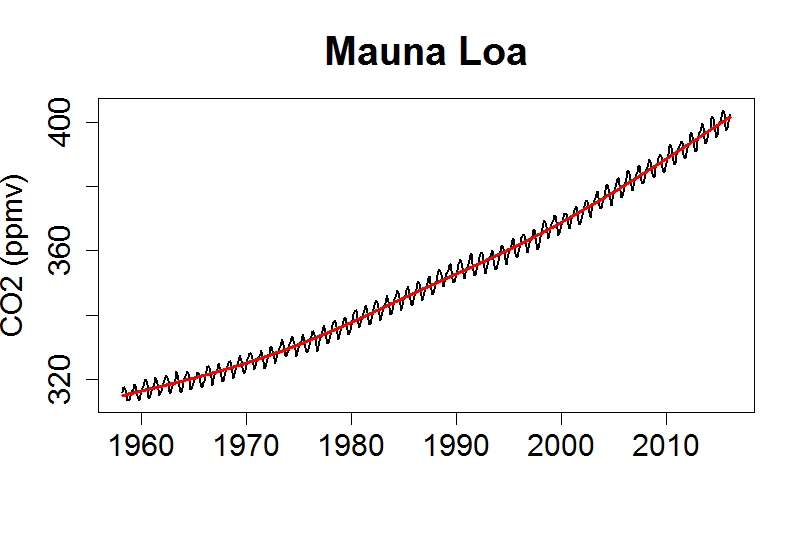
There are fluctuations, which are dominated by a seasonal cycle. But again, there’s also a trend. This particular trend isn’t following a straight line; the rate at which CO2 is increasing has been getting faster and faster.
Atmospheric CO2 is now higher than it has been in at least 800,000 years, possibly as long as 20 million years. CO2 is rising because we’re burning fossil fuels. It has carbon that’s been buried underground for millions of years, but now we’re digging it up and burning it, which results in CO2 that gets dumped in the easiest and cheapest way possible: in the atmosphere.
Despite certainty about why CO2 is on the rise, there are those who will dispute anything and everything, and a handful have even disputed that the atmosphere’s CO2 increase is because of us! There are a lot of crackpot ideas floated in the public discussion of climate change, but this is perhaps the crackpottiest of all. You can’t dig up billions of tons of carbon, burn it, dump all the CO2 into the air, then say that the rise of CO2 has nothing to do with us — unless you’re just not willing to accept the truth.
The more you investigate climate change, the more you’re bound to hear contrary claims. There are those who will tell you that global warming stopped, or that it’s about to stop, or that it never happened at all. Some will say it’s happening, but it’s not because of us. Others will admit it’s happening because of us, but insist it isn’t dangerous and won’t be. Every bit of evidence, including all that I’ve shown you, will be disputed by those who simply don’t wish it to be true. You’ll often hear the scientists who uncover this evidence accused of fraud — because attacking the messenger is an all-too-effective way to undermine the message.
But probably the most pernicious lie about global warming is the false claim, the scare tactic, that doing anything about it will “ruin the economy.” In truth, the surest way to ruin the economy is not doing anything about it.
