I love a simple, accessible graph that tells a clear story. A good example can be found in a new paper Climate Change: Past, Present, and Future (Chapman & Davis 2010). They plot past climate change over the past 1000 years together with what we can expect to experience over the next century. In a single figure, it tells us a number of stories which are fleshed out further in the paper.
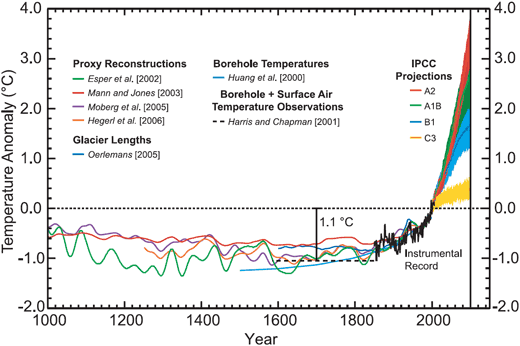
The past 1000 years feature a number of temperature reconstructions (the thin coloured lines) using various proxies such as tree rings, corals, sediments, glacier length and boreholes. The black dotted line is the average temperature over the decade centered on 1 Jan 2000. Having a variety of independent proxy methods gives us confidence that current temperatures are warmer than any experienced over the past 1000 years.
The coloured areas represent future projections of global temperature. The yellow projection (C3) tells us what would happen if CO2 concentrations were held steady at year 2000 levels. In other words, what would happen if humanity had suddenly stopped emitting CO2 in the year 2000 (but it's okay, we'd still be allowed to breath). Even in this imaginary case, temperatures would still continue to increase due to the thermal inertia of the oceans.
The other coloured areas represent the IPCC scenarios. Scenario A2 has global population increasing to 15 billion, accompanied by a warming of 4°C by 2100. Scenario A1B has population peaking at 8.7 billion and a mix of fossil-fuel and renewable energy use. This gives us a warming of 2.5°C. Scenario B1 assumes the same population growth as A1B but also assumes more aggressive cuts in CO2 emissions, leading to a warming of less than 2°C.
It's a simple graph but quite useful to have past temperature history displayed with various future scenarios, providing the benefit of both hindsight and foresight. All the emission scenarios present global warming in the 21st century that dwarfs warming seen in the past millennium. Of course, it's also important to realise that this is the global average. Warming at high latitudes may be 3 times as much.
Posted by John Cook on Thursday, 30 September, 2010
 |
The Skeptical Science website by Skeptical Science is licensed under a Creative Commons Attribution 3.0 Unported License. |