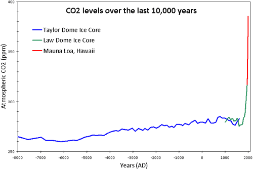
Figure 1: CO2 levels (parts per million) over the past 10,000 years. Blue line from Taylor Dome ice cores (NOAA). Green line from Law Dome ice core (CDIAC). Red line from direct measurements at Mauna Loa, Hawaii (NOAA).
What The Science Says:
CO2 levels are measured by hundreds of stations scattered across 66 countries which all report the same rising trend.
Climate Myth: CO2 measurements are suspect
"The Keeling curve, which is widely used to show the increase in CO2 emissions, is based on data from the top of Mount Mauna Loa in Hawaii. Mauna Loa is a volcano and it doesn’t seem to me that a volcano is the best place to be taking CO2 measurements" (disinter)
The following graph shows atmospheric CO2 levels over the last 10,000 years. It includes ice core data for CO2 levels before 1950. For values after 1950, direct measurements from Mauna Loa, Hawaii were used.
Figure 1: CO2 levels (parts per million) over the past 10,000 years. Blue line from Taylor Dome ice cores (NOAA). Green line from Law Dome ice core (CDIAC). Red line from direct measurements at Mauna Loa, Hawaii (NOAA).
Mauna Loa is often used as an example of rising carbon dioxide levels because its the longest, continuous series of directly measured atmospheric CO2. The reason why it's acceptable to use Mauna Loa as a proxy for global CO2 levels is because CO2 mixes well throughout the atmosphere. Consequently, the trend in Mauna Loa CO2 (1.64 ppm per year) is statistically indistinguishable from the trend in global CO2 levels (1.66 ppm per year). If global CO2 was used in Figure 1 above, the result "hockey stick" shape would be identical.
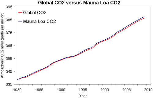
Figure 2: Global atmospheric CO2 (NOAA) versus Mauna Loa CO2 (NOAA).
The following video is a graphic example of where our data for CO2 levels comes from. It shows surface measurements of CO2 varying over different latitudes from 1979 to 2006. The graph is created by Andy Jacobson from the NOAA and includes a global map displaying where the measurements are coming from, a comparison of Mauna Loa CO2 to South Pole CO2 and the graph expands at the end to include ice core measurements back to the 19th Century.
Satellite data is consistent with surface measurements and present a fuller picture of global CO2 concentration. The next video shows global distribution of mid-tropospheric carbon dioxide. This data comes from the Atmospheric Infrared Sounder (AIRS) on the NASA Aqua spacecraft. Superiposed over the global map is a graph of carbon dioxide observed at the Mauna Loa observatory.
 |
The Skeptical Science website by Skeptical Science is licensed under a Creative Commons Attribution 3.0 Unported License. |