


 Arguments


The escalator rises again
Posted on 1 February 2023 by Ken Rice
One of the most effective, and successful, graphics developed by Skeptical Science is the escalator. The escalator shows how global surface temperature anomalies vary with time, and illustrates how "contrarians" tend to cherry-pick short time intervals so as to argue that there has been no recent warming, while "realists" recognise that even though there can be short-term variability, the long-term trend clearly indicates the reality of global warming.
A prominent example of the former was the one-time repetitious claim that it hadn't warmed since 1998, a year when there was a very strong El Nino. This claim persisted for quite some time, before - unsurprisingly - being dropped when it became clear that warming hadn't paused. However, this hasn't stopped others from making similar claims about more recent time periods, including, in 2019, a claim that we had just entered a cooling period. The escalator is a really nice way to illustrate the problem with such nonsense.
However, our escalator is now slightly dated. The original version went up until 2011, while the current version ends in 2015. We also noticed that Robert Rohde had updated the escalator and produced a staircase of denial. This motivated us to update our escalator, which we present below.
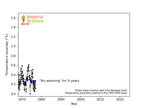
Source for data used in the graphic: Global mean monthly temperature anomalies, relative to the 1850-1900 mean, from Berkeley Earth.


Should you wish to predict the next time the "repetitious claim" will be reheated here is a 2016 preprint detailing a comprehensive mathematical model of "skeptical" behaviour:
https://GreatWhiteCon.info/2016/03/how-to-make-a-complete-rss-of-yourself/
"If Mr Monckton’s sausages leave an awfully bad taste in the mouth, it could be due to the fact that they are full of tripe."
Not to mention the obligatory quotation from Richard Feynman:
"Reality must take precedence over public relations, for nature cannot be fooled."
That's a good read, Jim. It's always time-consuming to show the errors in what appear to be simple results by people of the ilk of Monckton.
As for predictions of when they'll come up with a "new" claim of "no warming since..."? We've had a few years of La Nina and we're due for a warm El Nino year, so I'm going to guess we'll see if coming soon.
I've posted the following graphic in the past, and I just checked the timing of the original. I created it in July 2016. By then it was obvious that 2016 was going to be a warm year. By then it was obvious that a warm year like 2016 was going to give start to a whole new "no warming since..." meme.
So, my prediction is that the next one will probably be "no warming since 2023..." or "no warming since 2024..." We know that the false skeptic's material will be updated by a simple search/replace like this one.
Mr Monckton is still at it. As it is the start of the new month, we will find (within a few days) a Monckton article on WattsUpWithThat blog proclaiming that there has been No Warming for X years & Y months.
X = 8 years or thereabouts. Year after year, the figure remains roughly the same. The figure X is arrived at by a methodology which is a blend of abstruse & absurd. And despite the step-like escalation of surface temperature [well, actually the UAH air temperature series is used . . . which is appropriate for the level near Everest's peak]. Somehow, each pause of the escalation is seen (by Monckton & acolytes) as being conclusive proof that AGW has permanently halted, and that the climate scientists are all wrong.
I confess I enjoy reading the the Monckton article each month ~ there is typically a surge of 200 - 300 comments underneath . . . where the Usual Suspects (the acolytes, plus occasional awefully astute comments by the Great Man himself) manage to rehash much of their creed. They also get to express outrage against the few scientifically-minded commenters who enjoy pointing out the deficiencies of the whole exercise.
I feel sure that I count as a "scientifically-minded commenter", which is no doubt why Mr. Watts "banned" me from commenting on his eponymous blog many years ago.
We did offer Mr. Monckton the opportunity to reply publicly to the points raised by Bill The Frog’s culinary themed article, but for some reason he declined. As you point out he will no doubt shortly be proclaiming that there's been "101 months with no warming at all!".
Jim Hunt,
begorrah and to be sure, your appearance in the comments columns of Deniosphere blogs is always a welcome find. But, as you say, it can be an uphill battle to appear at all.
At WUWT, I was thinking of Nick Stokes and a small stalwart band of scientifically-minded commenters (largely pseudonymous) who provide most of the justification for any sane person to read that blog. Without them, WUWT would be little better than a tiresome repetitious display of anger, un-science, wingtardism, conspiracism, and childish sour-grapes. [Have I omitted anything there?]
Still, WUWT provides a useful exhibit of motivated reasoning and confirmation bias. Interesting & educational, for readers who wish to gaze into the Abysses which the human mind is capable of achieving.
Thank you for your kind words Eclectic.
My prediction proved to be reasonably accurate. The actual breathless headline from the WUWT abyss proved to be "The New Pause lengthens again: 101 months and counting …"
Meanwhile a new(ish) open access paper in Advances in Atmospheric Sciences asserts that there has been "Another Year of Record Heat for the Oceans"
"According to IAP/CAS data, the 0–2000 m OHC in 2022 exceeded that of 2021 by 10.9 ± 8.3 ZJ (1 Zetta Joules = 1021 Joules); and according to NCEI/NOAA data, by 9.1 ± 8.7 ZJ...
The salinity-contrast index, a quantification of the “salty gets saltier—fresh gets fresher” pattern, also reached its highest level on record in 2022, implying continued amplification of the global hydrological cycle."
Thanks for posting this OHC abstract.
Also, I find myself finding errors after I post. Is there some way to edit after posting?
[BL] No.There is no editing capability for regular users. Moderators can correct serious errors on request.
"The New Pause lengthens again: 101 months and counting …"
This astounds me. Have these denialists nothing better to do? Haven't they noticed a decades long repeating pattern of pauses of various sizes such that the temperature trend is step like? Havent they figured out by now that is how the warming trend progresses? Haven't they studied the obvious reasons it would be like this, such as the influence of solar cycles, etc,etc?
Are they really that lacking in thought? Or perhaps its more of an activity that just makes them feel good and gives them comfort by throwing mud at perceived enemies! Or perhaps its just wanting to protect vested interests for as long as possible. Or are they just cranks? Probably WUWT is an unholy alliance of all these types of personalities and more.
at WUWT : "The New Pause lengthens again: 101 months ..."
At my time of writing, that WUWT thread has 462 comments (in roughly 3 days). Much of it is frothing-at-the-mouth stuff, including some also having total denial of any climate effect of CO2.
The WUWT author uses only the UAH satellite-derived temperatures of the middle/upper troposphere. And uses a magic wand on the data.
Jim Hunt at #6 (above) touches on the hydrological cycle. Which is getting uncomfortably close to the Great Unmentionable at WUWT blogsite. Which is the continued rise of the elephantine Ocean Heat Content. The OHC rise knocks the author's [Mr Monckton's] claims into a cocked hat. But it is never mentioned on Monckton's regular monthly "New Pause Lengthens" article. Is such mention normally deleted by the WUWT moderators ~ or is the monthly Monckton bunfight so engrossing that the participants never lift their eyes to see the forest itself?
I think Monckton was using RSS TLTv3.3 for previous rants flat warming trends. He now switches to UAH TLTv6.0 although the wobbly nature of the TLT record is the cause of this nonsense (not the slow rate of TLT warming) and which record you use thrugh recent years (since 2005) doesn't make a significant difference. I think using RSS TLTv4.0 would today only provide a 100-month of flat trend.
The (Monckton) thread comments count is now up to 566. The monthly Moncktonian review of the New Pause has always been a very "popular" thread for the denizens at WUWT. This one, with over 500, is probably well above its usual level ~ but I am not going to bother to check back through the past 12 months of records there.
(A) As usual, Monckton turns a blind eye to Ocean Heat Content
(B) The long term UAH data trend continues to rise.
(C) The Monckton thread commenters have many wrangles about what constitutes statistical significance +/- confidence levels +/- Dr Pat Frank's peculiar ideas of Growth of Uncertainties. What many of them seem to have forgotten, is that this is not a case of statistical analysis of an abstract set of figures, but an analysis of physical events where the underlying causations are known.
I don't have the stomach to go over to WUWT, but the author of this blog post has also reposted it on his own blog, and here have been some interesting comments over there.
Willis Eschenbach, of WUWT fame, has commented, and posted a graphic of what he calls "an actual structural breakpoint analysis" for the period 1969 to now. He draws attention to the steps, claiming "this is not done by 'cherry picking' but by mathematical analysis, this brings up the interesting question … what is causing the jumps?".
Spolier alert: the "jumps" are an artifact of an inappropriate statistical analysis, and Willis has no explanation of any physical process to explain them, other than a brief hand-waving about El Nino events. But let's entertain the possibility for a bit.
I pointed out in the comments over at ATTP's that the month-to-month change in the anomalies (i.e., this month's anomaly minus last month's) shows absolutely nothing to suggest that the anomaly goes through any sort of slow change (as suggested by the linear segments) interspersed with sudden jumps. If you take the entire BEST record, this is what you see for the month-to-month change in the anomalies:
The month-to-month change in anomaly looks pretty much like random noise to me. If Willis' hypothesis of meaningful "jumps" existed, I'd expect to see periods of fairly steady (i.e., unchanging) anomalies, with periodic short episodes of large changes representing "jumps" No such structures appear in the data.
I also took the information from the graphic Willis posted of his "structural breakpoint analysis" and added the six line segments he created to a graph of the 1969-present BEST anomalies. This is a reproduction of that information from Willis' graph:
The point I made over at ATTP's is that Willis six-segment linear fit to the data provides virtually no additional statistical explanation of the overall data. The equation on the above graphic is the basic linear fit for the entire data set. Note that the r2 value is 0.81. The regression standard error is 0.145 C - indicating the remaining "unexplained" variation in the residuals from the regression.
How much better does Willis do with six line segments (and five breakpoints)? Not much. The accumulated standard error from the six regression lines is 0.133C - just over 0.01C better than the simple fit.
If we look at some statistics for the six segments, we get:
The P-values do not account for auto-correlation (there is lots), so take them with a grain of salt. But only one of Willis' line segments looks remotely significant, and the r2 values are very low.
The fact is that nearly all of the statistical explanation in Willis' analysis is in the jumps, but there is no reason (looking at the month-to-month changes) to expect this analysis to come up with anything that is not just a misrepresentation of the noise.
A basic linear regression does almost as well, with only two parameters (slope and intercept). In Willis' analysis, he needs 17 parameters: six lines (slope and intercept = 12 parameters) and five break-point years. This is not particularly parsimonious.
Splitting a gradual increase in the data into a bunch of "jumps" that are a function of noise may be entertaining, but it's not particularly scientific.
Bob Loblaw @12 ,
please do not go over to WUWT to point out their problems. There is already a (very) small number of scientific commenters in the WUWT threads, but they are continually shouted down by all the loons, goons, and crackpots (including the intelligent Willis Eschenbach and Rud Istvan).
The scientific commenters there are clearly getting some pleasure from tweaking the Denialist noses, yet they do not (and cannot) bring enlightenment to the denizens of WUWT. But their comments are worth reading in themselves ~ and I enjoy reading them, and I manage to stomach (or skip over) the comments by the crazies who oppose them.
There is a Schadenfreude to be had in viewing the statements by the crazies ~ it is challenging & interesting to recognize & unravel their logical errors and motivated reasonings. That gets tiresome rather quickly, though.
# Thank you Bob, for your statistics criticism. My own education stopped at Statistics-101 and has rusted since ~ so I cannot do much more than apply common sense to what I see at WUWT. And it is always impressive how *determinedly* the WUWT-ites refuse to use common sense in their thinking.
[Excuse repeated scathing of WUWT ~ but WUWT deserves no less.]
I asked someone to think about climate related trends in terms of what a stock market chart might look like. People can immediately picture and understand that a stock price which declines over the course of a year would nevertheless have periods of days or weeks or months wherein the price was rising and falling and rising and falling, only to close lower at the end of the year. So when looking at charts describing levels of atmospheric carbon dioxide, or surface air tempertures, a short segment in the middle of the graph won't be an accurate representation of what's happening (i.e., a global warming "pause"); looking at the long term is what matters. People intuitively understand stock market charts and I've found this analogy to long term climate changes to be helpful in day to day conversation.