Climate Science Glossary

Term Lookup

Enter a term in the search box to find its definition.

Settings

Use the controls in the far right panel to increase or decrease the number of terms automatically displayed (or to completely turn that feature off).

Term Lookup

Settings


All IPCC definitions taken from Climate Change 2007: The Physical Science Basis. Working Group I Contribution to the Fourth Assessment Report of the Intergovernmental Panel on Climate Change, Annex I, Glossary, pp. 941-954. Cambridge University Press.

Home Arguments Software Resources Comments The Consensus Project Translations About Support

Twitter Facebook YouTube Mastodon MeWe

RSS Posts RSS Comments Email Subscribe


Climate's changed before
It's the sun
It's not bad
There is no consensus
It's cooling
Models are unreliable
Temp record is unreliable
Animals and plants can adapt
It hasn't warmed since 1998
Antarctica is gaining ice
View All Arguments...


Username
Password
New? Register here
Forgot your password?

Latest Posts

Archives

How much will sea levels rise in the 21st Century?

What the science says...

Select a level... Basic Intermediate

Observed sea levels are actually tracking at the upper range of the IPCC projections. When accelerating ice loss from Greenland and Antarctica are factored into sea level projections, the estimated sea level rise by 2100 is between 75cm to 2 metres.

Climate Myth...

Sea level rise predictions are exaggerated

"Professor Niklas Mörner, who has been studying sea level for a third of a century, says it is physically impossible for sea level to rise at much above its present rate, and he expects 4-8 inches of sea level rise this century, if anything rather below the rate of increase in the last century. In the 11,400 years since the end of the last Ice Age, sea level has risen at an average of 4 feet/century, though it is now rising much more slowly because very nearly all of the land-based ice that is at low enough latitudes and altitudes to melt has long since gone." (Christopher Monckton)

The two main contributors to sea level rise are thermal expansion of water and melting ice. Predicting the future contribution from melting ice is problematic. Most sea level rise from ice melt actually comes from chunks of ice breaking off into the ocean, then melting. This calving process is accelerated by warming but the dynamic processes are not strongly understood. For this reason, the IPCC didn't include the effects of dynamic processes, arguing they couldn't be modelled. In 2001, the IPCC Third Assessment Report (TAR) projected a sea level rise of 20 to 70 cm by 2100. In 2007, the IPCC Fourth Assessment Report (4AR) gave similar results, projecting sea level rise of 18 to 59 cm by 2100. How do the IPCC predictions compare to observations made since the two reports?


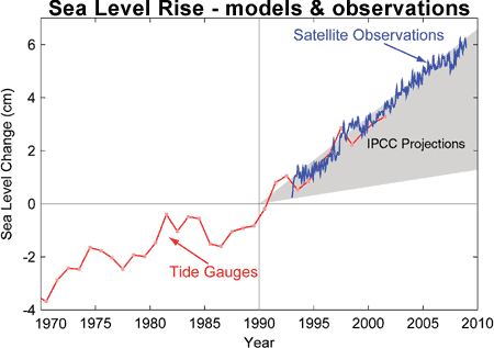
Figure 1: Sea level change. Tide gauge data are indicated in red and satellite data in blue. The grey band shows the projections of the IPCC Third Assessment report (Allison et al. 2009).

Observed sea level rise is tracking at the upper range of model predictions. Why do climate models underestimate sea level rise? The main reason for the discrepancy is, no surprise, the effects of rapid flow ice changes. Ice loss from Greenland, Antarctica and glaciers are accelerating. Even East Antarctica, previously considered stable and too cold, is now losing mass. Considering the importance of rising sea level to a human population crowded around coastlines, how can we predict sea level with greater accuracy?

An alternative way to predict future sea level rise is a semi-empirical method that uses the relationship between sea level and global temperature (Vermeer 2009). Instead of modelling glacier dynamics, the method uses model projections of global temperature which can be calculated with greater confidence. Sea level change is then derived as a function of temperature change. To confirm the relationship between sea level and temperature, observed sea level was compared to reconstructed sea level calculated from global temperature observations from 1880 to 2000. Figure 2 shows the strong correlation between observed sea level (red line) and reconstructed sea level (dark blue line with light blue uncertainty range).

 
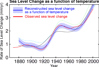
Figure 2: Observed rate of sea-level rise (red) compared with reconstructed sea level calculated from global temperature (dark blue with light blue uncertainty range). Grey line is reconstructed sea level from an earlier, simpler relationship between sea level and temperature (Vermeer 2009).

The historical record shows the robustness of the relationship between sea level and global temperature. Thus, global temperature projections can be used to simulate sea levels into the future. A number of different emission scenarios were used, based on how carbon dioxide emissions might evolve over the next century. Overall, the range of projected sea level rise by 2100 is 75 to 190 cm. As you get closer to 2100, the contribution from ice melt grows relative to thermal expansion. This is the main difference to the IPCC predictions which assume the portion of ice melt would diminish while thermal expansion contributes most of the sea level rise over the 21st Century.


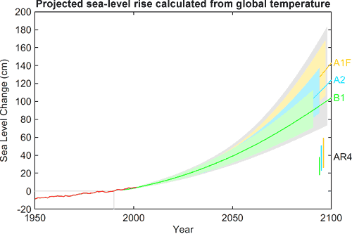
Figure 3: Projection of sea-level rise from 1990 to 2100, based on IPCC temperature projections for three different emission scenarios. The sea-level range projected in the IPCC AR4 for these scenarios are shown for comparison in the bars on the bottom right. Also shown in red is observed sea-level (Vermeer 2009).

Figure 3 shows projected sea level rise for three different emission scenarios. The semi-empirical method predicts sea level rise roughly 3 times greater than the IPCC predictions. Note the IPCC predictions are shown as vertical bars in the bottom right. For the lowest emission rate, sea levels are expected to rise around 1 metre by 2100. For the higher emission scenario, which is where we're currently tracking, sea level rise by 2100 is around 1.4 metres.

There are limitations to this approach. The temperature record over the past 120 years doesn't include large, highly non-linear events such as the collapse of an ice sheet. Therefore, the semi-empirical method can't rule out sharp increases in sea level from such an event.

Independent confirmation of the semi-empirical method is found in a kinematic study of glacier movements (Pfeffer 2008). The study examines calving glaciers in Greenland, determining each glacier's potential to discharge ice based on factors such as topography, cross-sectional area and whether the bedrock is based below sea level. A similar analysis is also made of West Antarctic glaciers (I can't find any mention of calculating ice loss from East Antarctica). The kinematic method estimates sea level rise between 80 cm to 2 metres by 2100.

Recent observations find sea level tracking at the upper range of IPCC projections. The semi-empirical and kinematic methods provide independent confirmation that the IPCC underestimate sea level rise by around a factor of 3. There are growing indications that sea level rise by the end of this century will approach or exceed 1 metre.

Intermediate rebuttal written by John Cook


Update July 2015:

Here is a related lecture-video from Denial101x - Making Sense of Climate Science Denial

This rebuttal was updated by Judith Matz on September 13, 2021 to replace broken links. The updates are a result of our call for help published in May 2021.

Last updated on 8 July 2015 by pattimer. View Archives

Printable Version  |  Offline PDF Version  |  Link to this page

Argument Feedback

Please use this form to let us know about suggested updates to this rebuttal.

Further viewing

From Peter Hadfield (potholer54 on YouTube) published on Dec 5, 2021

Compare two photos 130 years apart and it looks as though sea levels haven't moved. So why all the fuss about rising sea levels and evacuating islands? This video closes the yawning gap between internet myths and science.

Comments

1  2  3  4  5  Next

Comments 1 to 25 out of 102:

  1. I have been looking for more information in this area as most sea level graphs only go back 15,000 years to the end of the last ice age. 125,000 years ago the earth had 300ppm of CO2 and a temperature 5c warmer than now and sea levels rose 6 to 9 meters. We now have CO2 at 390ppm and rising so what can we expect from sea levels? 6 to 9 meters would be very modest. There needs to be more information on this. A sea level rise of one meter wipes out Holland, London, Florida, and many other industrial areas so we need to know how soon.
  2. Not to blow my own horn, but there's a fairly extended (some say positively puffy) article on London and rising sea level here: Grappling With Change: London and the River Thames From all accounts London will cope w/1m, it's the upside of uncertainty in projections that inspires consternation. Other places are a different story w/1m. The common thread is that of getting in line for lots of money, early.
  3. Has there been a response to the issues raised by Dr. Nils-Axel Mörner? He does seem to be a very experienced expert on sea levels. Am interested in evaluating his comments on sea level inferred from earth's rotation rate and other approaches. He seems quite convinced that the claims of AGW vis a vis sea levels are spurious. Feedback welcome. The interview is at http://www.climatechangefacts.info/ClimateChangeDocuments/NilsAxelMornerinterview.pdf.
  4. #3: "evaluating his comments ... " An interview that starts off with "there's no one who's beaten me" didn't do much for his credibility. When I got to "if the radius of the Earth increases, because sea level is rising, then immediately the Earth’s rate of rotation would slow down", I lost interest. Assuming the earth to be a uniform sphere (its not) one meter of additional radius would increase the earth's rotational inertia by a factor of 1.00000031, slowing the rotation rate in proportion. But the mass of water that moves outwards is much much less than the mass of rock that stays put, so the effect would be far less. His use of the familiar ice skater analogy is hardly appropriate in this context: rather than extending her arms changing her rotation rate, this is more like a drop of water on the tip of her nose. Then there's Wikipedia: Mörner has written a number of works claiming to provide theoretical support for dowsing. He was elected "Deceiver of the year" by Föreningen Vetenskap och Folkbildning in 1995 for "organizing university courses about dowsing...". As I said, I lost interest.
  5. Zoltan @ 3 -"He does seem to be a very experienced expert on sea levels." And water divining too. Which doesn't really say much for his credibility either. In fact he wrote some garbled paper trying to scientifically provide evidence for water divining, thereby effectively ending all credibility. But why rely on the word of one rather confused man, when we have satellite altimetry data and tidal gauges?:

    Response:

    [DB] Updated graphic from this url:

    http://sealevel.colorado.edu/files/2014_rel3/sl_ns_global.png

  6. Sea level rise has historically been at 2mm/year. Has that changed?
  7. Harry Seaward, have a look at the graph immediately above, in Rob Painting's post, and you will see the current rate shown. However, looking at the graph today, the rate has gone up to 3.1mm/yr. (If, like me, you get a mainly blank page at that link, just scroll down)
  8. The difference between the two graphs is actually due to the 'Inverse Barometer' being applied or not.
  9. Harry, if you check Rob's graph (comment 5) you will see that the rate since the 90's (when satellite measurements of sea level become available) is around 3mm/year. So the indications are that the rate of sea level rise has increased from the 20th century average of 1.6mm/year. Some of the world experts on sea level rise are Australian scientists at CSIRO, they have good webpage with some good information on SLR here.
  10. I'm looking at a TOPEX/Poseidon Jason-1/2 (CSIRO)chart showing 200 mm of rising ocean level over 130 years. This equates to a 1.54 mm per year rise. There is not much of an uptick in the curve corresponding to the increased levels of CO2. Let me check Rob's graph. Yes, it now shows 3.0 mm rate of rise. Almost double. Now I will go back to the latest CSIRO to see if they have similar data. Darm, you guys are making a believer out of me yet!
  11. Hey, At first, I was a GW skeptic, but then in the past year or so, I've really begun to study this data, and I'm convinced now that not only is GW real, but it's probably worse that what has been predicted. I'll just link to a few obvious sources for paraphrase and reference of data. http://www.grinzo.com/energy/2009/09/02/how-fast-is-greenland-melting/ http://nsidc.org/arcticseaicenews/ http://neven1.typepad.com/blog/2011/09/piomas-august-2011.html Ok, anyway, what I noticed several months back is the simple fact that each year you have a net melting, whether sea ice or land-locked ice caps, it would be obvious that the change in albedo of that area of "net melted ice" should "pay" for it's own melting within a certain number of years. I assumed it would be an exponential, and was playing around with a bunch of different numbers for the exponential growth, but I didn't know exactly what numbers to use, until a few weeks ago. Suffice it to say that one of the articles I linked to above shows how the five year average rate of melting of ice in greenland is doubled in ten years. As it turns out, just recently, it was discovered that the rate has actually quadrupled in about 10 years! Well, what curve does that follow? And is it related to the PIOMAS data? Well, yes it is! Greenland and Sea Ice are treated as two seperate entities, but they follow the exact same curve: A power series. IN the article above, "Lou" mentions what appears to be a linear progression for average annual net melting of Greenland as: 200, 220, 240, 260, 280. But these were not measurements, these were his rough estimates based on 5 year total loss data, going all the way back to 1996 @ 96km^3 to 280km^3 in 2008. Well, what I would suggest is this is not a linear function. The numbers appear linear because he "reconstructed" the annual rates by just assuming it's increasing, but the increase isn't linear, it's exponential. In 12 years it increase from 96 to 280(or 300), but assuming this is exponential increase, then we have: 280/96 = 2.916 12th root of 2.916 = 1.0933 we have the form: c*n^x x = time (delta) in years. n = 1.0933 c = 96 (initial melt rate) Now if we actually plot these numbers for whole number X, starting at 0: 96, 105, 115, 125, 137, 150, 163, 179, 195, 214, 234, 256, 279, 300,..., c*n^x.... is very close to linear: 100, 120,140,160,180,200,220,240,260,280,300... You can see how if you were trying to "post-dict" this from field observations with normal noise in raw data, you might mistake this for a linear relationship due to errors in instrumentation, rounding, etc. But what you find with the Piomas sea ice data is the same. If you take the 5 year running average of the data (the 10 year running average is too "back heavy" to be useful,) and starting from the last time there was a volcanic rebound in the 5 year average data: 5 year running average of Piomas volumetric sea ice data, starting with 1990: 90 14.86 91 14.38 92 14.32 93 13.78 94 13.58 95 13.08 96 13.12 0.04+ 97 12.78 98 12.64 99 12.10 00 12.06 01 11.78 02 11.28 03 11.02 04 10.82 05 10.46 06 9.82 07 8.96 08 8.34 09 7.74 10 6.78 11 5.84 Now, this is no big deal, its an exponential, which they calculated on the site, but the kicker here is that the 5 year average is itself "back heavy" by about 3 years. If you put this data in a graphing calculator and do a regression, you'll find that the five year running average is zero within 8 years. (I interpret negative numbers on this curve after the "0" as additional net losses to Greenland.) But what I noticed is you can smooth out the raw data from Greenland and the Sea Ice by simply noticing that they are the same thing, and adding the net losses together. The average net annual loss in sea ice in the past 5 years was: 9000 - 4300 = 4700 4700/5 = 940km^3 The net annual loss from Greenland is currently "somewhere" around 300km^3. 940 +300 = 1200km^3 annual loss. If you then assume the entire ice mass is following about the same curve, you can start with 1200 as the coefficient, c, above, to run a series to see the rate of melting. After all, the cumulative energy which is currently going into melting Sea Ice will have to go "somewhere" once the Sea Ice is melted. The obvious place is the ice on Greenland land mass... Since I know from the data that the exponent is certainly somewhere between 1.072 and 1.15, you can calculate the minimum and maximum times of Arctic Sea Ice melt (5 to 8 years,) and the minimum and maximum times of Greenland meltdown... Yes, I've done this, and God help us all, it's much faster than anyone publicly claims. NOw to show how well this works predictively, we can take the piomass data and pick two "good", adjacent data points which are not corrupted by the volcanic rebound peaks (or alternatively pick two adjacent 5 year running averages...) Take the difference between 86 and 87: http://neven1.typepad.com/blog/2011/09/piomas-august-2011.html 15.9-15.2 = 0.700 (thousands) Now, let's pick an exponential, say 1.15, a big one, and project the curve forwards. 2011 - 1987 = 24 years -0.700 * 1.15^24 = - 20.03 Well, you say that's too much? Well, not hardly, we have to add back the volcanic rebounds of years following major volcanoes: 86 1.4 (columbia) 91 1.4 Pinatubo 94 1.4 (unknownst ot me) 96 2.5 (Monsurat) 01 1.2 Hekla 07 0.6 Furnas (I think) Total: 8.5 Now -20 + 8.5 = -11.5 And of course, This is statistically close to the real data set's end: 15.9 -11.5 = 4.4 1986 minus 1.15 exponential projection to 2011, and adjusted for volcanic winter rebounds... Very close to the actual 2010 and 2011 data of 4.4 and 4.3 respectively... Therefore, 1.15 is probably the correct exponent when you factor out volcanism, but the real exponent with volcanism is a bit lower than that... This suggest Greenland is melting much, much faster than anyone publicly claims, as in possible total meltdown within the century, and that is NOT an exaggeration... To top it all off, World population growth is 1.1% per year, and then you figure all the countries modernizing, the net CO2 production will probably increase at a rate of about 22% per decade for at least the next 2 or 3 decades...Which gives something link another 90PPM CO2 by 2040, or around +57PPM by 2030...
  12. 11, Wade, Hansen argued your case in Paleoclimate Implications for Human-Made Climate Change (2011). The bulk of the paper tries to compare current events to the last time this happened (although over much longer time frames) in the Cenozoic, Holocene and Pliocene, when sea levels rose 15m to 25m. You would be most interested in section 6, however, on sea levels, where he argues that the increase is probably not linear, but instead with a potential doubling every ten years, with all of the nasty implications that you yourself have tuned into.
  13. Now remember, I'm not an expert and don't claim to be. I'm just johnny come lately looking at some data and stuff... Now Sea level rise from 1995 to 2005 was around 30mm to 40mm, depending on who's data you believe, and 20CM in the last several decades of recorded history. Thermal expansion of water suggests we should get about 7cm of sea level rise per degree celsius of temperature increase of the ENTIRE HYDROSPHERE. We have it that Sea Surface Temperatures average has increased by about 0.9...but that is just the SST, that is not the average of the entire water collumn... Which is what is misleading about this. The oceans do not top heat very well. The majority of the depths of the oceans is in total darkness, and most of the heat concentrates near the surface, sort of like your swimming pool, the top few inches are hot, but the lower levels are cooler. So in reality, almost no thermal expansion actually happens unless you heat the entire water collumn by an average of 1C, but to do that, you'd really need to heat the surface temps by an average of about 2C or 3C, if not more than that, to make up for the fact hot water doesn't mix well in the deep oceans. At any rate, the amount of heat required to heat the hydrosphere by the average 1C to cause 7CM of thermal expansion (as vertical sea level rise) is 4200 * 1.4*E21 Joules. This is equal to 391 days worth of the entire solar constant, if all energy went to nothing other than raising the temperature of water, which is completely ridiculous and we obviously know isnt happening. Anyway, by the time you take this into consideration, and SST has only risen about 0.9C average in the past century, then thermal expansion is probably no more than like 3cm or 4cm, but whatever. Let's give them 7cm from thermal expansions, just for the sake of argument...that's still leaves about 13cm from melting glaciers and ice caps during the modern records, and what? At least 20mm to 30mm in the past 10 years from melting Greenland and the West Antarctic sheets alone... If I calculate that out based on approximate surface of the ocean, I get a volume of 7.6485E12 meters cubed. This is 7648.6 kilometers cubed worth of ice melted in the past 10 years. Keep in mind, I'm just using "round" anecdotal numbers. http://www.grinzo.com/energy/2009/09/02/how-fast-is-greenland-melting/ Sn = 120* sum(1 + 1.1 + 1.1^2 + 1.1^3 + ... ... + 1.1^n) 120 being about the "known" annual net melting of 2001... I got a total, using round numbers, of 2100. Ok, well, admittedly, that's only around 1/4th of the total we need, however, we didn't consider Antarctica is probably melting at about the same rate, and we didn't consider other ice melting and snow packs melting earlier, and things of that nature. If you double it to make up for Antarctica probably melting similarly, that gives around 4200. Then double it again to make up for the fact field researchers and satellites may be missing some of the action when looking directly at the glaciers, (but the sea levels catch all whether or not man does).... So I explained at least half the Sea level rise of the past decade as definitely being from "known" ice cap melt in Greenland and Antarctica, and assume field researchers and satellite interpretations have missed as much as half of the losses.... Even if I'm off by 50% one way, or 100% the other way, it only makes a 5 to 10 year difference in the long term projection of when Greenland totally melts... At any rate, it shows that the Sea level rise data relates very, very well, almost exactly 1 to 1 with then measured melting rates of Greenland over the past 10 to 20 years....
  14. Sea level is rising. But rising at a fairly constant rate: And we should remember that during the Holocene Climatic Optimum, Greenland encountered significantly more summer sunshine for thousands of years around six thousand years ago, but this did not effect sea level:
    Response:

    [DB] Note: This comment was moved from the Climate and Sea Level: An Emerging Hockey Stick thread to this one.

  15. It is clear in the above post's graphs and elsewhere, sea level rise has been accelerating through the past 100 years - I presume that ClimateWatcher's first graph, covering just 23 tide records, is an unrepresentative sample. The thrid graphic presented by ClimateWatcher is, to me, one of the scariest graphs in climate science, but I suspect ClimateWatcher does not realise why. It shows Meltwater Pulse 1A, a sea level rise of about 20m in <~500 years, which happened abruptly at some point during the melt of the last great ice sheets (though two great ice sheets remain). Thus the graph shows what is possible when you begin to melt a big ice sheet - sudden pulses of accelerated sea level rise. There was little warning as to the onset of the Pulse 1A, no gradual ramping up to it. Of course, something like that might not happen this time, or it might be thousands of years down the line. But the climate forcing this time is much bigger, and who'd like to deal with a sea level rise rate of >~60mm/yr? Wetsuit fitting sessions for St Mark, Galileo, the Statue of Liberty, the Old Course and anything else within a short distance of the coast? Or invest in a sea wall manufacturing company...
  16. As I understand it the Greenland Ice Sheet is unlikely to collapse because it is surrounded by coastal mountains. The Antarctic sheets are however a different story.
  17. Greenland inner plateau is high as well. However, you dont need to melt all of it to get very wet.
  18. The GIS is drained very effectively by many marine-terminating ice-streams which penetrate into the heart of the sheet. Thus, decadal doublings of mass loss which can raise global sea levels by several meters per century have been observed in the paleo record. So even if the GIS takes several centuries to largely collapse, the ramifications of the collapse will still be felt this century. By us, our descendants and our civilization. The West Antarctic Ice Sheet (WAIS) is another story...
  19. CW#14:"Greenland encountered significantly more summer sunshine for thousands of years around six thousand years ago, but this did not effect sea level:" Excellent point! We're seeing more melting now than we did 6kya, yet (according to your unsubstantiated statement) we're now seeing less sunshine. Wonder what must be different now compared to then. Could it be that there's something in our atmosphere now that is keeping things warmer? Something that wasn't present in as large a concentration during 6kya?
  20. Mods: Rob Painting's graphic @ 5 must have been moved. When I try to display it, I see "The requested URL /files/current/sl_global.jpg was not found on this server." On topic, am I right in thinking that the rate of melt of the ice sheets will increase as they lose mass: ie the more they melt, the faster they melt? Something about mass relative to surface area, if I recall my high-school physics from 45 years ago.
    Response:

    [DB] Graphic updated.

  21. I keep reading about the comfortable 2m upper boundary of SLR this century, but can't shake the images from Greenland of roaring rivers discharging meltwater this past summer. With the fantastic shrinkage in arctic sea ice volume, and this past year loss of area, I'd be interested in seeing a followup post on the prospects for nonlinear SLR. I got interested in this when searching for comments on Pfeffer's kinematic constraints paper from 2008, and stumbled onto this excellent blog post: http://earlywarn.blogspot.com/2012/01/hansen-still-argues-5m-21st-c-sea-level.html Would be interested in the SkepSci crew's take on those questions.
  22. So, you have a prediction for sea level rise of between 750mm and 2,000mm, but have observed rates of 3.2 mm/yr.  100 yrs X 3.2 mm/yr = 320 mm.  So, essentially, you are predicting a substantial increase in the rate of rise.Looking at the graph of sea level rise for years 1880-2000,there does not seem to be much chance of your prediction coming true. 

    A gradual, steady increase from 3.2 to 11.8 mm/yr by 2100 would give you an increase of 750 mm after 100 years, but it would take a steady increase to 36.8 mm/yr by 2100 to give you a 2 M rise.  I realize you are not advocating for a linear increase, but the math is simpler and the principle remains the same.


    Bottom line, I don't see any evidence that these increases are occurring, so I don't see the predictions happenning.

  23. Kevin @22:

    Um, you did look at figure 2, that shows the rate of change increasing? Tamino's blog also has a recent post discussing some of this. And you realize how the rate of increase is going to depend on both warming of the oceans and increased loss of land ice, and future predictions of this don't depend on the past trend alone?

    First, you ignore the fact that the rate of increase has gone up over the last hundred years, then you do a linear extrapolation, then you admit that a linear extrapolation is not appropriate, but then you claim that the principle is the same and go ahead and do it anyway, because "the math is simpler"????

    Bottom line: you don't see any evidence because you're working so hard not to see it.

  24. Kevin @22, unless serious efforts to reduce carbon emissions are in place soon, the temperature difference between the end of this century and now will be approximately that between the coldest period of the Last Glacial Maximum and the Holocene average.  That temperature difference was enough to cause a 100 meter rise in sea level in 8,000 years, the equivalent of a 12.5 mm per year rise.  Given that, a rise of  0.785 meters (increase of annual rate to average rate of deglaciation over the century), or 1 meter (increase to deglaciation rate over fifty years, and constant thereafter) are likely.

    Given that the Earth warmed gradually after the LGM so the actual differential in temperature during the last deglaciation was less than what we will experience, and given that periods of much faster melting occurred durring the last deglaciation, sea level rises of 2 meters are a distinct possibility.

  25. I would agree with the Post 14 statement that the rate of rise - using a consistent measurement method - is constant. What tidal guage data set/type, or satelite data, do give different estimates, but none appear to show a change in rate. Can't take one data set in C and then go to F and say you have a temp acceleration, as an example of the same..

1  2  3  4  5  Next

Post a Comment

Political, off-topic or ad hominem comments will be deleted. Comments Policy...

You need to be logged in to post a comment. Login via the left margin or if you're new, register here.

Link to this page


The Consensus Project Website

THE ESCALATOR

(free to republish)


© Copyright 2024 John Cook
Home | Translations | About Us | Privacy | Contact Us