Climate Science Glossary

Term Lookup

Enter a term in the search box to find its definition.

Settings

Use the controls in the far right panel to increase or decrease the number of terms automatically displayed (or to completely turn that feature off).

Term Lookup

Settings


All IPCC definitions taken from Climate Change 2007: The Physical Science Basis. Working Group I Contribution to the Fourth Assessment Report of the Intergovernmental Panel on Climate Change, Annex I, Glossary, pp. 941-954. Cambridge University Press.

Home Arguments Software Resources Comments The Consensus Project Translations About Support

Twitter Facebook YouTube Mastodon MeWe

RSS Posts RSS Comments Email Subscribe


Climate's changed before
It's the sun
It's not bad
There is no consensus
It's cooling
Models are unreliable
Temp record is unreliable
Animals and plants can adapt
It hasn't warmed since 1998
Antarctica is gaining ice
View All Arguments...


Username
Password
New? Register here
Forgot your password?

Latest Posts

Archives

Are surface temperature records reliable?

What the science says...

Select a level... Basic Intermediate Advanced

Independent studies using different software, different methods, and different data sets yield very similar results. The increase in temperatures since 1975 is a consistent feature of all reconstructions. This increase cannot be explained as an artifact of the adjustment process, the decrease in station numbers, or other non-climatological factors.  Natural temperature measurements also confirm the general accuracy of the instrumental temperature record.

Climate Myth...

Temp record is unreliable

"We found [U.S. weather] stations located next to the exhaust fans of air conditioning units, surrounded by asphalt parking lots and roads, on blistering-hot rooftops, and near sidewalks and buildings that absorb and radiate heat. We found 68 stations located at wastewater treatment plants, where the process of waste digestion causes temperatures to be higher than in surrounding areas.

In fact, we found that 89 percent of the stations – nearly 9 of every 10 – fail to meet the National Weather Service’s own siting requirements that stations must be 30 meters (about 100 feet) or more away from an artificial heating or radiating/reflecting heat source." (Watts 2009)

There are three prominent reconstructions of monthly global mean surface temperature (GMST) from instrumental data (fig. 1): NASA's GISTEMP analysis, the CRUTEM analysis (from the University of East Anglia's Climatic Research Unit), and an analysis by NOAA's National Climatic Data Center (NCDC).


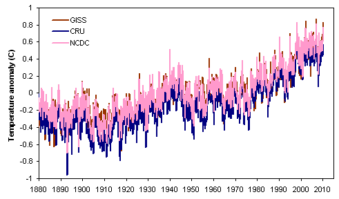
Figure 1. Comparison of global (land & ocean) mean surface temperature reconstructions from NASA GISS, the University of East Anglia's CRU, and NOAA NCDC.

How reliable are these temperature reconstructions? Various questions have been raised about both the data and the methods used to produce them. Now, thanks to the hard work of many people, we can conclude that the three global temperature analyses are reasonable, and the true surface temperature trend is unlikely to be substantially different from the picture drawn by NASA, CRU, and NOAA.

The three GMST analyses have much in common, though there are significant differences among them as well. All three have at their core the monthly temperature data from the Global Historical Climatology Network (GHCN), and all three produce both a land-stations-only reconstruction and a combined land/ocean reconstruction that includes sea surface temperature measurements.

Let's explore the reliability of these reconstructions, from several different angles.


The data and software used to produce these reconstructions are publicly available

Source code and data to recreate GISTEMP and CRUTEM are available from NASA and CRU websites. (The data set provided by CRU excludes a fraction of the data that were obtained from third parties, but the results are not substantially affected by this).

The software has been successfully tested outside of NASA and CRU, and it works as advertised

Both GISTEMP and CRUTEM have been successfully implemented by independent investigators. For example, Ron Broberg has run both the CRUTEM and GISTEMP code. In addition, the Clear Climate Code project has duplicated GISTEMP in Python. Figure 2 shows a comparison of the output of the GISTEMP reconstruction process as implemented by NASA and by Clear Climate Code ... but since the results are identical, the second line falls exactly on top of the first.

Comparison of GISTEMP and CCC
Figure 2. The GISTEMP land/ocean temperature analysis as implemented by NASA and by Clear Climate Code. Results of the two analyses are effectively identical.

Similar results can be obtained using different software and methods

Over the past year, there has been quite a flurry of "do-it-yourself" temperature reconstructions by independent analysts, using either land-only or combined land-ocean data. In addition to the previously-mentioned work by Ron Broberg and Clear Climate Code, these include the following:

(There are probably others as well that we're omitting!)

Most recently, the Muir Russell investigation in the UK was able to write their own software for global temperature analysis in a couple of days.

For all of these cases, the results are generally quite close to the "official" results from NASA GISS, CRU, and NOAA NCDC. Figure 3 shows a collection of seven land-only reconstructions, and Figure 4 shows five global (land-ocean) reconstructions.


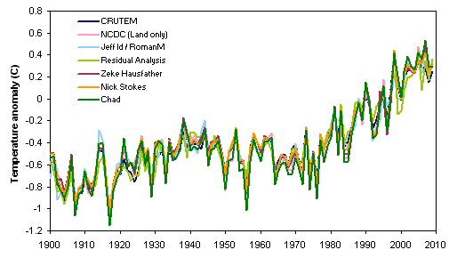
Figure 3. Comparison of land-only reconstructions, 1900-2009. Note that the NASA GISS reconstruction using only land stations is not shown here, because it is conceptually different from the other analyses.


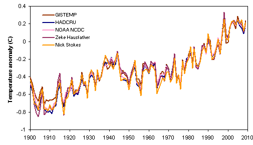
Figure 4. Comparison of land-ocean reconstructions, 1900-2009.

Obviously, the results of the reconstructions are quite similar, whether they're by the "Big Three" or by independent analysts.

The temperature increase is not an artifact of the GHCN adjustment process

Most of the analyses shown above actually use the raw (unadjusted) GHCN data. Zeke Hausfather has done comparisons using both the adjusted and raw versions of the GHCN data set, and as shown in fig. 5, the results are not substantially different at the global scale (though 2008 is a bit of an outlier).

GHCN
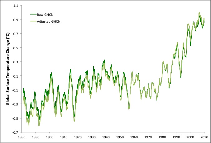
Figure 5. Comparison of global temperatures from raw and adjusted Global Historical Climatology Network (GHCN) v3 data, 1880–2010 (analysis by Zeke Hausfather).

The temperature increase is not an artifact of declining numbers of stations

While it is true that the number of stations in GHCN has decreased since the early 1990s, that has no real effect on the results of spatially weighted global temperature reconstructions. How do we know this?

  • Comparisons of trends for stations that dropped out versus stations that persisted post-1990 show no difference in the two populations prior to the dropouts (see, e.g., here and here and here).
  • Other data sets that don't suffer from GHCN's decline in station numbers show the same temperature increase (see below).

One prominent claim (by Joe D'Aleo and Anthony Watts) was that the loss of "cool" stations (at high altitudes, high latitudes, and rural areas) created a warming bias in the temperature trends. But Ron Broberg conclusively disproved this, by comparing trends after removing the categories of stations in question. D'Aleo and Watts are simply wrong.

The temperature increase is not an artifact of stations being located at airports

This might seem like an odd statement, but some people have suggested that the tendency for weather stations to be located at airports has artificially inflated the temperature trend. Fortunately, there is not much difference in the temperature trend between airport and non-airport stations.

The temperature increase is present in other data sets, not just GHCN

All of the above studies rely (mostly or entirely) on monthly station data from the GHCN database. But it turns out that other, independent data sets give very similar results.


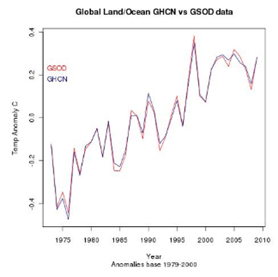
Figure 6. Comparison of global temperatures from the Global Historical Climatology Network (GHCN) and Global Summary of the Day (GSOD) databases. (Analysis by Ron Broberg and Nick Stokes).

What about satellite measurements of temperatures in the lower troposphere? There are two widely cited analyses of temperature trends from the MSU sensor on NOAA's polar orbiting earth observation satellites, one from Remote Sensing Systems (RSS) and one from the University of Alabama-Huntsville (UAH). These data only go back to 1979, but they do provide a good comparison to the surface temperature data over the past three decades. Figure 7 shows a comparison of land, ocean, and global temperature data from the surface reconstructions (averaging the multiple analyses shown in figs. 3 and 4) and from satellites (averaging the results from RSS and UAH):


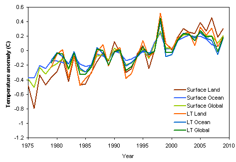
Figure 7. Comparison of temperatures from surface stations and satellite monitoring of the lower troposphere.

Reanalysis data sets also show the same warming trend.  A reanalysis is a climate or weather model simulation of the past that incorporates data from historical observations.  Reanalysis comparisons by Vose et al. (2012) and Compo et al. (2013) find nearly identical global surface warming trends as in the instrumental record (Figure 8).

Compo Fig 1

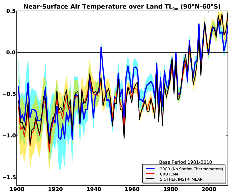
Figure 8. Temporal comparison of near-global land (90°N–60°S) 2 meter air temperature anomalies (TL2m) between 20CR and station-temperature based estimates. Red curve: global TL2m anomaly series from CRUTEM4, black curve: the average of five additional station-temperature datasets, and blue curve: the 20CR. 95% uncertainty ranges are shown for CRUTEM4 (yellow fill) and 20CR (blue fill) and their overlap (green fill).  From Compo et al. (2013)

A paper by Anderson et al. (2012) created a new global surface temperature record reconstruction using 173 records with some type of physical or biological link to global surface temperatures (corals, ice cores, speleothems, lake and ocean sediments, and historical documents).  The study compared their reconstruction to the instrumental temperature record and found a strong correlation between the two (0.76; Figure 9).

Fig 1

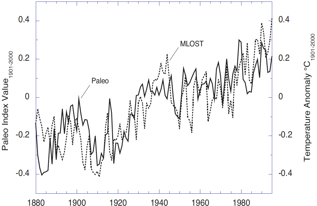
Figure 9. Paleo Index (solid) and the merged land-ocean surface temperature anomalies (MLOST, dashed) relative to 1901-2000. The range of the paleo trends index values is coincidentally nearly the same as the GST although the quantities are different (index values versus temperature anomalies °C).

We'll end by looking at all the surface and satellite-based temperature trends over the entire period for which both are available (1979-present). What are the trends in the various data sets and regions? As shown in fig. 9, the surface temperature trends over land have a fair amount of variability, but all lie between +0.2 and +0.3 C/decade. Surface trends that include the oceans are more uniform.


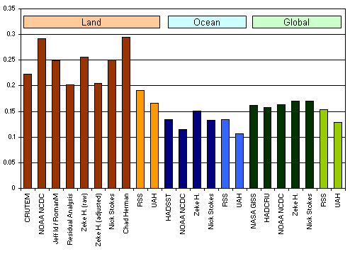
Figure 9. Comparison of temperature trends, in degrees C per decade.

Overall, the satellite measurements show lower trends than surface measurements. This is a bit of a puzzle, because climate models suggest that overall the lower troposphere should be warming about 1.2X faster than the surface (though over land there should be little difference, or the surface should be warming faster). Thus, there are at least three possibilities:

  • The surface temperature trends show slightly too much warming.
  • The satellite temperature trends show slightly too little warming.
  • The prediction of climate models (about amplified warming in the lower troposphere) is incorrect, or there are complicating factors that are being missed.

It should be noted that in the past the discrepancy between surface and satellite temperature trends was much larger. Correcting various errors in the processing of the satellite data has brought them into much closer agreement with the surface data.

Conclusions

The well-known and widely-cited reconstructions of global temperature, produced by NASA GISS, UEA CRU, and NOAA NCDC, are replicable.

Independent studies using different software, different methods, and different data sets yield very similar results.

The increase in temperatures since 1975 is a consistent feature of all reconstructions, and is also a feature found in reconstructions from natural temperature proxy measurements.  This increase cannot be explained as an artifact of the adjustment process, the decrease in station numbers, or other non-climatological factors.


Sources

Advanced rebuttal written by dana1981


Last updated on 5 July 2015 by pattimer. View Archives

Printable Version  |  Offline PDF Version  |  Link to this page

Argument Feedback

Please use this form to let us know about suggested updates to this rebuttal.

Related Arguments

Further reading

Denial101x video

Here is a related lecture-video from Denial101x - Making Sense of Climate Science Denial

Additional video from the MOOC

Kevin Cowtan: Heat in the city

Comments

1  2  3  4  5  6  7  8  9  10  11  12  13  14  15  16  17  18  19  20  Next

Comments 1 to 25 out of 530:

  1. The error is 2.6 K: http://biocab.org/NOAA_vs._UAH.jpg
    Response: When comparing temperature anomalies, the trend is what you want to look at, not absolute values. Temperature anomaly is calculated as the difference from a baseline average. Often different temperature datasets use different baseline periods (eg - 1960 to 1990 or 1978 to 2000). However, the trend will be the same regardless of the period. In the case of the NOAA vs UAH graph, the trends are very similar. An additional complication is there is much uncertainty in satellite data regarding correcting for long term satellite drift (see our Satellite page for more info)
  2. I strongly suspect that periodic physical checks are needed to avoid error. Poor ventilation, not painting when needed, allowing vents to get partially or totally blocked, etc. can have a heating effect on these stations independent of UHI. The abortive attempt to hide the station locations and an awful lot of hot air floating around the Internet about how physical checks aren't really necessary makes me think that the universal commitment to quality is more theoretical on some people's part than real.
  3. John V on CA has results using "good" stations and "bad" stations (per Watts definitions) and comes to results extremely close to GISSTEMP. GISSTEMP is closest to the curve obtained withe the "good" stations. There is a post and a link on Rabett Run, you can also go directly to CA.
    Response: Phillipe, thanks for the comment. You can find Rabett's post here plus here's a direct link to John V's graphs on Climate Audit. What I find particularly interesting is Steve McIntyre's response:
    "...keep in mind that USHCN stations have already passed one cut of quality control. They are represented as “high quality” stations. No such representations have been made for stations in China - they may be good, they may be bad, they may have had accurate records throughout the turmoil of Chinese history, they may not. I don’t know how you’d even begin to place “confidence” in the Chinese record in the absence of such analysis."
    Eg - he concedes that in spite of all those photos of air conditioners and car parks, the US stations are actually good quality. So instead, let's go pick on China instead!
  4. Obviously, it is beyond unthinkable at CA that the evidence pre-existing their "scrutiny" could have any validity. Let us not forget what exactly the CA/McIntyre effort basic drive consists of, in summary: we do not like what the scientific research concludes on this issue, so we are going to review every single detail, fishing for anything that could lead in the direction that we favor. On the other hand, the actual climate research follows this basic process: study climate, by considering the physical laws governing atmospheric dynamics and their interrelations, by modeling these on supercomputers, by gathering as much data as can be obtained and carefully sorting through and analyzing that data. It is not very suprising that when the CA folks actually get into a scientific way to analyze data, their conclusions confirm the prior ones from real researchers.
  5. If what you say is true than McIntyre's error is in conceding that the sites in the US are good. I believe what he is conceding is that they are likely to be better or at least no worse than elsewhere. http://wattsupwiththat.wordpress.com/ So far, with 40% of this supposedly gold standard network surveyed, 85% of sites are showing errors in the site and operations that are likely to be > 1 degree C. In other words larger than the entire GW signal to date. People promoting catastrophic warming scenarios frequently refer to graphs from this very data set to support their claims. It is clear that we just can't make a useful reconstruction of surface temperatures using these sites. I am somewhat dismayed by the idea that modeling with supercomputers is somehow climate research. While going thru and evaluating actual data and methodology is apparently not what "real researchers" do. I could have saved so much time in grad school if I had only known that computer models were real research and the actual data wasn't. Modeling is a valuable tool in science but the models are not evidence in any way of what is happening in the climate. Adding the word supercomputer does not make it science, in fact quite the opposite. By the way since Cray isn't making them anymore what makes a computer super these days?
  6. How do NASA and GISS claim to remove UHI effects? The term Urban heat island is probably not a good one it is a land use issue not simply an urban issue. A station in NYC central park may be just fine while a station in the middle of nowhere can be bad if it is placed on asphalt next to an air conditioner exhaust. Last month, Energy and Environment 18:985-995, published a not very kind report by Douglass J Keenan. It shows that two well known and influential papers, that are still the basis for the IPCC claim that UHI has been removed from the global climate data sets, are in fact incorrect. In fact the word used is Fraudulent. While Tom Wigley has sent me some references on sea temperature that seem pretty robust, (thank you sir) the land surface temperature measurements are in serious trouble. It looks to me like at least half of the late 20th century warming signal in this data is about to vanish. We really need a data set that is not badly contaminated, that uses sites that are properly placed and maintained, USHCN is not it.
  7. It would be nice to give us a little more detail, W.A., especially considering the terminology employed (fraud). What are the papers criticized by E&E (which is itself not a peer-review science publication)? Have the authors responded to it? This journal is far from being an objective reliable source: http://pubs.acs.org/subscribe/journals/esthag-w/2005/aug/policy/pt_skeptics.html This article treats of how UHI affects observations: http://www.ncdc.noaa.gov/oa/climate/research/population/article2abstract.pdf As mentioned higher, John V has plotted the data from the "good" sites (per Watts definition) and has found very good agreement with GISSTEMP, so they must be doing something right. It is worth emphasizing that Watts'effort concentrated on micro site effects, a different problem than UHI; nevertheless, agreement was still there in the data. I would not venture to say that climate science dispenses from going through and evaluating actual data. This RC post is of some interest as to how the UHI effect is accounted for: http://www.realclimate.org/index.php/archives/2007/07/no-man-is-an-urban-heat-island/#more-454 I believe the post references this article: http://www.ncdc.noaa.gov/oa/climate/research/population/article3abstract.pdf Is that one of the 2 criticized by E&E?
  8. Another point, mentioned by John Cook on the "More on Urban Heat Island" thread, is that there is also good agreement with satellite data and weather balloon data, both immune to the micro site effects as well as UHI. If these were really that much of a factor, there would be significant discrepancies, but all the trends are consistentt.
  9. I mistakenly included both UHI and microsite effects in the previous remark, UHI would still apply.
  10. Yes satellite nad balloon data have good agreement, but isn't the important thing here that neither of them correlate well with the surface record? I should have sited the actual papers but I thought you'd rather look yourself now I'll have to remember to dig it back out.
  11. I don't see too much of a disagreement on this graph: http://tamino.files.wordpress.com/2007/08/global2.jpg The sources are: http://data.giss.nasa.gov/gistemp/ http://www.remss.com/pub/msu/monthly_time_series/
  12. "Historic Climate Network surface stations only" That is the graphs and data sets that your post leads to Phillippe. (http://data.giss.nasa.gov.gistemp/) Exactly the portion of the data with which there is a problem. Compare to the Balloon data and the satellite data where the anomally is much smaller, and the trend much less pronounced. Yes the graphs from the surface data agree with the graphs from the surface data.
  13. What are you talking about? The comparison is between GISS and MSU. You say there is a problem with USHCN and by extension GISS, this graph compares the "problem data" to satellite (MSU). Did you even look at REMSS.com? Tamino's graph puts them nicely together so as to compare the trends. I don't see any significant disagreement. You say: "Compare to the Balloon data and the satellite data where the anomally is much smaller, and the trend much less pronounced." Graphs, sources, data, links?
  14. I don't know what you want me to look at. The giss data is clearly surface only. From what I can actually open of the remss data which appears to be similar style data sets, it is clear that the anomaly numbers in the remss data are very much lower that the giss data. for 2007 for instance they appear to be more than a half a degree C lower! We have been discussing the surface station data. I am not familiar with all of the ways these different data sets are compiled. I am pointing out that the USHCN has clearly got problems in their data collection end. Is it your contention that the balloon and satellite data show the large anomaly that the surface stations data does? The satellite and ballon data match each other well but neither is nearly as dramatic as the "surface record".
  15. That's because they are troposphere numbers. They should be like that. The trends are in agreement.
  16. Yeah but they are anomaly numbers, in other words how far they are from some mean. if surface anomaly is +.75 degrees are you saying it's ok that troposhere numbers are only +.25 degrees? Are you saying that it is ok that the surface is warming more than the atmosphere? That would directly falsify the entire greenhouse hypothesis. That can't be right.
  17. Are you saying that it is ok that the surface is warming more than the atmosphere? That would directly falsify the entire greenhouse hypothesis. Are you really sure about that? Did you also look at what reference period is used to compute anomalies?
  18. Yes I am 100% sure about that... if the surface warms more than the atmosphere than the atmosphere cannot be the cause as this would violate the second law of thermodynamics, think in terms of entropy and in terms of what is known as zeroeth law. I suspect that there must be something else in there that we aren't seeing, if they are using different reference periods for their anomaly calculations then combining them in the graphs as they have; that would be amazing incompetence so I doubt that's what it is. It could be what I have suggested on other threads we ought to quit using the land surface record until we get a better handle on what the heck the problems with it are. This meets enormous resistance because the warming signal from balloon measures has been so much weaker and the satellite record is so short.
  19. Back to comment 3 John V's post actually suggests that the CRN5 stations are introducing a poitive bias in the surface results since 1960. He graphs it fartherr down the page.
  20. How significant that actually is remains to be seen. About the satellite record: The T2 channel, used for troposphere measurements is influenced by the stratosphere. The T4 channel is all stratosphere. http://www.ncdc.noaa.gov/oa/climate/research/rss-msu.pdf http://climate.envsci.rutgers.edu/pdf/VinnikovGrody2003.pdf http://climate.envsci.rutgers.edu/pdf/TrendsJGRrevised3InPress.pdf http://www.ncdc.noaa.gov/oa/climate/research/nature02524-UW-MSU.pdf About balloons: http://www.sciencemag.org/cgi/content/short/309/5740/1556
  21. Re-reading through this, it seems that there may be some confusion. "if the surface warms more than the atmosphere then the atmosphere cannot be the cause as this would violate the second law of thermodynamics," The surface is not really the surface as in the surface of a spheroid. Surface temps measurements and estimates are rather the lowest troposheric temps and should be thought of that way. Sea surface temps would probably correspond better to the idea of surface as you use it in you thermodynamic view. But any AIR temperature can not be considered as surface that way, it is always atmospheric, even if it's 2 cm off the ground. "if they are using different reference periods for their anomaly calculations then combining them in the graphs as they have; that would be amazing incompetence so I doubt that's what it is." Actually that's exactly what it is and I don't know who you mean exactly by "they." This graph: http://tamino.files.wordpress.com/2007/08/global2.jpg Is a compilation by Tamino to show agreement in the trends and agreement does show, in spite of having different time periods for anomaly computation. The reference period for GISS is 1951-1980. Obviously, the satellite record can not use this same period. Satellite records use 1979-2000, during which average temps were already higher, making warm anomalies smaller than those seen on GISS. It is not incompetence to represent these on the same graph, so long as we know what we're looking at. In fact, it is a good test of the true trend. Incompetence would lie rather in the ignorance of the difference or using the graph for interpretations that ignore these differences. Putting these on the same graph to verify identical trends is not incompetence. One last thing: satellite measurements are, in fact, lower troposphere measurements, a sizable layer of atmosphere, and even the T2 channel includes a strong stratospheric influence. The papers cited higher give some details on that.
  22. Good job Phillipe that makes much more sense. That part is a baseline problem then and not a totally dumb one. Another way of saying 1979-2000 was already warming though is to say 1951-1980 was the coldest stretch in a century. Too bad GISS used this for a baseline but what can you do about that. Excellent first paragraph too. Though there is a lot of debate about where warming should be greatest vs where it is the greatest. I'm not sure who is right there. I think between the two things you took care of the problem I had with the anomaly numbers. Hurrah.
  23. Glad to help.
  24. And just as a reminder, it does not make any real difference what the ref period is.
  25. According to WikiP. there are around 4000 stations around the world that are used for collecting data. Some are well maintained and calibrated. Some are not. From a fair number of stations the data does not arrive for incorporation at the right time, or sometimes not at all. So the data set is 'adjusted'. On a scale of 1 - 10 how would we rate the accuracy of this data source? And how reliable does this make any model we try to construct? Most of the stations are land-based and the sea based ones limited to particular sea routes; this means we have less data about sea temps then land temps...despite the sea being somewhat bigger. What skew does that put on any resultants?

1  2  3  4  5  6  7  8  9  10  11  12  13  14  15  16  17  18  19  20  Next

Post a Comment

Political, off-topic or ad hominem comments will be deleted. Comments Policy...

You need to be logged in to post a comment. Login via the left margin or if you're new, register here.

Link to this page


The Consensus Project Website

THE ESCALATOR

(free to republish)


© Copyright 2024 John Cook
Home | Translations | About Us | Privacy | Contact Us