


 Arguments


4 Hiroshima bombs worth of heat per second
Posted on 1 July 2013 by John Cook, dana1981
UPDATE 27 Mar 2014: I just discovered that my talk at the Climate Action Summit was posted on YouTube:
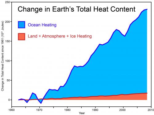
Last weekend, I gave a talk at the Climate Action Summit on the latest climate science. During the talk, I showed the following graph of the Earth's total heat content, demonstrating that even over the last decade when surface temperature warming has slowed somewhat, the planet continues to build up heat at a rate of 4 Hiroshima bomb detonations worth of heat every second. This data comes from a paper lead authored by Australian climate scientist John Church that tallies up the heat accumulating in the oceans, warming the land and atmosphere and melting the ice:
The next day, I was (pleasantly) surprised to see an AAP journalist had written an article about my talk (and also included some of the science on extreme weather presented by the distinguished scientist Lesley Hughes who spoke after me). The headline, "Climate change like atom bomb", focused on the Hiroshima metaphor (which I believe was first used several years ago by James Hansen). The article was picked up by a number of outlets across the world with a curious concentration of coverage in India. Subsequently, a number of people have commented on this metaphor or emailed me questions. So I thought I would address in this post, with some help from Dana Nuccitelli, why we use this metaphor and how the "4 Hiroshima bombs worth of heat per second" was calculated.
Why use the 4 Hiroshimas Per Second metaphor?
A book I recommend to all communicators, particularly those working with a complex, abstract concept like climate, is Made to Stick by Chip & Dan Heath. The book explores what makes a message "sticky" - how do you communicate a message that attracts attention and sticks in the memory. They identify six traits, some of which appear in all sticky ideas:
- Simple
- Unexpected
- Concrete
- Credible
- Emotional
- Story
The difficulty of climate communication is we often have to explain statistical concepts that are complex, abstract, dry and opaque - everything opposite to a sticky idea. So the challenge is communicating what's happening to our climate in simple, concrete, unexpected ways.
This is even more important when debunking misinformation. Not only do we need to show how the myth is wrong, we also have to replace the myth with a credible, more compelling alternative narrative. The Heath brothers summate this process with characteristic stickiness:
"Fight sticky ideas with stickier ideas"
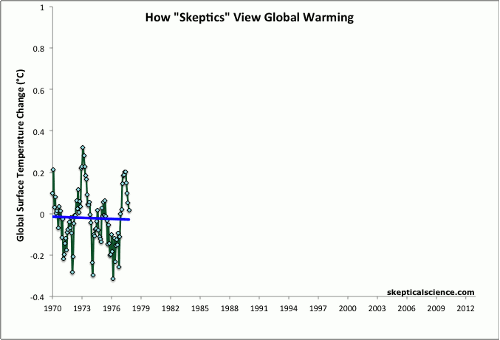
For example, one sticky idea is the myth that global warming stopped in 1998. The typical response to this myth is to point out that it's misleading to cherrypick short periods in a long-term warming trend. A sticky way of communicating this in a visual manner is the Escalator graph. The power of a sticky visual is demonstrated by the fact that the Escalator has been featured in a PBS documentary and by Senator Whitehouse on the senate floor.
Another sticky way of expressing this same idea is to examine the physical reason why there is a long-term warming trend - because the planet is building up heat. This is vividly demonstrated in the following graph which shows surface temperature jumping up and down from year to year while the Earth's total heat content shows a steady, near-monotonic increase.
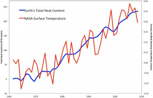
The blue line in this graph is not a statistical long-term trend or a 5-year average - it's actual yearly data of total heat content. The long-term warming trend is grounded in physical reality - the planetary energy imbalance. So I suggest a sticky way to communicate global warming is to express it in units of Hiroshima bombs worth of heat. This ticks all the sticky boxes:
- It's simple - nothing communicates a lot of heat like an A-bomb.
- It's unexpected - whenever I explain this to audiences, their eyes turn into saucers. Almost noone realises just how much heat our climate system is accumulating.
- It's concrete - nobody has trouble conceptualising an A-bomb. Well, much of the younger generation don't know about Hiroshima - when I test-drived this metaphor on my teenage daughter, she asked "what's Hiroshima?". But it's easily recommunicated as an atomic bomb.
- It's credible - the data comes from peer-reviewed research (Church et al. 2011) and has also been confirmed by more recent research (i.e. Balmaseda et al. 2013).
- It tells a story - the idea that second after second, day after day, the greenhouse effect continues to blaze away and our planet continues to build up heat.
- The only downside of this metaphor is it is emotional - the Hiroshima bomb does come with a lot of baggage. However, this metaphor isn't used because it's scary - it's simply about communicating the sheer amount of heat that our climate is accumulating. I've yet to encounter a stickier way of communicating the scale of the planet's energy imbalance.
The fact that out of a conference full of talks, rousing speeches and fascinating workshops, an AAP journalist chose that specific metaphor as the headline in an article picked up by media across the globe testifies to the stickiness of the Hiroshima metaphor. However, I'm happy to throw down the gauntlet - if someone can come up with a stickier metaphor to express our climate's energy imbalance, I would happily switch to it.
How 4 Hiroshimas Per Second was calculated
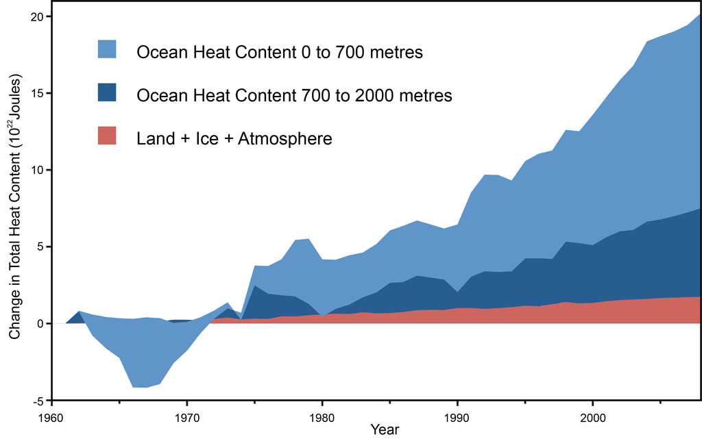
In 2012, several Skeptical Science contributors teamed up with John Church to publish a paper (Nuccitelli et al. 2012) in response to a flawed publication by Douglass & Knox (2012). In our paper, we analyzed global heat data, created by combining pentadal (5-year average) ocean heat content data to a depth of 2,000 meters from Levitus et al. (2012), and land, atmosphere, and ice heating data from Church et al. (2011).
As this figure shows, there has been no significant slowing in global heat accumulation, contrary to the mythical 'global warming pause'. So, how do we come up with 4 Hiroshima atomic bomb detonation equivalents per second from this data?
The slope of the global heat accumulation graph tells us how rapidly the Earth's climate is building up heat. Over the past decade, the rate is 8 x 10²¹ Joules per year, or 2.5 x 10¹⁴ Joules per second. The yield of the Hiroshima atomic bomb was 6.3 x 10¹³ Joules, hence the rate of global heat accumulation is equivalent to about 4 Hiroshima bomb detonations per second. That's nearly 2 billion atomic bomb detonations worth of heat accumulating in the Earth's climate system since 1998, when we're told global warming supposedly 'paused'. That has to be the worst pause ever.
The data used in Nuccitelli et al. (2012) are now available for download so you can check it out for yourself.


John Lyman used the Hiroshima bomb reference with regard to ocean heat in May 2010, during interviews regarding his Nature (2010) study, e.g.:
http://www.livescience.com/6472-study-ocean-warmed-significantly-16-years.html
It is not easy to quanity such a large number as 250 TW in a fashion that is meaningful to people. The anology of each of the 7.1 billion people on the planet continuously running about two dozen 1500-watt hair dryers might also be a useful, although it is hard to imagine 7.1 billion.
I'm a non-expert here, but I'm uncomfortable with the Hiroshima Bomb analogy.
1) It gives the idea, quite strongly, that we 'warmists' are just out to scare everyone without any rational basis. A bit like Godwin's law.
2) (And echoing theelf): It doesn't help the reader to place the size of the problem. OK it's scary. And I know that a Hiroshima bomb going off in my living room would be quite dramatic. But what does it mean on the global scale? How many Hiroshima bombs are a degree celsius, for example?
Per antwerpenaar above, I can't help but agree. Can you quantify what that number means? How does the 4 Hiroshima bombs per second relate to the energy received from the sun per second?
According to Wikipedia, the earth receives 119 x 10^15 Joules of energy per second from the sun, discarding the amount that is reflected. http://en.wikipedia.org/wiki/Solar_energy
The point is: how much of that is retained to drive up the earth's temperature, given the energy imbalance in the earth's climate system (Heat In > Heat Out).
The Wikipedia number equates to 1900 Hiroshima bombs (using 6.3 x 10^13 to be the heat released by a single bomb).
According to the above estimation, only 1896 bombs-worth of energy escapes back to outer space per second, leaving 4 bombs-worth per second to accumulate in the earth's climate system, raising the temperature.
An A-bomb's-worth of energy is an easier unit to imagine than 6.3 x 10^13 Joules, so I am good with it.
Discussing this elsewhere, I used the analogy of an electric kettle heating water - the heating element is pumping energy into the water per second, more than is escaping through the kettle sides per second. Result is temperature rise in the water as a fixed amount of energy accumulates per second.
Two dozen 1500-W electric kettles continuously operating for every living person on Earth might be even better for the tea-drinking countries.
I am layman, approaching eighty and admit to a sceptical bent. I live in the UK, where through an aggressive commitment to reduce carbon emissions coupled with plain incompetance, succesive Governments have followed an energy policy that has led to escalating electricity prices and, now, threats of black outs giving us an electricity supply situation akin to that of a third world economy. The carbon reduction element of this catastrophic policy had better be worth it and although I won't be around to see the evidence that it is, or is not, I would like to make my own informed judgement before I kick the bucket. Therefore:
It appears from SKS that rather than the atmosphere currently warming as predicted by the majority of models, it is the oceans that are rapidly heating. I would be interested to know what empirical evidence exists that the increase in OHC is actually caused by CO2 and what the mechanism is. I read for example, that downwelling radiation from CO2 acting as a GHG will only heat the top millimetre of the oceans, but that this is sufficient to alter the heat gradient in that skin and reduce ocean heat loss sufficiently to cause the current warming. Is this hypothesis really credible in the real world of turbulent and wind swept oceans?
arncliffe @6, all models predict that the ocean will warm. In a recent study, a group of models set up to the standards specified for the next IPCC report showed a mean Top of Atmosphere energy imbalance of 0.47 W/m^2 when forced by a 1% growth in CO2 concentration per annum, ie, approximately equal to equivalent to the average increase in GHG forcing over recent decades:
Of necessity, those models show most of that warming going into the ocean, for if they did not they would predict rises in temperatures greater than 10 degrees C per decade. That compares with the 0.5-0.6 energy imbalance over the last decade found in recent studies.
Further, all models show "pauses" in surface temperature increase against the background of ongoing global warming. That is a simple consequence of annual variations in temperature equivalent in magnitude to a decades worth of global warming. The presence of an upward fluctuation at the beginning of a period, coupled with a downward fluctuation towards the end can greatly decrease or entirely eliminate the overall upward trend. In models, these "pauses" have lasted up to twenty years with no long term impacts on predicted temperature increases. That is, the presence of a 20 year "pause" at the start of the 21st century has no impact on the predicted temperature of the model in 2100.
Finally, the current so-called pause in temperature increase covers a period starting with one of the two largest known El Nino (short term warming) events known, and ends with two large La Nina (short term cooling) events. Starting with a straight linear trend of 0.2 C per decade (the IPCC prediction), adding in the initial El Nino and just one of the terminating La Nina's results in an apparent linear trend less than that observed over the last 17 years. Further, the current "pause" in temperatures actually shows an apparent linear trend 40% greater (over the last 17 years, gistemp) than the linear trend from 1901 to 2000.
Arncliffe - as to how CO2 warms the ocean, see links where this was recently discussed here. It looks to me like you are getting your information from sites created to misinform you rather than from the science.
Another easy way to visualize the accumulation of heat is in terms of football fields (Soccer). It takes approximately 71.43 billion Wembley Stadiums to pave the Earth's surface. The average energy gain over the last decade, therefore, equates to illuminating each such Wembley sized area with thirty five 100 Watt bulbs. That is 0.46% of the energy from the 380 2Kw normally used to light Wembley Stadium for night games. It is dubious that it is enough light for the players to see the ball, let alone the fans.
That visualization is not as high impact as the atomic bombs. It is, however, probably more accurate.
The crucial element which makes it more accurate is entropy. Entropy can be most easilly understood as the inverse of relative energy intensity. If you take an amount of energy, and concentrate it in one location it has a low entropy, whereas if you smear it out it has a high entropy. One billion atomic bombs has a very low entropy, but 2.5 trillion 100 watt light bulbs spread evenly over the Earth, and operating for a decade has a very high entropy. Very clearly, the energy accumulation in the Earth system is more like the latter than the former.
The important fact about entropy is that in high entropy systems, it is difficult to extract energy to do work. Put another way, the lower the entropy of your energy source, the more of that energy you can extract to get things done. Atomic bomb explosions have very low entropy. They get a lot of work done, in the form of flattened buildings and lives destroyed. One hundred watt bulbs, in contrast, have high entropy and can accomplish little beyond allowing us to see.
And that is the scientific problem with the atomic bomb analogy. Three percent of the Earth's surface is urban. So, if one billion atomic bombs had actually rained down at random over the Earth's surface over the last decade, then on average 30 million such bombs would have landed in urban areas. Nobody on Earth would be in doubt as to the danger the rain of destruction would represent.
The accumulation of heat due to global warming is also dangerous - but not on that scale. Lives have been lost due to global warming already, and property and economic damage in the billions has been caused almost without doubt. But the destruction is difficult to pick out against the normal background of droughts, heatwaves and destructive weather. By evoking the image of the atomic bomb, we risk triggering peoples "bullshit sensors" because they know that global warming is not yet (and may never be) as destructive as 4 atomic bombs per second raining down on the Earth's surface. Put simply, the image invoked by atomic bombs is that of raw, destructive power; but that image is false as applied to the heat accumulation when quantified in terms of energy alone. Therefore using atomic bombs as a unit of energy is fundementally misleading. We would be better sticking with the raw numbers, however, poorly understood than introducing a sticky, but fundamentally misleading image.
Tom Curtis @ 7
Arncliffe asked for evidence but all you gave him was computer model simulations.
[DB] Actually, Tom gave the vast majority of the answer requested with ScaddenP pointing to the rest of the answer.
Please read more and look to provoke less.
If you go to the SoD articles referenced, this is a little experiment off the MV Tangaroa in one of them. As with everything in science, you have a theory/model from which you make predictions, then check it against observations. (ie the temperature and temperature profile of the ocean). Those measurements are empirical. If you propose that increase isnt from CO2, then please provide an alternative model for where the energy in the ocean is coming from? (And an explanation as to why extra thermal radiation hitting its surface is not heating it - the extra radiation is also empirical). Scientists are extremely attached to conservation of energy law.
Donthaveone,
arncliffe wrote:
It appears from SKS that rather than the atmosphere currently warming as predicted by the majority of models, it is the oceans that are rapidly heating.
This suggests that arncliffe thinks that the oceans "rapidly heating" is inconsistent with what is predicted by the majority of models.
So Tom responded:
arncliffe @6, all models predict that the ocean will warm.
And went on to prove that claim.
scaddenp then went on to address the issue of how CO2 warms the ocean, as pointed out by DB.
Why do you have a problem with that?
Scaddenp,
So far my comments have been related to Tom @7 in that i do not believe he provided the evidence arncliffe asked for.
[DB] Again, ScaddenP provided the remainder of the response requested.
Drop it.
Donthaveone resorts to a stupid rhetorical game. He correctly points out that models aren't evidence; but does not take heed of what the evidence actually is. In this case, the evidence is the warming oceans. The models are the best prediction of the consequences of known physical laws and the known increase in CO2 concentration (among other forcings). As it happens, the best prediction of the consequence of known physical laws indicates that an increase in CO2 concentration will, all else being equal, result in an increase in Ocean Heat Content. Therefore the theory predicts that which is actually observed.
Donthaveone's stupid game is to pretend that because models are not evidence, they are irrelevant to understanding whether or not the theory predicts the observed consequences. Nothing could be further from the truth.
This excellent article by Rob:
How Increasing Carbon Dioxide Heats The Ocean
explains the mechanism of ocean warming via inhibitted OA heat exchange due to skin layer warming in simple terms, and should be a good source for skeptics like Donthaveone and arncliffe. Also see the reference to Gentemann & Minnett (2008) therein.
arncliffe,
Perhaps I can offer a comparison that is utterly deviod of math, but large on conceptuallization that will make it easier to see the fallacy of what you have been told.
"...downwelling radiation from CO2 acting as a GHG will only heat the top millimetre of the oceans..."
OK, I think it is save to say that thermal radiation penetrates a rock less than a millimeter. In fact, all forms of energy exchange penetrate a rock less than a millimeter before the transfer becomes internal to the rock. Measure the temperature of a rock in the morning, set it in the shade, and later measure its temperature in the afternoon.
Is the whole rock warmer, or just the outer millimeter?
Does the ocean have more turbulence at the surface than a rock? If yes, then there is more opportunity to transfer energy internally.
Does the ocean have more convective currents than a rock? If yes, then there is also more transfer of energy internally.
Another experiment: Take two well-insulated containers and fill both with cold water. Cover one with a lid, and leave the other exposed to the air. Which warms up faster? If the extra energy in the warmer water did not come from the air, from where did it come?
Ask yourself why you chose to believe information that was so demonstrably jibberish as to say that it was necessary for IR to penetrate to depth in order for depth to be heated.
I like this information and so good and interstisng. thanks for sharaing.
<a href="http://www.gogreenindia.co.in/global.aspx">global warming news<a/>
arncliffe @ 6
I am thrilled to see that you are being truly sceptical of both the science and the way that it is reported to the public. I am also from the UK and I agree that many newspapers and broadcasters have recently reported that 'efforts to reduce carbon emissions' have increased energy prices. However, is this really the case or is the increase in energy prices down to factors such as the increasing scarcity of oil in the North Sea and the cost of importing gas? I recommend this link as a helpful balance to much that is written in certain newspapers. There is also a wonderful and well-balanced free publication called Sustainable Energy Without the Hot Air. There is much to be studied on the subject and I hope that you find examining the stories behind the headlines as enertaining as I do!
Tom Curtis:
Thanks for your reply, I will read your recommended link with interest. Although my main interest in writing to SKS was the rising OHC issue, your comments on the atmospheric temperature 'pause' were interesting but also highlight a problem I have found in gaining an understanding of climate science: There is now an absolute plethora of both models and data sets and these tend to create a 'pick and mix' facility that can seemingly be used to support or rebut any argument. For example, Dr Roy Spencer has recently published on his site a graph that I haven't seen rebutted anywhere, showing the same models as yours, but plotting the satellite/balloon temperatures of the 'tropical mid troposphere', which currently fall well outside the predictions of any of the models.
scaddenp:
I read as widely as I can, but my questions on rising OHC and the thin cool-skin layer were prompted solely by the above article and earlier ones by Rob Painting and Dana.
Chris G:
In answer the last, offensive, paragraph, I did not say that 'it is necessary for IR to penetrate to a depth in order for depth to be heated' or anything remotely like it. I simply referred to the the thin cool- skin effect mentioned by Rob Painting in his article last week, in which he postulated that it inhibited loss of OHC to the atmosphere.
Going back to the original point of the the post i.e. “sticky ideas”. When our local vicar wrote a mildly denial article in the parish magazine I invited him around for a solar powered coffee and an explanation of the science of global warming. We finished our session with a look at some of the graphics from here, starting with the escalator and ending with the change in total heat content.
He asked “how much energy is that?”.
I said “four Hiroshima size bombs”.
He said “every year?”.
I said “every second”.
His jaw dropped...
As an idea it’s brilliantly effective.
BTW, Evil Doctor Daddy is what my kids (3 & 5) call me when I case them around the house...
EvilDoctorDaddy @ 20
LIKE :)
arncliffe
The full body of evidence that GH gases are causing the warming covers quite a range of subjects. However using a very few pieces of information, just simple observations, we can narrow the field of possible explanations for the warming radically.
Ocean warming is occuring at around 8 * 1021 joules per year, or at a rate of around 253 TeraWatts. So a simple question one can ask is 'Where has this heat come from?'. It must have come from somewhere, the 1st Law of Thermodynamics demands that. The largest heat source here on Earth is Geothermal heat, heat from within the Earth, is estimated at around 44 TeraWatts. So the heat accumulating in the oceans is occuring around 5.75 times faster than could be caused by the largest terrestrial heat source. So there is an unavoidable conclusion.
This extra heat isn't coming from anywhere here on Earth. No terrestrial heat source is remotely large enough.
So those two pieces of data have ruled out all possible 'internal variability' arguments.
The heating must be being caused by the Earth being in an energy imbalance with Space. Some combination of an increased amount of sunlight being absorbed by the Earth and decreased amount of Infrared Radiation being radiated to Space.
Next piece of evidence is that the Sun hasn't been warming recently. The Sun has been under virtually constant observation since the mid 70's. Apart from it's normal 11 year cycle, its heat output hasn't been increasing. If anything it has cooled very slightly. So it isn't more sunlight.
Could it be that more of the sunlight reaching the Earth is being absorbed? Around 30% of the sunlight that reaches the earth is reflected back to space and isn't absorbed. So if that percentage had dropped, perhaps due to less reflective cloud cover or something letting more sunlight through, that would explain things.
Except there is another piece of evidence that rules that out. If the warming was being caused by anything related to the Sun then we would expect to see more warming when the Sun is shining - during the day and in summer. And we aren't. Temperatures have risen as much if not more during nights and winter. Whatever is warming the Earth operates day and night. And that rules out anything to do with the Sun as a cause.
This leaves us with only one physically possible conclusion. The Earth is radiating less heat out to space.
But we know the surface has warmed so the Earth should be radiating more to space, not less!
So something is blocking more of the Earth's radiation, stopping it from reaching Space. And there is only one thing that can do that. The Greenhouse Effect. The size of the Greenhouse Effect must have increased; that is the only conclusion we can reach from the data.
Over a decade ago, when the first analyses of Ocean Heat Content were published showing rising heat content, this data was labelled at the time as 'The Smoking Gun'. The gun is still smoking.
arncliffe
" I read for example, that downwelling radiation from CO2 acting as a GHG will only heat the top millimetre of the oceans, but that this is sufficient to alter the heat gradient in that skin and reduce ocean heat loss sufficiently to cause the current warming. Is this hypothesis really credible in the real world of turbulent and wind swept oceans?"
2 scenarios.
Sounds like swings and roundabouts to me, with the same net result.
arncliffe
Roy Spencer is playing a bit fast and lose with the available data. There are 3 research groups that analyse the data from the satellites. Spencer is one of the principles of one team at UAH. The other teams are at RSS and Star/NESDIS. UAH have been showing a trend of 0.04 C/decade. RSS a trend of 0.078 C/decade. Roy averages these two and shows that average. He doesn't mention Star/NESDIS who are showing a trend of 0.124 C/decade. So if one averaged all 3 satellite results the result would be higher. And in fact it is more accurate to say that the correct value for the satellite data lies somewhere between UAH and Star. If Star is closer to the mark, the models are spot on.
He doesn't mention that the handling by UAH of the troubled transition between the NOAA satellites NOAA-9 and NOAA 10 has been identified as possibly flawed, leading to a cool bias in the UAH data since then.
He doesn't mention that the radiosonde datasets are regarded as questionable for climatological purposes at higher altitude due to radiative heating/cooling effects on the instrument packages.
And then he compares them to model runs based on one of the scenarios with the highest rates of CO2 accumulation.
Finally he doesn't mention that models don't predict exactly what will happen year by year but rather the broad trends. The models aren't good enough to capture all the causes of short term variability. And if you look at his graph, the data for the sensors still falls within the range of model prediction up to around 1998, 2000. So the models may be missing events over the last decade plus. And this isn't an exceptional result. Shorter term climate variability is harder to model, even when longer term trends can be modelled. And a decade is short term in climate terms.
It is a couple of decades too soon to claim that the models are wrong.
John and Dana:
After thinking about this some more, I understand that you are using the analogy of 4 Hiroshima bombs per second to represent the amount of heat gained by the earth as a whole. I don't think it helps the vast majority of even the educated population to understand what is happening. We all know that an atomic bomb is a bad thing. But, on a global scale, is it really?
When you take the surface area of the earth (5.1×10 8 km 2), and the amount of energy received from the sun: the result is that each square meter of area facing the Sun receives about 1,380 joules per second (otherwise known as the Solar Constant). Once you look at numbers on this scale, the numbers produced by an atomic bomb (even 4 per second), aren't scary anymore.
But, everyone knows how bad an atomic bomb is. So, your use of this analogy is an effective tactic.
Glenn and Dana, will y'all please add Glenn's comment as a new section in The Big Picture post? It fills a gap in the logical flow that I've had to fill when pointing people to that post for them to get a very quick basic understanding. I think it is well worth the tradeoff of making that post slightly longer. It would be a new section after the section "Global Warming Continues" and before the section "Humans are Increasing Atmospheric Greenhouse Gases." The section title should be something like "Increased Greenhouse Gases are Causing the Warming."
If people don't like Hiroshima bombs you could go with something like 'global energy consumption'. As in, 'global warming is causing the planet to accumulate heat at a rate equal to our monthly global energy consumption every 2 days'.
Most people probably don't have a good handle on just how much energy we use, but it is one of the few other values in the right ballpark to be a useful comparison point. It would also help to dispel the 'global warming is caused by waste heat' myth.
Hi all
I do not understand this obsession here with "science communicating". Science is not communicated (not as political propaganda), is disseminated and/or popularized, and as far as possible, when it has already passed the rigors of scientific method (empirical validation at least).
Glenn Tamblyn #24 says "It is a couple of decades too soon to claim that the models are wrong." Yep, However it is not too early to say that the models are correct... I think this is a version of scientific validation quite asymmetric, being naive.
Last but not less important. Using Hiroshima bomb (more than one hundred thousand dead), gives people an idea of the ethical level, and of the balance between popularize (or explaining) on the one hand, and convince (terrify rather), on this side of debate. From my point of view is a wrong strategy, to the point that it can only work with the more illiterate society. But hey, I'm aware that my opinion is worthless here. It's your choice.
Sincerely.
I do believe that many of us convinced in the seriousness of AGW really is trying to figure out how we can explain this to people so they are able to act upon it. Its really one of humanities biggest challenges, one that could have consequences on a planetary scale if not handled in time. Many believe we are really running of out of time. Talking about CO2 emission cuts of a certain % by 2050 isnt going to cut it. What is needed is for people to wake up and understand that our CO2 emissions through our addiction to fossil fuel burning is really turning up the thermostat of the planet causing a shift that the planet likely only have experienced in rather more cataclysmic events like the big siberian traps vulcanism or asteroide impact. The data shows a dramatic concentration of CO2 in both the air and seas at rates 10x past extinction events. I think its really cause for concern even though we dont really see the big consequences right this second. A tipping point can be passed (and most likely several have been passed now with the Arctic melting fast) where the changes happen so fast that global average temperatures could rise rapidly.
I do believe there is enough evidence now that the planet is absorbing more of the suns energy than it has in the past, and that this amount is significant even on a planetary scale (some are trying to make the 4 abombs per second sound like a small number, just like CO2 is only a small part of the atmosphere - this is a dangerous way of thinking - it only takes 0.25g of arsenic to kill a person). Looking at the broad picture, its really fantastic that life even exists on the planet, and while humans might feel like small gods wielding the power of fossil fuels, we really are quite insignificant and vulnurable, like all living things on this planet. I do believe we should treat our lucky position in this galaxy with some respect and at least acknowledge what we have discovered about simple physics. Sometimes one does not need proof in order to know something is right, if I fall out of a 10 story building, I will likely die - but I dont really need to watch someone fall to their death to understand this is a physical fact. The same way we do know CO2 is a greenhouse gas and that it traps heat. Glenn Tamblyn's line of reasoning perfectly explains a valid reason for the extra heat stored and I my opinion it shouldnt be hard for people to grasp this if they are willing to listen.
Cheers
Very eloquent!
IMHO: The rate should be more important. You should say that by 1998. We were at a rate of ~2 Hiroshima bomb detonations per second and since that so called pause we have move to 4 Hiroshima bomb detonations per second. Or put it in step with time. Like in 198x we were at 1 by 199x at 2... and today at 4. How much many more Hiroshima bomb detonations does it need to increase before we start taking this seriously.
Some of the heat goes into the melting of Arctic Ice. If we apply gentle heat to a beaker of water containing a lump of ice, the water temperature will not increase until the ice has finished melting.
So how much ice has melted?
The figure here:
http://psc.apl.washington.edu/wordpress/research/projects/arctic-sea-ice-volume-anomaly/
shows that the September mean volume for 1979-2012 stands at 12,000 cubic km of ice.
The September value for 2012 stands at 3,000 cubic km of ice.
Therefore we have lost 8,000 cubic km of ice, since about 1997.
1 cubic kilometer of ice = 10^15 grammes of ice
80 calories of heat are required to melt 1 gramme of ice.
Therefore to melt 1 cubic km of ice we need 8 * 10^16 calories
To melt 8000 cubic km ice we need 6.4 * 10 ^ 20 calories
That is 2.7 * 10^21 Joules which have gone into melting the Arctic ice since 1997.
This is clearly a lot of heat, but I have no idea how significant it is compared to the earth's energy budget.
It is 2*10^8 Hiroshima bombs, but how much surface warming would it represent, if, instead of going into melting ice, it went directly into heating the surface air?
Glenn Tamblyn @22
Thank you for the time and trouble taken in your three responses. They were both informative and thought provoking.
I have two points that I think are worth making on your very clear 'walk through' of the likely role of CO2 in increased OHC.
Firstly, a paper published last year by the team at BEST showed that the gap between night and day temperatures has actually been increasing for some twenty five years. I don't have the reference to give you, nor the skills to provide a link if I did, but no doubt it is easily traceable.
The second point is the possibilty of solar radiation contributing to increased OHC. There seems to be general agreement across the Climate Science Blogosphere that when ENSO is in a 'La Nina', or 'neutral' phase the eastern equatorial pacific ocean and land regions cool due to easterly winds driving surface water westwards and generating an upwelling of cold water in the east. I understamd that the winds that move this mass of upwelling water eastward also create minimal cloud cover, thus exposing the water to high levels of solation on its long journey across the Pacific - over a third of the way around the globe. When this heated water reaches the western extremity of the Pacific, some moves through to the Indian Ocean, some diverts towards the poles, some remains in a pool to fuel the next El Nino and some goes down. As 'neutral' or 'La Nina phases have been dominant this century it seems credible to assume that this process has been a net contributor to OHC.
If I understand 'Shoyemore' @4 above correctly, the earth receives 1,900 Hiroshima bombs worth of solation per second (Elsewhere I have seen a figure of 1,000). As the process described above is occurring at the equator, a gain in OHC of 4 hiroshima bombs from solation alone doesn't seen too far fetched? - but I'm sure somone cleverer than me can do some sums to see just what the figure could be.
Turning to the question of the thin, cool- skin hypothesis: I agree that if it is flawed it may well be a question of swings and roundabouts as far as OHC is concerned. However, as the mechanisms by which CO2 affects OHC are so completely different in each case, I find it surprising that this issue can even be questioned at this stage (When so much effort and money has been expended on climate science over the last twenty or so years) and in re-reading Rob's article on the layer he references only one paper on the subject.
And so finally to the Roy Spencer paper that I mentioned. I am amazed to read that trends generated by the three bodies processing the same satellite temperature data vary by a factor of three. Someone ought to get them round a table!
Apologies for such a long winded post, but I felt that I owed you the best response that a layman can provide.
Glenn Tamblyn
Whoops Typo: 4th para - winds that move this mass of upwelling waterWESTWARD
Taking Tom Curtis' point about etnropy, the energy accumulating in the atmosphere was once of high entropy, when it began in the sun's thermonuclear furnace. So the proviso around the "4 Hiroshima bombs" can be posed as "If we express this energy in units appropriate to where it began .... ", relateable to the sun's arriving energy on earth.
It still carries the image of a lorra, lorra energy, which is why I like it. And people can express it in more than one way .... "Here are different ways you can express this energy .. 4 Hiroshima bombs per second, or illuminating 71 billion Wembley sized areas with thirty five 100 Watt bulbs .... "
Obviously, no one should use the unit if they feel uncomfortable with its accompanying imagery, but a concrete example that you can explain is very usful.
Stephen Schneider: Each of us has to decide what the right balance is between being effective and being honest. I hope that means being both.
Glenn Tamblyn
Sorry, another error: para 5 - Four Hiroshima bombs PER SECOND
Arncliffe - 1.My post on the cool-skin layer of the ocean hyper-links to 3 different papers on the topic, and those three papers cites numerous others in support of the physics, math, and observations involved. Climate science contrarians on the other hand cite none. Why do you think that is?
2. The simple experiment carried out by Professor Minnett whilst aboard the New Zealand research vessel Tangaroa (Maori for the god of the sea) is rather compelling. Why else would the surface waters warm under cloudy conditions? The typical contrarian response of furious handwaving is not an explanation.
3. The amount of sunlight reaching Earth has declined over the last 3 decades due to a decline in the sun's radiation output. Instead of a decline in ocean heat content, we have seen a dramatic increase - as the greenhouse gas-forcing of the ocean's cool-skin layer predicts.
4. Attempts to blame current ocean warming on natural factors are generally by people who have little understanding of oceanography - such as the contrarian Bob Tisdale, and whose ideas are contradicted by the observations.
5. For example, mainstream science not only correctly predicted the current ocean warming, but accounts all previous Earth warming episodes that involved increased atmospheric concentrations of greenhouse gases - due to the fact that over 90% of heat goes into the oceans. The clearest illustration of this is the correlation between global temperature and atmospheric carbon dioxide (the main greenhouse gas) as shown in the ice core records dating back 800,000 years. The last 400,000 years of which is shown below:
How does Bob Tisdale's idea fare when you run it backward in time?
@arncliffe
I would be very skeptical of the claim:
Not in my country, Canada. Winters are warming faster than summers and daytime minimums are increasing faster than daytime maximums. Just as predicted.
And BTW, if someone provides you with data, or explictly argues, that the sun is magically, or increasing some sort of output that is the cause of the earth's additional heat accumulation... they are instantly not a trustworthy source.
arncliffe - "...a paper published last year by the team at BEST showed that the gap between night and day temperatures has actually been increasing for some twenty five years."
That's not what the data shows - Vose et al 2005; "Minimum temperature increased about twice as fast as maximum temperature over global land areas since 1950, resulting in a broad decline in the diurnal temperature range...", and Zhou et al 2009; "Observations show that the surface diurnal temperature range (DTR) has decreased since 1950s over most global land areas..." would disagree.
If you have a reference, it would be interesting to look at - but your assertion is contrary to the data I know of.
I had a quick look and found the claim in the BEST paper here: http://www.scitechnol.com/GIGS/GIGS-1-101.php
Specifically, Figure 4 on page 4 shows a decline in diurnal range from 1900 to 1987, followed by an increase in diurnal range:
The paragraphs above the figure note that "The rise takes place during a period when, according to the IPCC report, the anthropogenic effect of global warming is evident above the background variations from natural causes" and "We are not aware of any global climate models that predicted the reversal of slope that we observe".
Personally, I wouldn't be rushing to point to this as evidence that the current understanding of AGW is wrong.
Firstly, the recent figures don't like look like they stand out with respect to the long-term trend extrapolated forward from about 1970; the steep decline from the late 60s to the mid 80s followed by the rebound back up to the long-term trend is perhaps the portion that needs explaining. Indeed, the steep incline seems to have levelled off again.
Secondly, even with that dip and recovery, there is still an overall decline on longer time scales, exactly as expected. Although BEST are fairly confident in their results as shown by their uncertainty estimates, I think they are talking about the uncertainty in the true value, not the uncertainty introduced by short-term fluctuations about the trend. The highly "certain" dip and recovery could well be a highly certain natural variation that is in no way unusual (the uncertainty in the earlier figures makes that hard to determine) and it could be that, in fact, there was no change in the long term trend underlying that natural variability. (In other words, even if the monthly anomalies reported for GISTEMP, for example, were accurate to 0.00001 degrees, it wouldn't change the fact that we'd need well over a decade of readings to ascertain the long-term trend, because the variability is real feature of the system and not simply a measurement error.) Since temperature readings are affected by more than just CO2, it's possible that the diurnal temperature range is, too.
Thirdly, this is just one study by one group. As it notes, four previous studies reported significant decreases in the diurnal temperature range.
While I have enormouse respect for Robert Rhode's work at BEST, the rest of that paper wouldn't have passed review in a climate journal.
That's weasel wording for "The diurnal temperature literature looked difficult, so we didn't read it".
There is an extensive literature on diurnal temperature range and it is far more complicated than the BEST paper makes out. DTR does decrease with greenhouse forcing, but is much more strongly influenced by aerosols, clouds, soil moisture and so on, as even two minutes with google scholar will reveal.
To be fair SkS's material on DTR is similarly lacking in nuance - it's on my list of things to fix if we ever get a breathing space between debunking new nonsense. Glenn is correct that in the absence of other factors solar warming would cause an increase in DTR, however the other influences are sufficiently large that we would have to eliminate them to draw a strong conclusion from this effect alone. Drost et al use multiple fingerprints in combination to obtain a much more robust result.
More compelling still is the fact that we can see the increase in greenhouse warming in both the outgoing infrared radiation spectrum, and in the infrared glow looking up at greenhouse gases from the surface.
Rob Painting @
In my reply to Glenn Tamblyn I was referring to your recent article on climate shift that only referenced the Tangaroa experiments. I have subsequently found your article of June 2011 with the references that you mention. In simple terms it seems that the effect of downwelling LR radiation is not to heat the ocean directly, but to turn the thin cool skin layer into a thermal insulating barrier and thus increase OHC by reducing heat transmission to the atmosphere. Is this a reasonable summary?
You mention Bob Tynsdale: whilst I do not subscribe to his view that that global warming has nothing to do with CO2 but is caused by ENSO, his position on the ability of ENSO neutral and La Nina modes to increase OHC seems similar to yours.
Bob Painting:
Sorry-first para: your paper of OCTOBER 2011
arncliffe - the thin cool-skin layer of the ocean already is an insulating barrier. Warming the atmosphere, through additonal greenhouse gas emissions, simply increases the efficiency of that insulating barrier.
Reduced equatorial cloud cover during La Nina (due to the cooler sea surface temperature), combined with the strong upwelling (Ekman suction) in the eastern equatorial Pacific, does indeed lead to greater warming of the ocean - because it's bringing cool subsurface water to the surface, where it can be heated by the sun. I briefly touched on that in this post: Search For 'Missing Heat' Confirms More Global Warming 'In The Pipeline'.
Once the posts explaining the wind-driven ocean circulation and deep ocean warming are completed, it will be definitely worthwhile explaining how all the pieces of the puzzle fit together. Many readers overlook the obvious implications.
theelf @ 1: "The anology of each of the 7.1 billion people on the planet continuously running about two dozen 1500-watt hair dryers might also be a useful, although it is hard to imagine 7.1 billion."
Isn't the point, though, that you don't have to imagine 7.1 billion to understand this analogy? The 7.1 billion is just a scaling factor that could just as easily be left out; all you have to do is imagine everyone, everywhere running two dozen hair dryers constantly, which could be a very funny image. I picture the following cartoon: a goofy looking human in a bath towel running a dozen hair dryers in each hand, and then zooming out to bring all of their neighbors into view doing exactly the same thing, then panning over to show a busy city sidewalk packed with people rushing to work with a briefcase and a dozen running hair dryers in each hand (either with arms at their sides, or perhaps even up above their heads continuing to dry their hair as they walk, briefcases dangling in the air), and then zooming out again to show the same scene carried out on every city sidewalk. Then, maybe a time lapse, and show people doing it on the job - at their desks in front of computers, on construction sites, standing up at a chalkboard in front of a classroom (each student also holding the two dozen hairdryers at their desks).
Admittedly, the message is no longer bite-sized once you've gone to this extent of production, and the cartoon might only be viewed by people who already understand that we have a real problem on our hands.
The whining sound effect of the hair dryers could be amplified the more people are in view - e.g., you might show the teacher shouting or talking in a bull-horn to teach the day's lesson over the din of several hundred hair dryers...
Thanks for this informative website.
I was trying to derive the 2 billion atomic bombs number. I can see where the rate comes from the slope of the global heat accumulation graph:
8x10^22 J / 10 years = 8 x 10^21 Joules per year
=2.5 x 10^14 Joules per second
Now over a 17 year period this should be equal to:
(8 x 10^21 Joules per year )(17 years) x 1/2 = 6.8x10^22 J total
= 1.08 billion atomic bombs
or 1/2 of the 2 billion number since we are trying to determine the area under the curve to determine the total heat energy.
What mistake am I making?
of global heat accumulation is equivalent to about 4 Hiroshima bomb detonations per second. That's nearly 2 billion atomic bomb detonations worth of heat accumulating in the Earth's climate system since 1998, when we're told global warming supposedly 'paused'.
Nevermind, I worked it out. I realize that, obviously, if you know the energy rate then multipyling it by the time gives you the total energy directly. The area under the curve would give you the Joule*years of the system which I am not sure if that can be interpreted as anything significant.
I've been looking at updated versions of this figure, but I seem to be getting around a factor of 1000 wrong, so if someone could point out what mistake I'm making, that'd be great.
EEI (from 2019) = 1.12 W/m²
surface area of Earth = 5.1 * 10^14 m²
1.12 W/m² * 5.1 * 10^14 m² = 571.2 TW
This means 571.2 TJ every single second.
energy released by the Hiroshima bomb as per what I found = 63 GJ
So the number of bombs per second would be:
571.2 TJ / 63 GJ = 9067
As mentioned in the beginning, this seems to be a factor of 1000 too much; what am I doing wrong here?
Philalethes @48 :-
My quick glance at Wiki suggests Hiroshima yield roughly 63 TJ
leaving you with 9 bombs per second.
And planetary heat gain might actually be less than 1.12 W per m2.
Philalethes @48,
In addition to Eclectic's repsonse, only half of the Earth's surface receives sunshine energy at any moment in time.