


 Arguments


Record-Breaking Sea Surface Temperatures in 2014: Has the Climate Shifted?
Posted on 22 December 2014 by Rob Painting
The record for the warmest monthly global sea surface temperature (SST) has been broken three times this year and the five warmest months of sea surface temperature ever recorded have all taken place in 2014. Although the year is not yet over, 2014 looks set to break the annual SST record too. This record warming of the ocean surface has, not surprisingly, had a big impact on global surface temperatures as well with 2014 currently on track to beat 2010 as the warmest year recorded in several data sets.
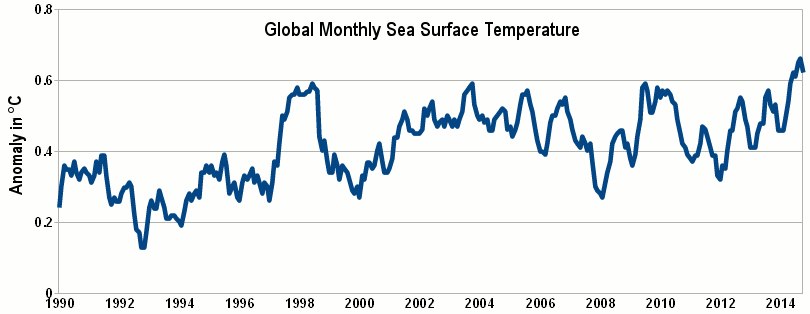
Figure 1. Monthly global sea surface temperature (SST) anomaly (ERSST v3b) from 1990-October 2014. June through to October 2014 has seen the 5 warmest months of SST ever recorded. Image based on data from NOAA's National Climatic Data Center.
Climate Shifts and the Interdecadal Pacific Oscillation (IPO)
None of this will come as a shock to regular readers of Skeptical Science as we have pointed out in numerous posts over the years that global warming has actually sped up in recent times, with an increase of heat being absorbed into the subsurface ocean despite a slower (short-term) rate of surface warming. A prime (but not only) culprit in the slower rate of global surface warming in the last decade and a half has been the temporarily strengthened wind-driven ocean circulation and, at some point, this was likely to weaken. In short; during the negative phase of the Interdecadal Pacific Oscillation (IPO) stronger winds mix more heat into the oceans, which leads to below average surface temperatures, whereas the positive phase of the IPO sees weaker winds which result in reduced ocean heat mixing and thus above average surface temperatures.
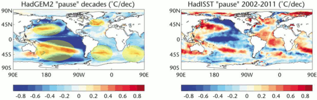
Figure 2 - The HADGEM2 climate model's average negative IPO phase (left) compared with the observed sea surface temperature (Hadley) from 2002-2011 (a negative IPO phase) on right. One dominant feature in the model simulations is the strong surface warming in the ocean gyres as convergence of warm water from the tropics there strengthens when the gyres spin-up (yellow-shaded ellipses). The intensification of the gyre circulation is apparent in the observations too. Image from the UK Met Office.
Recent Research on the IPO
Research into multi-decadal climate variation in the Pacific Ocean stretches back decades. This field of research attracted public attention when Meehl et al (2011) examined simulations from one climate model and found that decadal hiatus periods (decades of surface cooling) were possible even when the Earth was under a strong long-term warming trend. The authors noted that the patterns exhibited in the climate model were similar to the spatial patterns of the Interdecadal Pacific Oscillation (IPO) and that, in the model at least, the negative IPO-like condition was a time when anomalous heat was taken up by the deep ocean. The year after Meehl et al, Levitus et al (2012) was published and found that not only was the subsurface ocean warming strongly but, in the recent decade, the deep ocean was warming at a greater rate than the upper ocean layers, therefore confirming the model 'prediction' in Meehl et al.
Since 2011 a slew of research papers have been published building upon Meehl et al's work. For instance, Kosaka & Xie (2013) demonstrated that when sea surface temperatures in a small, but key, part of the tropical Pacific Ocean were prescribed in climate models, the models closely matched the observed evolution of surface temperatures for the entire world - suggesting the models were doing a good job of simulating the Earth's wind-driven ocean circulation. England et al (2014) took this a step further, but rather than stipulating sea surface temperatures in a key region, the authors instead fed the model the observed changes in wind forcing. Again the model simulated the evolution in global surface temperatures with good fidelity and, more importantly, matched not only surface spatial patterns, but structural changes in the subsurface ocean too.
Another study, Risby et al (2014), revealed climate model simulations that, by chance, coincided with the timing of real world variations in the IPO, did well in matching the observed surface temperatures. And lastly, Maher (2014) extended the work of Meehl et al (2013). These authors used no less than 31 different climate models and found that anomalous surface cooling associated with the negative IPO phase was a feature common to all climate models.
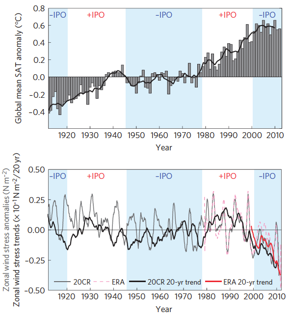
Figure 3 - Global mean surface temperature trend and positive/negative IPO phases in top panel, and zonal wind stress anomalies in bottom panel. The wind strength trend anomaly since the late 2000's is unprecedented in the observational record. Image from England et al (2014).
Decades of Accelerated Warming on the Way??
It's possible, likely even, that some of these simulations may be over-egging the pudding somewhat because natural variability of the IPO is not the only factor to have affected surface temperatures in the last decade and a half. Volcanic aerosols, the solar cycle, and even industrial sulfate pollution may have helped to slow surface warming (see Schmidt et al [2014] and Huber & Knutti [2014]). These 'wrinkles' will be ironed out in the scientific literature in due course, but the point is that this natural oscillation in the IPO has been a major contributor to the slower rate of surface warming in recent times and in the future, when it does switch phase, surface temperatures are likely to rise more rapidly.
So does the rapid rise in global sea surface temperature in 2014 necessarily mean that the IPO has switched phase? No, not by itself, because this could be a temporary phenomenon. But there are a number of other indicators, such as local changes in sea surface height, that suggest that the background climate state has once again shifted and we might expect to see decades of accelerated surface warming. The IPO is simply an index based upon spatial patterns of SST in the Pacific Ocean, but the index is highly informative of the underlying physical behaviour of the climate system worldwide. In upcoming posts we'll look at the fundamentals of the IPO, and why we might be headed for a decade or more of accelerated surface warming.
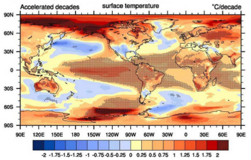
Figure 4 - The average spatial pattern of modelled surface temperatures in accelerated warming decades from Meehl et al (2013). A distinguishing feature is the surface cooling in the subtropical ocean gyres, and the North Atlantic subpolar gyre (south of Greenland), as they spin-down in response to the weaker wind forcing. The 'cool tongue' in the eastern tropical Pacific (see Figure 2) becomes a 'warm tongue' as the trade winds weaken and upwelling of cold water from below the thermocline diminishes.


All very confusing. Bottom line: how much has the global ocean temp risen? And, when is the last time it was this high?
The short-term prognosis seems rather grim for corals and the cryosphere, particularly in the Arctic and all that implies.
Perhaps Rob Painting or other SkS scientists will publish their conclusions on the consequences of sustained rising SST on these areas in the near future. A glimpse is provided at Figs 3 and 4. Both are disturbing.
Gumball... Those are not questions the article is addressing. The article is addressing indicators that may signal whether we will see accellerated warming in the coming decades.
If you want to know about past sea surface temperatures you could try research posted on the NOAA website here.
Note that ERSSTv4, which includes a correction for engine room intake bias, shows considerably more warning over the last decade than ERSSTv3b. Having said that, I am not very convinced by the behaviour of ERSSTv4 in the 19th and early 20th centuries, so I wouldn't necessarily assume that the new version is right.
it is not a coincidence that the mid-century negative IPO correlates to the rapid post WWII industrialization and subsequently ends at the implementation of aggressive sulphate emissions reductions by U.S. and Europe in the mid 1970's.
Obviously the IPO is influenced by anthropogenic aerosols.
[Rob P] - See the Maher et al (2014) paper linked to in this post. You will find it interesting.
I am wondering about the relationship between ocean heat content and the IPO? As ocean heat content has been increasing (down to 2000m) quite steadily for many decades, it seems the relationship to the IPO is one that the ocean heat content increases even faster when the IPO is negative, but is always increasing even in positive IPO periods. Only the Pinatubo eruption seemed to have an impact on halting the ocean heat content rise for a brief period.
Where can I found the data timeseries (updated up to now) showing the IPO and Trade Wind timeseries used in the England et al. (2014) paper?
Can they be found at NOAA, NASA, UK Met Office, etc.?
I will find interesting to see the finer details of those indices. If there are monthly data, the possible shift in climate may be visible in them.
From Peru @8.
The most up-to-date IPO data I know of is the most recent of Folland's quarterly data which is up to mid-2008. (Note that England et al (2014) FIg 1a is not a plot of IPO but a plot of annual global temperatures with annotated IPO phases.)
If you are after spotting climate shifts there is a quartet of graphics which show equitorial Pacific SST, SL & wind stress 1980-to-date on this NOAA-NCEP page (the 8th set down) that you might find useful. A graphics package would easily stitch them all together into one image.
I need help understanding something here: In the second paragraph in the text of the article it says: "during the negative phase of the Interdecadal Pacific Oscillation (IPO) stronger winds mix more heat into the oceans"
But the graphs at figure 3 seem to show stronger winds specifically in the positive phase of the IPO. I have a feeling that 'zonal wind stress anomalies' is measuring something (to me) counterintuitive.
Any help for my bewilderment would be most welcome.
Wili:
The same graph of zonal wind stress anomalies was used in this SkS post on Unprecedented Trade WInd Strength...
I gave an explanation of the units in that graph in this comment on that post.
Thanks, Bob. I thought this confusion seemed familiar.
This seems to be the most relevant passage for what I was confused about:
"One custom in measuring turbulent atmospheric motion is to make all fluxes directed away from the surface to be positive. Examples of such that make sense are thermal energy transfer (within the turbulently-mixed air) and the movement of water vapour away from the surface (AKA evaporation). For shear stress (also known as "momentum transfer"), the actual direction is from the top down: the air is dragging on the earth and transferring momentum from the atmosphere to the surface. So, being downward-directed, it ends up with a negative sign, and more negative means stronger forces."