


 Arguments


SkS Analogy 1 - Speed Kills
Posted on 19 April 2017 by Evan
Tag line
Speed Kills
Elevator Statement
Deceleration from 60 mph to 0 in …
- 30 seconds (base rate): Normal exit from a freeway; no drinks spilled, life goes on.
- 3 sec (10 times base rate): Slam on the brakes. All drinks and loose items end up on dash board. People not wearing seat belts do ungraceful face plants. Survivable injuries.
- 0.3 sec (100 times base rate): Like running into a parked car. Crumple zones in both cars absorb much of the energy, but people are seriously injured, some mortally.
- 0.03 sec (1000 times base rate): Like running into a brick wall. Most don’t live to tell about it.
Climate Science
It is not only the CO2 concentration that is important, but the annual rate of increase of CO2 concentration, because the rate of increase determines the rate at which natural systems must adapt … or go extinct.
For 1 million years life on earth has adapted itself to going into and out of ice ages (i.e., glacial cycles) over approximately 100,000-year cycles. We come out of ice ages in about 10,000 years, with CO2 rising 100 ppm in that time. That is a rate of increase of about 0.01 ppm/year. If we use this as a typical rate to which nature has adapted, and has done so already for at least 10 cycles, then we can determine how much faster than this we are now moving. The idea is that if we limit CO2 rise to this rate, we expect nature will adapt; the further away we move from this base rate the more difficulty nature will have adapting.
To get some perspective on how rapidly CO2 is currently increasing relative to the base rate coming out of ice ages, we define V_CO2 as the annual rate of increase of CO2 relative the rate of increase of 0.01 ppm/year. By this definition V_CO2 = 1 corresponds to the rate at which we come out of an ice age. A value of 10 means we are pushing nature 10 times faster than this base rate. If we use the start of the industrial revolution as the beginning of rapid CO2 rise, we can divide the data into two groups: pre- and post-1950. Plotting linear functions to 10-year averages of V_CO2 (to smooth out annual fluctuations) for each group yields the following plot.
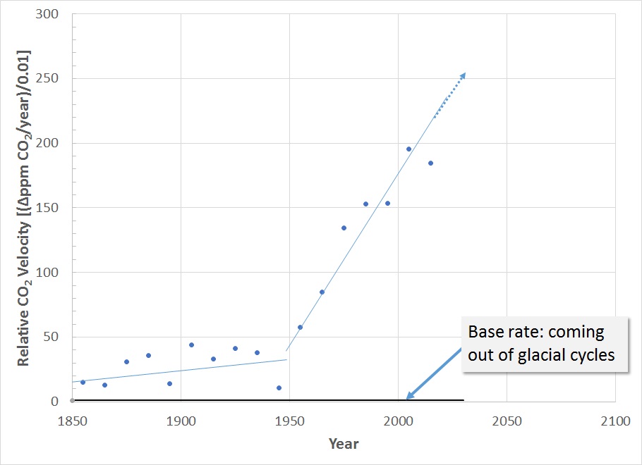
Even before the age of big oil and coal, we were already pushing nature more than 10 times the base rate. The rapid industrialization sparked by WWII marked a rapid increase near 1950 that has continued, unabated, yielding a rate now more than 100 times the base rate.
This is comparable to the effect of running into a parked car, and if left unchecked, we may soon be running into a brick wall.


" Slam on the breaks" should be " Slam on the brakes"
[JH] Glitch corrected. Thank you for pointing it out.
If I read the plot correctly, the linear trend since 1950 does not look to fit the data. The data rises faster than the line in the figure. And the data in more accurate than pre-1950 part (I'm assuming data comes from MaunaLoa and rapid accumulation ice cores respectively).
So, since the y-axis is already a first derivative (dppm/dy), while the x-axis is linear, the actual CO2 trend looks faster than quadratic since 1950. This is the first time I've realised it. I don't need to explain to people on this site what ultra-quadratic trend means in context of "Elevator Statement" above: more than freefall, more than gt2/2. Those politicians who still have such basic understanding of maths & kinetics (sadly none associated with GOP in US) should be given this post to read.
Typo in my post@2.
"dppm/dy" should read "dppm/dt". Sorry.
The analogy does make some good points, & clearly. Does anyone besides me worry, though, about using the period 1851-1950 as the comparator? For that period to be meaningful, it would have needed to last as long as we expect our current warming rate to last (probably many centuries, under a business-as-usual scenario), & we would need to have observed the warming's impacts on food supplies, sea level rise, weather & so on.
Since 1851-1950 was not that long, maybe a more meaningful comparator period would be the last previous period of warming of >1,000 years (ignoring any periods with other factors present that would grossly exacerbate extinctions & so on, such as asteroid hits).
The post-1950's data is a simple linear fit in Excel. Nothing fancy. Although one can eaily make the case for CO2 rising faster than a linear trend (as pointed out in the responses), in this analogy the point was to simply introduce the idea of just how much faster we are moving than a "base rate" defined by deglaciation cycles.
This is a very useful rebuttal to "The climate is always changing." argument.
For or those who don't care about nature, it would be helpful if there were a mention that agriculture is also affected.
is there an explanation for the three very high points?
The BBC also reported on the rate back in 2006
"The "scary thing", he added, was the rate of change now occurring in CO2 concentrations. In the core, the fastest increase seen was of the order of 30 parts per million (ppm) by volume over a period of roughly 1,000 years."... "The last 30 ppm of increase has occurred in just 17 years. We really are in the situation where we don't have an analogue in our records,"
http://news.bbc.co.uk/2/hi/science/nature/5314592.stm
I am not an expert on the CO2 dataset, but my expectation is that like temperature, the absolute values jump around a lot from year to year. That is why the best way to view the data is with a fitted curve. For the analogy I calculated the rate for each year. Converting the data into a 10-yr. average of the CO2 rate of increase produces the following plot, which loses the big variations in data, but preserves the overall trend.
Perhaps it is a minor niggle but I wish we would agree on terminology and then continue to use it. As I understand it we are in an ice age which started some 2.5m years ago. During that period, we have had about 30 glacials or if you like glacial periods and about 30 interglacials. We are at present in the Holocene interglacial and the previous one about 125,000 years ago was the Eemian interglacial (or interglacial period). In the first half or so of this ice age, the period was about 41,000 years but more recently the period has been around 100,000 years. It doesn't help educating the non scientific community if we use sloppy terminology. I don't care if we decide to call glacial periods ice ages but then we need another term for the recent 2.5m years.
Point taken William, and my mistake. I will be more careful in the future.
Because the original plot of the annual rate of increase of CO2 showed too much annual variability, I replaced the original figure with a 10-year average of annual CO2 flucuations. For reference, the original figure is shown here.