


 Arguments


SkS Analogy 14 - Inertia and Inevitability
Posted on 10 October 2018 by Evan, jg
Tag Line
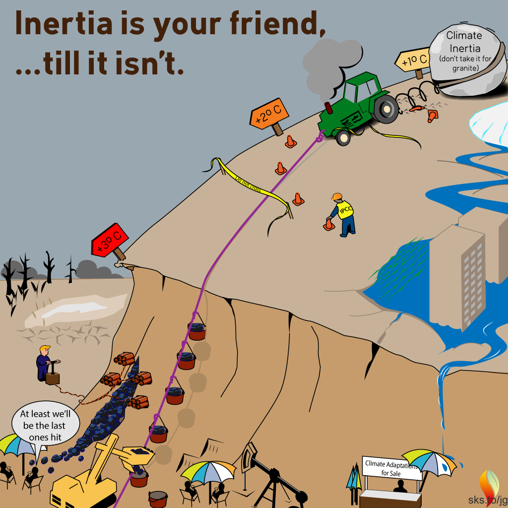
Inertia is your friend … until it isn’t.
Elevator Statement
Inertia delays the response …
But for each CO2 level there is a guaranteed response …
Be patient, the response is coming …
And when it finally comes there’s no going back.
Tie a rubber band to a weight. Move your hand rapidly1 away from the weight,2 stop your hand,3 wait, and the slowly accelerating weight will eventually slam into your hand.4
Think of your hand as CO2 concentration and the weight as atmospheric temperature. Moving your hand quickly is like rapidly increasing CO2 concentration.5 The motion of the weight is like rising atmospheric temperature, where the position of the weight is an indication of atmospheric temperature. A heavy weight causes a large time delay between the motion of your hand and the motion of the weight, similar to the delay between GreenHouse-Gas (GHG) emissions and warming caused by the thermal inertia of the oceans.
So just like connecting your hand to a weight with a rubber band, moving your hand quickly does not guarantee that the weight will initially move quickly. But if you are patient, and if you experiment by moving your hand at different rates, you will find that the quicker and further you move your hand the faster and harder the weight will eventually slam into your hand. You just have to be patient to let the weight catch up.
For another example of the effect of inertia in a system with a small force moving a large weight we turn to NASA. NASA uses solar-powered ion thrusters to power its current generation of deep-space voyagers. Ion thrusters use electrical energy provided by solar panels to accelerate individual xenon atoms, ejecting them at high velocity out the back of the rocket engine. The beauty of ion thrusters is that they combine an essentially infinite energy source (i.e., the sun), together with on-board fuel (xenon) to provide high-efficiency propulsion. The down side is that the thrust/weight ratio is so low that it may take months to years for the probe to reach maximum velocity.
Noting that the heating effect of GHGs in Earth’s atmosphere is relatively low, and that the mass of the oceans is massive, just as ion-thrust engines require months to years to accelerate their payload up to maximum speed, GHGs in Earth’s atmosphere require years to decades to accelerate their “payload” up to maximum temperature, with a typical cause-and-effect time constant of about 30 years: the length of a typical house mortgage.
Climate Science
The reason for the disconnect between the doom and gloom climate scientists are forecasting and the relatively mild6 climate we still enjoy is that climate scientists have their eyes on the hand pulling the rubber band, realizing the climate we are locking in, whereas climate-change deniers have their eyes on the weight, preaching its perceived stability (i.e., “No warming in ??? years”7) and lack of movement above historical extremes (i.e., "It’s been warmer before" argument). While the world “enjoys” the climate we have (i.e., the current position of the weight in our rubber band analogy), climate scientists “see” the climate to which we are committing ourselves (i.e., the position of the hand pulling on the rubber band). The year-to-year increase of CO2 concentrations commit us to an increasingly more difficult future, with temperatures already committed to rise higher than they’ve been in ??? million years.8 The commitment has to do with how far we’re stretching the rubber band, and the delay is due to just how heavy a weight we are pulling. Oceans covering 75% of the surface of the Earth to an average depth of 2 miles represent a really big weight that imposes about a 30-year delay between GHG emissions and rising temperatures. So, how’s that house-building project coming along? Will your house withstand the climate we inherit at the end of your mortgage?
Increasing GHG concentrations is like stretching the rubber band: try to increase surface temperature but end up slow heating the oceans first. Because the temperatures (effect) lag the increased GHG concentrations (cause), some interpret this as meaning that GHGs do not cause global warming and that the scientific theories about the greenhouse effect are incorrect. Worse yet, because the actual system is much more complicated than a simple rubber band and a weight, natural fluctuations in the global weather patterns can mask the cause-effect relationship, making it difficult to relate observed warming to measured GHG concentrations. Waiting until the cause-effect relationship is obvious to non-scientists is waiting too long.
Figure 1 shows the temperature anomaly we expect for a given level of CO2 (left curve) as well as the observed temperature anomaly (right curve). The difference between the expected and observed temperatures is due to the thermal inertia of the oceans. Figure 1 indicates that we now clearly see the relationship between cause (increased GHG concentrations) and effect (rising temperatures) with an observed lag of about 30 years. The observed temperatures show much more year-to-year fluctuations than the expected temperature anomalies because
- The expected temperature anomalies are based only on the measured CO2 concentrations and assuming a climate sensitivity of 3°C/doubling CO2, whereas
- The observed temperature anomalies include natural variations such as El Nino/La Nina cycles, solar activity, temperature reduction due to air pollution and volcanic eruptions, etc.
But the average, overall trend of the measured anomalies is unmistakably following what we expect from measured CO2 concentrations, with a time lag of about 30 years, driven by the inertia of the oceans.
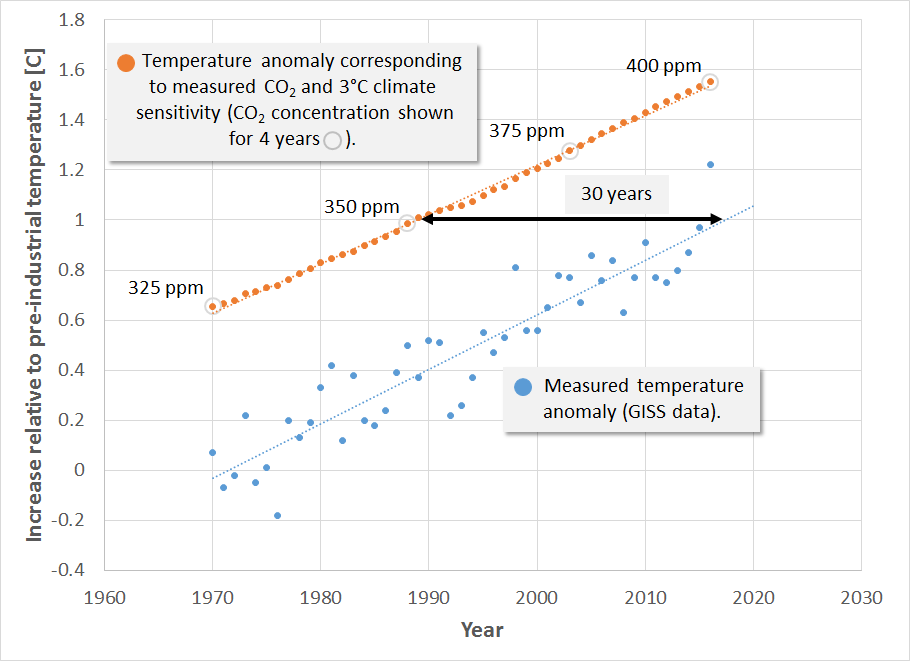 Figure 1. The orange dots show the temperature anomaly we’re committed to based on CO2 concentrations and assuming a climate sensitivity of 3°C warming/doubling CO2. The blue dots show the measured temperature anomaly.
How Inertia Affects our View of Climate Science
Deniers, optimists, and realists all accept (for the most part) that we have exceeded 410 ppm CO2 in 2018. However, the thermal inertia of the oceans may be part of the reason they differ in their interpretation of what 410 ppm CO2 means. Thinking of the rubber band analogy …
- Deniers preach based on the position of the weight (i.e., 1°C warming)
- Optimists preach based on the current position of the rubber band9 (i.e., 1.5°C warming corresponding to 400+ ppm CO2)
- Realists preach based on how long civilization will keep stretching the rubber band (i.e., 2+°C warming)
Nobody knows when civilization will stop stretching the rubber band, so it is wise to hope for the best (2°C warming) but prepare for the worst (3+°C warming).
Figure 2 shows 12-month averages of the measured CO2 concentrations, also known as the Keeling Curve, represented as gray circles. The data spans from the first measurements in 1958 to the present. That’s 60 years of data indicating a consistent, persistent upward acceleration. If we fit a quadratic function to this data and use it to extrapolate the rise forward,10 we can estimate where we’re headed. The reason for this exercise is that the Keeling Curve is actual, measured data of how the entire Atmosphere-Ocean-Biosphere-Human system is responding, and it accounts for all emissions, carbon sinks, positive feedbacks, and atmospheric accumulation, accounting for how humans have responded over the years. It is therefore a realistic assessment of where we’ve come from and where we’re heading in the absence of meaningful intervention. We say meaningful intervention, because even during 30 years of increasing awareness of climate change and the rapid rise in renewable energy of the last 10 years, the Keeling Curve continues its unabated upward acceleration. To interrupt the upward trend shown in Fig. 2, we must do everything we can to rapidly reduce our GHG emissions.
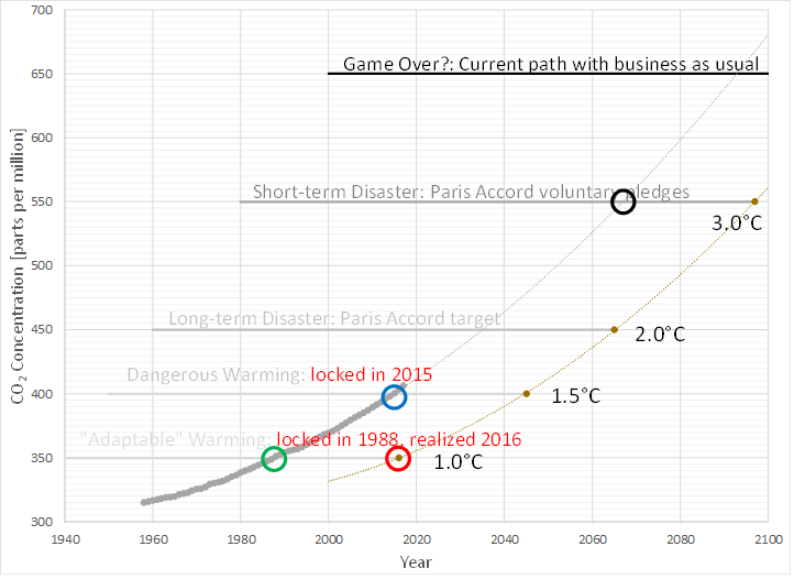 Figure 2. 12-month averages of the measured CO2 concentrations, known as the Keeling curve, shown as gray circles. The curve through the data is a quadratic fit, extrapolated to the year 2100, assuming the same overall behavior as during the 60 years of data currently comprising the Keeling curve (based on NOAA data). The dotted line to the right shows the temperature to which each CO2 level corresponds, and the date when this temperature can be expected to be realized, based on a 30-year time lag due to the thermal inertia of the oceans. The red circle represents what Climate-Change deniers focus on (i.e., the current temperature anomaly), the blue circle represents what optimists focus on (i.e., the temperature we’ve locked in), and the black circle represents what the realists focus on, where we’re heading under current policies.
To the right of the Keeling Curve is a curve that mirrors the Keeling Curve, but with an offset of 30 years. This line is a projection of the temperature response, assuming a 30-year delay due to the thermal inertia of the oceans and assuming a climate sensitivity of 3°C/doubling CO2. The green open circle marks when we locked in 1°C temperature rise, the red open circle marks when we realized 1°C temperature rise, the blue open circle marks when we locked in 1.5°C temperature rise, and the black open circle marks when we can expect to lock in 3°C warming, assuming that Figure 2 is representative of how CO2 will rise.
What this means is that at the point that we realized 1°C warming, we had already locked in 1.5°C warming. Looking ahead, if the Keeling Curve follows the same upward trajectory in the future as it has in the past, by the time we realize 2°C warming, we will have already locked in 3°C warming! This increasing spread between realized and lock-in temperature is due to the projected upward acceleration of the Keeling Curve.
Climate scientists and the IPCC still talk about a remaining budget to stay below 1.5°C warming, whereas Fig. 2 indicates we have already locked in 1.5°C. What's the difference between these viewpoints? Figure 2 shows what is happening, IPCC models talk about what needs to happen to stay below a given target. If we were to reduce net GHG emissions to near zero within a couple of decades, there is a chance we could keep warming to near 1.5°C. This is unlikely, but technically possible (whether it's politically possible is another matter). To meet IPCC targets requires action for which the world has shown a lack of appetite. Figure 2 shows where we are headed. Are you prepared to respond to the IPCC challenge to get us off the upward trajectory? Be thankful that inertia delays the response, giving us time to react. 1°C is here, and given the lack of appetite for responding to the challenge, we are likely out of time to stay below 1.5°C warming. Warming to an unsafe level (i.e., 2°C or higher) appears inevitable without rapid intervention. No matter what temperature we reach or stabilize at, it’s time to prepare. The good thing about the immense inertia in the system response is that it gives us time to prepare.
From Fear to Hope for the Future ... and your Children
Inertia is your friend … until it isn’t.
Hope for the future lies in the fact that inertia slows the response. This slowed response gives us time to prepare and to mitigate. If we stabilize CO2 concentrations at some level, such as 450 ppm, then the temperature will slowly rise to a level corresponding to that GHG concentration, which is likely 2°C above preindustrial temperatures. However, if we were to somehow bring net GHG emissions to 0 (this is extremely unlikely and would require sucking CO2 out of the atmosphere), then Earth will reabsorb much of the CO2 already in the atmosphere, and CO2 concentrations would begin to decrease on their own. Therefore, the huge inertia in Earth's system gives us time not just to prepare for certain bad effects of climate change, but to mitigate to help Earth's natural systems partially restore balance. To bring net GHG emissions to 0 requires that we control GHG emissions from the following sources
- Electricity generation
- Car, trucks, buses, ships, planes, etc.
- Home and building heating/cooling systems
- GHG emissions from animals
- Deforestation
- Cement
- Etc.
as well as to pursue technologies to remove CO2 from the atmosphere.
What can you do to help?
Additional reading
- Climate Change Commitments
- How Big is the Climate Change Deficit?
- A bit more about committed warming
Footnotes
1. Your hand represents GHG concentrations. Moving implies increasing GHG concentration. Moving it rapidly implies rapidly increasing GHGs.
2. The weight represents the thermal inertia of the oceans. The heavier the weight, the larger the implied inertia and the longer it takes for the weight to start to move. The position of the weight represents temperature, and speed of the weight represents the rate of increase of temperature.
3. Stopping our hand would represent successful implementation of the Paris Accord to successfully cap GHG emissions.
4. Slamming into your hand is comparable to the effect of rising temperature on storms and our climate. This is where this analogy breaks down, because if we keep stretching the rubber band negative climate effects will occur, whether or not the weight ever catches up with our hand.
5. For this analogy we assume there is no friction between the weight and the surface it sits on. Therefore, once the rubber band is pulled, the weight will move. It is just a question of quickly it responds to the stretched rubber band.
6. We mean no disrespect to the many people suffering the effects of more intense hurricanes, drought, floods, wildfires, and the like, which climate scientists are increasingly associating with climate change. For the average person, however, the climate has not yet affected them in a way that is readily distinguished from the climate to which they have become accustomed.
7. The number represented by the question marks changes from year to year, but a favorite benchmark is 1998, the year of a monster El Nino that caused larger than normal global warming.
8. The number represented by the question marks continues to change, partly due to the uncertainty of just how hot it was millions of years ago, and partly because each year that it gets hotter the further back we have to go to find a time when it was equally hot.
9. The additional assumption is that civilization will soon stop stretching the rubber band.
10. A quadratic function fits the 60 years of data with R2 = 0.99, indicating a very consistent trend over the 60 years of measurement.
11. We are not disputing their validity, just preferring to stick with the Keeling Curve.


Great post! Thanks!
What makes this even more important is the fact that we have released more CO2 since Al Gores inconvenient truth presentation, and have yet to feel the full effects, than we did in the prior 30 years or so. Sorry I looked but I couldn't find the article where I read this.
Jef@1, or for those of us pushing 60 or so, in my lifetime we have increased atmospheric CO2 concentrations about the same amount as when we came out of the last glacial cycle (i.e., about 100 ppm). But the gist of what you're saying is that CO2 concentrations are not just increasing, they are accelerating upwards.
Scientists are saying we might see a 3 deg C rise in temperature in the near future with climate change. I do not believe that CO2 will be limited with all the exploration going ahead - that is a lost cause for the time being. I am all for renewables, but we are going to keep warming as mentioned above. So it seems we must take CO2 out by growing trees, etc. To grow trees in deserts we need rain enhancement, etc, and planting. One method to increase rainfall is to heat sea surfaces. Indeed the sea air may actually be drying out land air where there are cold seas near hot land - see explanation below:
Suppose the sea air temperature Tseaair=16 deg C and sea air RH=75%. Suppose the air temperature over land is Tlandair=26 deg C and the RH of land air is 45%. Now suppose the sea air blows to land and the land air is pushed to light coloured land with high albedo so the land air remains at 26 deg C. Suppose the sea air is over dark land and it heats to T=26 deg C. The dew point remains the same if air is heated at constant atmospheric pressure, so the dew point of the sea air remains at 11.57 deg C. The dew point of the land air stays at 13.16 deg C. So the land air is more moist (it has to cool less for condensation). The sea air is therefore drier. Summary of calculations below: Tseaair=16, RHseaair=75%,Tlandair=26 deg C, RHlandair=45%. Then dew point of sea air is 11.57 deg C and dew point of land air=13.16 deg C. So if the sea air heats up to 26 deg C then its RH will be lower than 45% (in fact the RH will become 40.55%).
Here is a dew point calculator: http://www.dpcalc.org
Swayseeker,
It is my understanding that on average the ocean is warmer than the air above it. That means it adds water to the atmosphere. Can you provide a peer reviewed paper to support your idea?