


 Arguments


The El Niño cometh
Posted on 25 March 2026 by Zeke Hausfather
This is a re-post from The Climate Brink
El Niño and its sister La Niña are the warm and cool phases of a natural climate pattern across the tropical Pacific (collectively called the El Niño-Southern Oscillation, or ENSO). The planet shifts back and forth irregularly between El Niño and La Niña every two to seven years, changing ocean temperatures and disrupting wind and rainfall patterns across the tropics. This in turn has a number of second-order effects around the planet.
El Niño also has a major effect on global temperatures, reducing the rate of ocean heat uptake and increasing atmospheric temperatures. Global mean temperature can temporarily increase as much as 0.2C during a very strong El Niño event, with the maximum temperature increase in global mean temperature occurring around 3 to 4 months after El Niño conditions peak in the tropical Pacific.
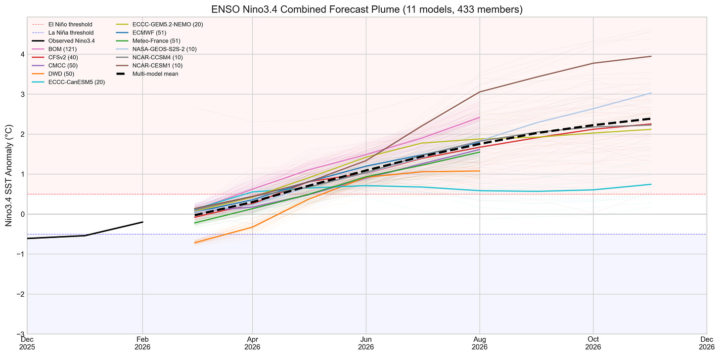
In the past week, a number of modeling groups that try to forecast future ENSO conditions have released forecasts that suggest that a very strong El Niño may be in the works for late 2026. This is a notable revision upwards from earlier forecasts in January and February that suggested that an El Niño might develop, but that it would likely be more modest. Historically it has been hard to precisely predict ENSO development early in the year – hence the famed spring predictability barrier –
I’ve collected 11 different models that have been updated since the beginning of March. Each of these in turn features a number of ensemble members, so that we end up with 433 total ENSO forecasts. A subset of these obtained from Copernicus’ C3S (from Australia’s BOM, CMCC, DWD, ECMWF, and Meteo-France) only extend through August, while the remainder (CFSv2, ECC-CanESM5, ECC-GEM5.2, NASA-GEOS, NCAR-CCSM4, and NCAR-CESM1) extend all the way through November.
The figure below shows a combined super plume of all the ensemble members of all the models, with the mean of each model shown as a bold colored line and the average of all the models (the multi-model mean) shown as a black dashed line.
We can also look at the distribution of temperatures in each month across all ensemble members. The figure below shows the median, interquartile range (25th to 75th percentile) and whiskers (1.5x the interquartile range) for each month, with the statistics weighted based on the number of ensemble members for each model so that models with more ensemble members do not get more weight.
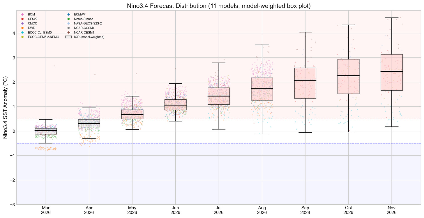
These clearly show that a strong El Niño is indeed likely to develop later in the year. While I’d probably discount some of the higher values (much above 3C) as outliers here, the median and mean across all the models still gives an estimate around 2.5C, which would put it notably stronger than the 2023/2024 El Niño and close to if not matching what we saw back in 2015/2016. 1
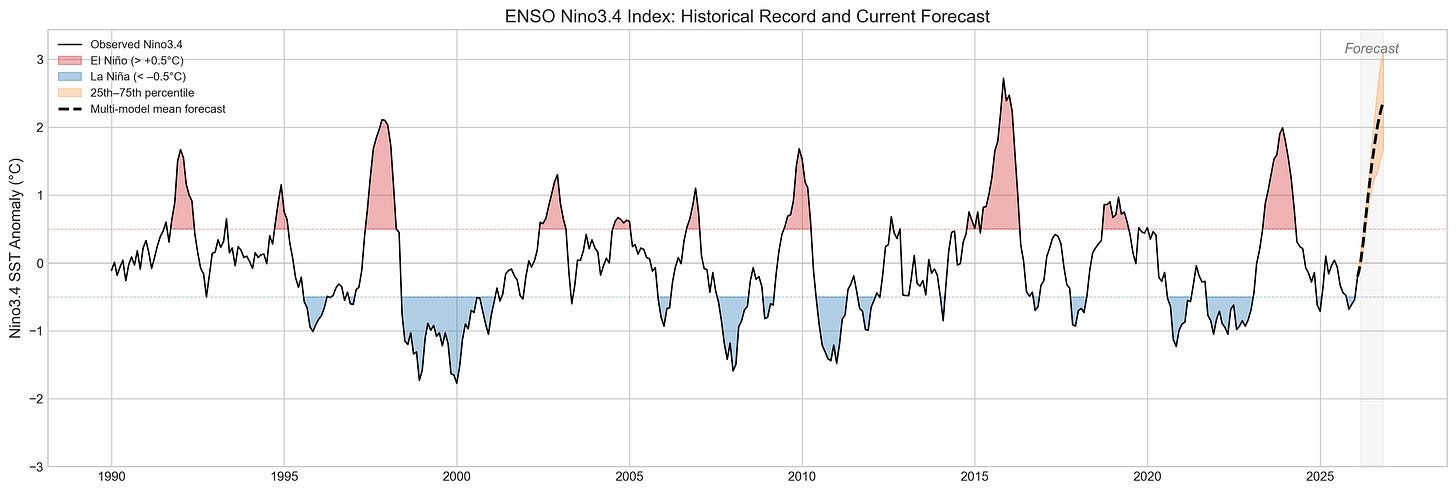
So what does this mean for global temperatures this year and in 2027? All things being equal, the lag between peak El Niño conditions and the global surface temperature response would result in the largest impacts on 2027 temperatures (as El Niño events generally peak between November and January). It would still boost 2026, but probably not enough to set a new record this year.
However, I have to be a bit cautious here. Long time readers may remember my post in May 2023 where I deemed it unlikely that 2023 would set a new record (given this historical lag in global temperature response to El Niño) and argued that 2024 would instead. I was partially wrong – 2023 was weird, and the heat came much earlier than expected. We think the extended triple-dip La Niña event between 2020 and 2023 may have primed the system for more rapid heating, something absent this time around. But we don’t know for sure. Fool me once, and all that.
Either way, this means that 2027 looks increasingly likely to set a new record, perhaps by a sizable margin if we end up on the high end of the range of El Niño forecasts.
Also, as a bonus, I’ve also added a new permanent tab to our Climate Dashboard where you can see the latest El Nino / La Nina forecasts, and play around with interactive versions of all these charts.
1 Note that this shows the old ONI 3.4 Index rather than the new RONI one that better separates out recent global warming from the ENSO signal and has the 2023/2024 El Nino notably smaller. This is because the forecast models still use the old approach to calculating ENSO 3.4 anomalies.


Climate change is increasing the natural chaos of the air masses that move around our tilted planet. In near twelve months,one hemisphere then the other, take its turn, absorbing the more perpendicular radiation from our star.
The current and ever increasing unprecedented weather catastrophes will surely be amplified by the Enso phases. All countries really need and especially in this climate, leaders and government with foresight and empathy and using qualified people to navigate. Sometimes it is obvious how poorly gov perform and sometimes you need to look up and be an unsilent majority-make science great again. www.nokings.org/
[BL] The link you added at the end appears to have no connection to the topic, and has been snipped. You've been around here long enough to know the rules.
"Climate change is increasing the natural chaos of the air masses"
What is that even supposed to mean? El Ninos are not chaotic, as they are triggered by an annual impulse If they were truly chaotic they could would evolve at any time and not be phase-locked to the seasonal cycle.
Paul, I think that is getting into the semantics of what can be described as "chaotic". In the usual sense of extreme sensitivity in complex non-linear system, then phase-locked systems can be chaotic (eg Chaos In Phase Locked Loop). While almost all ESNO switching has a predictable seasonal pattern, it appears that switching remains extremely sensitive to the details of the coupled interactions in the ocean/atmosphere.
I would also agree that ENSO tends to amplify already extreme weather.
Air masses are related to climate zones. They are large bodies of air that influence weather patterns and climate by carrying specific characteristics, such as temperature and moisture, over different regions.
Air masses can significantly affect the climate of a region, leading to variations in weather and temperature.
They are classified based on their source regions and characteristics, which determine their impact on local climates. The interaction of air masses with geographical features contributes to the establishment of climate zones, such as tropical, temperate, polar, and arid.
In summary, air masses play a crucial role in shaping climate zones and influencing weather conditions across the globe.
There has always been a unpredictable forecast about how long and how far or even when the air from these climate zones will travel into their neighbouring zones. Currently, so many multitudinous disasters happening on our watch as climate change does this. e360.yale.edu/features/redrawing-the-map-how-the-worlds-climate-zones-are-shifting#:~:text=Rising%20global%20temperatures%20are%20altering%20climatic%20zones%20around,move.%20By%20Nicola%20Jones%20%E2%80%A2%20October%2023%2C%202018
My censored link was to info for the no kings rally. Without rules for all-where would we be?
[BL] I don't know about "rules for all", but rules for people commenting here at SkS are clearly outlined in the Comments Policy. Those rules include:
No link or picture only. Any link or picture should be accompanied by text summarizing both the content of the link or picture, and showing how it is relevant to the topic of discussion. Failure to do both of these things will result in the comment being considered off topic.
and
All comments must be on topic. Comments are on topic if they draw attention to possible errors of fact or interpretation in the main article, of if they discuss the immediate implications of the facts discussed in the main article. However, general discussions of Global Warming not explicitly related to the details of the main article are always off topic. Moderation complaints are always off topic and will be deleted
In particular, note the last sentence in the second paragraph.
Actually the other way around. Chaose is reduced by periodic forcing. Lorenz himself explored whether the "butterfly effect" in the atmosphere could be mitigated by the annual cycle of solar heating, finding that forcing can indeed confine a system to a more restricted, predictable region of its state space.
Edward N. Lorenz (1990). "Can chaos and intransitivity be removed by periodic forcing?" Tellus A: Dynamic Meteorology and Oceanography, 42(3), 282-293.
What I find rather disturbing is that, SST-wise, we are at much worse situation than in 2023. I will post the COPERNICUS SST and SSTA, taken from the "Climate Pulse" website:
Climate Pulse (COPERNICUS EU)
The graph shows that 2026 has already topped 2023 and 2025, trailing barely behind only 2024. The El Niño has just begun (and not in the central Pacific yet). Current SST is at 21°C (like in the apex of 2023 series) and SSTA is increasing in like in 2023 (but offset by a warming of 0.15-0.2 °C).
If the trend persists, 2024 will be topped in a month or two (SST-wise)...
NB: unfortunately I could not post the image, as COPERNICUS just allows to dowload the jpg images, this website cannot upload raw images. Please tell me if there is some way to solve this technical obstacle...
[BL] There is a brief description near the end of the Comments Policy, describing how to include images.
You are correct that you cannot upload images to SkS. Images need to be available as a file in an image format (JPG, PNG, etc.), hosted on a publicly-visible web page. You can then use the link to that image as a pointer in your comment, using the Insert Image tool on the Insert tab of the editor.
For example, the link to the first graph in the OP is the rather messy "https://substackcdn.com/image/fetch/$s_!YOJ-!,w_1456,c_limit,f_auto,q_auto:good,fl_progressive:steep/https%3A%2F%2Fsubstack-post-media.s3.amazonaws.com%2Fpublic%2Fimages%2F010d462f-072b-40f1-bbf5-c33522eafb9c_4162x2060.png."
If I use the chain link icon on the "Insert" tab of the comment editor, I can put that link behind other text so that people can follow the link (as you have done to point to the Copernicus web page).
If I use the icon on the Insert tab that looks like a tree, then I can put the link to the picture so that the image appears in the comment: (but don't forget to specify an image size <500 pixels wide).
Unfortunately, the Copernicus page you have linked to appears to be generating dynamic, interactive images. Your only choice would be to do a screen grab, save a file, place that file on some public page you can write to and SkS can read from, and then link to that file.
green tortoise,
Concerning in-thread images - There are a number of sites offering on-line image hosting images for free. As an example, I've just uploaded an the image below with this site. It can be a for-ever upload if you choose but in this case it will be live for a month.
The graphic is actually on-line on my The Banana!!! Watch site which is hosted by GoogleSites who don't allow hot URL links.
Concerning the present global SAT/SST - The Climate Pulse site is excelent for giving year-on-year up-to-the-moment temperatures but these do need to be both de-wobbled and adjusted for the underlying rate of AGW to allow the comparison you attempt.
The monthly SAT anomalies in this graphic above show the start of 2026 pretty-much on the 2010-22 trend line. That is what we also see back in 2015, prior to the 2016 El Niño. The situation in early 2023 was a little different as the La Niña had not lessened at all in preceding years, so the SAT would be expected to be significantly depressed prior to the El Niño wobble.
Of course, the 2010-22 warming trend of +0.30ºC/dec does not escape discussion. In the preceding decades, AGW had been strongly constant, stuck at roughly +0.18ºC/dec when models suggested there should have been some acceleration. The models do show today's AGW at +0.30ºC/dec with that acceleration.
The less-wobbly monthly SST anomalies (60N to 60S) provided by Climate Pulse show a strong warming since November last year and that warming has now reversed the cooling seen Jan-Nov. But comparisons with previous pre-El Niño periods show that such a warming is quite normal in pre-El Niño periods. Mind there is the possibility that the coming El Niño will come with a repeat of those 'bananas!!!' temperatures.
Concerning the coming El Niño - The NINO3.4 SST which is used to calculate the ONI (a measure of the ENSO) has just poked its head above zero. The forecasts are strongly pointing to an El Niño by the end of the year and the models have shifted it a little stronger in the last month. (Note that ONI has recently had a new friend RONI - Relative Oceanic Niño Index - that allows for better comparisons back through the years. Today RONI runs lower than ONI)