


 Arguments


New study: global warming keeps on keeping on
Posted on 27 April 2017 by John Abraham
As humans continue to dump heat-trapping gases like carbon dioxide into the atmosphere, the Earth continues to warm. In fact, it has been warming for decades and we now routinely hit temperatures that are 1°C (about 2°F) above the temperatures from 100 years ago.
But despite what we may expect, temperatures across the globe don’t rise little by little each year in a straight line. Rather, temperature changes are a bit bumpy. They go up and they go down somewhat randomly as they increase. Think of a wiggly line superimposed on a straight rising line.
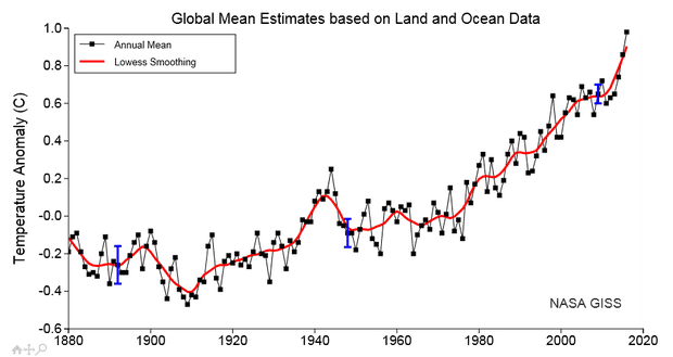
A great depiction of the behavior is seen from the NASA data, shown below. Each black mark is the Earth’s temperature for a given year. The red line is calculated from 5-year averages of the black data marks and is much smoother than the black line. As you move from left to right, you pass from the year 1880 to the most recent year (2016), which is shown in the very upper right corner.
Careful observation of the graph shows that the last three years (2014, 2015, and 2016) were all record-breakers. It makes you wonder, what the chances are that global warming has sped up?
Well this is a question that can be tested with statistics, and a new paper out in Environmental Research Letters did just that. In the study, the authors ask a few important questions. First, can the latest three years, all of which were record-setting, tell us whether the rate of warming has changed? Also, can the years that preceded those (which were cooler than the trend) tell us whether the rate of warming had slowed?
With respect to whether surface warming has sped up or slowed down, the authors of this study made a testable hypothesis. They started out assuming that the Earth was warming at a constant rate but superimposed on this warming was a random short-term variability. Then they looked at the temperature measurements (like those shown in the figure above) and ran statistical tests to see whether those temperatures would be unlikely to occur given their hypothesis. A simple way to state this is, do you get temperature results like that above with the simple assumption of constant warming with natural year-to-year fluctuations?
Using what is called a Monte Carlo method where you let your statistics tool give you a large population of possible temperatures by running many random trials, the authors found that using the NASA temperatures, the likelihood of seeing a trend as low as, or even lower than what was observed during the 2001–2014 period was 74%. The likelihood of seeing the actual 2000–2012 temperatures was 96%. In other words, it’s very likely that a time period with a trend as low as observed would occur just by chance, given a constant warming rate.
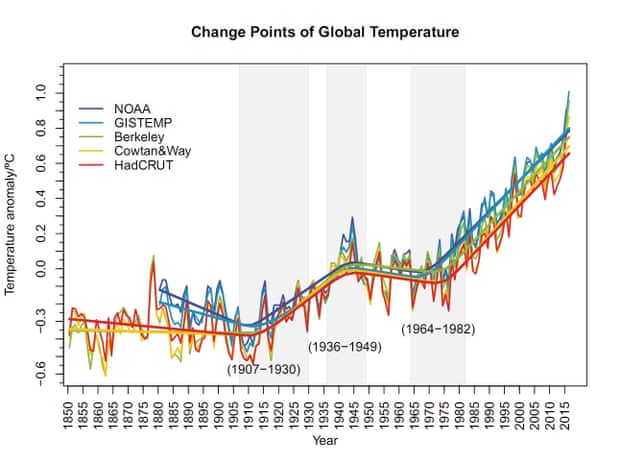
They repeated the analysis for another climate dataset (HadCRUT4) and found again, it’s not unusual to expect the temperatures we actually saw over these periods. The figure below shows five different sets of temperature data; they are all telling this same story of uninterrupted rise over the past four decades or so.


As has been pointed out by some scientists, the amount of warming is not what we observe. It is how much the present temperature is above what we would expect based on previous interglacials in which, as soon as we reached peak warming as we came out of a glacial, we immediately started the slow slide back into a glacial. Apparently the interglacial with a most similar Milankovitch profile to our own is the one which occured some 400,000 years ago. Using this expected cooling curve as the base line, the amount of warming is more than the 1 degree we observe.
Oddly, this article ends up failing to answer one of the questions it sets out at the beginning, even though the paper it describes does answer that question. The answer to the question "[W]hat the chances are that global warming has sped up [in the last 3 years]?" is "pretty low", or rather: