


 Arguments


State of the climate: how the world warmed in 2017
Posted on 30 January 2018 by Zeke Hausfather
This is a re-post from Carbon Brief
The climate data for 2017 is now in. In this article, Carbon Brief explains why last year proved to be so remarkable across the oceans, atmosphere, cryosphere and surface temperature of the planet.
A number of records for the Earth’s climate were set in 2017:
- It was the warmest year on record for ocean heat content, which increased markedly between 2016 and 2017.
- It was the second or third warmest year on record for surface temperature – depending on the dataset used – and the warmest year without the influence of an El Niño event.
- It saw record lows in sea ice extent and volume in the Arctic both at the beginning and end of the year, though the minimum extent reached in September was only the eighth lowest on record.
- It also saw record-low Antarctic sea ice for much of the year, though scientists are still working to determine the role of human activity in the region’s sea ice changes.
Warmest year on record in the oceans
More than 90% of the heat trapped by increasing greenhouse gas concentrations ends up going into the Earth’s oceans. While surface temperatures fluctuate a bit from year to year due to natural variability, ocean heat content increases much more smoothly and is, in many ways, a more reliable indicator of the warming of the Earth, albeit one with a shorter historical record.
2017 set a clear record for the highest ocean heat content since records began in 1958, according to the Institute of Atmospheric Physics of the Chinese Academy of Sciences(IAP-CAS), which maintains an up-to-date ocean heat content database.
The figures below shows ocean heat content for each year in the region of the ocean between the surface and 2,000 meters in depth (comprising the bulk of the world’s oceans), as well as a map of 2017 anomalies.
The upper figure shows changes in ocean heat content since 1958, while the lower map shows ocean heat content in 2017 relative to the average ocean heat content between 1981 and 2010, with red areas showing warmer ocean heat content than over the past few decades and blue areas showing cooler.
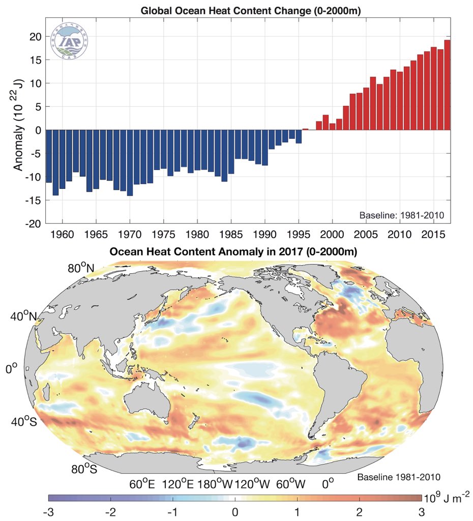
Change in global ocean heat content between the surface and 2000 meters of depth from 1958 to 2017 (top) and distribution of ocean heat content anomalies in 2017 (bottom). Figure from Cheng and Zhu (2018), using data from IAP-CAS.
Ocean heat content in 2017 was significantly higher than in 2015, the next warmest year. While 2016 was the warmest year on the surface, it was only the third warmest year for ocean heat content as the El Niño event that helped 2016 surface temperatures be so warm redistributed heat out of the ocean and into the atmosphere.
Warmest surface temperatures without an El Niño
Global surface temperatures in 2017 were the second or third warmest on record since 1850, when global temperatures can first be calculated with reasonable accuracy. Unlike the other warmest years – 2015 and 2016 – there was no El Niño event in 2017 (or in late 2016) contributing to increased temperatures this year (and mild El Niño conditions in early 2017 were offset by mild La Niña conditions during the later part of the year).
Records that include coverage of the full Arctic, such as those from NASA, Berkeley Earth and Copernicus/ECMWF, showed 2017 as the second warmest after 2016, while records with sparser coverage in that region showed 2017 as the third warmest behind 2016 and 2015. All surface records show quite similar results when examined over regions where they all have coverage.
The figure below shows global surface temperatures records from the principal research groups around the world since 1970. These are created by combining ship- and buoy-based measurements of ocean sea surface temperatures with temperature readings of the surface air temperature from weather stations on land. Temperatures are shown as anomalies relative to a 1970 to 2000 average. [Each temperature record can be turned on or off using the figure legend.]
Annual global average surface temperatures from 1970-2017. Data from NASA GISTemp, NOAA GlobalTemp, Hadley/UEA HadCRUT4, Berkeley Earth, Cowtan and Way, and Carbon Brief’s raw temperature record. 1979-2000 temperatures from Copernicus/ECMWF (as the reanalysis record starts in 1979). Anomalies plotted with respect to a 1970-2000 baseline. Chart by Carbon Brief using Highcharts.
Short-term variability in the record is mostly due to the influence of El Niño and La Niña events, which have a short-term warming or cooling impact on the climate. Other dips, such as the one in the mid-1990s, are associated with large volcanic eruptions. The longer-term warming of the climate is entirely driven by atmospheric increases in CO2 and other greenhouse gases emitted from human activity.
The record warm temperatures experienced over the past three years are not due to any adjustments made to the underlying temperature records. The figure above includes a “raw records” line calculated by Carbon Brief using data not subject to any adjustments or corrections for changes in measurement techniques. Since 1970, the raw data and the adjusted temperature records produced by different groups largely agree.
Global surface temperature records can be calculated back to 1850, though some groups choose to start their records in 1880 when more data was available. Prior to 1850, records exist for some specific regions, but are not sufficiently widespread to calculate global temperatures with any reasonable accuracy. Global temperature records since 1850 are shown in the figure below, again shown as the difference from a baseline of 1970-2000.
Same as prior figure, but with data extending back to 1850 (or as far back as each individual record is available). Chart by Carbon Brief using Highcharts.
Global surface temperatures in 2017 were 1-1.2C warmer than temperatures in late 19th century (between 1880 and 1900), depending on the temperature record chosen.
It is striking how warm 2017 was, despite the end of the massive El Niño event that pushed up 2015 and 2016 temperatures. The past three years are well above any prior years’ temperatures, by a margin of more than 0.15C,
This is shown in the figure below from Berkeley Earth. Each shaded curve represents the annual average temperature for that year, and the further that curve is to the right, the warmer it was.
The width of each year’s curve reflects the uncertainty in the annual temperature values (caused by factors such as changes in measurement techniques and the fact that some parts of the world have more sparse station coverage).
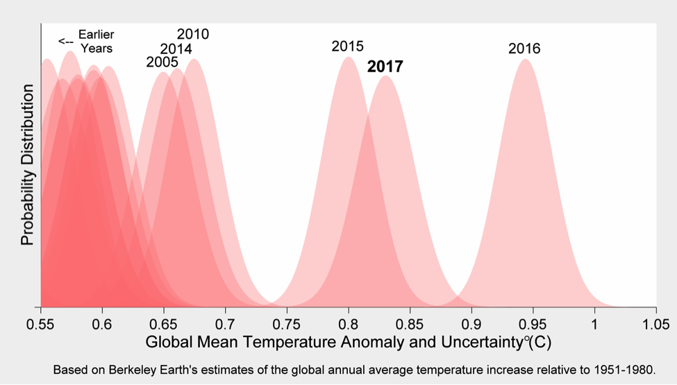
Global average surface temperatures for each year with their respective uncertainties (width of the curves) from Berkeley Earth. Note that warming is shown here relative to the temperature of the 1951-1980 period, but the relative position of the years would be the same using a 1970-2000 baseline. Figure produced by Dr Robert Rohde.
While El Niño and La Niña events have a sizable short-term impact on global temperatures, their influence tends not to extend for more than six months or so after the event has ended. With the large El Niño event of 2015 and 2016 fading by the summer of 2016, it had little direct influence on 2017 temperatures.
In the figure below, Dr Gavin Schmidt, director of the NASA Goddard Institute for Space Studies, uses a simple statistical model to estimate what the global temperature record (black line) would be like in the absence of El Niño or La Niña influences (red line).
Although El Niño bumped up the temperatures of 2015 modestly and 2016 quite a bit, it had almost zero effect on 2017 temperatures. When the influence of El Niño is removed from the record, according to Schmidt’s analysis, 2017 would be the warmest year on record.
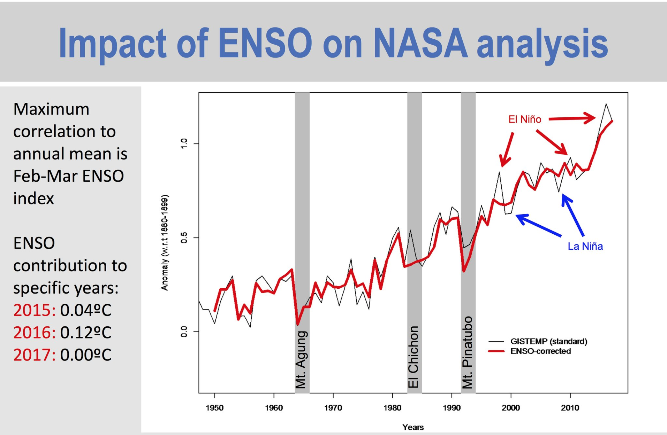
Global average surface temperatures from NASA’s GISTemp (black) and with the influence of El Niño and La Niña (collectively referred to as ENSO) removed (red). Figure produced by Dr. Gavin Schmidt.
However, Dr Tim Osborn, director of the Climatic Research Unit at the University of East Anglia, cautions that these results are somewhat sensitive to the statistical method and El Niño index used.
He suggests that, while 2017 is probably the warmest when ENSO is taken out, it is not necessarily as clear a winner over 2016 and 2015 if different methods are used. It is clear, though, that 2017 is the warmest non-El Niño year by any measure.
A paper recently published in Geophysical Research Letters by researchers at the University of Arizona suggests that global temperatures may not return down to pre-2015 levels any time soon. They suggest that extra heat was absorbed by the tropical Pacific Ocean since the late 1990s and that the recent El Niño event acted as a trigger for that heat to be released. The cycle of extra heat uptake by the oceans may be over for at least a decade.
Near-record warmth in satellite records
In addition to surface measurements over the world’s land and oceans, satellite microwave sounding units have been providing estimates of global lower atmospheric temperatures since 1979. These measurements, while subject to some large uncertainties, also show 2017 as a near-record warm year.
The record produced by Remote Sensing Systems (RSS) shows 2017 as the second warmest year after 2016, while the record from the University of Alabama, Huntsville(UAH) shows it as the third warmest after 2016 and 1998. The two records are shown in the figure below – RSS in red and UAH in blue.
Global average lower troposphere temperatures from RSS version 4 (red) and UAH version 6 (blue) relative to a 1979-2000 baseline (as the satellite records begin in 1979). Chart by Carbon Brief using Highcharts.
These satellites measure the temperature of the lower troposphere and capture average temperature changes around 5km above the surface. This region tends to be influenced more strongly by El Niño and La Niña events than the surface and satellite records show correspondingly larger warming or cooling spikes during these events.
This is why, for example, 1998 shows up as one of the warmest years in satellites, but not in surface records.
Observations tracking close to climate modelling projections
Climate models provide projections of both long-term and shorter-term changes to the Earth’s climate. While climate models show their own El Niño- and La Niña-like behaviour, it does not necessarily occur at the same time in models as it does in the real world.
However, temperatures in recent years – both during the El Niño event and, more importantly, now that the El Niño event is over – are tracking rather close to the average projection of the climate models included in the latest report from the Intergovernmental Panel on Climate Change (the CMIP5 models).
These models used historical records of greenhouse gases and other factors through to 2005. Model estimates of temperatures prior to 2005 are a “hindcast” using known past climate influences, while temperatures projected after 2005 are a “forecast” based on a estimate of how things might change.
The figure below shows the range of individual models forecasts between 1970 and 2020 with grey shading, with the average projection across all the models shown in black. Individual observational temperature records are represented by coloured lines.
Annual global average surface temperatures from CMIP5 models and observations between 1970 and 2020. Models use RCP4.5 forcings after 2005. They include sea surface temperatures over oceans and surface air temperatures over land to match what is measured by observations. Anomalies plotted with respect to a 1970-2000 baseline. Chart by Carbon Brief using Highcharts.
While global temperatures were running a bit below climate models between 2005 and 2014, the last few years have been pretty close to the model average.
Low sea ice at both poles
In addition to near-record temperatures, 2017 also saw record-low sea ice during parts of the year, both in the Arctic and Antarctic.
The figure below shows the average Arctic sea ice extent for each week of the year for every year between 1978 and 2017. Prior to 1978, satellite measurements of sea ice extent are not available and the data is much less reliable.
Average Arctic sea ice extent by week from 1978-2017. Data from the US National Snow and Ice Data Center (NSIDC). 2017 is shown by the black line. Chart by Carbon Brief using Highcharts.
The figure shows a clear and steady decline in Arctic sea ice since the late 1970s, with lighter darker colours (earlier years) at the top and lighter colors (more recent years) much lower. A typical summer now has nearly half as much sea ice in the Arctic as it had in the 1970s and 1980s.
Arctic sea ice in 2017 had record-low extents for much of the first five months of the year, though it recovered a bit after that to show only the eight lowest summer minimum on record. However, Arctic sea ice has again seen near-record lows in the December 2017, reflecting unusual warmth in the region.
Sea ice extent only provides part of the picture, as some sea ice is much thicker or older than others. The Pan-Arctic Ice Ocean Modeling and Assimilation System (PIOMAS) project provides estimates of sea ice volume since 1979, shown in the figure below.
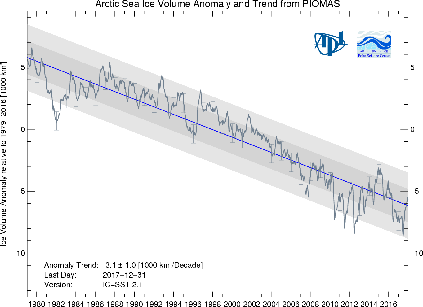
Arctic sea ice volume anomalies from 1979 through 2017 from PIOMAS.
According to PIOMAS, sea ice volume was around 12,000 cubic kilometers lower than in 1979. They found that 2017 tied 2012 for the lowest measured Arctic sea ice volume on record, though 2012 remains the year with the lowest summer minimum volume.
While the long-term decline in Arctic sea ice is clear, the Antarctic is much more complicated. Weekly Antarctic sea ice extent from 1978 through to 2017 is shown in the figure below.
Average Antarctic sea ice extent by week from 1978-2017. Data from the US National Snow and Ice Data Center (NSIDC). 2017 is shown by the black line. Chart by Carbon Brief using Highcharts.
Unlike in the Arctic, the Antarctic has no clear long-term trend in sea ice extent. In the figure early years (darker lines) and recent years (lighter lines) are intermixed. In fact, 2015 and early 2016 set records for the most sea ice extent observed.
In 2017, however, Antarctic sea ice hit record lows for much of the year. Even in recent months it has been the second lowest recorded after late 2016. It is unclear what role, if any, climate change is playing in Antarctic sea ice changes, though it is an area of very active research.
Finally, both Antarctic and Arctic sea ice extent is combined to estimate global sea ice extent in the figure below.
Average global sea ice extent by week from 1978-2017. Data from the US National Snow and Ice Data Center (NSIDC). 2017 is shown by the black line. Chart by Carbon Brief using Highcharts.
Global sea ice set a clear record low in the first half of 2017, driven in large part by record low Antarctic sea ice cover. There has been a long-term downward trend in summer global sea ice extent, though the trend is less clear in the winter, reflecting the fact that the Arctic shows a clearer long-term trend than the Antarctic.
Methods
Carbon Brief produced a raw global temperature record using using unadjusted ICOADSsea surface temperature measurements gridded by the UK Hadley Centre and raw land temperature measurements assembled by NOAA in version 4 of the Global Historical Climatological Network (GHCN).
Raw land temperatures were calculated by assigning each station to a 5×5 latitude/longitude grid box, converting station temperatures into anomalies relative to a 1971-2000 baseline period, averaging all the anomalies within each grid box for each month, and averaging all grid boxes for each month weighted by the land area within each grid box.
Raw combined land/ocean temperatures were estimated by averaging raw land and ocean temperatures weighted by the percent of the globe covered by each.


Comments