Climate Science Glossary

Term Lookup

Enter a term in the search box to find its definition.

Settings

Use the controls in the far right panel to increase or decrease the number of terms automatically displayed (or to completely turn that feature off).

Term Lookup

Settings


All IPCC definitions taken from Climate Change 2007: The Physical Science Basis. Working Group I Contribution to the Fourth Assessment Report of the Intergovernmental Panel on Climate Change, Annex I, Glossary, pp. 941-954. Cambridge University Press.

Home Arguments Software Resources Comments The Consensus Project Translations About Support

Twitter Facebook YouTube Mastodon MeWe

RSS Posts RSS Comments Email Subscribe


Climate's changed before
It's the sun
It's not bad
There is no consensus
It's cooling
Models are unreliable
Temp record is unreliable
Animals and plants can adapt
It hasn't warmed since 1998
Antarctica is gaining ice
View All Arguments...


Username
Password
New? Register here
Forgot your password?

Latest Posts

Archives

New temperature reconstruction vindicates ...

Posted on 28 September 2010 by Ned

Guest post by Ned

A new temperature reconstruction has been published in the Swedish journal Geografiska Annaler: Series A, Physical Geography.  The reconstruction (hereafter Ljungqvist 2010) covers the past 2000 years for the middle and high latitudes of the Northern Hemisphere.

This reconstruction includes a number of new proxies that have not been included in previous hemispherical or global temperature reconstructions, and avoids many of the proxies that have been the subject of contention in the past. The results are shown in Figure 1:

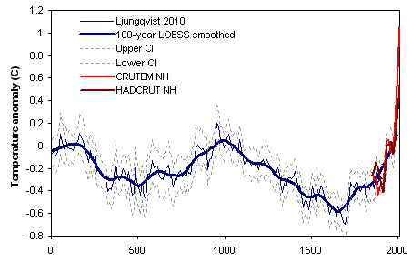
Figure 1.  Extratropical (30-90 N) northern hemisphere temperature reconstruction by Ljungqvist (2010).  Northern hemisphere instrumental temperature records shown for comparison (CRUTEM land only, and HADCRUT land/ocean).

Ljungqvist notes that this reconstruction shows a Roman Warm Period prior to AD 300, followed by a Dark Ages Cold Period (AD 300 to 800), a Medieval Warm Period (AD 800 to 1300), the Little Ice Age (AD 1300 to 1900), and modern warming in the 20th century.  While there has been debate about how "globally consistent" these various warm and cold periods have been, they have long been recognized as prominent features of the extratropical Northern Hemisphere temperature record, so their appearance in Ljungqvist 2010 is not surprising.

Readers may wonder how this new reconstruction compares to previous hemispherical and global temperature reconstructions.  In his conclusion, Ljungqvist (2010) reports that:

"Although partly different data and methods have been used in our reconstruction than in Moberg et al. (2005) and Mann et al. (2008), the result is surprisingly similar. The inclusion of additional records would probably not substantially change the overall picture of the temperature variability."

On the other hand, Craig Loehle claims that Ljungqvist's work vindicates his own previous "global" reconstruction (Loehle and McCulloch 2008, previously discussed elsewhere on this site). Writing on the website Watts Up With That, Loehle claims:

"In this post I demonstrate perhaps a little vindication [...] There is excellent agreement over the past 1100 years [...] My peak temperature occurs about 100 years earlier, but I agree with the new reconstruction [....]  The MWP looks real."

So who's right?  Does Ljungqvist confirm the results of Mann (2008) and Moberg (2005)?  Or do his results agree with Loehle and McCulloch (2008)?  Figure 2 provides a comparison of them all, starting in AD 500 (the earliest date in Mann 2008's global reconstruction), with the northern hemisphere instrumental record shown for comparison.


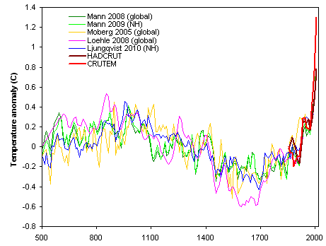
Figure 2.  Comparison of northern hemisphere and global temperature reconstructions.  Northern hemisphere instrumental temperature records shown for comparison (CRUTEM land only, and HADCRUT land/ocean).

It's worth noting that all the reconstructions show the Medieval Warm Period, the Little Ice Age, and 20th-century warming (though Loehle 2008 only runs through 1935).  

Loehle's Medieval Warm Period is both warmer and earlier than the rest (and, as noted above, Loehle recognizes that his early peak circa AD 850 is probably incorrect).  Loehle also shows a much colder Little Ice Age.  All of the reconstructions diverge more in the period before AD 800, with Moberg being the coolest, Loehle the warmest, and Mann and Ljungqvist being in the middle of the pack.

When comparing Ljungqvist 2010 to Loehle 2008, it's important to remember that Ljungqvist's reconstruction is for the mid- and high-latitude Northern Hemisphere only, while Loehle's was supposed to be global.  In this light, the presence of relatively extreme temperatures in Loehle's reconstruction during both the Medieval Warm Period and the Little Ice Age ought to be viewed somewhat skeptically.  Whether or not these episodes were truly "global", they were certainly strongest in the Northern Hemisphere, particularly in the North Atlantic region. Ljungqvist 2010 suggests that his own reconstruction may have underestimated the magnitude of Northern Hemisphere cooling during the Little Ice Age, but Loehle's still appears to be an outlier if it is considered as a global reconstruction.

Finally, it's worth noting that comparison to the instrumental record suggests that modern temperatures are significantly warmer than those during the height of the Medieval Warm Period.  Additional projected 21st Century warming will produce a climate unlike anything experienced in the history of human civilization.

Update (29 Sep 2010)

Several people have expressed interest in seeing how the various reconstructions compare to current temperatures (from the instrumental record).  In order to do this, it's important to carefully "center" each reconstruction such that it matches the instrumental record as closely as possible during the period of overlap.

I've taken the three Northern Hemisphere reconstructions (Mann, Moberg, and Ljungqvist) plus Loehle's "global" reconstruction, and carefully matched each one to the same instrumental temperature record (CRUTEM Northern Hemisphere land temperatures).  The results are in Fig. 3:


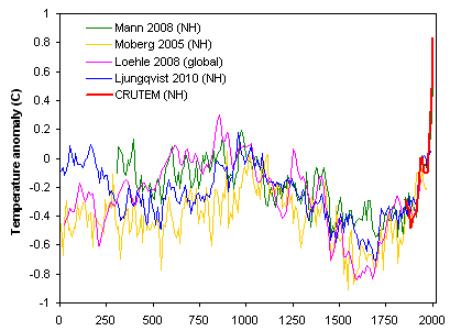
Figure 3.  Comparison of temperature reconstructions, re-centered to match CRUTEM NH land record (based on each reconstruction's period of overlap).

Bit of a mess, eh?  To focus on just the Medieval Warm Period and the Little Ice Age, I've pulled out the three warmest decades and three coolest decades in each reconstruction (during the period from AD 500 to 1900).

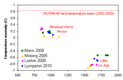
Figure 4.  Warmest decades of the Medieval Warm Period, and coolest decades of the Little Ice Age, after re-centering each reconstruction to match the instrumental temperature record during the period of overlap.

Moberg is a bit on the cool side overall -- which might just mean it was anomalously warm during the calibration period used for centering.  Mann and Ljungqvist agree very closely on the Medieval Warm Period, though Mann's Little Ice Age is not as cold. 

Loehle manages to be both too warm and too early on the Medieval Warm Period and on the cool side during the Little Ice Age.  This difference would not be all that noteworthy, except for the fact that Loehle 2008 is supposed to be a global reconstruction ... and the magnitude of the MWP-LIA difference should almost certainly be smaller for a global reconstruction than for a Northern Hemisphere one.

The other obvious point is that when we compare these to the current instrumental temperature record, the Medieval Warm Period seems to be about 0.7 degrees C cooler than the 2000-2010 mean temperature.  

0 0

Printable Version  |  Link to this page

Comments

Prev  1  2  3  4  

Comments 151 to 151 out of 151:

  1. KL #149 Well that's a rule of thumb. In reality we use significance tables (at p = 0.05, two tailed):
    No paired observationsMinimum value of R required for significanceMin val of R2
    140.4970.247
    100.5760.332
    80.6320.399
    50.7070.499
    2.950.903
    Anyway if you're going to try to make strong claims about correlations over short periods, you need to do it quantitatively, not qualitatively, and as you can see above, it's a pretty blunt instrument.
    0 0
  2. Ken #153: "I have noticed that when an argument gets hot and running - and the counter punches are telling on the non-skeptics" So, that'd be... never? Oddly when I look at the "It's the Sun" page I don't see any comments from YOU... and comments directed TO you, such as this one, seem to have gone unanswered. Perhaps you put something up which was removed for violation of the comments policy? In any case, I think the non-existence of any posts from you on that page is a more likely explanation of a failure of people to reply than your theory that redirecting discussions to the appropriate page is an attempt to hide an inability to refute your claims.
    0 0
  3. #145. You are not serious. You use like 2 year trends to prove "accelerated warming". Plus some heavy La Nina- El Nino -cherrypicked trends. Your comparisons were as valuable as this: Nice cherrypicking mate. The problem is that any other shorter interval also includes a lot of noise from weather phenomenoms. Therefore you need to draw the lines from CREST-TO-CREST, on ENSO-neutral intervals. 1998 to 2010 is one of those intervals, and there is no statistically significant warming there. Also a note for the Neds original post: The Lundgqvist data ends on 1999 so therefore you need to ONLY add the temperature increase since then (with 10yr smoothing). Your "method" to add the thermometer data is HIGHLY suspicious, since the NH hasnt warmed since 1990 any more than 0.4 degrees. Best way would be to add the 2000-2009 decadal mean as a spot to the end and THATS IT. Even Taminos version shows its only 0.2K warmer than on MWP: (note that he didnt add any thermometer comparison to Loehle and THEN offset to the mean, therefore his offsets are bogus only to support his preconceived notions): And the error margins on MWP are about +-0.2K Also, from the paper itself, please read the actual paper before making such "comparisons": "a very cautious interpretation of the level of warmth since AD 1990 compared to that of the peak warming during the Roman Warm Period and the Medieval Warm Period is strongly suggested." Your comparisons DO NOT fall into category 'very cautious interpretation'. And from McShane&Wyner pg. 3: "It is not necessary to know very much about the underlying methods to see that graphs such as Figure 1 are problematic as descriptive devices. First, the superposition of the instrumental record (red) creates a strong but entirely misleading contrast. The blue historical reconstruction is necessarily smoother with less overall variation than the red instrumental record since the reconstruction is, in a broad sense, a weighted average of all global temperature histories conditional on the observed proxy record. Second, the blue curve closely matches the red curve from 1850 AD to 1998 AD because it has been calibrated to the instrumental period which has served as training data. This sets up the erroneous visual expectation that the reconstructions are more accurate than they really are." Therefore the thermometer data is actually not even comparable to proxy data. And your methods HIGHLY problematic.
    0 0
  4. Here is actually a screenshot from the paper, a more honest apples-to-oranges comparison: The modern maximum clearly fits to the MWP and RWP margins. And even considering the fact that the graph uses data up to 1999 there is actually little or no need for such a comparison. Try calculating 2000-2009 minus 1990-1999 and add the result on the papers 1990 decaedal mean. Neds plots are really exaggerated and falsely interpreted.
    0 0
  5. protestant writes: The Lundgqvist data ends on 1999 so therefore you need to ONLY add the temperature increase since then (with 10yr smoothing). Your "method" to add the thermometer data is HIGHLY suspicious, since the NH hasnt warmed since 1990 any more than 0.4 degrees. Best way would be to add the 2000-2009 decadal mean as a spot to the end and THATS IT. I think you're reading deceptive intent where none exists. I wanted to compare a number of different reconstructions including that of Loehle which isn't calibrated to anything else and ends in 1935. In order to do that, it's necessary to somehow recenter the various reconstructions. In Figure 2 I did this based on the period of overlap among the reconstructions, while in Figure 3 I did this by matching each one as closely as possible to the instrumental record during their period of overlap with the instrumental record. One can argue about which is better, but they're both up there. Comparing proxy-based reconstructions to the instrumental record is inherently problematic. Yes, the temporal resolution is different, and some proxies show a well known divergence from actual temperatures in recent decades. There's also the question of which instrumental record to use as a comparison (land vs land/ocean, NH vs global). Faced with those problems, one can either not compare to the instrumental record (and thus draw no conclusions about how past temperatures compare to the present) or one can try to match the proxy and instrumental records as closely as possible during their period of overlap. This is what I do in Figure 3. I understand Ljungqvist's comment that you cite ("a very cautious interpretation of the level of warmth since AD 1990 compared to that of the peak warming during the Roman Warm Period and the Medieval Warm Period is strongly suggested") and have no problem with that. However, the key point of my post is to assess the degree to which Ljungqvist "vindicates" Loehle (2008) vs "vindicating" other reconstructions. Loehle's reconstruction is supposed to be a global reconstruction, yet it shows a greater amplitude for NH-centric episodes than actual NH reconstructions (Ljungqvist, Mann, Moberg). To me, that suggests that insofar as Ljungqvist 2010 "vindicates" anyone, it's a much better match to Mann or Moberg than Loehle.
    0 0
  6. #152: "you need to draw the lines from CREST-TO-CREST, on ENSO-neutral intervals. 1998 to 2010 is one of those intervals," I don't understand that strategy. Crests are, by definition, noise from short term phenomena. Connecting the dots from 1998's crest to 2009's crest is just as arbitrary as connecting the dots from 1993's trough to 2007's trough. The conclusion that 'there's no statistically significant warming 1998-2010' is to use two and only two data points. How is that not cherrypicking?
    0 0
  7. muoncounter at 03:43 AM on 14 October, 2010 I think protestant is saying that calculating the mean trend over a period between two ENSO peaks is valid? I checked the trend (it looks similar), but the premise is incorrect, and it is still cherrypicking. From a signal analysis point of view to get close to a meaningful trend we would want to calculate over a minimum period equivalent to several of the maximum length ENSO cycles, - if ENSO has a strong influence (which it does). This would be closer to 20 years than 10. We would normally try to take a trend through extreme excursions like the 1998 peak. To take this peak as a starting point for a 10 year trend is as wrong headed as using it as an end point for the previous decade. Both trend results would be unduly biased in opposite directions. A running decadal average (red below) would be better at extracting underlying trends with minimised ENSO influence, but as this clearly shows the underlying rising trend few deniers would recommend this methodology. Back to the post, the rather crude reconstruction here (using most of Ljungqvist 2009 data) seems suspect in some areas compared to Ljungqvist 2010. If so, by association, so is Loehle, as the methodology is similar (but he uses less proxies).
    0 0
  8. #156: "to get close to a meaningful trend we would want to calculate over a minimum period equivalent to several of the maximum length ENSO cycles" Peter, I think that statement is the key take-away here. Whenever trends are calculated using long enough data sets, we see 'statistically significant warming.' When the 2,3,5,10 year trends are calculated, you can get whatever you want, depending on how you've picked the years. To me, that's the working definition of 'statistical significance.'
    0 0
  9. muoncounter #157 You can demonstrate the effect sizes needed for statistical significance as I explained in this post. A further thing of note, is that if you're doing short-series correlations, and the value of R2 varies wildly depending on the start and end points within the set of data that you're interested in, then you're doing something wrong, and need more context or alternative statistical methods. In Peter Hogarth's (#156) instance, you'd want to control for the effect of ENSO in some way, and then measure the trend.
    0 0
  10. #154: "I understand Ljungqvist's comment that you cite ("a very cautious interpretation of the level of warmth since AD 1990 compared to that of the peak warming during the Roman Warm Period and the Medieval Warm Period is strongly suggested") and have no problem with that." But your reconstructions DO have a problem with that. Your post maybde had an intention of also vindicating the original hockey stick shape and that the current temperature trend would be unprecedented. The original study doesnt support that. If you want to be credible also in the eyes of us sceptics', next time, when someone publishes a new proxy-reconstrucion, please cite the graphs used in the papers ant not making your own with your own undocumented un-peer-rewieved methodologies. "However, the key point of my post is to assess the degree to which Ljungqvist "vindicates" Loehle (2008) vs "vindicating" other reconstructions. Loehle's reconstruction is supposed to be a global reconstruction, yet it shows a greater amplitude for NH-centric episodes than actual NH reconstructions (Ljungqvist, Mann, Moberg). To me, that suggests that insofar as Ljungqvist 2010 "vindicates" anyone, it's a much better match to Mann or Moberg than Loehle." And if you add temperature data to Loehle, you get basically same results as Ljundgqvist. She shapes on both are remarkably similar. Some differences occur - like Loehle fails to show RWP and also shows LIA a bit colder. It does NOT vindicate Mann, except with the apples-to-oranges comparison you just did and which was justifiedly strongly critisized on my last posts. The shapes of the original studies simply DO NOT agree. #155: "I don't understand that strategy. Crests are, by definition, noise from short term phenomena. Connecting the dots from 1998's crest to 2009's crest is just as arbitrary as connecting the dots from 1993's trough to 2007's trough. The conclusion that 'there's no statistically significant warming 1998-2010' is to use two and only two data points. How is that not cherrypicking?" Since 1998-2010 ENSO has no significant trend (well it HAS a slightly POSITIVE one). Any other short-term trend will get biased by ENSO (La-Nina to El-Nino trendis 4 example). #156: A running decadal average (red below) would be better at extracting underlying trends with minimised ENSO influence, but as this clearly shows the underlying rising trend few deniers would recommend this methodology." Ok, first of all, you cant calculate running 10 year average to 2010. The graph must end on 2005 since you dont know the avg of 2011 yet (needed for calculating 2006 etc.) Seconly, the warming happened until 1998 until it halted to the "high" level. You are trying to debunk a 12 year trend with a 10year average which is almost as long as the whole trendline which was in question. That doesn't really address my argument, really. Even if 2000 decaedal averge is higher than 1990avg it does not mean the temperatures couldn have halted in the end of 90's. If they just stay on the same level they rose to, the decaedal avg will be simply higher. What if the halt lasts also next 10 year, will you be then using 20yr avg to prove "warmest 20 years in the recorded history!"?
    0 0
  11. @protestant: I guess my original post was too "hot" and got deleted. I agree with the terms of use on this blog, and so will not complain about it. I'll simply repeat that you totally miss the point by accusing me of cherry-picking. The goal was *precisely* to show that short terms - including the one from 1998 - are not statistically significant when trying to analyze trends. "And if you add temperature data to Loehle, you get basically same results as Ljundgqvist." Uh, no, you don't. See Tamino's convincing argument to the contrary. "Seconly, the warming happened until 1998 until it halted to the "high" level." ...except it didn't. You know, unless you're cherry-picking, i.e. using an unusually warm year as a starting point. "What if the halt lasts also next 10 year, will you be then using 20yr avg to prove "warmest 20 years in the recorded history!"?" The "halt" has already stopped, as temperatures are once again appearing to go up. Of course, we'll have to wait a couple of years to make sure there's a clear trend, but so far there's *no* statistically-valid reason to claim the warming has stopped.
    0 0
  12. protestant writes: Your post maybde had an intention of also vindicating the original hockey stick shape and that the current temperature trend would be unprecedented. The original study doesnt support that. I'm not sure what you mean by "vindicating the original hockey stick shape". My post compares this new reconstruction (Ljungqvist 2010) to several others (see Fig. 2 and Fig. 3). The current decadal mean temperature (2000-2009) is in fact higher than any decade in the reconstruction. This is true whether you use the instrumental record "as is", or whether you just take the 2000s-1990s difference and add it to the end of the reconstruction (the method you specifically recommend in your previous comment). protestant continues: If you want to be credible also in the eyes of us sceptics', next time, when someone publishes a new proxy-reconstrucion, please cite the graphs used in the papers ant not making your own with your own undocumented un-peer-rewieved methodologies. I cited and linked to the Ljungqvist paper in the first two sentences of the post, and provided links to all other data sources. There is no peer-reviewed paper that shows the comparison I was making in this post (comparing Ljungqvist 2010 to previous reconstructions by Loehle, Mann, and Moberg). If there were a paper with figures showing that comparison, I would have used it. protestant writes: And if you add temperature data to Loehle, you get basically same results as Ljundgqvist. She shapes on both are remarkably similar. [...] It does NOT vindicate Mann, except with the apples-to-oranges comparison you just did and which was justifiedly strongly critisized on my last posts. The shapes of the original studies simply DO NOT agree. There is no way to "add temperature data to Loehle" other than the kinds of methods I used in Fig. 2 or Fig. 3 -- recentering it to match some other temperature record during some overlap period. The raw data in Loehle 2008 are just centered on their own mean. More to the point, Loehle 2008 is supposed to be a global reconstruction. Ljungqvist 2010 is a mid- to high-latitude Northern Hemisphere reconstruction. If you want to claim that "the shapes match" then that is a sign of problems with Loehle because a global reconstruction should not show a larger MWP-LIA amplitude than a mid- to high-latitude Northern Hemisphere reconstruction. In contrast, the Mann and Moberg reconstructions shown in Fig 3 are both Northern Hemisphere only. Thus, comparing them to Ljungqvist is much less of an "apples to oranges" comparison than the comparison of Loehle to Ljungqvist.
    0 0
  13. archiesteel writes: Uh, no, you don't. See Tamino's convincing argument to the contrary. I don't think Tamino gets that right, personally. He apparently just uses the numbers in Loehle's reconstruction as they are. But Loehle's reconstruction is just centered on its own long-term mean. In order to compare Loehle to anything else, you need to recenter it using some base period. In Fig 2, the "base period" is the entire period of overlap among all the reconstructions. In Fig. 3, it's the period of overlap with the instrumental record. Both of these are defensible, though I think the latter is better. Tamino's figure (comparing two reconstructions that have different base periods without recentering them) is simply wrong, IMHO.
    0 0
  14. @Ned: I stand corrected. Your response to protestant was spot on, BTW.
    0 0
  15. #159: "Even if 2000 decaedal averge is higher than 1990avg it does not mean the temperatures couldn have halted in the end of 90's. If they just stay on the same level they rose to, the decaedal avg will be simply higher." I assume you meant to say that 'even if the 2000 decadal avg is higher than the 1990 decadal avg, it doesn't mean temperature [increase?] [warming?] couldn't have halted in the end of the 90s.' This is still not making any sense. Consider the examples below:
    90s   |  00s   | 20 yr avg  |  Conclusion
    +.5   |  +.3   |   +.4      |  warming on halt
    +.5   |  +.4   |   +.45     |  maybe on halt
    +.5   |  +.5   |   +.5      |  no change
    +.5   |  +.6   |   +.55     |  maybe still warming
    +.5   |  +.7   |   +.6      |  still warming
    
    The 90s average doesn't bias the result any more than the 2000s average. But I have to admire the dedication to message: Only a true denier would say that even if temperatures are higher, it doesn't mean warming didn't halt.
    0 0
  16. Sorry Ned, off post a bit, I'll get back on track shortly. protestant at 00:30 AM on 15 October, 2010 In the above case (156) the simple "Excel" moving average function plots a mean for the previous 10 years. You are correct that a 10 year average centred on 2010 is currently impossible but this is not the point. You have rather conveniently ignored the mathematically valid statement on ENSO periods with regard to linear regression and then confused this with averaging in terms of appropriate period. On a time series like this, a trend will significantly change with end point choice, a running average will not. You simply cannot arbitrarily choose peaks or troughs for linear trend start/end points to support your argument, and you really do need to calculate a linear trend over something like 20 years to avoid severe bias from ENSO (or try to subtract ENSO index as commented above). You continue with the misconception about warming halting in 1998. How can you validate this? Look at the ten year running average in red (now +/- 5yrs), and the most recent 20 year trend in dark blue below. Both sailing straight through the 1998 peak, on an underlying upwards trend. Do you really claim flattening or halting? I will come back to you in ten years on your final point, but if the 20 year trend was flat we could at least have some confidence that the underlying cause was not ENSO related.
    0 0
  17. I have read Ljungqvist's 2010 article and I think the approach is very similar to what Peter Hogarth did in the post Tai Chi Temperature Reconstructions I am curious to know if other people think the same?
    0 0
  18. # 166 See my comment another thread here elaborating on this.
    0 0
  19. I'm reminded that one needs to take care with terminology, as "extra-tropic" sometimes mean different things, and when comparing reconstructions, one should remember: Relative NH areas are: 0.13 60°N (Alaska, N. Canada, Scandanavia, Polar Urals, etc) Likely to show sharpest swings, ice-albedo feedback. etc 0.50 30°N (to pole, sometimes also called extra-tropic) 0.60 23.5°N (Tropic of Cancer to pole, ~Moberg(2005)) 1.00 0°N, NH (MBH98, MBH99, others) smoother curves expected One can argue about whether or not a given set of proxies actually represents the area claimed, but for sure, one would expect even perfect sets of proxies to differ by area covered.
    0 0
  20. The Problem with this article is not only that you've done the same stirching job which was supremely questionable with the Mann Graphs to begin with, but even that aside, you have used alarmist graphs which double the amount of warming we've experienced vs the actual observations. If the stitching were done with a non-manipulated Temperature graph, then you find that the temperatures we have today are *Still no different than the range of temperatures that were experienced in the MWP.   

    0 0
    Moderator Response:

    [BL] The problem with this comment is that it makes unsupported accusations of dishonesty, and throws in a few unsupported claims. All items that have been discussed elsewhere on this site:

    On Mann and the reviews of his work:

    https://skepticalscience.com/Climategate-CRU-emails-hacked.htm

    https://skepticalscience.com/CRU-tampered-temperature-data.htm

    https://skepticalscience.com/Mikes-Nature-trick-hide-the-decline.htm

    On the myth that observations show less warming that predictions:

    https://skepticalscience.com/Earth-expected-global-warming.htm

    https://skepticalscience.com/ipcc-global-warming-projections.htm

    https://skepticalscience.com/ipcc-overestimate-global-warming.htm

    ...also covered in a post over at RealClimate with more up-to-date observations:

    https://www.realclimate.org/index.php/archives/2021/01/update-day-2021/

    ...and lastly, the Medieval Warm Period

    https://skepticalscience.com/medieval-warm-period.htm

    Unsupported assertions will gain you no credibility here.


Prev  1  2  3  4  

You need to be logged in to post a comment. Login via the left margin or if you're new, register here.


The Consensus Project Website

THE ESCALATOR

(free to republish)


© Copyright 2024 John Cook
Home | Translations | About Us | Privacy | Contact Us