


 Arguments


Another year and glaciers are another metre thinner
Posted on 31 December 2014 by MarkR
The world's glaciers act like frozen water towers, storing snowfall in winter before releasing meltwater in the summer. This water flows downstream to thirsty cities such as La Paz in Bolivia. Since 1980, the World Glacier Monitoring Service (WGMS) reports every other year on how a sample of worldwide glaciers are doing. They report the "annual mass balance", which tells you how much ice the glaciers have gained or lost each year, and the latest values have just been released.
Over the last 2 years, the glaciers measured lost almost a metre of thickness each year, bringing the total since 1980 to over 19 metres. That's taller than the world's biggest piñata.
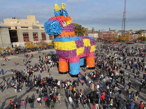
Figure 1 - the world's biggest piñata is about 18 metres tall. The glaciers measured by the WGMS have thinned by more than that since measurements began in 1980.
2013/2014 falls into 5th place for loss rate, but it continues the accelerated trend. Since 2000, ice loss has been about 100% faster than it was between 1980-2000. This fits with results of a scientific study by Marzeion et al. (2014) that reported that most of the recent glacier loss is due to human-caused global warming. Andy Skuce talks about this study in more detail in his report on a trip to the vanishing Athabasca glacier.
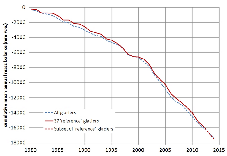
Figure 2 Change in mass of the WGMS measured glaciers since 1980, reported as mm w.e. (millimetres of water equivalent). If the melted ice were left on the glacier as water, this is how deep it would be. The amount of ice lost is even thicker, because ice is less dense than water.
The WGMS only measure a sample because they use measurements taken by scientists on the ice, and it's slow and expensive to get enough to report on each enormous glacier. To expand these measurements further, we use satellites. Jacob et al. (2012) used the GRACE satellites which "feel" Earth's gravity to calculate that glaciers worldwide lost about 150 billion tonnes of ice each year from 2003-2010. This meltwater flows into the oceans, and explains part of the sea level rise that's been measured by other satellites.
The big picture of worldwide measurements is ignored by some bloggers who don't believe in global warming. Even the WGMS data leaves space for a technique called cherry picking, where most data is denied or ignored, in favour of the small parts that agree with your opinion.
There are more than a hundred thousand glaciers worldwide, and although more than 80% of those measured are shrinking, and overall about 150 billion tonnes of ice is disappearing each year, there are always some growing glaciers at any time. This has been reported publicly and explained by scientists for decades (e.g. Mayo et al., 1990), but is commonly misrepresented in blog posts that attack climate science. I talked about this technique in a previous post.
Even in 2014, at least one anti-science blog held up Silvretta glacier in Switzerland as an example that undermines the science of global warming. Why? Because from 1999 to 2001, it got about 2 metres thicker. Then to 2014, it thinned by about 12 metres. Glaciers all around it are shrinking as well, last year there were 6 retreating glaciers in Switzerland for each one that advanced.
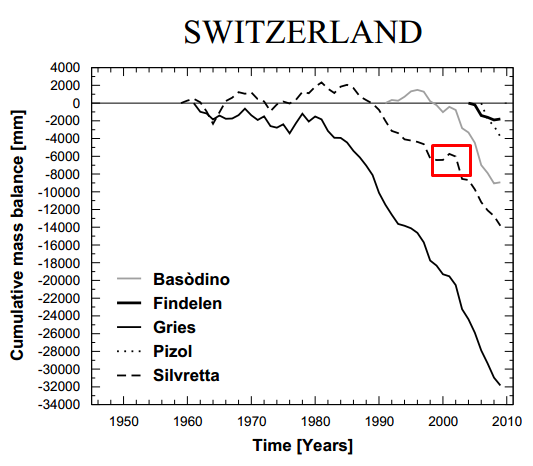
Figure 3 Changes in the mass of glaciers in Switzerland reported by the WGMS up until 2010/2011. The red box shows where Silvretta glacier grew slightly from 1999 to 2001. It has since shrunk by much more, but this growth was enough for at least one blog to claim it was growing in 2014.
If you don't cherry pick the data you like and ignore the data you don't, then the picture on glaciers is clear. Most, but not all, glaciers are shrinking. Billions and billions of tonnes of ice are melting each year, some glaciers have already gone and many more are expected to disappear. Scientific research published this year calculated that the main reason is now human-caused global warming. That explains why glaciers have lost 19 metres of thickness, which is taller than the world's biggest piñata.


I have always been impressed how well the cherry-pick works. Please keep putting up graphs like figure 3 for the truly curious and skeptical as well as providing links to good information sources such as WGMS or GLIMS.
You are simply not cut out to be a cherry picker. For Switzerland the 6 retreating to 1 advancing is for 2013. In 2012 the ratio was 92 retreating to 1 advancing. For 2011 it was 96 retreating to 1 advancing.
http://glaciology.ethz.ch/messnetz/glacierlist?year=2011&submit=Go%21&order=&field=
I don't like the way you chose axes for these graphs. Great examples of how to lie with graphs, without fibbing at all.
Here's the issue: The height of the right end is, what, 1/20 of the height of the start of the graph. The unstated visual message is, "There is only a little bit of ice left! Most of it is gone!"
This is the nature of deficit graphs. A more honest graph scales with total thickness, or percent mass lost, with the axis running all the way to zero. Graphed like that, it may show that we have lost 5% or 20% or 1% of the ice.
We must not be tricksy.
@mspelto: I had some trouble with your link. Is this one correct ?
sgbotsford,
The scale of the graphs is not biased. And their presnetation is not deceptive.
All of the data fits. And the change of rate of ice loss, becoming steeper, is evident. A deceptive presentation would have been to use something like a log scale in a way that appeared to indicate even more rapid more recent ice loss.
The point is that glacier ice mass is declining and the graphs present that without bias, especially when looked at as part of the reading of the article, which is what was intended.
sgbotsford - The standard with graphs is to plot them with the data of interest filling the chart. Since the graphs you are complaining about are entitled Change in mass they are indeed plotted correctly.
Choosing an expanded scale (as you suggest) is often done to be deceptive. One of my favorite pseudo-skeptic graphs of this type displayed global temperature changes in degrees Kelvin, with the axes extending to 0K, or -273.15C. That was indeed tricksy. And, yes, deceptive.
sgbotsford @3, the two graphs showing cumulative mass balance are both scaled in mm water equivalent, which the article makes plane equates to a loss average thickness of the glacier. Intuitively, with warming, a 50 meter thick glacier* and a 20 meter thick glacier would both lose equivalent amounts of ice, all else being equal. That is, if temperatures rose enough for one to become 1 meter thinner, then we would expect the other to be one meter thinner also, all else being equal. All else is, of course, never equal, so our expectations would be in terms of averages over many glaciers but the point remains.
What we would not expect is that if a glacier just 5 meters thick melted away completely, glaciers 200 meters thick would also melt away completely. Yet that is the expectation encoded in your "non triksy" scaling. Percentage loss is only a meaningful comparison across the world's glaciers if we would expect thick glaciers to take no longer to melt away, and to melt away as completely for small temperature rises, as we would for thin glaciers. Is that really your expectation? If so, what is its basis in physics?
Regardless of your (likely) uninformed expectations, however, the world's glaciologists appear to have the former expectation - born out by years of observation - as is shown by their use of the same scale as is used in the graph above. That being the observed experience, switching to a percentage graph would be tricksy indeed.
* Glaciers are, of course, not of uniform thickness so these thicknesses, but for this discussion, and only to illustrate a logical point, it is convenient to simplify and treat them as though they are.
Related:
Mernild et al 2014 - Northern Hemisphere Glacier and Ice Cap Surface Mass Balance and Contribution to Sea Level Rise
It would appear that sgbotsford as been taking Dr. Doom seriously. For a full description of how to cook a graph, look here. The description over at Dr. Doom's uses sea ice, but it would also work well for glacier ice - how to adjust the scales to make the change disappear.
There are percentage graphs of projected glacier loss, by region, in a paper by Marzeion et al 2012 (open access). I extracted a few examples for my piece on the Athabasca Glacier.
Most temperate and tropical glaciers will be mostly gone by the end of this century.
In the Marzeion et al paper there are graphs of historical glacier loss by region and globally in their figures 17 and 18.
Based on current trends, glacier recession models predict that by 2030, Glacier National Park will be without glaciers.
sgbotsford:
Working out how best to present data is really important. In this case, I think that the WGMS have done it right.
Firstly, it's common to cover as much of the graph as possible to see changes and how big they are. This is taught in university physics and meteorology courses as a valid way of presenting data in many situations.
Secondly, anyone who can read a graph looks at the axis scales, and although the units in this case are a little opaque, I tried to make this as clear as possible in the caption.
Thirdly, it's not easy to work out the zero point here. Some glaciers like Chacaltaya are 100% gone. Others are much thicker, so much less is gone.
Finally, as others have pointed out, it's often misleading to use true zeroes, as the wonderful DenialDepot posts show.
The WGMS graph is a report on the mass balance of glaciers, and that graph is a clear and fair way of showing that. I agree that there is a risk that some people will misinterpret the graph, but that is true of almost any way of presenting data. The way this graph is presented is clear to anyone who has any experience of reading graphs and I'm pretty sure that any other way of presenting it would be much more misleading.
I agree though, that it's not able to answer every question and it doesn't clearly say much about impacts. That's why we have lots of other research!
I think this discussion misses the point. This type of graphs is called a 'Gee Whiz Curve' for a reason. Much admired of marketers and political advocates. The factual, numeric content isn't the point. It is the visual representation. A steep decline across the width of chart is wonderfuly impressive. Telling people to look at the axes and labels doesn't help.
From a factual point of view the graph shows the actual loss of ice which is fine. In the context of the debate, however, the issue is also about how important this loss is. This needs to be demonstrated in the context of the actual thickness of the glaciers. Looking at the labels doesn't provide this context so the chart is just a Gee Whiz.
The chart does however provide the evidence for the comment that the deniers got it wrong so for that it is fine.
Alun @14:
1) Dismissing information with a pat phrase ("Gee Whiz Curve") is, unlike the graphs above, always an attempt to evade thought about the information thus dismissed. I would be far more suspicious of the motives of somebody introducing such phrases into the discussion than of somebody introducing the graphs above. Especially if that person failed to note the standard use of graphs truncated such that the data occupies the entire space was standard in all sciences, and (come to that) in economics but rather cherry picked for mention their use by marketers and political advocates. (Given the cherry picking involved in that, it is rather ironic.)
2) It is never the case of any graph that it can be fully interpreted without referenence to the axis, and a clear description of the contents of the graph. Suggesting that graphs can be so interpreted, and that it is a desiderata that they be designed to be so interpretted is simply to invite the use of graphs as political or marketing props rather than as conveyors of actual information.
3) You have failed to specify the universal depth of all glaciers that we would need to provide the information in percentage terms; or failing that, why it is interesting that some glaciers have only lost 15% of their depth (because they were initially very thick) while others have lost 100% of their depth (because they were initially very thin) is a matter of particular significance such that the average of all those percentage terms would be in any way meaningfull (see my comment @7).
In contrast, knowing that the worlds glaciers are on average 18 meters thinner than in 1980 (and that consequently, glaciers originally thinner than 18 meters have typically now vanished) is usefull information. Still more so if we are aware (as the third figure above indicates) that there is substantial individual variation even within small regions, and still more so globally (a very necessary caveat).
Speaking of individual glacier melt variations.
Big variations are visible in Swiss glaciers on Fig3: Gries has melted twice (34m) the global average while while Findelen has barely thinned by 2m.
It is well known that ambient warming (that can be deduced from nearby T records) does not have proportional influence on the melting. In fact, the ambient warming can sometimes result in growing ice! E.g. in the most extreme case: warming from -40C to say -30C at high altitude on the glacir top with increased moisure in the air results in more snow precipitation & the glacier gains more ice on top than it loses through sublimation and melting/sliding at the warmer bottom. That's why, East Antarctic IS is currently gaining ice. The very simple glacial melt models that I played with, do show that process.
So, the talk about glaciers becoming thinner but "there is substantial individual variation... a very necessary caveat" per Tom Curtis@15, is a necessarily incomplete picture. I think the individual variations could easily be explained by the differences in altitude, precipitation patterns, absolute ambient temperature (yes, absolute value is important here), slope gradient. For example, would I guess right if I said that said Gries glacier lies at much higher elevation than said Findelen? It Gries' ambient temp during precipitation season increased from say -10C to -5C then snow is falling on it and keeping it healthy. On the other hand if Findelen's ambient temp increased from say -2C to +2C, then rain started falling on it instead of snow, with obvious consequences.
Does Marzeion et al. (2014) talk about this obvious point or just does not bother? I think any study which tries to measure individual glacier melt variations should at least mention it. I'd be also interested in a more comprehensive study that would try to explain the variations in question, rather than blindly concluding that global warming resuls in accelerated glacier melt.
Alun,
I teach High School abd College Chemistry. One of the few ways to always lose points on labs is to make a graph that does not fill the page. There must be a reason to make a graph that does not fill the page. Deniers frequently use this tactic to hide the slope of graphs they do not like. Read the article referenced above by Dr. Inferno (labeled Dr. Doom) in post 9.
Does anyone know why Dr. Inferno has stopped posting?
chriskoz @16:
The third figure can easilly mislead, and evidently has. Records of glacial thickness are more recent and fewer in number than records of glacial length. The earliest glacial thickness records start circa 1945, hence the initial point in the x-axis of that graph. For each glacier, its first year of record is then the first year for which the WGMS has a glacial thickness record. For Findelen and Silvretta, that happens to be 1959, so Silvretta lost 14 meters from 1959-2009* (below the global average). In contrast Findelen lost 32 meters from 1959 to 2009. That turns out to be 0.63 meters per year, compared to the 17.5 meters from 1980-2014 in the global average shown in the second figure, ie, 0.5 meters per year. Ergo, it loss was above average by about 25%, but the periods are not strictly comparable.
At the other end of the scale we have Gries with a loss of only two meters from 2004-2009, ie, the period of observations for Gries. That turns out to be 0.33 meters per year, or 34% below the global average but again over a not strictly comparable period. It is, however, faster than the average rate of loss for Silvretta (0.28 meters per year) over not comparable periods, and over two short a period to be statistically significant. Over strictly comparable periods (2004-2009) Silvretta lost 5 meters and Findelen lost 7 meters. The global average dropped about 4 meters over the same period. (Figures eyeballed from the graphs, so not exact.)
* The caption says the data extends to the 2010-11 season, but on the graph it definitely ends in 2009. I assume that it was the 2010-11 report, which was only up to date to 2009.
As documented in the below article, personal observations in New Zealand, Peru, and Greenland also support the underlying message of MarkR's OP.
New Zealand Glaciers Ebb and Tour Guides Play Catch-Up by Mike Ives, New York Times, Jan 2, 2015
With regard to chriskoz's substantial point @15, all glaciers by their nature must have an extent above the snow line (the accumulation zone) where by definition temperatures are on average below freezing. Further, with rare exceptions, most glaciers will extend below the snowline were by definition temperatures are on average above freezing (the ablation zone):
(Source)
Because of this, most glaciers will have sections affected by both temperature patterns mentioned by chriskoz, so while the difference in effect on accumulation and ablation zones is a relevant factor in the variation of glacial behaviour, I suspect the causes of differences in change is far more complex than that.
This can be seen in the different patterns in change of glacial length between the Findelen,
which has an initially slow decline which has become precipitate in crecent years, and the Gries
which, although it has a similar length reduction over the twentieth century, has had a far steadier decline.
(Source for graphs: Findelen and Gries)
What michael sweet said @17: I should have said "Dr. Inferno", not "Dr. Doom" @9.
As for why Dr. Inferno hasn't posted anything recently? - perhaps it's just too hard to come up with new parody that can still be distinguished from the worst of the bat-crap crazy denier sites that take themselves seriously. Dr. Inferno definitely has a skill... Read through the comments over at DenialDepot - there are readers there that take a bit to realize it's parody.