Climate Science Glossary

Term Lookup

Enter a term in the search box to find its definition.

Settings

Use the controls in the far right panel to increase or decrease the number of terms automatically displayed (or to completely turn that feature off).

Term Lookup

Settings


All IPCC definitions taken from Climate Change 2007: The Physical Science Basis. Working Group I Contribution to the Fourth Assessment Report of the Intergovernmental Panel on Climate Change, Annex I, Glossary, pp. 941-954. Cambridge University Press.

Home Arguments Software Resources Comments The Consensus Project Translations About Support

Twitter Facebook YouTube Mastodon MeWe

RSS Posts RSS Comments Email Subscribe


Climate's changed before
It's the sun
It's not bad
There is no consensus
It's cooling
Models are unreliable
Temp record is unreliable
Animals and plants can adapt
It hasn't warmed since 1998
Antarctica is gaining ice
View All Arguments...


Username
Password
New? Register here
Forgot your password?

Latest Posts

Archives

Measurements show Earth heating up, think tanks & newspapers disagree

Posted on 2 February 2012 by MarkR

The Global Warming Policy Foundation (GWPF) is a British political think tank that attacks climate science. Its commentary is often regurgitated by journalists at newspapers with similar political opinions on climate science such as the Daily Mail, Express and Telegraph (whose consulting science editor is a GWPF adviser).

The Daily Mail recently published an article covering two bits of science news. One is that the UK Met Office and their partners are updating their global temperature data and including more measurements from Russia and around the Arctic. The data aren't publicly available yet, but graphs from a Met Office presentation suggest that 2005 and 2010 could be warmer than the previous record holder (1998), bringing the British data into agreement with NASA and the National Climatic Data Centre.

The other bit of science news is research on how the Sun is expected to cool down slightly in the coming decades. "The likely reduction in the warming by 2100 is found to be between 0.06 and 0.1K" (Jones, Lockwood & Stott, 2012), much less than the 0.17 C warming per decade measured since the 1970s (1 K is the same size as 1 degree Celsius).

Gareth Jones, the climate science expert who led the Met Office research said "this research shows that the most likely change in the Sun's output will not have a big impact on global temperatures or do much to slow the warming we expect from greenhouse gases."

The Daily Mail's interpretation is the opposite of what the scientists reported, and dutifully parrots GWPF talking points. The article claims we're possibly heading for a "mini ice age", that there has been "no warming for 15 years" and quotes the GWPF's Benny Peiser's prophecies of doom for climate models.

The data the Global Warming Policy Foundation won't want you to see

In the past 15 years the upper 700 metres of the ocean have gained the amount of heat that would be released by around 1 billion Hiroshima bombs exploding. Hundreds of billions of tons of ice have melted, and needed millions of Hiroshima bombs worth of energy to do so. The deeper oceans have also warmed up and all of these things lead to rising sea levels which satellites see clearly over the past 15 years. The GWPF and Daily Mail simply ignore this data when making their "15 years" claim.

don't look here

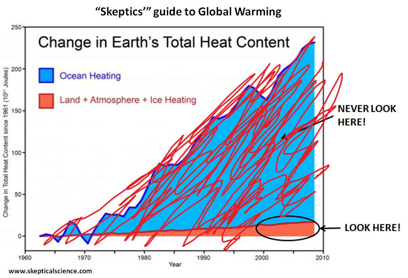
Figure 1 - Earth's heat content based on Church et al, 2011. Graph by crossing out data ignored by the Global Warming Policy Foundation. If you work for the GWPF, do not UNDER ANY CIRCUMSTANCES look at the data outside of the circled area and if you are a journalist who supports the GWPF, do not UNDER ANY CIRCUMSTANCES let your readership know about the crossed-out data.

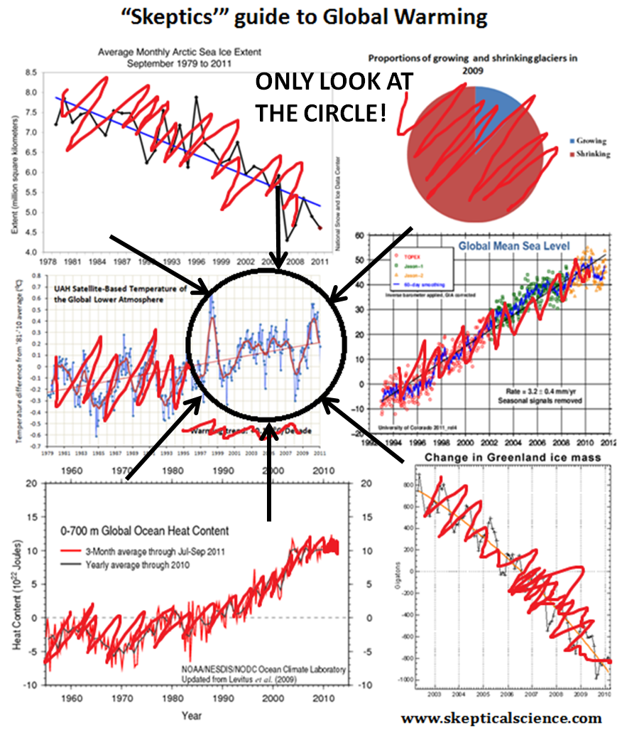
Figure 2 - Suggested second page of the Global Warming Policy Foundation's Guide to Global Warming. Data that disagree with the political opinions of the GWPF have been crossed out. Look at the stuff inside the black circle, DO NOT LOOK AT ANYTHING ELSE.

Their claim is based on atmospheric temperatures measured by thermometers and satellites, because over the past 15 years the warming in Earth's oceans and ice is obvious.

At Skeptical Science we've explained before why short term trends in atmospheric temperatures are not good indicators for global warming, as the atmosphere is very sensitive to natural cycles and is constantly swapping heat with ice and the oceans. This makes them a 'skeptics'' favourite for cherry picking. The Skeptical Science explanation is based on peer reviewed science done by climate scientists and statisticians (Santer et al, 2011; Foster & Rahmstorf, 2011).

You need to look at all of the data rather than ignoring (or in some cases, deleting) most of it. However, in this case it appears that even with ignoring most data because it disagrees with their opinion, it's a swing and a miss from the think tank as both satellites and thermometer measurements show warming.

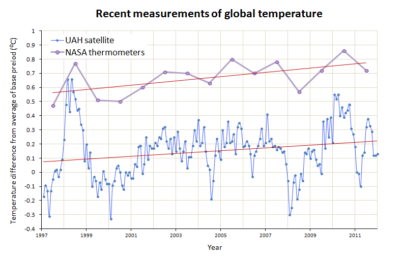
Figure 3 - Annual measurements of temperature changes from NASA thermometer data, and monthly measurements from UAH satellite data along with least-squares trendlines showing warming. Starting the trend in 1998 reduces the size of the warming trend, but it is still warming. NASA data used as British data is currently being updated and latest version is not available online. Measurements of air temperature for the past 15 years were the data specially selected by the GWPF think tank and the Daily Mail's journalist to try and persuade people that global warming has stopped.

The Met Office responds and lessons for the media

The newspaper article has an air of credibility thanks to hiding its selective data-blindness and favourable interviewing of some of the small portion of climate 'skeptic' scientists. It sticks very strongly to the think tank script, the same script as is repeated by think tank mouthpieces from Australia to the US.

Published, peer reviewed science says that the Sun is likely to cool down slightly, but that the effect will cancel less than 3% of the global warming expected by 2100 on our current path. Think tanks and journalists want to tell you that global warming isn't a problem so they selectively quote the science to get an air of credibility but then don't report what the scientists who did the work say.

They want to give the impression that most climate scientists are wrong so they selectively quote numbers because the vast majority of data disagree with their opinions. The Met Office explained just how their results were manipulated by the media, in a response that starts (emphasis added):

Today the Mail on Sunday published a story written by David Rose entitled “Forget global warming – it’s Cycle 25 we need to worry about”.

This article includes numerous errors in the reporting of published peer reviewed science undertaken by the Met Office Hadley Centre and for Mr. Rose to suggest that the latest global temperatures available show no warming in the last 15 years is entirely misleading.

Science journalists who want to try to impartially and accurately report on science, informing their readership about the wonders of scientific endeavour, should not rely on the wild statements of politically motivated think tanks. Sound-bite 'science' is not proper skeptical science.

0 0

Printable Version  |  Link to this page

Comments

1  2  Next

Comments 1 to 50 out of 57:

  1. Yep the Australian denialist commentators have been reproducing this Daily Mail story too.
    0 0
  2. You forgot to scribble out the trend line in the satellite data graphic. Whadya trying to pull?
    0 0
  3. Any of us who spend any time doing battle online with the various Muppets of Misinformation will recognise Figures 1 and 2, both of which are constantly referenced. But surely to be properly understood - via the Monckton Method, don'tcha know - Figure 3 should be rotated clockwise about 8°? Thanks for the laugh! It helps; sometimes I have to pinch myself and remember 'yes, they really are putting up that risible argument, and, yes, their powerful friends really will ensure it gets all the attention it doesn't deserve'...
    0 0
  4. The GWPF was started by yet another lord (little 'l' deliberate) of the UK peerage, IIRC. What are the upper crust smoking over there? Are they like the Republicans, where you have to be rabidly anti-science in order to attain membership? It is sad that the Fourth Estate has come down to occupying a factless, information-free zone which acts merely as an echo chamber for the Jovian pronouncements of the Masters of the Universe. Thank the Lord (big 'L' deliberate) for SkS and their ilk.
    0 0
  5. From the article:- "Meanwhile, one of America’s most eminent climate experts, Professor Judith Curry of the Georgia Institute of Technology, said she found the Met Office’s confident prediction of a ‘negligible’ impact difficult to understand." That's actually twice as funny as it should be.
    0 0
  6. owl905 @5, I'm sure Judith Curry found the prediction "difficult to understand". Why she would admit to that level of incompetence is beyond me ...
    0 0
  7. I like the graphs Mark. A visualisation of cherry picking. Maybe we should do such compilations more often, it probably gets that message over better than trying to write loads of texts to say the same thing. Can we create a cherry picking series to put in the library?
    0 0
  8. As the Daily Mail was named in the article it is worth pointing out there is serious doubt that many of the weather forcasters the Mail uses for its stories exist. http://www.guardian.co.uk/environment/georgemonbiot/2012/jan/26/weather-forecasters-daily-mail?INTCMP=SRCH
    0 0
  9. I just tried accessing positive weather solutions web site (via a Google search) dorlomin and it says 'server not found'.
    0 0
  10. I noticed the last 6 months show a distinct cooling trend on Fig 3 - 0.3ºC in the period!! I predict a full strength Ice Age by 2020. You will not see this in a peer-reviewed journal, which proves their bias.
    0 0
  11. @PaulD. They have now ceased trading. However they were still being quoted on the 13th of January this year http://www.dailymail.co.uk/news/article-2086258/UK-weather-Britain-awakes-scenes-frost-freezing-fog.html?ito=feeds-newsxml
    0 0
  12. You missed the really fun bit of Rose's article (credit to Carbon Brief). Rose says:
    According to a paper issued last week by the Met Office, there is a 92 per cent chance that both Cycle 25 and those taking place in the following decades will be as weak as, or weaker than, the 'Dalton minimum' of 1790 to 1830.
    The Met Office press release actually says:
    The most likely scenario is that we'll see an overall reduction of the Sun's activity compared to the 20th Century, such that solar outputs drop to the values of the Dalton Minimum (around 1820). The probability of activity dropping as low as the Maunder Minimum - or indeed returning to the high activity of the 20th Century - is about 8%. The findings rely on the assumption that the Sun's past behaviour is a reasonable guide for future solar activity changes.
    Do you see? If there is an 8% chance of a new Maunder Minimum, there must be a 92% chance of a new Dalton Minimum. Prof Lockwood actually puts the chance of minimum similar to the Dalton Minimum at 50%.
    0 0
  13. Owl@5: I thought I knew what "eminent" meant. If that's what it actually means, I've been dissing good people for years. ("eminence front" more likely)
    0 0
  14. There are some other forecasts of a low cycle 25 reviewed here. From this article's summary of Penn and Livingston 2010, there's a basis for this in the decline of sunspot magnetic field strength: ... since about 2000, the average field strength has declined from 2,500 or 3,000 gauss to about 2,000 gauss now. They expected Cycle 24's spots to appear with rejuvenated field strength, but they didn't. The average magnetic field in the centers of sunspots has continued a more or less unbroken decline, as shown here. Forty five years of satellite measurements of solar mag field flux shows this decline over a longer period. (See Its the sun).
    0 0
  15. I find it rather difficult to see why you think your own approach is in any way superior to the cherrypicking that you highlight. If we are looking for evidence of temperature changes then surely it is temperature that we should look at. The graphs that you point to your opponents as having ignored relate to the extent of ice cover (all needless to say in the northern hemisphere) sea level (which presumably you think is moved by temperature alone) and something that you call "heat content". How appalling of your opponents to have ignored these and used the only graph that you show in that section which actually relates to the subject under discussion, temperature. You put a red line through the bit of this graph that has not been used by your opponenents, although when I try to look through the crossing out it seems that for much of that period there is no great evidence of warming. You then go on to show us a graph which includes satellite readings. Any normal human being would be hard pressed to see an increasing temperature in this, but helpfully you have inserted a trend line to ensure that the reader, who might otherwise be forgiven for wondering if there is any evidence of warming in it at all, is given the impression by your judicious use of maths that there is some warming going on. Yet we can see that in 2008 the temperature was no higher than it had been 10 years earlier. Even if your trend line is in any way representative it would appera that such warming as is taking place is about 0.1 degrees every 15 years or perhaps .7 degrees in 100 years, (-sniprather less than most of the horror stories that are peddled by most of the alarmist sect within the warmist movement-).
    0 0
    Response:

    [DB] Ideology snipped.

  16. "political think tank" It has reached the point that 'think tank' is usually little more than a euphemism for 'propaganda unit'. Most of them conduct little or no actual research and instead are just 'cardboard cut outs' to help hide who is paying to deceive people.
    0 0
  17. elsa wrote: "ice cover (all needless to say in the northern hemisphere)" Actually, the pie chart is global... the Arctic and Greenland ice graphs are indeed 'limited' to those portions of the Arctic and Greenland in the northern hemisphere. Maybe we should add in the Antarctica ice mass chart to show it is declining too? also: "sea level (which presumably you think is moved by temperature alone)" Are they making more water out of thin air in 'elsa reality'? Damn! Why do I always get stuck with the boring worlds with silly things like the 'law of conservation of matter'? :[ also: "something that you call 'heat content'" Yes, what an absolutely impenetrable term. Well, clearly this 'heat' stuff has nothing to do with temperature. >plonk<
    0 0
  18. elsa: Your comment is abject nonsense and is a textbook case of denialism: instead of referring to basic physics and the scientific literature you are trying to dispute the reality of human-induced rapid global overheating by reference solely to a few graphs on a website. The eyecrometer (kudos to whomever at this site coined this term) is a very poor scientific instrument, and I heartily recommend you avoid relying on it to perform statistical or empirical analysis.
    0 0
  19. The 2nd generation eyecrometer, Eyecrometer Mk 2.0TM is somewhat superior in that the operator uses both eyes instead of just one...
    0 0
  20. elsa - The issue highlighted in this post is the tendency for 'skeptic' commentators to focus on short term temperature. Which, in the noisy climate, has little statistical significance over short stretches - it's hidden in the weather, the short term variance, much as the difference between winter and summer is much higher than the clearly identified climate changes. The various ice measures, ocean heat content (which, not incidentally, is a temperature measure), sea level rise (thermal expansion and added water from ice melt), and most importantly of all checks on air temperature trends over statistically significant intervals: these all show something important. And that is the climate is warming. Add to that the understanding developed over the last 100-150 years in spectroscopy, known emissions of various greenhouse gases, and recent declines in solar and volcanic forcing - and the conclusion is we're doing it. --- That's what folks focusing on short term (10 year) temperature variations are trying to ignore, or, perhaps, to distract people from recognizing.
    0 0
  21. Elsa, not again . . . please, please have some perspective. You are capable of thinking for yourself, right? You cherry-picked the "2008 is not higher than ten years earlier." Are you simply blind to the fact that 1998 was extraordinarily warm, even within the context of global warming? If 2008 was as warm as 1998, and no unusual conditions existed for 2008 as they did in 1998, wouldn't you agree that the trend for the decade was realistically positive (it's positive from 1998 to 2011 anyway, according to two and soon to be three temp records)? If three of the next five years are warmer than the extraordinary 1998, will you finally spit the cherry stem out of your mouth?
    0 0
  22. #15 Hi elsa, there're plenty of reasons why I think that looking at all the available data, rather than a small portion, is a better way of telling whether global warming is going on or not. Global warming is caused by energy building up. Natural cycles constantly move heat between the elements (and can affect energy balance), but ultimately all parts of climate have to respond to the heating. By cherry picking dates and data you can make convincing-sounding (but wrong) arguments easily. The atmosphere has, for the past 15 years, had a warming trend below the average of IPCC models, but any claims that the trend is flat is mathematically not true for the most common meaning of 'trend'. Also, the Santer paper shows that statistically it's not outside expectations whilst the Foster paper shows that natural cycles have been acting to try and cool the atmosphere. But the trend is still positive - pretty much impossible to explain without a background warming. Is there an energy imbalance? Well, sea level rise + buoy data shows there is. Sea level rise comes from water expanding as it warms up and from adding water. Added water comes from melted ice, and the latent heat of ice is pretty hefty. Sea levels have risen 40 mm since the journalist tells people global warming 'stopped'. If that was from melting ice, then the heat required would be enough to warm the atmosphere by 1 C. If it came from thermal expansion, then we're talking over 10 C of atmosphere warming worth of energy. So the energy imbalance is clearly there, Earth's building up heat as the theory predicts. This is what think tanks and journalists have to try and hide, and that's why they only use 15 years of one type of observations.
    0 0
  23. @elsa, How appalling that people still don't realize temperature is a measure of energy within a given system or defined space. "Temperature is a physical property of matter that quantitatively expresses the common notions of hot and cold." Also, if you're going to insult scientists, I wouldn't recommend accusing them of "judicious use of maths" Judicious: Having, showing, or done with good judgment or sense.
    0 0
  24. I think many have responded to elsa. But an obvious point is that temperature is a measurement of energy, as has been pointed out, measuring it in one place may not account for all the energy, which is why cherry picking is so, so wrong. An example analogy. You have a machine that has to locations that produce heat (it may have a transformer in one location and a motor in another), if you only measure the temperature at the motor, then you will not account for the total heat losses of the machine which must include the transformer and other components. Elsa stated "If we are looking for evidence of temperature changes then surely it is temperature that we should look at." But the point Mark has made is that the 'temperature' measurements must include as many places as is practical to assess where energy is going or leaving.
    0 0
  25. A large portion of the "missing" heat is kicking around in the Arctic, as evidenced by the extremely rapid loss of Arctic sea ice volume. Conveniently for the deniers, large portions of the Arctic are still being ignored by the datasets. Over the past few years, we have seen cold Arctic air spill onto the continents where its effect on temperature is being measured. However, at the same time there is warm air going the opposite direction, to where its effect on the temperature is not being measured. The result is a cool bias in the global average temperature measurements. Most visible in the HadCRUT data.
    0 0
  26. Most IPCC scenarios project an acceleration in global warming because unless we take action to prevent it, GHG emissions are expected to accelerate (and aerosol emissions expected to decline). It's very simple, if you want to stay in the IPCC 'low' scenarios, CO2 emissions must be cut in comparison to business as usual. Because right now, the IPCC projections are running almost spot-on, so there's no reason to doubt that global warming will accelerate if we continue with business as usual.
    0 0
  27. Nice article.
    0 0
  28. Paul D is right in saying that many have responded to me and I am grateful to him for a polite and reasoned reply, in contrast to one or two of the others. I would agree with him entirely that temperature must include as many places as is practical. I could not agree more that we should not cherry pick the places, yet that is exactly what is being done when we look at ice cover in the Arctic, when we know that the climate in the poles is often completely unrepresentative of what goes on elsewhere. CBDunkerson adopts a different approach. He does not answer the criticism that if you are arguing about whether the world is getting warmer you should look at temperature but instead asks if “they” are making more water out of thin air. Since he has not understood the point that I made above I will try to put it in simpler terms for him. You can only use changes in the sea level as a proxy for changes in temperature if you think that temperature is the sole factor that alters the sea level. Is that what he thinks? He does not go anywhere near the obvious question “if you have a good temperature record, why would you use some other far less reliable means of looking for warming?” Composer99 claims I am “trying to dispute the reality of human-induced rapid global overheating by reference solely to a few graphs on a website”. Actually my point here was to point out the flaws in this particular article using only the graphs provided with in it, not ones picked by me. He then says that to use your eyes to assess one of those graphs is the use of a very poor scientific instrument. However he does not answer the criticism I made of the graph using the author’s statistical analysis, which shows a much much slower rate of warming than is generally put about by the (-snipmore alarmist members of the warmist church-). Is he saying that the author got this wrong and, if so, what does he think the underlying trend is for the period? KR makes a polite comment but I am not really sure what it trying to say. I have said that if you want to show that the climate is warming there is one thing that you need to do and that is look at the temperature. Ice cover and sea level can change for reasons other than a general rise in temperature and so are of little or no help in establishing whether or not global warming is taking place. DSL claims I cherry picked the figures. What I did was to look at the graph provided in the article. What is clear is that temperature in 2008 is no higher than the starting point (it is considerably lower than 1998) some 10 to 11 years earlier. But we have no need to argue about reading the graph. The (-snipwarmist-) author of the article has provided a trend line for us. I rather doubt it is meaningful but what it shows, as I have set out above, is a level of warming far below the normal (-snipwarmist-) claims. Does DSL dispute that and, if so, what does he think was the trend in the period shown by the graph? In contrast to DSL, MarkR is friendly and polite. Unfortunately I do not agree with him. If you are looking for global warming I would say the primary, probably only, thing that you need to look at is the temperature. If you had no instruments for measuring temperature you could well be justified in using another indicator. But we do have such instruments and can use them. In such circumstances it may be unhelpful or even misleading to use something such as sea level, where clearly other factors can play their part in changes. (-snipBiophilia gets rather angry but contributes nothing to the debate-).
    0 0
    Response:

    [DB] Multiple instances of ideology/inflammatory tone snipped.  Future comments constructed thusly will be simply deleted.

  29. I am not sure why Biophilia asks "how appalling that people still don't realize temperature is a measure of energy within a given system or defined space" but he will doubtless explain further. It is good to see that he thinks the trend line in the graph has been arrived at by a means "having, showing, or done with good judgment or sense." Presumably this means he also accepts the implication of this line, which shows a far slower rate of warming than he has probably thought had been happening until now.
    0 0
  30. Elsa: The reason for not just looking at temperature is that temperature is only a very crude measure of energy. The same amount of energy required to raise the temperature of the whole of the Earth's oceans by 0.1 degree, would raise the temperature of the Earth's atmosphere by 100 degrees, because the heat capacity of water is so much greater than that of air. The problem we are facing is that we have changed the earth's energy balance - more energy is coming in than going out. The size of that change is the critical factor. The energy balance at the top of the atmosphere has remained positive over the whole of the last decade, as evidenced by both the CERES satellite data and the rising total heat content of the Earth system. In other words the earth is still accumulating energy. (The commonly used term is 'warming' - if you think that term is misleading, feel free to stick to energy.) In the short term, depending on where the energy goes, it can have very different effects in terms of temperatures, but over the long term the extra energy will permeate the whole system (or worse, slosh about). So the energy is the more fundamental measure.
    0 0
  31. Composer99 and Daniel Bailey. Human-caused climate change denialists are using the latest generation of the technology - the Koch-eyecrometer. It has negative resolution, but that doesn't matter... it's associated wet-wear has less computational capacity than a Commodore 64, so the requirement for discrimination has always been moot.
    0 0
  32. Kevin C @30 The issue is the real magnitude of the warming imbalance and at what equilibrium temperature it will close. CERES gives a positive imbalance but what is its magnitude? CO2 effect is logarithmic and other feedbacks have unknown trajectories. Heat loss via Stefan Boltzmann is exponential (with absolute Temperature to the fourth power).
    0 0
  33. elsa - If I was unclear in my previous comment, my apologies, although I believe it's rather straightforward. Cherry-picking data - particularly short term data (as 'skeptics' do) - is statistically unsupportable, and may be a sign of a lack of statistics background, confirmation bias, or an intent to distort the issue for others. Ocean heat content is a temperature measure, and even by your criteria is clearly something to pay attention to. Ice cover, glacial melting, sea level rise and others are interplays with temperature and other things (precipitation, land run-off), but those influences are estimable, and hence estimates of (and the tracks of) temperature are determinable from them. As to satellite measures, which you also pooh-pooh - the trend lines you seem to dislike are the statistics of those measures, and if you for some reason don't approve of statistics, I fail to see how you are discussing science or evidence. The human eye is extremely good at finding patterns, often incorrectly - the 'cost' of mistakenly seeing a bear in the woods is trivial compared to the cost of not not seeing a bear that is actually there, and we tend to a lot of pattern false positives. Statistical analysis helps overcome the biases of the 'eyecrometer'. --- Long term temperature statistics, cryosphere measurements, ocean heat content and level - all of the evidence agrees, all supports the observation of ongoing climate change and global warming. The only way to not see this in the data is to, in fact, cherry-pick it, look at insignificant short terms or subsets of the data, such as: Yet we can see that in 2008 the temperature was no higher than it had been 10 years earlier.. You have, in that very statement, supported the thesis of the thread - that cherry-picking is required in order to deny the full body of the evidence.
    0 0
  34. #32 victull: at the region we're looking at, the Stefan-Boltzmann response is pretty close to linear. From 273 K up to 300 K, a linear fit explains most of the variance, R^2 is over 0.99. One way is to look at ΔF/ΔT (F = flux [W m-2]) for known changes in flux. If you fit a linear trend based on the change from 273-274 K, then expand that out for 5 K of warming your answer is only ~2% smaller than the real change predicted by S-B. Pretty close to linear! CO2 is expected to rise at least exponentially in the long run, so the CO2 forcing should also rise linearly.
    0 0
  35. MarkR: "CO2 forcing should also rise linearly." To be complete, that does not translate to Linear Warming over the long run.
    0 0
  36. I am hoping this will not be seen as political but, having made having made a thorough review of GWPF pronouncemnents of recent years for my MA degree, I decided that the it would be more appropriate to call it the "Global Wonky Policy Foundation". See http://lackofenvironment.wordpress.com/category/global-warming-policy-foundation/
    0 0
  37. I do not belly-laugh at the SkS blogs or comments often. But I did today. Great relief. May I be equally serious ... There seems to be a crocodile invested river in India which carries the notice: "Swimming forbidden. Survivors will be prosecuted" Can anyone rework this to apply to denialists?
    0 0
  38. Interestingly I raised a number of questions for CBDunkerson, Composer99 and DSL to answer but they have chosen not to respond. While I suspect that KR and I disagree on many things I would comment again that at least his comments are well and politely made in contrast to some others. This approach, of reasoned argument well put, is completely necessary for a truly scientific approach, which recognises differences of opinion and weighs up evidence in a calm manner. My replies to his points are: 1. I completely agree with his comment on cherry picking, although I think it is unfair to say that this is solely a skeptic tendency. In many ways that was one of the points of my comments on this article. 2. I would also agree completely with the comment on ocean heat content. But surely to measure this we use a measure of temperature first, in order to calculate the heat content. Would it not have been much simpler if the authoress of this article had just shown us ocean temperature in the first place, when it is warming that we are discussing, rather than putting it in another less obvious form which also makes it impossible for us to judge by how much the oceans have warmed? 3. I note there is no comment on ice cover or sea level. Does KR agree with me that if we are debating whether or not the world has warmed, it is very odd to use these measures as a proxy for temperature when we could use the temperature record itself? 4. I have not pooh-poohed the satellite readings, indeed I think they are highly relevant as they are part of the subject we are discussing, the temperature. My point is that they do not support the global warming view, certainly not in its most alarming form. 5. I would agree that the human eye is extremely good at finding patterns, often incorrectly. But it is not me that seeks to do so. The authoress of this article claims to see a warming pattern. I do not. 6. I make no comment here about long term statistics etc. because the article has chosen to focus on short term statistics and the claim is made that these support the global warming hypothesis. My point is that you can equally interpret the statistics in another and opposite way. Kevin C comments that the reason for not just looking at temperature is that temperature is only a very crude measure of energy. But this is no excuse for using even cruder measures, such as ice cover and sea level, which may move totally independently of average global temperature.
    0 0
  39. To the rational,observant and informed the AGW case is proven conclusively "beyond all reasonable doubt".Yet,many sections of the media continue to lie,obfuscate and confuse.What struck me most about the David Rose Daily Mail nonsense were the commenting punters' affection for AGW denialist remarks and their loathing for all others.Denialist stances are popular and that helps sell advertising. While I'm not a scientist,I've read Hansen's Storms Of My Grandchildren and Spratt & Sutton's Climate Code Red,plus others.I'm an old Lovelock fan too.I follow the science on a long list of excellent sites like this one.My opinion echoes many people's--but not nearly enough--like me.It is that we are heading for a humongous catastrophe;a combination of the impact of CO2 and CH4,and it's too late for anything but drastic worldwide action. To achieve this,I suggest we need a charismatic,articulate and loveable leader--a modern day international Churchill--to capture the hearts of of the majority so that the denialists and other contrarians become irrelevant. The time for argument and debate,much of it so juvenile and divisive,has passed.The time is for action but without a leader nothing much will happen. Where are you?
    0 0
  40. elsa - Please see my comment here. This thread shows that looking at the larger data (all the data, all the indicators) clearly shows global warming - only 'skeptic' cherry-picking indicates otherwise.
    0 0
  41. Regarding my Churchill post,may I add some other criteria?At least bi-lingual:Mandarin and English.An internationally well-respected scientist possibly,maybe a writer,but with highly developed political skills.Charisma in bucket loads and absolutely clean--no DSKs please.An ex-warrior,perhaps? Appointment to be by a non-political committee of internationally recognised scientists; and by acclamation.But soon,very,very soon,please. Peter Cummins New Zealand
    0 0
  42. elsa #38: you're handwaving. You claimed in #15 not to see much warming in the full temperature record in the opening figure, despite the large and statistically significant warming present in the figure. You then claim that the surface temperature record is all that matters. However, heat in the near-surface Earth environment goes into many things, most importantly ocean water and sea/glacier ice. If you fail to account for those you miss quite a lot of the heat (see Fig 1 above). Ocean heat content is a measure of temperature, despite your claims otherwise, as others have pointed out to you. And you're repeatedly claiming that the other measures, of glacier ice melt, sea ice loss and sea level rise are not indicators of temperature rise. Theoretically possible, but what is your alternative mechanism for an acceleration of sea level rise, and an accelerating decline of glacier and sea ice, that does not involve temperature rise. It's rather difficult to move all three simultaneously without temperature rise, particularly when that is observed clearly in every surface temperature dataset and in the 0-700m and 0-200m ocean heat content datasets. Add to that the 10 human fingerprints on climate change, notably the cooling stratosphere, reduction in heat escaping to space and increase in heat returning to ground, and there is a coherent, consistent picture that explains all the evidence. What is your explanation for all this evidence?
    0 0
  43. Minkie41 at 09:21 AM on 3 February, 2012 To the rational,observant and informed the AGW case is proven conclusively "beyond all reasonable doubt".Yet,many sections of the media continue to lie,obfuscate and confuse. I'm an old Lovelock fan too. Well here is what he has to say on the science that you think is proven: "The great climate science centres around the world are more than well aware how weak their science is. If you talk to them privately they're scared stiff of the fact that they don't really know what the clouds and the aerosols are doing. They could be absolutely running the show. We haven't got the physics worked out yet." So who is right? Him or you?
    0 0
  44. Elsa has been pandering this form of denial, "We can't be sure because we don't know everything" on the intertubes for well over a year now. Examples just from GPWayne's site are here and here. It is quite obvious due to the utter lack of supportive links that Elsa is just here to prosecute the twin agendas of delay and denial.
    0 0
  45. ... and clearly avoiding providing any alternative explanation for the consilience of evidence. Elsa, Have you an explanation for all the evidence in #42? You might also want to read Dessler on clouds, and as aerosols are predominantly a cooling agent, invoking them is not good news for Earth: lots of aerosols may indeed mean that our GHGs are responsible for more than 100% of global warming.
    0 0
  46. elsa... Would that be the same James Lovelock who says that humans are too stupid to prevent anthropogenic climate change?
    0 0
  47. Getting back on the topic of think tanks and media misinformation for a moment ... The desmogblog has an interesting article shining the light on a strategy document put out by the International Climate Science Coalition. In part, the strategy document says:
    But small community newspapers are where the real easy pickings are to be found. The strategy explains these publications are more likely to publish submissions because they’re not swamped with offers like larger newspapers. Also, these publications might not yet have an editorial stance on “controversial, ‘big city’ media issues such as climate change.
    To take the ICSC on at its own game, I have decided to start writing regular letters to the editor of my local paper. It is a right-wing rag, but I have had letters published in the past, so I can hope at least a few will be published in future. This is something I can do that is positive. I have the time, I am literate and I am concerned, which is all it takes to write letters. I am not a scientist, but I can write and I vote. I invite others who are wondering what they can do to help, to take up the same challenge.
    0 0
  48. Daniel Bailey - I have to agree. elsa has clearly misconstrued the entire thread, failed to follow any information or links provided, and appears to be commenting simply to confuse. Elsa - If I'm wrong, please demonstrate it by actually commenting on the content of the thread, or the information you have been provided. If not, I would have to consider you a troll.
    0 0
  49. elsa#43: You quote Lovelock without providing a reference. That's poor form in a scientific discussion; it tends to erode your credibility. Here is the interview you refer to. Note his statement a few paragraphs below your selection: I think the sceptic bloggers should worry. It's almost certain that you can't put a trillion tonnes of CO2 into the atmosphere without something nasty happening. This is going to resolve itself and global heating is going to come back on stream and it's these bloggers who are going to be made to look weird when it does. ... But everything has a price and an unexpected price may hit these bloggers. It's the cry-wolf phenomenon. When the real one comes along, they'll be laughed at. We call picking only the data that fits your argument a cherry-pick.
    0 0
  50. Elsa @15:
    "I find it rather difficult to see why you think your own approach is in any way superior to the cherrypicking that you highlight. If we are looking for evidence of temperature changes then surely it is temperature that we should look at."
    Contrary to Mark R, the Daily Mail article was a response to this press release rather than news of the upcoming revision of the Hadley/CRU Land/Ocean Temperature Index. That press release contains data from four Land/Ocean Temperature Indices, three of which are in close agreement and show significant temperature increase over the last fifteen years. There is, however, one which is an outlier, and which shows little or no temperature increase over that period. The land component of that index is also an outlier compared to various land only temperature indices including the BEST analysis (not included in the Met Office press release as it is not a Land/Ocean index). As we also know, it is an outlier with respect to its revised version which, though not yet fully implimented, is known to show warming over that period due to the addition of more station data from regions which where formerly sparsely covered. Naturally, the Daily Mail article focuses exclusively on the outlier. The fact that it is an outlier, however, puts Elsa's suggestion that we look exclusively at the temperature into perspective. The GWPF and the Daily Mail did not look exclusively at the temperature, but exclusively at just one temperature index. That is the nature of the cherry picking she has taken it upon herself to defend. When faced with contradictory temperature data, the obvious thing to do is to exclude the outlier. It is also obvious that we should exclude the temperature index with the least geographical coverage (and hence most unrepresentative of the globe as a whole). We should also exclude the temperature index with the least raw data, ie, actual station records. On all three counts, the temperature index we would drop is the HadCRUT3 temperature index, ie, the temperature index the the Daily Mail (and apparently Elsa) focus on in exclusion to all others. Of course, given that there may be problems with the analysis in any of the indices, the other sensible thing to do is to look for corroborating evidence. If we look at natural events which are significantly effected by temperature, and they tell us a different story from what our temperature index is telling us, then we have significant reason to distrust our temperature index. This is in fact a method recommended by the scientists at NASA:
    "This derived error bar only addressed the error due to incomplete spatial coverage of measurements. As there are other potential sources of error, such as urban warming near meteorological stations, etc., many other methods have been used to verify the approximate magnitude of inferred global warming. These methods include inference of surface temperature change from vertical temperature profiles in the ground (bore holes) at many sites around the world, rate of glacier retreat at many locations, and studies by several groups of the effect of urban and other local human influences on the global temperature record. All of these yield consistent estimates of the approximate magnitude of global warming, which now stands at about twice the magnitude that we reported in 1981. Further affirmation of the reality of the warming is its spatial distribution, which has largest values at locations remote from any local human influence, with a global pattern consistent with that expected for response to global climate forcings (larger in the Northern Hemisphere than the Southern Hemisphere, larger at high latitudes than low latitudes, larger over land than over ocean)."
    (Source, my emphasis.) If you follow NASA's advise and look at other indicators of global temperature increase, it becomes obvious that global temperatures continue to rise. Arctic, and global (Arctic plus Antarctic) sea ice have declined: Glaciers have retreated: The Greenland and Antarctic Ice sheets have lost mass, while other smaller ice sheets are disappearing entirely: The oceans are gaining heat: And, among a host of other smaller signs, the Donner Christmas family hockey game is a dying tradition: These secondary indicators clearly show the Earth has continued to warm over the last 15 years. That is, it is GISS and NOAA who are giving us the straight dope on temperatures, not HadCRUT3, on which the Daily Mail keeps its eyes so firmly fixed. Apparently Elsa wants our eyes firmly fixed on HadCRUT3 as well. Not for her any glance outside of that little black circle (figure 2 above). For if we do glance at the additional evidence, we won't believe the Daily Mail's con.
    0 0

1  2  Next

You need to be logged in to post a comment. Login via the left margin or if you're new, register here.


The Consensus Project Website

THE ESCALATOR

(free to republish)


© Copyright 2024 John Cook
Home | Translations | About Us | Privacy | Contact Us