


 Arguments


Record growth of atmospheric CO2 in 2013
Posted on 22 May 2014 by Guest Author
This is a guest post by Alexander Ac.
The fact that last year the atmospheric CO2 concentration reached 400 ppm at Mauna Loa observatory was widely publicized. However, almost unnoticed is the fact, that according to preliminary NOAA ESRL data, global CO2 concentration increased in that same year by a record amount.
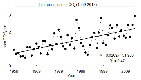
Fig. 1: Average yearly growth of global atmospheric CO2 from 1959 to 2013. The last point, i.e. 2013 might be a subject to minor corrections. Last year the concentration of CO2 has risen by 2,95 ppm, the highest growth on record. (Source: NOAA ESRL)
As can be observed, the gradual rise of CO2 is associated with a considerable year-on-year variability. The increasing long-term trend is mainly the result of rising anthropogenic carbon emissions. It is well established, that about one quarter of carbon we emit is absorbed by oceans, and second quarter is absorbed by land-based vegetation (for more details see e.g. Global Carbon Project).
The majority of the y-o-y variability can be explained by a variable land carbon sink (see Fig. 2 for explanation), as evidenced by the results of Global Carbon Project:

Fig. 2: Graph of global carbon balance. Negative CO2 flux means net removal of carbon from the atmosphere (i.e. carbon sinks) and positive CO2 flux means net carbon sources. Land-based vegetation and oceans absorb increasing amount of anthropogenic carbon, with approximately constant “airborne fraction” at around 43 %. (Source: Global Carbon Project)
During 1987 and 1998 land-based vegetation absorbed almost no carbon. This can be largely explained by the occurrence of strong El Niño during this period. Indeed, CO2 atmospheric growth is generally higher than normal during El Niño events, and generally lower than normal during La Niña events (for more details see also a study by Bastos et al., 2013).
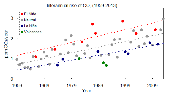
Fig. 3: Average yearly growth of global atmospheric CO2 from 1959 to 2013 during El Niño events (red circles), La Niña events (blue circles), neutral years (grey circles), and volcanic eruptions (green circles). Year where CO2 growth was influenced by volcanic eruptions were excluded from the regression analysis. The El Niño/La Niña years are according to classification by WMO. (Source: NOAA ESRL)
If we look in more detail at Fig. 3, we can see that the slope for La Niña years is slightly lower than during neutral years, and the slope for El Niño is slightly higher than during neutral years. This suggests that we should be able to observe “carbon saturation” first during hot years, and later during colder years. Indeed, a recent publication by Schneising et al. (2014) quantified the temperature dependence of global carbon rise using the SCHIAMACHY satellite data. Their key conclusion from the abstract is following (emphasis added):
“We find linear relationships between warming and CO2 growth as well as seasonal cycle amplitude at the 98% significance level. This suggests that the terrestrial carbon sink is less efficient at higher temperatures during the analysed time period. Unless the biosphere has the ability to adapt its carbon storage under warming conditions in the longer term, such a temperature response entails the risk of potential future sink saturation via a positive carbon-climate feedback.”
While there is still an ongoing scientific debate if the planetary carbon sinks are decreasing its efficiency or not, the record rise of CO2 in 2013 seems to be significant, because:
- 2013 was not El Niño year
- Previous non-El Niño record was surpassed by 0.53 ppm, which as also a record
Thus if we are going this or next year to experience an El Niño event, as one recent study suggest, a CO2 rise of more than 3 ppm and possibly closer to 4 ppm should not be too surprising.


"Previous non-El Niño record was surpassed by 0.53 ppm, which (W)as also a record"
As strong el Ninos are not necessarily natural, it's no surprise nature has hard time adjusting to them.
Why do volcanoes reduce interannual CO2 rise?
In the years after a major volcanic eruption (i.e. when there is an abundance of sulphate aerosols in the atmosphere), heterotrophic respiration decreases due to a lowering of the Earth’s surface temperature and the productivity of ecosystems in forested area increases under enhanced diffuse radiation. Both processes lead to a negative anomaly in CO2 growth rate. See Wang 2013, Gu 2003, Frölicher 2013
That's a false statement. The source linked from NOAA directly contradicts that statement:
Annual Mean Global Carbon Dioxide Growth Rates table shows: "2013 2.48"
Mauna Loa Annual Mean Growth Rate table shows: "2013 2.05"
I guess 2,95 ppm in the article is a typo. Nufortunately followed by the erroneous interpretation of that typo: allegedly last year's growth was "the highest on record". In fact year 1998 has seen the higher rate of 2.84. Some studies explanains such unusually high 1998 growth was in part due to massive ElNino cooking and in other part due to massive indonesian forrest fires that year, that released as much as 5GtC (half of antropo emissions).
chriskoz @4, NOAA shows a Mauna Loa CO2 concentration of 398.35 ppmv for April 2013, and 401.3 ppmv for April 2014. The difference is 2.95 ppmv as stated in the article. Unfortunately the link in the article is to the Global March figures, which show a difference of 2.56 ppmv. The figures you quote for annual means are for Jan-Dec 2012 and Jan - Dec 2013, shown in a graph for Mauna Loa further down the page to which I linked above. Unfortunately, the annual growth rates shown in the graph above appear to be for Global, year to Dec, annual figures. On that basis, the 2.56 ppmv for 2012-2013 is exceded by 1997-1998 (2.84 ppmv) and 1986-1987 (2.71 ppmv). Both were El Nino years, giving 2012-2013 the record for non- El Nino years, but not the overall record.
Therefore seems to imply the hotter we get the less carbon drawn down by biosphere.
Do models represent that well?
Clearly CO2 has been introduced very quickly into the system so there si some lag before euqilibrium between the sinks for sure and thus theoretical if we stopped emitting CO2 the redistribution would lower CO2 in atmosphere. However we are going to still warm as still in radiative imbalance at these CO2 levels and the sinks do buffer 50% of the full release immediate;y, and natural drawn down takes millenia due to weathering, so where is the balance point, 75% drawn down and the reminaing 25% take eons what?
It is just that so many seem to actually beleive that if CO2 emissions stopped CO2 woudl fall rapidly and this seems not quite right for me, the buffer has already taken up 50% and keep in mind that Nitrogen fertilization has helped that quite alot (not in models often) and the sinks from this get less as we heat up and we aren't cooling any time soon due the inherent heat lags and a now the albedo drivers.
Also many of the sinks seem to be under threat, forest fires, permafrost, peat fires, droughts in Brazil, old tree die off and the warming ocean etc, etc...
And although emissions are increasing year on year, can't help feeling th esinks are waining in their effect.
This for implies that even stopping CO2 today CO2 will not fall that quickly and may even still rise, indeed in this study showed if climate sensititivity 4C, then goes up and let's face it recent evidence is in line with a CS of 4C, indeed even IPCC CS 4.5C or above is a 1:3 chance.
Who said we had a carbon budget???
Last time CO2 was 350ppm (and we aren't getting back to that unless we remove CO2 from the atmosphere somehow for at least 200-300 years even if stopped all emissions today), sea levels were 20-25m higher on average and temperature were 3-5C higher, although probably even higher considering the West Pacific warm pool was actually much hotter than prweviously thought and covers ~1/10th of the ocean.
What carbon budget??
Basically from the evidence shows we don't have a carbon budget we have a huge debt and if we don't repay it very soon by going carbon negative asap we won't be able to to adapt even.
Therefore isn't every ounce of carbon a huge gamble now?
Shouldn't the questions be how on earth are going toget to 350ppm by 2100, and even that means 2-3C warming by then if the 60-80% of the full warming proposed by Hansen is correct.
350ppm for millenia, earth 3-5C hotter, therefore 350ppm 100 years, we get 60-80% of that, so 1.8C to 2.4C being optimistic.
Anyway lets pretend and elts emit loads more carbon and think 450ppm is safe in some way!
And just how standard deviations shift of the mean is a 2C rise in temperature?
Looking at the bottom graph, excluding the last 30 years, it seems the range is 0.8C max arround the mean, implying a Standard deviation of ~0.4C.
That means 2C is a 5SD shift in mean.
That is equivalent to increasing the average height of man to 7'1", and means a 1/20 year warm year is 7SD from pre-industrial, and that means we are going very extreme in our weather does it not!
So 2C is well miore dangerous than policy makers have any clue of.
Therefore isn't the question now, how can we get carbon negative asap to give us any chance at all, becuase lets face, a 10SD shift in mean temperature (4C) means things so extreme we have no chance of avoiding human civilization choas.
So what doe sthat mean.
Well it means serioulsy thinking is that flight really worth such an outcome?
And as for solutions, scale is everything, and all renewables have extensive environmental imapcts that are just dismissed, like toxic waste, rare earth metals, etc,etc, and all becuase coal is worse or somethign else we do is worse, you wouldn't think the biosphere was on its kbneees becasue of toxic waste, land use etc....
And the sinks are declining and we have to stop using nitrogen fertilizers so they wilol reudce further.
When is this the scale of this problem going to stop it being abstract dinner party talk to oh shit, lets get on, rebuild the earth's ecosystem and stop using power asap, inhcluding the car!
[JH] Your initial sentence sugests to me that it may not in fact be the intended initial sentence of your post. Either way, please clarify.
[RH] Adjusted image size.
Tom@5,
Thanks for that clarification. From the article, I wouldn't have guessed that "Last year" (and last point) on Figure 1 means "Year to April 2014".
While other points are perhaps year to Dec XXXX (where XXXX spans from 1959 till 2013) ? Where was that data taken from? Or maybe, in fact, the other points are taken from that NOAA table I've been referring to? Note that the table shows "The table shows annual mean carbon dioxide growth rates" which is different than "year to Dec XXXX". In the latter case the last point does not belong to the rest of the graph.
Pardon my quibble, but in order to be confident about the validity of article conclusions, I have to be confident that the data is accurate and not skewed/cherry picked. Especially if the article makes a big projection/speculation based on the last April 2014 point in the graph. If I was about to construct Figure 1, I would e.g. take 12 times more points, representing annual growth rate ending at each month from Dec 1959 till Apr 2014. Such 12-month running average would smooth the noise and my conclusion would be better supported by the actual trend of last several months rather than by a cherry picked point.
Having said the above, I of course do not deny that CO2 trend on Keeling Curve is exponential (the first derivative shown on figure 1, like the similar figure on NOAA page, is linear with good confidence).
"Your initial sentence sugests to me that it may not in fact be the intended initial sentence of your post. Either way, please clarify.
Therefore seems to imply the hotter we get the less carbon drawn down by biosphere."
Thanks yes, it should read more "that it seems from the excellent and interesting post that the warmer we get the less carbon is drawn down into the biosphere's sinks".
Not sure how to edit an old post for typos etc, so sorry.
[JH] Thank yuou for the clarification. Unfortunately, the SkS coments system does not curently provide commenters with the ability to edit posts. Until such time as an editing function is installed, commenters are more than welcome to post a revised/corrected edition of a previously posted comment.
chriskoz @7, I've run the data from NOAA. Doing so for all 12 month intervals in the global monthly mean data shows the interval March 2013-March 2014 to rank 33rd among all twelve month intervals in the record since Jan 1980. The highest ranked 12 month interval is Sept 1997 - Sept 1998, with a global increase of 3.6 ppmv. For Mauna Loa, April 2013 - April 2014 ranks 15th among all twelve month intervals since records began in March, 1958. Sept 1997 - Sept 1998 is again shows the highest twelve month increase in CO2 concentration, with an increase of 3.7 ppmv.
From this it is evident that the author compared the most rescent Mauna Loa 12 month increase with the global Calendar year increases, which is not a like for like comparison. The result is that most, if not all the claimed records in the OP are mistated. The most recent 12 month increases are not even records for non El Nino years, with larger 12 month increases from Feb 1012 to Feb 2013 for Mauna Loa (3.2 ppmv), and from July 2012 to July 2013 for the Global record (3.47 ppmv). The later is a non-El Nino record, as it ranks second among all intervals. I am not certain of the non-El Nino record for Mauna Loa.
Evidently the first few paragraphs of the OP requires a significant rewrite to correct these errors, which is a shame because it is an otherwise informative article.
Tom@9,
AFAIK I've truly seen the 2.95 ppm figure in the NOAA website, as a global mean for 2013 ... but 2 months ago. It was a preliminary result, now corrected as 2.48 ppm. There is an extensive explanation of the data treatment in http://www.esrl.noaa.gov/gmd/ccgg/trends/global.html
This alters the somewhat emotional title, but not the trend, well described in Figure 3. The preliminary value was at the upper limit of the interannual variability for a neutral year (grey points), the corrected value is still above the expected mean values but well within the variability range.
OTOH, I think that the sentence following Fig.3 "If we look in more detail at Fig. 3, we can see that the slope for La Niña years is slightly lower than during neutral years, and the slope for El Niño is slightly higher than during neutral years." is overstated, since we lack enough El Niño or La Niña points (only 8 red and 7 blue points) for inferring robust - statistically significant - statements.
Yves @10, I certainly don't want to claim that 12 month increases in CO2 concentration of 2.95 ppmv or above have not occurred. Only that such increases do not represent a record. As it happens, the top ten 12 month increases in CO2 concentration for the global data are:
Rank Value
1_____ 3.6
2_____ 3.47
3_____ 3.42
4_____ 3.41
5_____ 3.32
6_____ 3.21
7______3.03
8______3
9_____3
10____2.99
Of those, the bolded values have terminated within the last twelve months. The underlined values terminated in late 1998/ early 1999. The tenth ranked increase terminated in early 1988 (an El Nino year based on Fig 3 in the OP).
With regards to the specific points you make:
1) If the result was from January to January (as indicated by the adjusted value you quote), then the provisional result was 2.63 ppmv. The adjusted value may, however, have been for 2.47 (December to December), for which I can find no archive values.
2) The trend shown above is about correct, with the current trend value being 2.2 ppmv per twelve month period, incrementing at 0.03 ppmv per annum. That value is far more significant than individual monthly values.
3) You are probably correct with regard to differences in trend for different ENSO state. However, using rolling twelve month differences may give enough data to give a significant result (I have not tested).
Lets lay the CO2 increase data set for 2003-2014 up against the Global Temperature Record for 2003-2014.
Stopping the series at the year 2000 does not tell us what is happening now. Look at the authoritative Hadley-Crutchfield Temperature graphs themselves.
[PS] So which figure stops at year 2000? Please avoid cryptic comments. If you have an argument to make, then make it in a clear fashion, and dont spam lots of threads.