


 Arguments


IPCC Explainer: Mitigation of Climate Change
Posted on 16 August 2022 by Guest Author
If a picture is worth a thousand words, a 750,000 word IPCC report is logically worth 750 pictures. John Lang, Net Zero Tracker lead with the Energy and Climate Intelligence Unit and science communicator, is trying out a new way of seeing climate change, one picture at a time.
The length of the latest set of IPCC Sixth Assessment Reports was sanity straining, hitting a record of more than 10,000 pages. When the IPCC produced its maiden assessment of climate change for governments in 1990, it was one-tenth the size — an intimidating but doable 1,000 pages. British chemist Robert Watson allegedly received strict instructions when he sat down to write the opening chapter: “Keep it short.” Author and natural scientist Beatrix Potter would’ve been proud: “the shorter and the plainer the better.”
Does the enormously complex and never-endingly nuanced issue of climate change have to be presented to policymakers, and therefore the public, as the behemoth it actually is? If the proliferation of papers on climate change were used as the measure, the answer would be a resounding yes. IPCC authors, in preparation for this assessment report since the last one in 2013-14, have ploughed through and synthesised the findings from over 230,000 studies.
Like a set of Russian dolls, the IPCC has tried to present its reports in ways that might convince an interested punter — or even a politician — to take the plunge. Its Working Group III Summary for Policymakers came in at a congenial 53 pages or 28,000 words, just under the wordcount of George Orwell’s Animal Farm. Not bad, but not good enough on a planet where (1) climate change is still too often relegated to a sideshow in the circus of life, (2) scrolling Instagram, Facebook and Tiktok are just three of the 100s of rollercoasters on offer before breakfast, and (3) scientific jargon and acronym swamps put up prohibitive barriers to entry.
How, then, could we better get through to apes with smartphones — especially those roaming corridors of power for whom the summaries are really intended?
One way is to treat them like children. John Berger, in Ways of Seeing, reminds us that “Seeing comes before words. The child looks and recognizes before it can speak.” Lynell Burmark, a visual literacy expert, writes that "Unless our words, concepts, and ideas are hooked onto an image, they will go in one ear, sail through the brain, and go out the other ear. Words are processed by our short-term memory where we can retain about seven bits of information. Images, on the other hand, go directly into long-term memory where they're indelibly etched.”
New ways of seeing IPCC reports
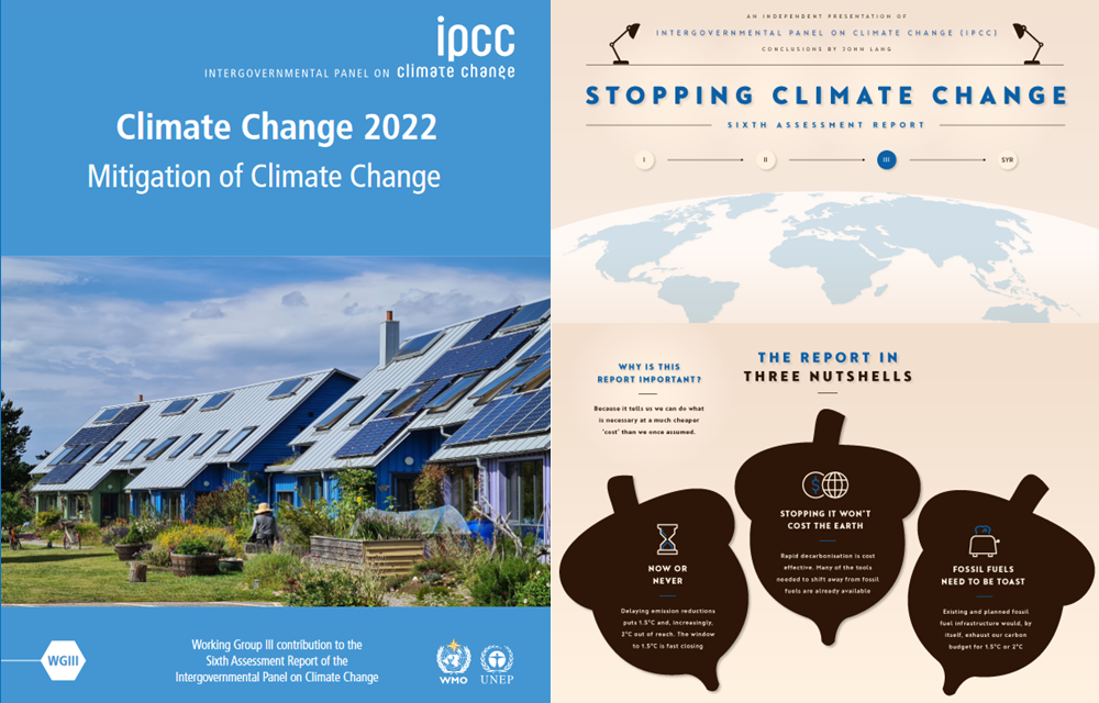
On August 16, 2022 I released a visual explainer of the latest IPCC assessment report, the second of three I’ll publish before COP27 in Sharm El Sheikh. Since creating one on the IPCC’s Special Report on the Ocean and Cryosphere and another called Worlds Apart based on its Special Report on Global Warming of 1.5 °C, making these has, somewhat counterintuitively, become harder. That’s likely got something to do with the curse of knowledge, a cognitive bias that afflicts communicators of all bents. The problem is that once humans know something — say, the lyrics of a song — we find it increasingly hard to imagine not knowing it. As I’m becoming more knowledgeable, I’m becoming less able to straddle expertise with ignorance. And, as I’m learning, it’s a problem that can’t be solved, only managed.
Because seeing is learning, my hope is that this belated set of infographics (and their individual elements) will be used as visual reference points to help improve climate literacy and support the concise communication of what matters to those who matter. Regardless of a policymaker’s or Joe Public’s scientific literacy, we need more people talking confidently about climate change, because it really is the most important thing you can do. Note: to see larger versions of the folowing images, clicking will open them in a separate tab.
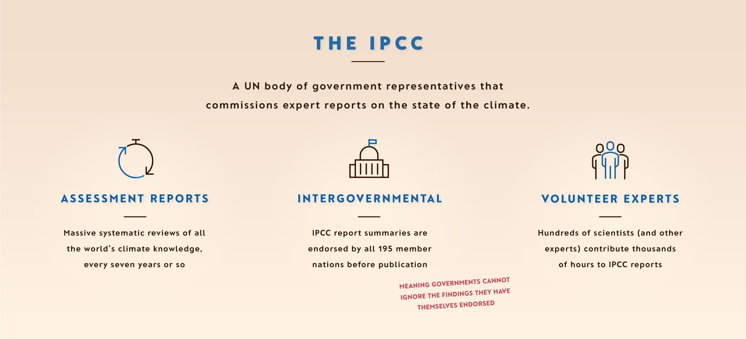
To the dismay of scientists and policymakers alike, the IPCC is often presented as being a ‘group of scientists’. I set that canard straight first.
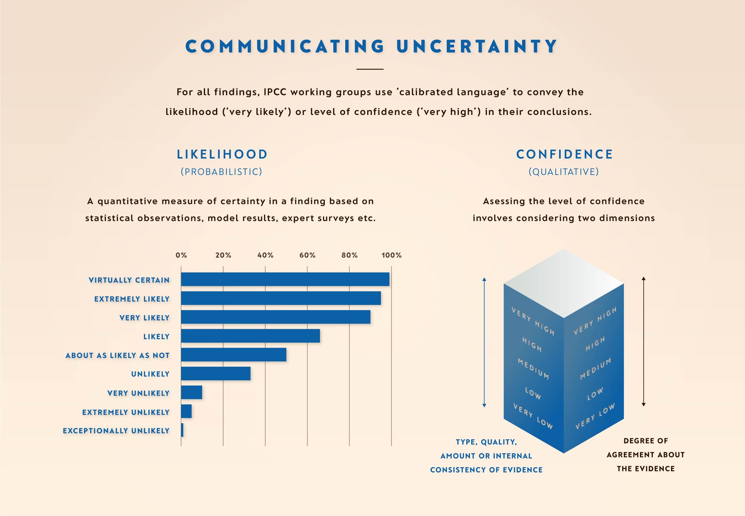
The IPCC communicates scientific uncertainty, inherent in all science, through what it calls ‘calibrated language’. But even with consistent language to guide us, humans find it difficult to gauge the difference between very likely and likely, for example. I don’t blame us. I’m virtually certain this is likely to help.
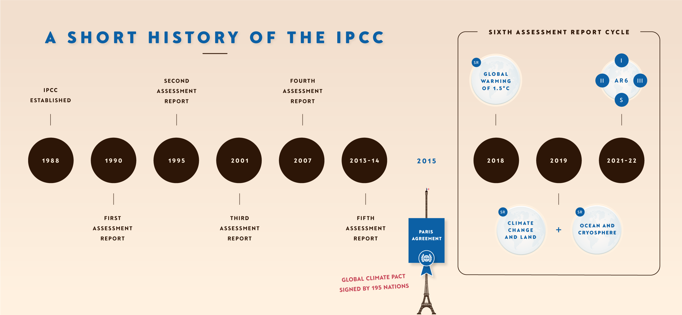
A short timeline of IPCC reports follows, where I make a devastating omission: In 2007 the IPCC shared the Nobel Peace Prize with Al Gore ‘for their efforts to build up and disseminate greater knowledge about man-made climate change, and to lay the foundations for the measures that are needed to counteract such change.’ I’ll be adding it to the next iteration.
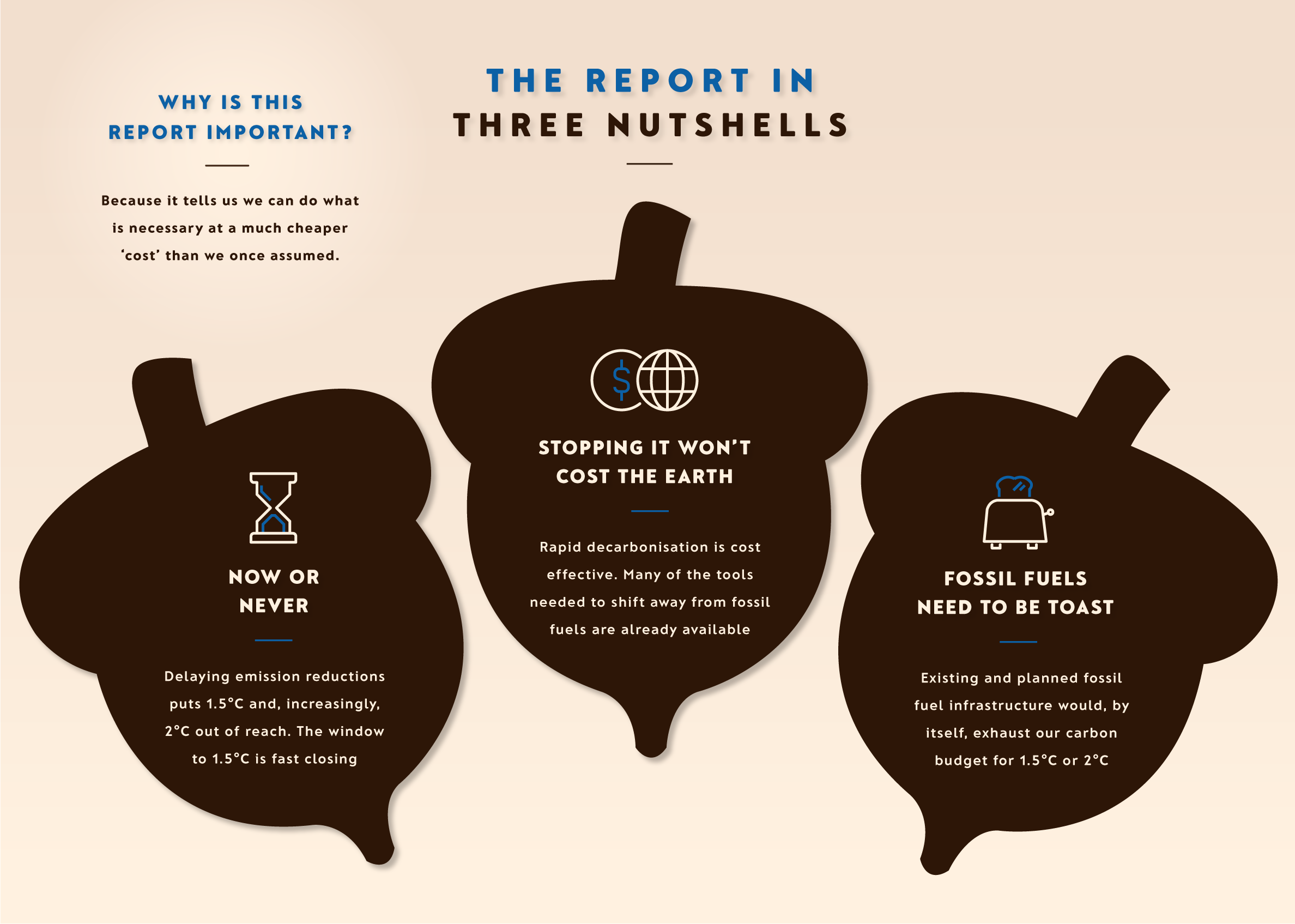
‘Tell ‘Em What You’re Going To Tell ‘Em; Next, Tell ‘Em; Next, Tell ‘Em What You Told ‘Em’. This is where I sum up what the IPCC scientists are saying in three nutshells. Please note the text in the top left corner. It’s important.
A problem well stated is a problem half solved. That’s until you meet climate change: you “almost couldn't design a problem that is a worse fit with our underlying psychology,” says Anthony Leiserowitz, director of the Yale Program on Climate Change Communication. Climate change has no single identity, no single cause, no single solution and no single enemy.
Despite the challenge, I think it still pays to reinforce what might be patronising to some but a prerequisite for others. Purists would be right to point out that the climate problem as presented below is not well stated due to a focus on CO2 at the expense of other greenhouse gases. Very simply, CO2 makes up about 75% of humanity’s heat-trapping emissions and is the gas we must unequivocally drive to net zero as quickly as possible this century. From my experience, focussing on a single cause (CO2) and single solution (net zero), from a communication and problem statement perspective, makes life easier when dealing with a problem as wicked as climate change — at least to begin with. Sometimes, nuance has to wait.
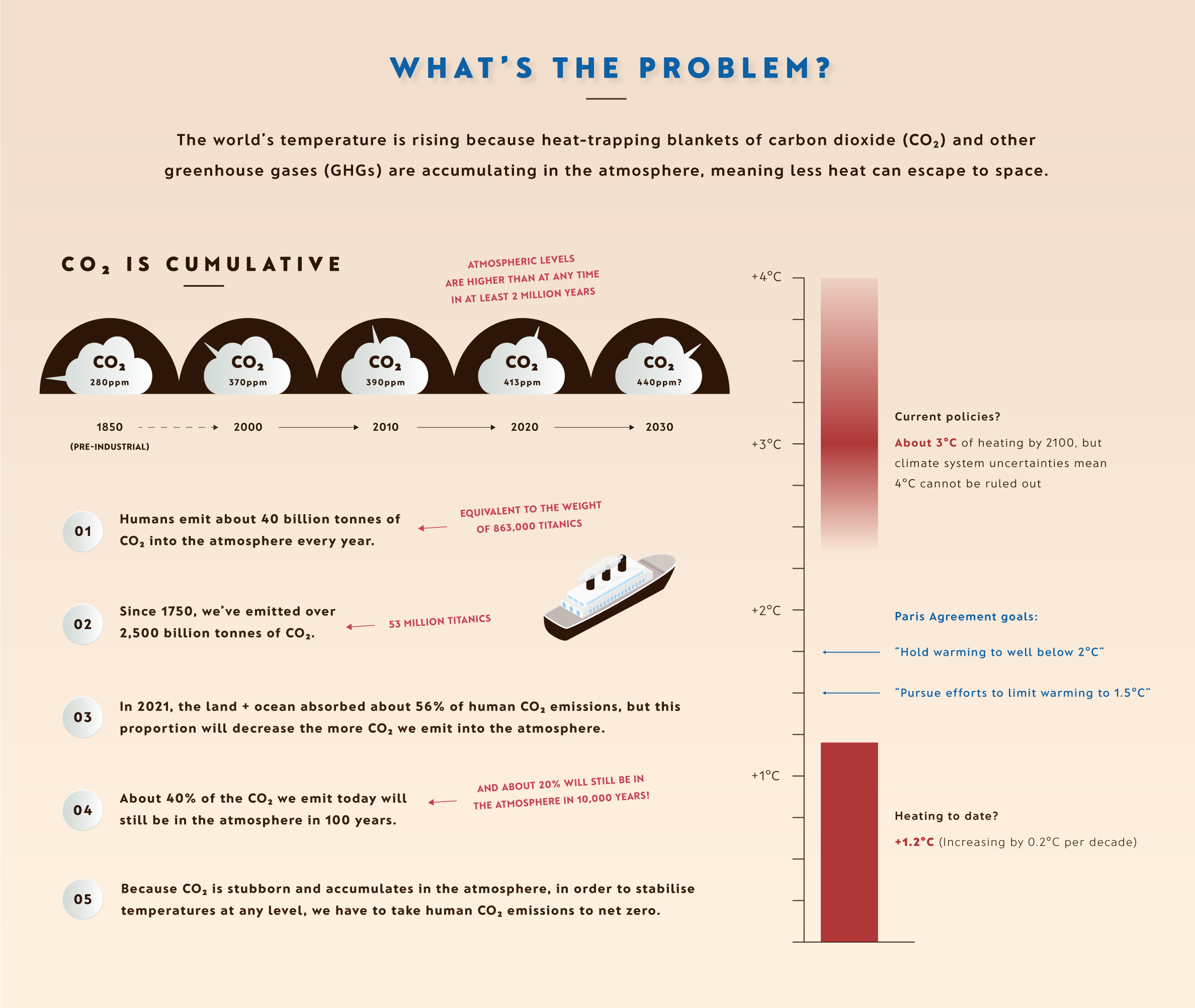
After much internal angst and external debate, I chose to illustrate the weight of human-caused CO2 emissions using Titanics rather than, for example, London double-decker buses. Both are too anglicized, so I’m all ears for a more universally relevant suggestion. The Great Pyramid of Giza?
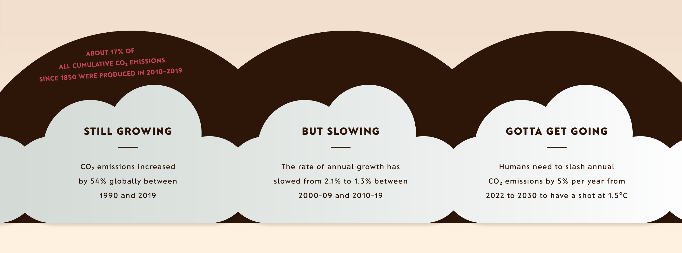
A crudely crafted rhyme about the slowing annual rate of growth in human-caused CO2 emissions follows. Like so many decarbonisation trends, the direction of travel is encouraging, but the gap between what’s necessary and what’s happening is exasperating.
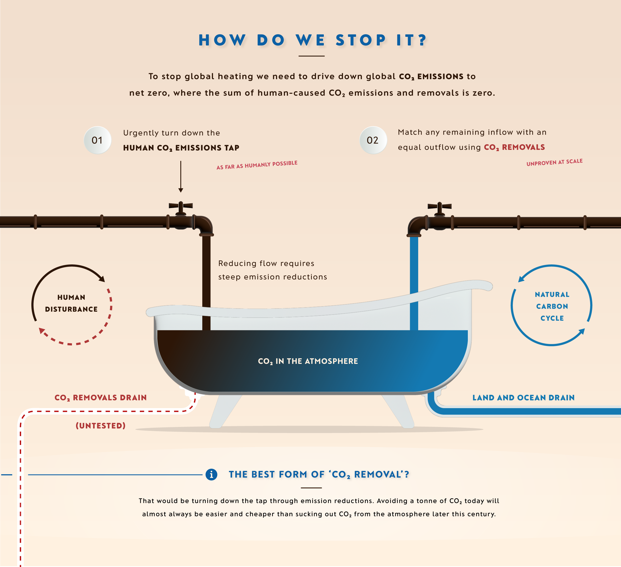
Any climate infographic these days would seem bare without a bath. How do we stop climate change and prevent the bath from overflowing? Going net zero, in all of its naked glory, of course.
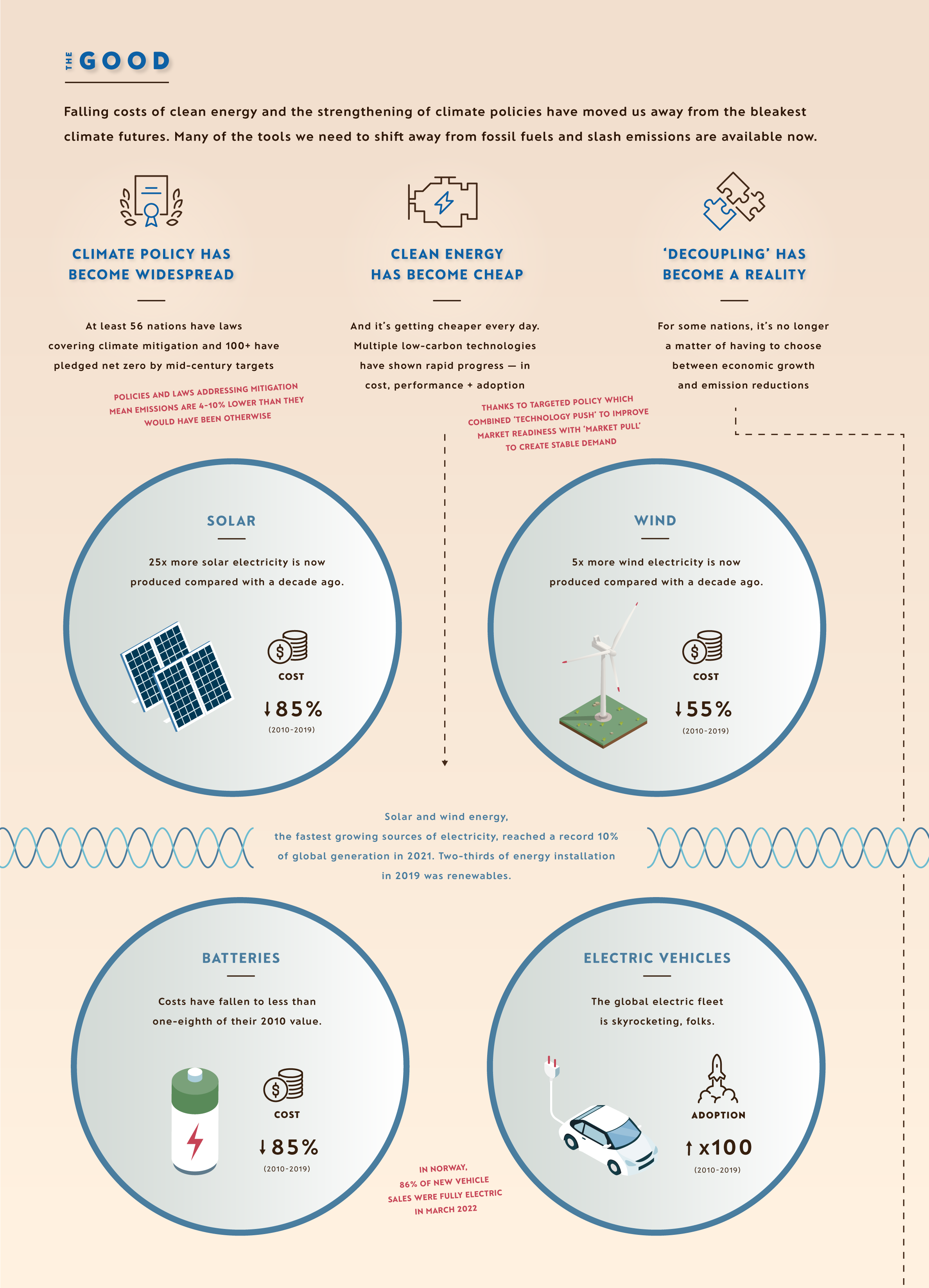
‘The Good, the Bad, the Ugly and the Great’ structures what comes next. Granted, it doesn’t roll off the tongue quite like the spaghetti Western title, but one of the golden rules of climate communication is to end on a positive, upbeat tone. Luckily, there really is plenty to be positive about in this report: climate action is accelerating, clean energy is dirt cheap and reducing emissions does not have to compete with economic development. And we haven’t even arrived at The Great yet.
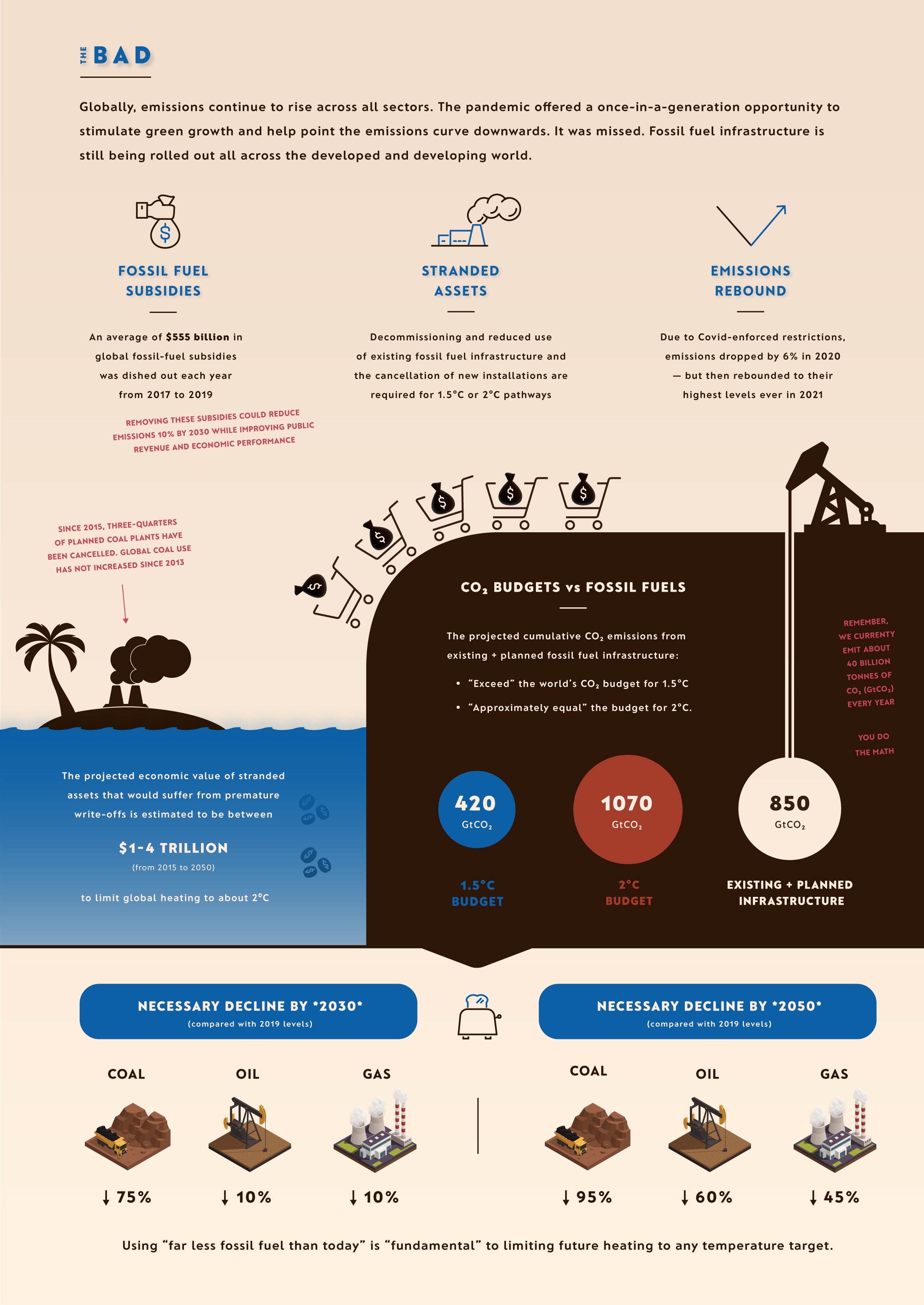
The Bad, and the baddy: fossil fuels.
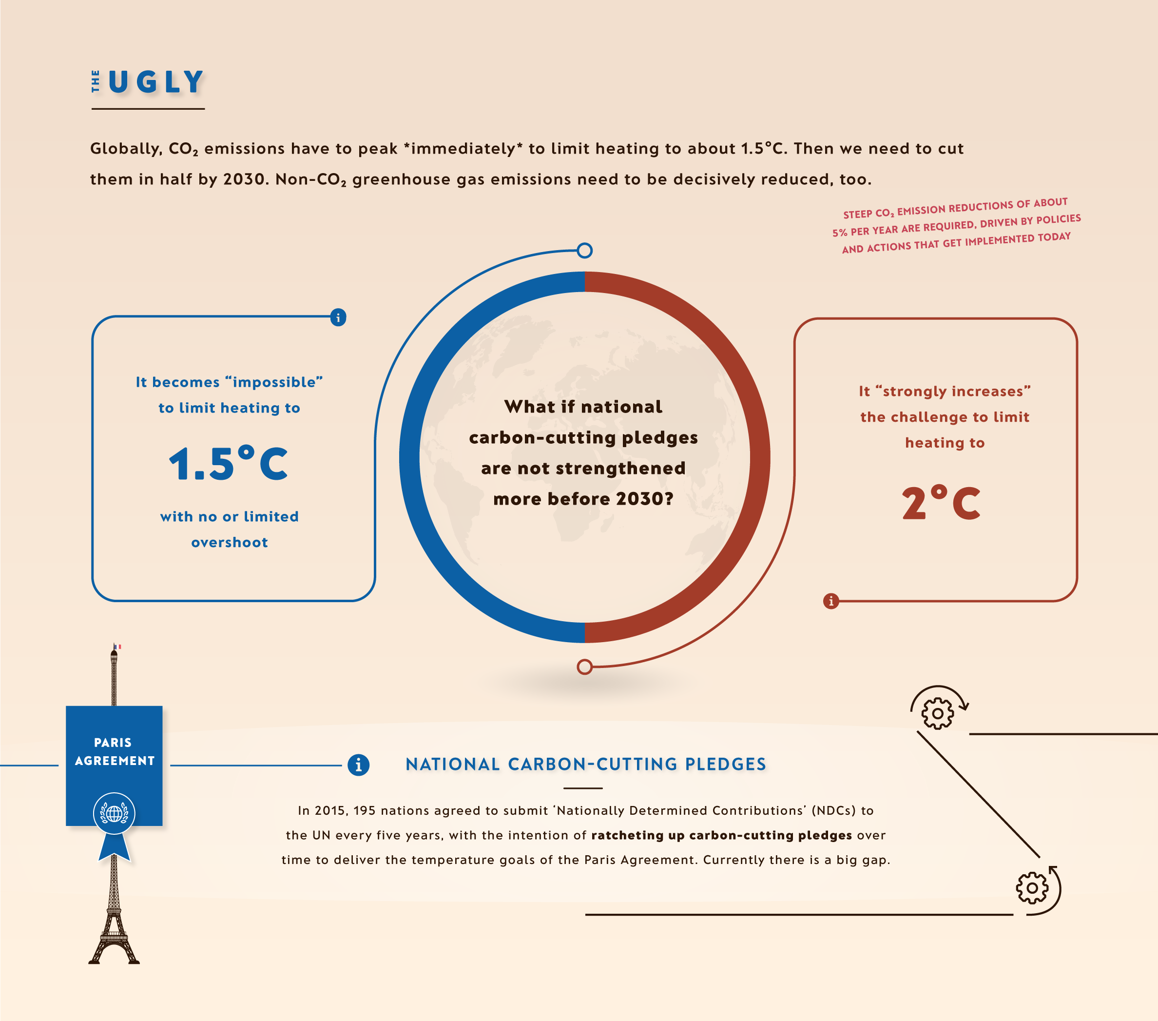
The Ugly. The IPCC tells us in its slides that accompanied the report: ‘We are not on track to limit warming to 1.5°C.’ That’s a profound understatement. The ugliest aspect of climate change, by far, is that the door that was wide open is closing fast.
And The Great. It’s simple: stopping climate change will not cost the Earth. In fact, the cost of #notzero is more than the investment required to achieve #netzero.

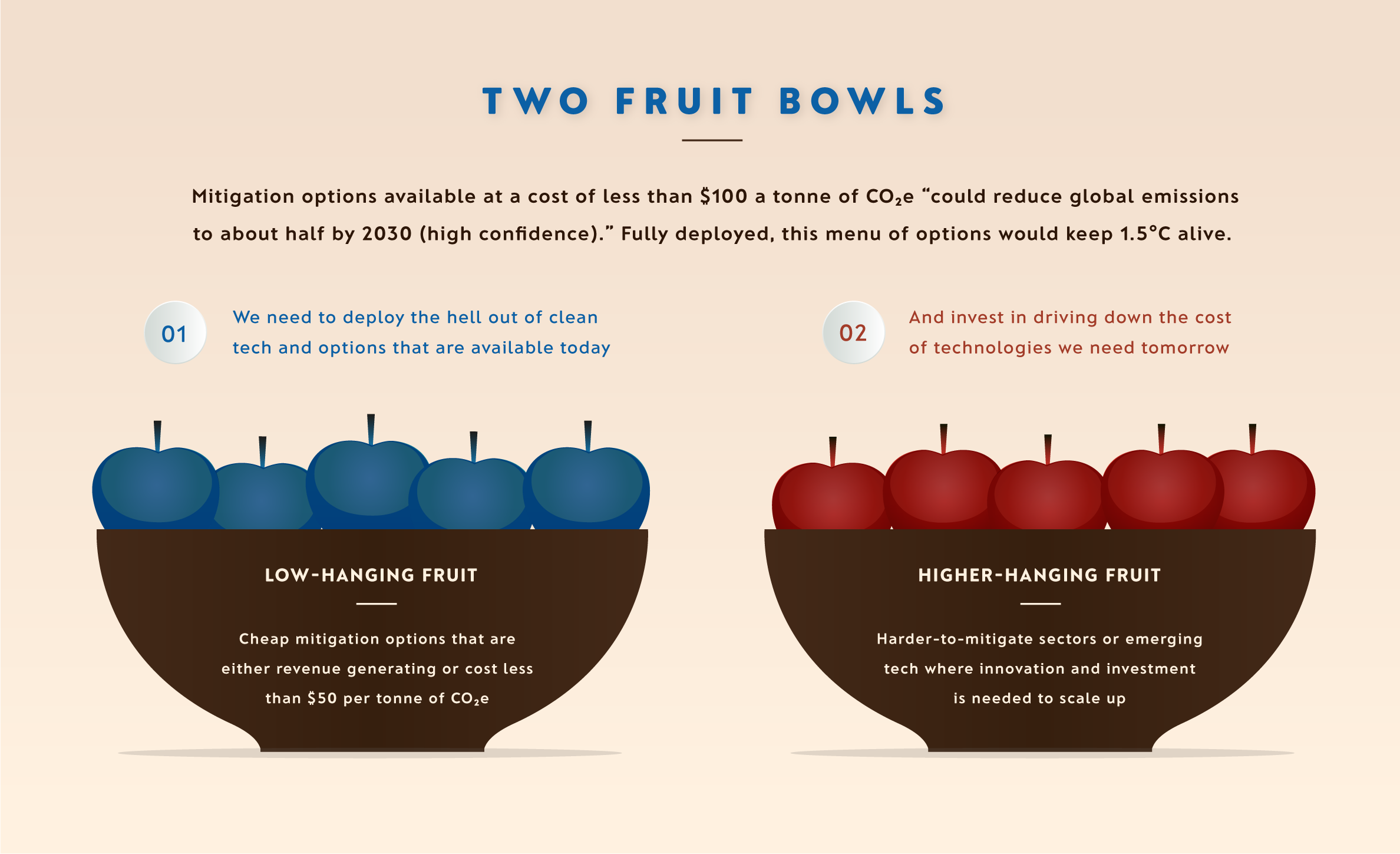
Over the last 30 years of rising climate consciousness, policymakers’ favourite type of policy fruit has tended to be of the low-hanging variety — those that are convenient and cheap. But low-hanging has sometimes turned out to be synonymous with low-impact. Not anymore. As the IPCC stresses, in what is its key message, there are cheap options available now in every sector that can at least halve emissions by 2030.
Convenient and cheap has been joined by carbon-cutting potential.
The Tree of Solutions. One low-hanging fruit a day can keep our emissions at bay.
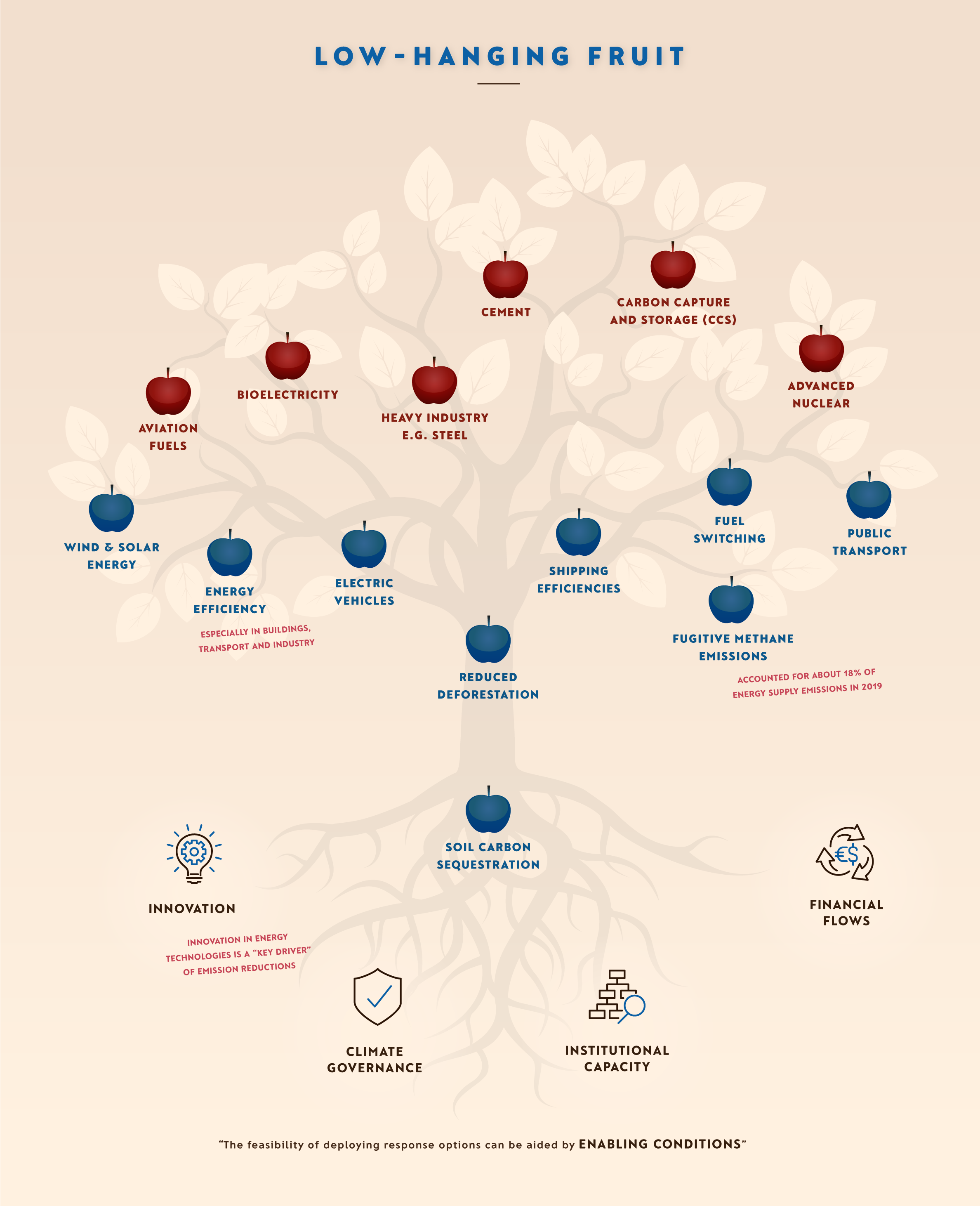
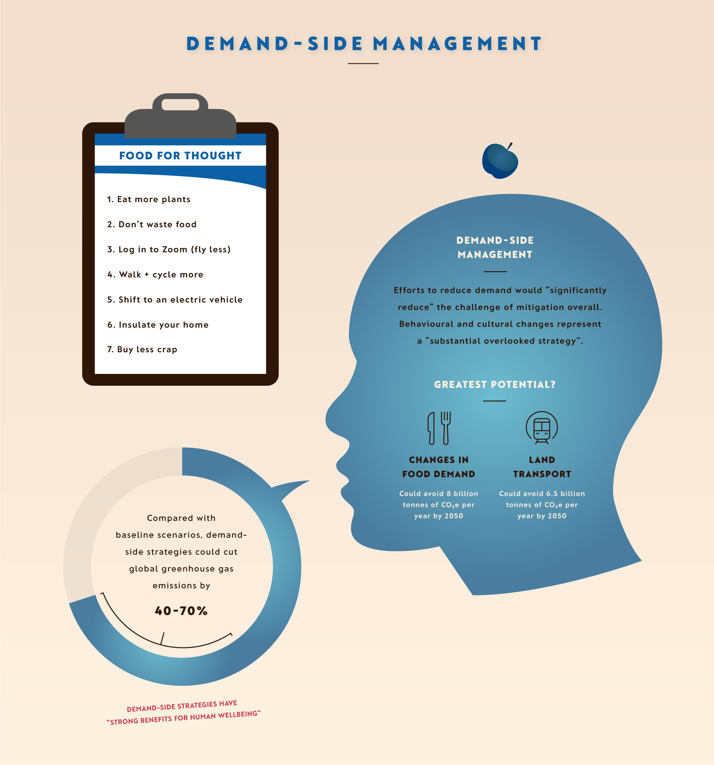
According to the IPCC, behavioural and cultural changes represented a ‘substantial overlooked strategy’ that have been left out of transition pathways and scenarios for too long. So, I wasn’t about to overlook it. For the record, ‘Buy less crap’ is not positioned at eye level for any particular reason…
“All models are wrong, some are useful.” Scientific models and storytelling may seem like unlikely bedfellows, but that’s the best way to think about the scenarios the IPCC uses to help us peer into what the future might have in store. Frankly, there is enormous scope to bring these evidence-backed stories to life even more. I had the privilege of working with IPCC scientists to do just that here. Numbers and tables just don’t cut it.

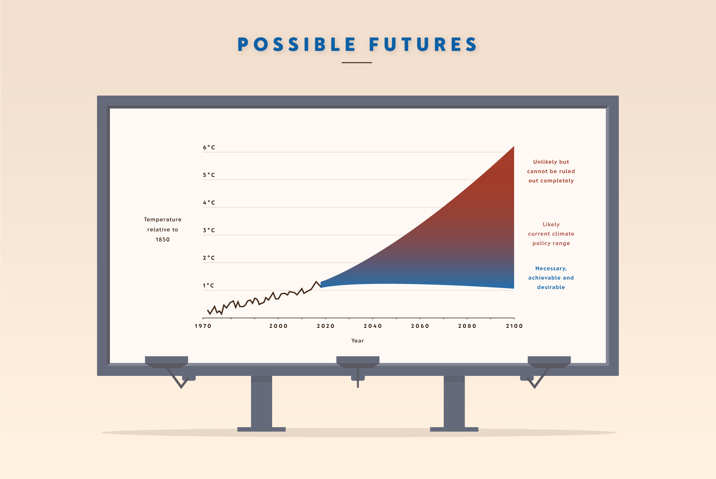
We’re almost there. An oversimplified take on possible climate futures is next. All three, including Christiana Figueres’ ‘necessary, achievable and desirable’ future, have one crucial thing in common: each relies on the decisions we make now and over the next few years.
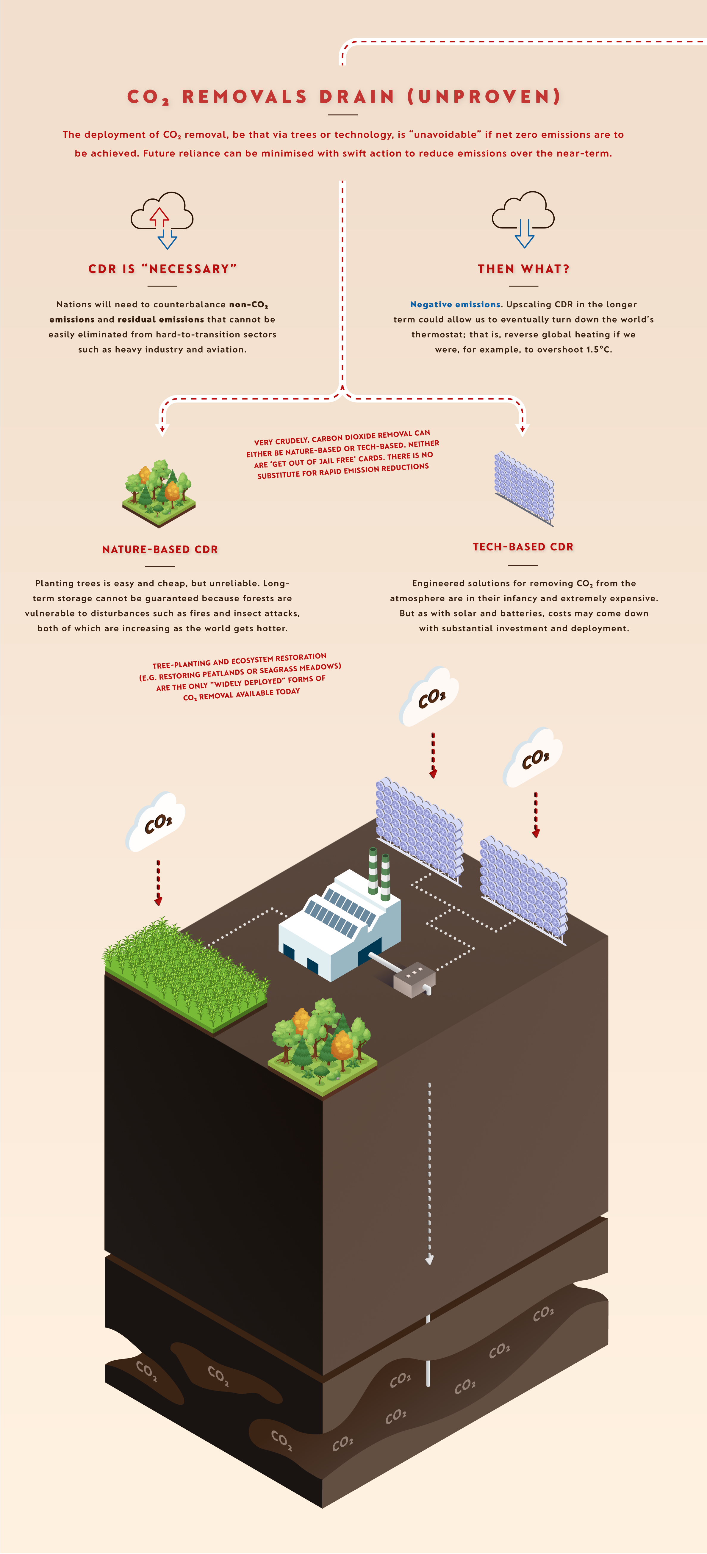
Have you taken a look at the full monty and been wondering why the ‘CO2 Removals Drain’ has been in perpetual freefall? Few beyond those deeply enmeshed in carbon dioxide removal (CDR) know much about it, so I thought it deserved special attention. As the IPCC says, removing CO2 from the atmosphere, both globally and nationally, is “unavoidable” if the world is to reach net zero by mid-century. In other words, everyone is going to need to know more about it at some point soon. (I’m cooking up a dedicated explainer on CDR for the Net Zero Tracker, due for release later this year. Is it a moral hazard or a necessary evil?)
Finally, we arrive at The Bottom Line, inspired by someone who regularly illuminates my Twitter feed with characteristic clarity and level headedness: climate scientist and communicator Zeke Hausfather.
Comparable visual explainers are planned to be published for the WGI and WGII reports respectively in due course.
The full explainer can be viewed here: Stopping Climate Change (IPCC, WGIII)
John also released an explainer on The Physical Science Basis report by the IPCC on 9 August 2022, a year after it was published. See more of his work here:
Worlds Apart, Special Report on Global Warming of 1.5°C, IPCC
COP26: A Visual Guide, Energy and Climate Intelligence Unit
Energy & Climate Intelligence Unit explainers
The E-nvironmentalist (John’s blog)
If you fancy using one of the above explainers for yourself (or your classroom), drop John a note over email, Twitter or Linkedin. He can provide them in various formats.


I haven't been through the whole post yet (I'm otherwise busy) but this section stood out
"After much internal angst and external debate, I chose to illustrate the weight of human-caused CO2 emissions using Titanics rather than, for example, London double-decker buses. Both are too anglicized, so I’m all ears for a more universally relevant suggestion. The Great Pyramid of Giza? "
How about using some US centred icons, as that's where a lot of opposition comes from? Possible icons: Mount Rushmore, Mount st Helens, Statue of Liberty, Empire State building, Golden gate Bridge, Hoover dam etc
Hi Nick, John here. I think that's a really good shout. I like the Golden Gate Bridge or Empire State building personally... I will look at their respective weights and have a think!
Many thanks for reading.
John
Like Nick I have not yet finished reading the entire presentation. What I have seen so far does look like it should help someone who is interested in being more aware and better understanding things.
I wonder if it would be helpful to use the tonnes of carbon in a square kilometre of mature healthy forest (with the value per square mile in brackets). The complication is clarifying that one number would be for the average amount of carbon contained in the forest and another number would be the annual additional carbon capture and sequestration. A further complication to explain would be the range of values by forest type. But all of that additional explanation in a footnote could be helpful.
I suggest the square kilometer (mile) rather than hectare (acre). I am not convinced that many people in the general population have as good an idea about the size of an acre or hectare.
I've now looked at all of it - much easier to read at this link
Re: 'The bath' graphic.
It might be more 'denier proof' if it had proprotionately thick or thin pipes to account for the fact that the inflow/outflow of the natural carbon cycle is much bigger than the human caused one.
Re: 'The bad' graphic
I'm always unhappy about how activists say that Big Fossil Fuel is subsidised to the tune of, in your graphic $555 billion, but do not say that this is mostly standard tax breaks for investment employment etc that any business would get. There is an insinuation that these subsidies are 'special' ones just for Big Oil!
Re: Two fruit bowls
I think an unfortunate omission in the 'higher hanging fruit' tree is advanced geothermal, which seems to be currently under most people's radar. Scroll down to, or search for, 'enhanced geothermal' or EGS.
Without going into the various new developments, this holds out a very credible technology that would, besides being virtually emissions free, be widely available in almost every country on Earth 24/7/365, giving those countries significant energy independence. Planned plant have a very low 'footprint' area, unlike wind or solar... It has the further benefit that it would redeploy much of the work force and machinery of the oil and gas exploration industry to a good end, thus minimising the economic dispruption that would follow the shuttering of that industry.
RE: Demand side management
I love the 'buy less crap' line. Perhaps have a look at Buy me Once - a website that is trying to encourage the world to buy quality that lasts, rather than 'crap' that has to be purchased over and over again
[BL} I have deleted what appears to have been a duplicate of this comment. If it contained new information, please outline it as a new comment, not as an attempt to revise an old one. (I am guessing it was an accidental resubmission.)
In addition to my suggestion @3 that forests may be a good alternative to Titanics, in keeping with a 'living thing theme' maybe Blue Whales or Elephants could be used.
I am going through the presentation a second time to better understand it and provide additional comments.
On the Communicating Uncertainty image the Confidence image does not show that the confidence level is the combination of the amount/quality of evidence and the degree of agreement between the types of evidence. The presentation of the two as axis of a graph with confidence increasing diagonally up and to the right would be clearer.
Also on that panel the word "Asessing" under Confidence needs another 's'.
On the Short History image it may be helpful to clarify that the IPCC was established by the UNEP and WMO, and was endorsed by the UN General Assembly, in 1988.
Some conspiracy theory fans speculate about alternative explanations for the formation of the IPCC.
On the 3 Nutshell image it may be helpful to mention that the costs of climate change increase significantly as the temperature increases.
A more important point is that ethically it is unacceptable to impose any costs or harm onto others no matter how beneficial it may be for some current day people. But that may be too heavy of a point to try to make.
On the What's the Problem image something like the following wording may help limit misunderstanding.
...accumulating in the atmosphere, meaning the surface has to be warmer to balance emitted energy with incoming energy.
A minor point on the Two Fruit Bowls image.
The word 'hell' in the Low bowl description is potentially distracting and not necessary to make the point.
We need to hyper-accelerate the implementation of low hanging actions.
On the Demand Side image I would like to see the action of 'reduced non-essential energy consumption'.
People living less than basic decent lives may 'need' to increase their energy consumption to live decently. But people who improve their lives beyond a basic decent life should try to limit their 'excess optional' energy consumption. The 'keeping up with the Jones'es' competition needs to become 'limiting energy use like the Jones'es'.
Regarding my comment @11,
There is growing understanding that 'being less of a consumer' can reduce impacts more than 'being more attentive to choosing lower impact options'.
'Reduced Consumption' can be really helpful. Energy use, and waste, is associated with almost any consumption. And there can be many other impacts from consumption, including non-climate change impacts of energy use, that are cumulatively more harmful as each person's consumption impacts add up. Tragically, every little bit of harm done adds up.
Re#5
Moderator - Yes, I must have submitted it twice, probably when using the back button and seeing the comment apparently unsubmitted...
#10 OPOF
Re: "we need to deply the hell out of clean tech and options that are available today"
Actually, I really liked it. I suspect it is a clever reference to Matt Damon's 'The Martian' in which an astronaut is seemingly pemanently stranded on Mars with impossible odds. Probably the most famous lines of the movie - they're even in the trailer - are:
"...in the face of overwhelming odds, I’m left with only one option:
I’m going to have to science the shit out of this"
Click for Youtube clip
Nick Palmer @14,
I also got a kick out of the 'science the shit out of it' moment. It fit in the context of the movie and at that moment. Alluding to what he had to do with his excrement was very good.
In this presentation's context I see a connection to the 'hot as hell' consequences of less aggressive corrective actions. But the term seems out of place in the context of a presentation intended to 'appeal to everyone who might be inclined to want to better understand this issue'. Other terms that convey a required 'urgent emergency response' may be better.
This presentation seems to be ingoring nuclear power as a low-cost solution to our CO2 problem. I understand there are worries about safety, waste management, weapons proliferation and cost. I have been designated editor for a series Nuclear Power Reconsidered in Citizendium to address those issues.
There is a discussion of our latest article examining the cost issue at Renewable vs Nuclear Debate. If you having some good information to contribute, please join that discussion.
[BL] You have your run on about your other blog when you brought it up on the "What role for small modular nuclear reactors in combating climate change?" post.
Please do not re-start that same unproductive discussion.
Macquigg,
Nuclear is on the tree of solutions, read more carefully.
Michael Sweet and [BL]: I was not intending to re-start any discussion on this forum, and I will not respond here to any criticism. I am inviting your participation in a more neutral forum.
The article on cost is new. I am doing my best to collect the most important facts on a controversial issue. This forum seems to be the most technically informed on the anti-nuclear side, so I value your participation in the debate. From our earlier discussion, I as able to distill two critiques on the ThorCon article, one of which (Cs-137) has not been adequately answered by the ThorCon engineers.
I am about to submit the earlier articles for final peer review, and I am intending to put an invitation on the other post where those articles were discussed. This post on climate change seemed like the better place to invite discussion on a more general topic. If you would rather I communicate privately, send and email to macquigg at gmail. I value the work here on climate change, and I don't want to distract you with the nuclear issue.