Climate Science Glossary

Term Lookup

Enter a term in the search box to find its definition.

Settings

Use the controls in the far right panel to increase or decrease the number of terms automatically displayed (or to completely turn that feature off).

Term Lookup

Settings


All IPCC definitions taken from Climate Change 2007: The Physical Science Basis. Working Group I Contribution to the Fourth Assessment Report of the Intergovernmental Panel on Climate Change, Annex I, Glossary, pp. 941-954. Cambridge University Press.

Home Arguments Software Resources Comments The Consensus Project Translations About Support

Twitter Facebook YouTube Mastodon MeWe

RSS Posts RSS Comments Email Subscribe


Climate's changed before
It's the sun
It's not bad
There is no consensus
It's cooling
Models are unreliable
Temp record is unreliable
Animals and plants can adapt
It hasn't warmed since 1998
Antarctica is gaining ice
View All Arguments...


Username
Password
New? Register here
Forgot your password?

Latest Posts

Archives

1998 is not the hottest year on record

Posted on 23 December 2009 by John Cook

The argument "global warming stopped in 1998" still enjoys popularity (in fact, #7 on the skeptic leaderboard). The nuanced response to this line of thought is to point out that global warming is fundamentally due to the planet accumulating heat. Direct observations find the planet's total heat content has continued to rise past 1998 (Murphy 2009). Recent ocean heat measurements show the planet has been in positive energy imbalance to the end of 2008 (Schuckmann 2009). Global warming is still happening. Nevertheless, there is a simpler response to the argument that 1998 is the hottest year on record. It's not true. 1998 is not the hottest year on record.

The most prominent global temperature records come from the Hadley Centre at the University of East Anglia (HadCRUT), a branch of NASA called the Goddard Institute of Space Studies (NASA GISS) and the National Climatic Data Center which is part of the USA government’s National Oceanographic and Atmospheric Administration (NOAA). Of these three records, only the HadCRUT record shows 1998 as the hottest year on record. While all three records show near identical long term trends, there are differences on a year-to-year basis. GISS and NOAA both find 2005 is the hottest year on record (with 2009 possibly on track to pip 1998 as the second hottest year on record).

A new independent analysis of the HadCRUT record sheds light on this discrepancy. The analysis is by the European Centre for Medium-Range Weather Forecasts (ECMWF) who calculated global temperature, utilising a range of sources including surface temperature measurements, satellites, radiosondes, ships and buoys. They found recent warming has been higher than that shown by HadCRUT. This is because HadCRUT is sampling regions that have exhibited less change, on average, than the entire globe.

Figure 1 shows the regions that HadCRUT have sampled compared to the regions ECMWF included in their dataset. The ECMWF analysis shows that in data-sparse regions such as Russia, Africa and Canada, there is strong warming over land that is not included in the HadCRUT's sampling data. This leads the ECMWF to infer with high confidence that the HadCRUT record is at the lower end of likely warming.


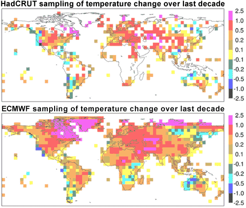
Figure 1: Increase in mean near-surface temperature (°C) from (1989-98) to (1999-2008). Top figure shows HadCRUT sampling regions, lower figure shows ECMWF analysis (ECMWF 2009).

This result is not unexpected. NASA GISS found a major contributor to the record hot 2005 was the extreme Arctic warming (Hansen 2006). As there are few meterological stations in the Arctic, NASA extrapolated temperature anomalies from the nearest measurement stations. They found the estimated strong Arctic warmth was consistent with infrared satellite measurements and record low sea ice concentrations.

 
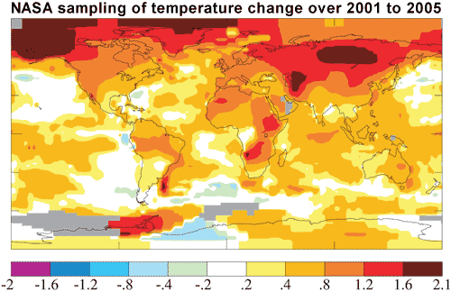
Figure 2: Surface temperature anomaly for the first half decade of the 21st century (Hansen 2006).

For the record, I've updated the "global warming stopped in 1998" page, adding the ECMWF analysis. However, I've still kept the discussion of total heat content as more prominent in the hope that this will lead to greater scientific understanding.

0 0

Printable Version  |  Link to this page

Comments

Comments 1 to 26:

  1. John, is there a more complete reference besides the press release? I haven't found any yet. Interesting information about the global coverage.
    0 0
    Response: Not yet - I searched the ECMWF website and tried emailing HadCRUT and ECMWF for more info but no success yet. Will update with more info as soon as I learn more.
  2. John........ Rest assured you are not the only one who has had difficulty obtaining data form HadCRUT :) RE: the NASA plot of temperature above for 2001 to 2005, why is the major part of the temperature increase concentrated in N. Canada, Greenland and Siberia ? Also there are places on the map where in one area the temp has risen by say 1.8 degrees while at the same time, relatively close-by the temp has decreased by about 0.4 degrees. How do you explain this ?
    0 0
  3. neilperth, the San Francisco Bay Area is one example. Increased heat on the inland side of the bay causes air to rise, which sucks in cold air from the Pacific ocean, and that cold air travels through San Francisco, which gets colder. So if you were thinking such a situation is physically impossible, so divergent temperature changes must be due to measurement error, you were wrong.
    0 0
  4. Tom......... I was thinking more of the difference in temps between the areas north and south of the Persian Gulf. I am not talking about local temp differences on the scale of cities - the hot spot north of the Persian Gulf for example is about the size of India. Have the original temp data been kriged to get the "blocked" temp data ? If so this produces a smoothing effect which means that the original ( raw ) temp differences were even greater than shown.
    0 0
  5. Thanks for this alert, and thanks to the Met Office for posting this release. I have been suggesting to 'climate science' denier friends that the lack of polar temp estimates were accounting for some of the differences between HadCRUT3 and GISS 'global' estimates. Glad there is now a scientific study, apparently, investigating this difference between the reports of global temps of the Met Office and, say, Goddard. As this is an instance of 'climate science' it will probably have little impact on my 'science is a conspiracy' oriented friends, but is good to have available for voting bystanders who listen with both ears. Thanks for the update!
    0 0
  6. The paper is Simmons, A. J., K.M. Willett, P.D. Jones, P. W. Thorne, and D. Dee (2009), Low-frequency variations in surface atmospheric humidity, temperature and precipitation: Inferences from reanalyses and monthly gridded observational data sets, J. Geophys. Res., doi:10.1029/2009JD012442, in press.
    0 0
  7. Merry Christmas to all, and praying for a peaceful 2010! Thanx John for your time and patience. May Santa be kind to you and yours!
    0 0
  8. Comparing the lower figures 1 with figure 3, the dynamic ranges in temperature are about the same, yet the time span for figure 3 includes only half as many years within the same period. This constitutes a fairly large discrepancy unless this implies a curve that peaks or flattens out somewhere in the middle.
    0 0
  9. The fact that there are localized hot spots leading a global warming trend seems to suggest these as sources of heat which radiate outward. Greenhouse gases fill the entire atmosphere equally. Why do their effects precede locally, and coincidentally downwind of locales where waste heat is being generated? Conversely, if the heat source was homogeneous, you would expect to see exception (last vestiges of cooler zones) appearing as remanant localized cold spots, yet the data indicates just the opposite.
    0 0
  10. Merry Christmas, happy new year and thanks for all your hard work John.
    0 0
  11. RSVP CO2 is not well mixed in the troposphere according to this NASA release: http://www.jpl.nasa.gov/news/news.cfm?release=2009-196 Some interesting things happening right now in the science, as more results start arriving from better equipment.
    0 0
  12. From the report: (quote)"The implication of these studies is that, should greenhouse gas emissions continue on their current course of increase, we are virtually certain to see Earth's climate warm by several degrees Celsius in the next century, unless some strong negative feedback mechanism emerges elsewhere in Earth's climate system," Dessler said(end quote) Lovely phrasing here. Dressler is a true scientist, IMHO.
    0 0
  13. @RSVP in #9, On can think about it in this way: Since water vapor dominating the green house effect, and since water vapor varies in concentration in the atmosphere, and if CO2 is uniformly distributed, and if CO2 has a significant effect, then it follows the warming will be greater at those places where water vapor has less concentration. Therefore, since water vapor concentration is lower at the polar region the prediction is that warming due to CO2 should be greater at the polar regions.
    0 0
  14. #9, Looking at Fig 2 above, I see what you say we should expect: "(last vestiges of cooler zones) appearing as remanant localized cold spots" -- there are really just a few speckles of blue. Then, when I look at the hottest spots in Fig 2, I don't see them being downwind of "coincidentally downwind of locales where waste heat is being generated". Approximately Angola, the Antarctic Peninsula, north of the Faulkland Islands, Siberia, Uzbekistan, Siberia, and the Western Arctic seem to be the reddest. Please explain. http://www.youtube.com/watch?v=B7OdCOsMgCw (This Peter Sinclair video may not be appropriate [strays from scientific discourse in places] but it does some nice things with maps of heat and people.)
    0 0
  15. In figure 2 you will see a hot spot in Angola where temp change from 2001 to 2005 had increased by about 1.8 degrees. And in general most of south Angola has warmed by about 1.2 degrees But on the ECMWF map, (1998-2008)the reverse is shown. The location of the hot spot in figure 1 has actually cooled by 0.3 degrees and in general the south of Angola has cooled. Or to put it another way, figure 2 shows appreciable warming in South Central Africa while the ECMWF map shows cooling to no change in the same area. How is this explained ?
    0 0
  16. The red hot-spot anomaly in Antarctica, just below the tip of South America sticks out like a sore thumb and is partly surrounded by areas which are cooling. How is this explained ? What is special about the area where the hot-spot occurs ?
    0 0
    Response: This is possibly due to the cyclonic conditions around Antarctica which lead to dramatic warming in West Antarctica and cooling in the East Antarctic interior. I touch on it briefly when looking at Antarctic sea ice.
  17. #14, Approximately Angola, the Antarctic Peninsula, north of the Faulkland Islands, Siberia, Uzbekistan, Siberia, and the Western Arctic seem to be the reddest. Please explain. ////////////// I already explained above, and I did watch the video. The link is very apropo and appreciated, however the style is defensive and biased giving it a political campaign type feel. I would like to answer your question in part by asking another question. Are red and purple splotches random, or might there not be a particular reason why some parts of the world are warming in general more than others? And if we had maps comparing temperatures over ten year intervals going back in time 1000 years, would one expect temperature cycles to have a homogeneous distribution, or resemble the kind of thing we are seeing here? I would assume that even in a totally non anthropogenic scenario, you would have uneven warming, for whatever the causes. However in the case here, these patterns are due in part by nature and in part by man. Drivers such as waste heat may be local or downwind as I was saying. The cumulative effect of an urban continent such as Europe, or metropolis such as Los Angeles, Mexico City cannot be cooling the Earth. I dont think anyone is denying this. (Maybe the video is and exception) I would also ask if polar zones arent more prone intrincially to have their average temperatures change given that they are dry, and represent the tail "edge" of the planet's net thermal energy reservoir.
    0 0
  18. RSVP@17: No, you haven't explained. You said two things in #9, both of which are at odds with Fig 2. You said GHG effects are downwind of waste heat sources (not "may be" as in #17), and I asked for explanation because Fig 2 seems to contradict you. You also said the data indicate the opposite of localized cool spots, but I see blue only in localized spots on Fig 2. You didn't explain that either. The Arctic is supposed to warm quickly, the Antarctic is not. I don't know why you persist in insinuating that regional patterns of warming are unexpected from AGW theory. I thought you were cured of that (http://www.skepticalscience.com/Was-there-a-Medieval-Warm-Period.html see your much appreciated response at comment #42). Your response in #17 above is a bit of a jumble, and it's probably not worth delving into here (even if I had the expertise) because (1) this post is about how hot 1998 was, and (2) the figures we're discussing (esp Fig 2) have observational periods that are too brief. Finally, I didn't notice in the video someone saying that cities cooled the Earth. Did you? The only time I ever heard that was at a talk given by Hadi Dowlatabadi who gave the example of Pittsburgh -- the aerosols from post-war industry there apparently reduced the temperature of the city by quite a bit. I can't find the ref. But if you want a big picture view, go no further than our host's other pages. For example: http://www.skepticalscience.com/urban-heat-island-effect.htm
    0 0
  19. Neilperth @15 -- the difference between Figs 1 and 2 is that the latter compares individual years, whereas the former compares decadal averages. Weather effects become more important than climate effects as the temporal and spatial scales are reduced. For rates of global warming (large spatial scale), somewhere over 15 years is recommended in this post: http://tamino.wordpress.com/2009/12/15/how-long/
    0 0
  20. To follow up on my #18, RSVP, I know I have linked to RC to look up waste heat stuff before, and I think it is done better there, but see this too: http://mustelid.blogspot.com/2005/04/global-warming-is-not-from-waste-heat.html . And we know that anthropogenic aerosols are cooling the planet considerably: http://skepticalscience.com/CO2-is-not-the-only-driver-of-climate.html ' If ever asked how much CO2 contributes to global warming, you could say "all of it... and some!" ' Large industrial cities are responsible for a good proportion of the aerosols, so let me be the first one you've heard say, "cities cool the planet, with the exception of greenhouse gas production." Sorry for the off-topic, John. I don't know how to make this more relevant to your post.
    0 0
  21. To Steve L To answer your question about what I meant. I suppose a very different picture is conceivable. One where the entire planet's temperature is raised slightly, everything one color for the most part, and possibly some holes where the trend is lagging. This being a situation where the temperature is increasing globally and in general unison.
    0 0
  22. Steve L @19 "For rates of global warming (large spatial scale), somewhere over 15 years is recommended in this post"... So I can disregard NASA's temperature map above as it reflects weather and not climate ? In that case, why was the map posted here?
    0 0
  23. #22. I think you might instead ask John Cook, or re-read the post. In the post, John writes that he would rather people focus on energy imbalance, but he thought it was also worthwhile to show that one specific year (1998) likely wasn't the warmest. It is only estimated to be the warmest in one case because of the limited spatial distribution of sampling in that case. You can compare the NASA GISS map in Fig 2 to the top panel of Fig 1 and see that the probable hottest year was 2005 owing to all that warmth in the polar regions where HadCRUT doesn't sample. That's what the maps are about. Re-read the post and tell me if you agree.
    0 0
  24. Steve L @ 23 I have had a look at NASA's data and the current hot spot in Antarctica started around 1982, about the same time as the hot spot in Angola. That is based on 27 years of data and therefore I would argue reflects climate and not simpy weather. Also, with regard to which year has been hottest, taking into consideration the accuracy of the temp measurements ( +/- about 0.1 degree C according to NASA ) the years 1998, 2002,2003, 2005, 2006 and 2007, can be regarded as being of similar temperature.
    0 0
  25. NP @24 -- I haven't looked at the NASA estimates for Angola over the last 27 years. Hopefully you can ask someone who might know why there's a persistent anomaly there, or at least someone who will confirm your finding.
    0 0
  26. The question is- Why did ECMWF analyse the HadCRUT records and not the GISS or NOAA. It's seems like HadCRUT's result was not acceptable but GISS & NOAA's were. The funny thing is, if you look at figure 1 above comparing both their samplings some interesting things come out: 1. ECMWF looks like they have averaged down the southern hemisphere 2.Apart from more infill on the northern hemisphere, there doesn't seem to be much difference between the two. Except for the west coast of the United States of America(how could HadCRUT got this area so wrong).
    0 0

You need to be logged in to post a comment. Login via the left margin or if you're new, register here.


The Consensus Project Website

THE ESCALATOR

(free to republish)


© Copyright 2024 John Cook
Home | Translations | About Us | Privacy | Contact Us