


 Arguments


The 2012 State of the Climate is easily misunderstood
Posted on 24 October 2013 by MarkR
Every year the National Oceanographic and Atmospheric Administration (NOAA) provides a kind of health check of Earth's climate. They take its temperature and see how the rest of its vital signs are doing, but just as many of us would make diagnostic mistakes if we read a doctor's charts, some news reports have totally misinterpreted the results of the latest health check.
The report looks at everything from ice on mountains to where and how heavily it's been raining. Perhaps the biggest story of 2012 was the incredible disappearing Arctic sea ice, which ended up covering 3.3 million square kilometres (about 5 Texases) less area than it usually does.
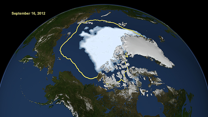
Figure 1: Map of Arctic sea ice cover during its record low minimum in September 2012. The yellow line shows the average extent of the ice pack (credit: NASA)
Mostly, this regular check just adds another year of data and sees how it fits in with past patterns. Global surface temperatures were the 8th or 9th highest recorded, partly because the first two months were cool-ish thanks to a La Nina in the Pacific, where cooler waters sit on the top of the ocean and suck up heat from the atmosphere.
Kevin C's excellent trend tool shows us what the new data mean for the surface temperature trend since 1970: it's about +0.17 C per decade, but there's a range in that because short term wiggles are caused by things like the El Nino-La Nina cycle in the Pacific which warm or cool the atmosphere by storing or releasing heat from the oceans. The trend is most likely to be warming of 0.17 C per decade, but really it's between 0.14 and 0.20 C per decade.
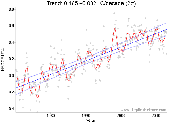
Figure 2: The global warming trend since 1970 according to the UK Met Office data. The vertical axis is temperature in degrees C measured as the difference from a climate average.
However, this isn't the full story because some areas don't have their temperatures reported, such as the Arctic which is one of the fastest warming areas on the planet (remember how 5 Texases worth of ice have disappeared?).
The newer UK Met Office data (HadCRUT4) uses more thermometers closer to the pole, but there is still a lot missing in the Arctic (Morice et al., 2012). So really, the truth is that that trend is only where the UK Met Office reports temperatures.
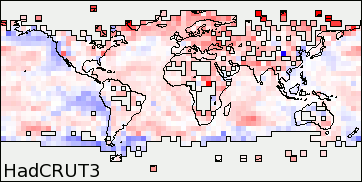
Figure 3: Maps of the measurement coverage of the old ('HadCRUT3') and new ('HadCRUT4') UK Met Office record of surface temperatures. Darker red means that the area has warmed quickly and blue that it has cooled. The newer version includes measurements from more thermometers, especially in the far North where warming has been fastest.
There's an obsession with temperature trends starting around 1998, which was one of the biggest El Niño events on record where huge amounts of heat were released into the air. 1998 is still one of the 3 hottest years on record, although global warming means that it's not the hottest year on record any more, its El Niño guaranteed it was still a scorcher.
The Met Office says that the trend since 1998 is about +0.04°C a decade: this sure sounds like a slowdown, but if you use a shorter time period to calculate your trend then the statistical range is bigger.
Imagine you measure the temperature at midday and again at midnight. You'd be sure you'd found a massive cooling trend. But then the next 12 hours is an enormous warming trend. Neither of these are really trends, they're just the wiggles you get from days being warmer than nights. If you measured for a longer time period the wiggles would cancel out and your range for the 'true' trend would get smaller.
This is true on a global scale over years thanks to things like the El Nino-La Nina cycle. Trends calculated since 1998 have a bigger range than ones since 1970: the best estimate is a warming of 0.04°C per decade, but the full range is from -0.10 to + 0.20°C per decade.
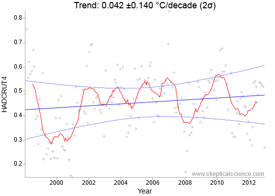
Figure 4: The trend in surface temperatures since 1998, measured by the UK Met Office.
Warming is 3 times as likely as cooling and the trend since 1998 isn't statistically different from the warming trend since 1970. And since the fastest heating has been in the Arctic which isn't reported here, we also know that the trend calculated since 1998 is lower than the global trend (Folland et al., 2013).
Global warming carries on, it's just that temporary wind patterns seem to be hiding part of it in the oceans recently (Balmaseda et al., 2013).
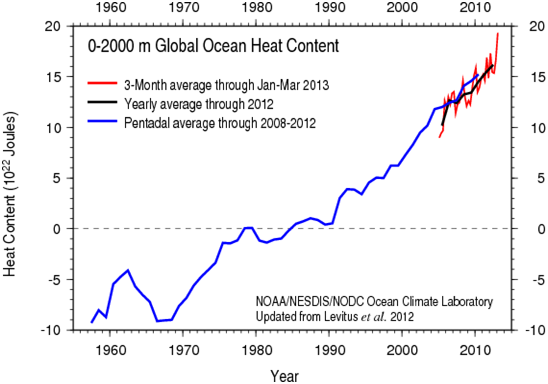
Figure 5: Heat content of the oceans measured down to 2000 metres depth.
Warming continues and 97% of climate scientists think that most of it is man-made (Cook et al., 2013). One of the 'fingerprints' of man-made global warming is that part of the upper atmosphere called the stratosphere is cooling. Partly because of the thinning ozone layer, which normally absorbs sunlight and turns it into heat, but part of it is a temporary trapping of heat lower down in the atmosphere by man-made greenhouse gases (Ramaswamy et al., 2006). The NOAA report points out that the 2012 data confirm the stratospheric cooling trend, a fingerprint of man-made global warming.
CNS News recently ran a story based partly on a blogger whose opinion was different from the scientists who wrote the report. Unfortunately, this difference was not because of new research with exciting results, but from repeating common mistakes.
The article is convinced that the data show a cooling trend, and the first step in this is to pick the start date to be a big El Niño: 1998 of course. If you pick enough short term trends like this, you can convince yourself that no warming ever happened!
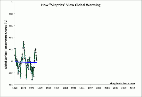
Figure 6: The Escalator shows how, by picking your times carefully, you can make global warming disappear into lots of periods of no warming. The warming is hidden in the 'steps', and this is what happens when people choose 1998, a warm El Nino year, as their start point.
The next choice was to use the old version of the data, HadCRUT3, which missed lots of measurements in the fastest warming areas such as Siberia. If you choose to ignore the data from the fastest warming areas, then you can calculate a cooling trend. Then in order to think that this calculated value is important, you have to ignore the statistical range that shows that the chance of the cooling trend being real doesn't pass textbook standard tests.
Next, the article reports on stratospheric cooling without and doesn't mention that this is a fingerprint of man-made global warming: the chance to report that something is cooling seems to be more important.
Finally, the news article completely ignores the oceans heating at a rate of 4 Hiroshima nukes per second and, combined with ignoring the fastest warming areas of Earth's surface and poor statistics confidently concludes that 'Earth has stopped warming'. A lot of writers come to similar conclusions but scientists disagree because they tend to use as much data as possible, and apply statistics to check their results.


The final paragraph shows NOAA's State of the Climate 2012 to be seriously remiss in not addressing the obvious question which is: "Atmospheric CO2 has continued to rise every year since 1998, assuming the Laws of Physics have not been suspended, temperatures must have risen by a lot more than 0.042/decade, so where is the missing energy and what is the true decadal energy gain?"
Fortunately the answers are well known by those familiar with climatology - but for those who are not ... well, NOAA needs to do better with State of the Climate 2013.
Further to Agnostic's remarks, a fundamental communications problem with NOAA's reports on climate in general is the cognitive dissonance introduced when the public is frequently invited to compare the latest complete year's surface temperature record with that of other years. Indeed, even Skeptical Science is guilty of this emphasis .
Simultaneously, it is emphasized to the public that global warming is an inexorable process, that the accumulation of energy on the planet is steady and uninterrupted. That leaves a confusing puzzle for the public: if the warming process is inexorable, how then can the latest year we've experienced not be the warmest year? Why is the latest year not always the warmest year?
Obviously this is a problem with repeatedly and enthusiastically announcing the wrong measurement, akin to assessing a fever patient's condition by taking the temperature of their earlobe. If the patient's ear happens to be turned toward a draft then hey-ho, the fever's down. Turn the patient around and uh-oh, it's up again. None of these changes of course having anything to do with the patient's core temperature, the measurement of signficance.
Now that there is at long last some attention being paid to the basic instructional error being communicated to the public, it's quite understandable that we find the hole that's been dug by communicators to be a little bit deep. The reason for the change in emphasis isn't correct, unfortunately. Only by being forced to explain better and more accurately because of the so-called and non-existent "hiatus" in warming is the pedagogy here finally being improved. Now we hear that warming of the planet is inexorable and uninterrupted, naturally inviting the crowd of cranks to accuse communicators of moving goalposts.
Not that communicators are bad or incompetent. This is a novel problem of huge dimensions.