


 Arguments


2015: A Very Bad Year for the Global Warming Policy Foundation
Posted on 30 October 2015 by Guest Author
This is a re-post from tamino at Open Mind
Desperate to hold on to the “pause” that never happened in global warming, David Whitehose has penned a piece for the Global Warming Policy Foundation(GWPF). What he really shows is that it’s a very bad year indeed for the GWPF.
He objects to this graph:
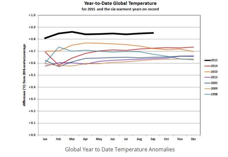
It shows global temperature year-to-date (using data from NOAA) for 2015 (that’s the one way at the top) compared to the same for the next six hottest years on record. David Whitehouse doesn’t like that — because it shows, in graphic terms, how much hotter this year has been than its predecessor, and just how likely it is that 2015 will be the new #1 hottest. A fact which even David Whitehouse admits.
His “argument” is that the “pause” (the one that never happened) hasn’t ended, mainly because not every month this year so far has been the hottest on record. To make that argument, he switches from NOAA data to NASA data. He also points out that only 5 of 9 months (so far this year) have been hotter than the same month last year (he doesn’t bother with “by how much”). He also blames the record-breaking year-to-date (in NOAA and NASA data, and HadCRUT4 to boot) on the current el Nino. It’s true that el Nino years tend to be hotter … which is why 1998 was so hot, and why deniers usually start their “no warming since” graphs with 1998. Finally, he emphasizes that there’s uncertainty in global temperature, of about 0.1 deg.C.
Which is funny, because when deniers were in “full pause mode” (the pause that never happened) they didn’t talk about uncertainty. And yes, they started their “pause” meme with 1998 and because of 1998 being such a hot year.
What’s also funny is the “not the hottest month every month” argument. Suppose you played a baseball game — nine innings — and in the first inning you only scored th 2nd-most runs in league first-inning history, in the second inning you only scored the 2nd-most runs in league second-inning history, etc. etc. After nine innings, you’ve scored the most total runs in one game in league history. But that’s worthless; I guess, according to David Whitehouse, your offensive scoring is in a “pause” (you know, the one that never happened).
What’s not funny is David Whitehouse simply denying the truth:
Despite this extensive research taking place Peter Hannam continues in his article with a very out-of-date comment. “For years, climate change sceptics relied on a spike in global temperatures that occurred during the monster 1997-98 El Nino to say the world had stopped warming because later years struggled to set a higher mark even as greenhouse gas emissions continued to rise.” This myth has been addressed so many times. The year 1998 and its strong El Nino has nothing to do with the pause. Neither “climate sceptics” nor climate scientists would fall for such an obvious aspect of the data, but it seems journalists still do!
Au contraire. Fake skeptics (a.k.a. deniers, a.k.a. climate anti-vaxxers) exploit the 1998 el Nino, have for years. And climate “skeptics” fall for it all the time.
As for the whole el Nino thing, it looks like we’ve got a strong one going on right now. The last time we had such a big one was 1998. Were those years so hot onlybecause of the el Nino? Let’s compare the two directly (2015 isn’t complete, so I’ve plotted year-to-date):
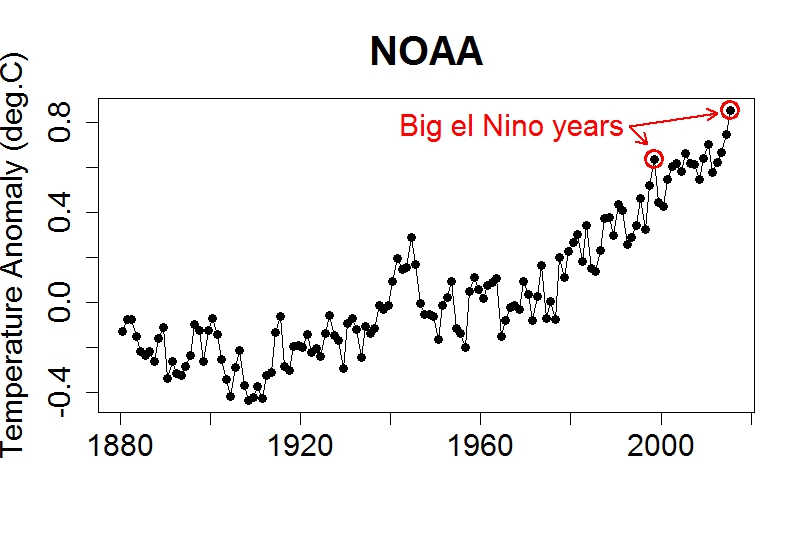
Both of the big el Nino years were hotter than nearby years. But they weren’t just hot because of el Nino, they were hot because of global warming. That’s why this year is so much hotter than the 1998 monster el Nino. That’s why 2005, 2007, 2010, 2014 all broke the 1998 record in spite of 1998 being a monsterel Nino. Because there is no “pause.” It never happened.
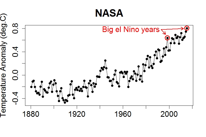
You can see the same thing with NASA data (again, 2015 is year-to-date):
He closes with this utterly nonsensical non-sequitur:
What the data is showing us is that over the past 15 years or so there has been little underlying change with El Ninos elevating the temperature a little and La Ninas reducing them. Is what is happening to global annual average surface temperatures all that surprising?
Surprising? Of course not. Because the globe is warming. Because of us. As for the “pause” that David Whitehouse and the GWPF so desperately cling to — it never happened.
Help us do science! we’ve teamed up with researcher Paige Brown Jarreau to create a survey of Skeptical Science readers. By participating, you’ll be helping me improve SkS and contributing to SCIENCE on blog readership. You will also get FREE science art from Paige's Photography for participating, as well as a chance to win a t-shirt and other perks! It should only take 10-15 minutes to complete. You can find the survey here: http://bit.ly/mysciblogreaders. For completing the survey, readers will be entered into a drawing for a $50.00 Amazon gift card, as well as for other prizes (i.e. t-shirts).


Using the Cowtan's University of York temperature plotter, it is interesting that the RSS satellite data shows a small cooling trend since 1998 (particularly if one ignores the two big El Nino spikes in 1998 and 2010). Yet UAH shows a warming trend over the same time frame. I think until the reason RSS is not keeping up with the rest of the data sets is clearly communicated, deniers will remain on the dark side of this pseudo-debate. Meanwhile, there is that "10 indicators of a warming world" that suggests to me that RSS is missing something.
An excellent visualization of the impact of El Nino (and La Nina) on the underlying global warming trend is the SkS animated gif that shows the temperature trend for separate Nino/neutral/Nina years (graphic #67).
LarryM I crudely plotted the estimated 2015 temperature anomaly using up to September data here
http://d1355990.i49.quadrahosting.com.au/2015_09/2015est.jpg
Bert
Another fact against the claims that warming has not continued is that in previous El Nino events it is the year following the start of the El Nino that is the warmest, 1998 for the 1997/98 event. So it is likely that the 2016 global average will be even warmer than the anticipated 2015 global average.
And there is no need to wait for the end of a calendar year to get an annual average. Any 12 month period contains each month of a year. And the trend so far through 2015 is clearly that the averages of 12 months keep going up with each new month.
The trend of 30 years also continues to go up with each new month. In fact the trend the 30 year averages never 'noticably paused'. Every new month is significantly warmer than the month 30 years before. And it seems likely that February 2028 will be warmer than that very unusually warm Feb 1998 value, even if 2028 is La Nina influenced (the graph in LarryM's comment shows an average difference of about 0.15C between El Nino and La Nina).
@One Planet Only Forever-
Well-put. It's worth noting, also that the 97/98 event was preceded by a fairly COOL 1997 year. If you want to compare THIS El Nino event and global temperatures, it should be compared with 1997 at this point, and then 1998 compared with 2016.
It is not being presented clearly enough to people that global temperatures lag El Nino by 3-6 months, which is how the data were handled in that graph posted by LarryM, originally in the Houston Chronicle.
Also....this non sequitur statement:
What the data is showing us is that over the past 15 years or so there has been little underlying change with El Ninos elevating the temperature a little and La Ninas reducing them. Is what is happening to global annual average surface temperatures all that surprising?
is demonstrably FALSE.
If you look at decadally averaged temperatures and ENSO, you will see that during La Nina dominated periods, global temperatures are now remaning about constant (e.g. actually a 'hiatus') and during El Nino dominated periods, we are getting about 2x the decadal warming rate of the overall average. Over the past century, global temperatures basically stair-step based on ENSO phases, but they have NOT gone down.
Here's something to think about .....
It was the downside year of the '97-'98 el Nino that set the record not the year leading into it. Having the record warmest year 2 years in a row is already unprecedented but there is a very good chance 2016 could be the third year in a row or at the least a Top 3 year in the 2014-2016 cluster
I predict that in 10 years these same Deniers will be going "Global Warming ended in 2015 so there is nothing to worry about"