


 Arguments


Tracking the 2C Limit - July 2015
Posted on 26 August 2015 by Rob Honeycutt
Following my last post on The 1C Milestone I've decided to build my own chart to track our progress relative to the 2C Limit. This will be a monthly post that I make here on Skeptical Science once the GISS monthly data come out.
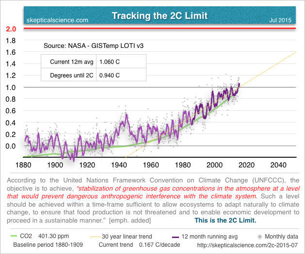
In conjunction with these updates I'll try to throw in additional information that might relate to the 2C limit as it becomes available (or as I happen upon it). With this first post there are a few things that I'd like to point out.
Data Source
I'm choosing to use NASA - GISTemp LOTI v3 data mostly because the data are published in a manner that makes it easy for me to manage. I've played around with the GISS data before and am more familiar with it than the other data sets. As new versions of GISTemp come out I will switch over to those, hopefully without too much pain.
If anyone is interested in checking out the data, you can find it here:
http://data.giss.nasa.gov/gistemp/tabledata_v3/GLB.Ts+dSST.txt
Baselining
This is an issue that can trip up some folks who might be new to the climate change issue. It can be confusing as to why the surface temperature data sets use "anomalies" off of a baseline instead of actual relative temperature. NOAA has a very good short explanation about why.
What I'm doing with this data is, essentially, re-baselining it. The original data are baselined to a 1951-1980 average, making the average of those data points the zero axis. But, we want to know what the temperature anomalies are relative to a "preindustrial" baseline, in essence, so we can see how much warming has taken place since humans started pumping CO2 into the atmosphere.
The best we can to for preindustrial in the GISTemp data is to just take the first 30 years. We were already adding CO2 at that point, but that's as early as we get with GISTemp. So, we'll take it.
Trend Line
The World Meteorological Organization (WMO) defines climate as "weather over 30 years or more." I've added a trend line for the last 30 years of the GISTemp data, but one needs to be careful interpreting that trend.
No one that I know drives their car only by looking in the rear view mirror. That trend line is the result of what has already taken place, and is not a predictor of what will happen... and we all know you'd have to speak to Galadriel, the Lady of Lothlórien, for the privilege of seeing things that have not yet come to pass. Or just check out...
Representative Concentration Pathways (RCP)
Looking at forward projections of emissions pathways is the correct way to start thinking about where we're headed. Skeptical Science author G. P. Wayne has a great introduction series to RCP's that's well worth checking out.
I found this adaptation of RCP scenarios that specifically references rise in temperature. This is the sort of information which would be more indicative of what we will see for future warming relative to various carbon emissions scenarios.
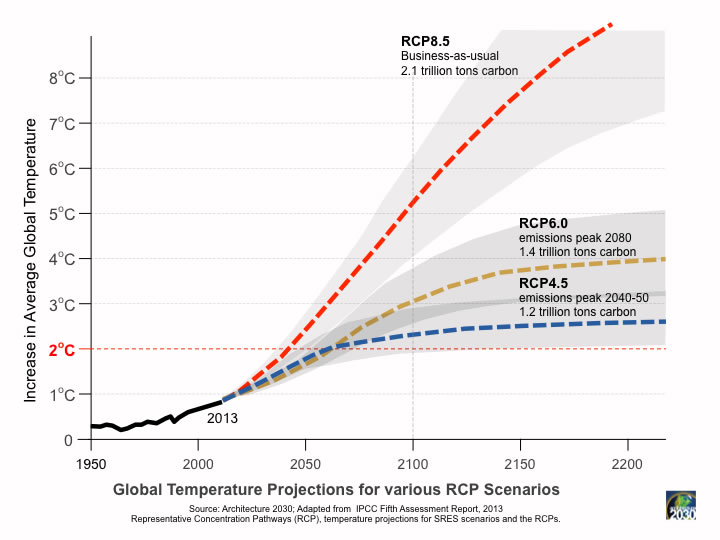
Take note that we are still currently on the RCP8.5 emissions pathway. It is imperative that we get off that track as early as we possibly can.
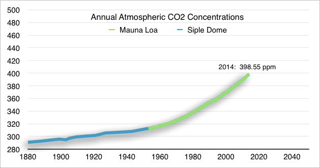
CO2 Concentrations
I've added our atmospheric CO2 concentrations in the background of the graph. Below is a version that gives you more detail about that data. I will be keeping this up to data along with the temperature graph.
File Naming Convention
One of my big beefs with the internet these days is with how much old information clutters up the interwebs. When I try to locate a chart, I can usually find the right chart, but I can't find the most recent chart.
With that in mind, I'm creating a very simple naming convention so that people can always find the latest data. The URL will always start with, of course, skepticalscience.com. Then if you ever want to find the latest update just add: /2c-[YYYY]-[MM].html. So, for instance, this post is: 2c-2015-07 for July 2015.
The main chart image will aways reside at: skepticalscience.com//pics/2c-[YYYY]-[MM].png


This is a good idea. However, I have a few of concerns about the first figure you've shown and since this appears to be the beginning of a long process I'm going put them here for you to consider.
1) You are showing two different quantities on a chart with one axis that has no units defined. That axis seems to be indicating °C at present. Also, these are temperature anomalies. Yes, that is hinted in the figure caption with the words "baseline period ..." but it probably should be stated in the axis label as well.
You need two axes and sets of axis labels for this plot unless somehow the variables have been normalized against the same dimensionless scale. I doubt that's the case but if it is it needs to be explained.
2) The unit for temperature is °C. Think of that as a single character that should be used in place of C. As far as I'm concered not using °C is just wrong regardless of how commonly it's done. °C should be a single character in the character sets of the world as far as I'm concerned. Is it?
3) units should always be preceded by a (non-breaking) space. You've done this inconsistantly in the same figure. e.g. '12m', '1.060 C'
4) though it may seem obvious, the time axis needs to be labelled with years or those units must be explained somewhere.
5) I don't care for the term, "2C Limit" but I recognize it's a name for "2 °C Limit". I don't think I can persuade the world to change that. On the chart you have "Degrees until 2C". This one I can't abide. Try, "Difference from 2 °C". At present you have "0.940 C" which is 2 °C - 1.060 °C = +0.940 °C. When we (inevitably) get above the 2 °C temperature anomaly this number will become negative. Is that really the way you want to think about it? I think it's backwards.
On the whole I think this is a good idea and obviously you can take my comments or leave them, it's your project.
Thanks for the feedback, ecwiebe. This is definitely going to be an ongoing project with many updates along the way. A few responses, though.
1) We discussed this internally. My own take was that I really wanted to add the CO2 curve in there as a reminder of what's causing this. But adding the second data axis ended up visually confusing. The exact same data is presented as a second chart below with the y-axis data included.
2) Let me think about that one. I've always used the "C" without the degree symbol primarily because in the general course of typed communication, it's impossibly slow to add. But in a static chart like this it's less problematic.
3) That's easy to fix.
4) I'll see if I can squeeze the axis labels in there for next time.
5) Very good point as well about "degrees until 2C." I hadn't thought of what that number becomes when we reach 2C.
The 'purple' line does not look like a 30 year, straight-line average but some smaller interval. I recommend making it 365.25 days or one year so seasonal changes disappear.
Also, a straight-line average is easy to compute, it has the bad habit of suppressing local minimums and maximums in the data. More work, I prefer a Gaussian weight average so random forcing functions like El Nino/La Nina and volcanic erruptions are seen in the data.
The other problem of a time-range, trend is the data lags by 1/2 the interval. You can include today's data in a one year average but the mid-point of the average is six months earlier. There are techniques that can allow showing 'current data' but it leads to subsequent versions 'moving the dot.'
Last, if using excel, use a calculated trend line and compare it to the excel generated trend line. I've been disappointed by the excel trend line function in the past.
Bob Wilson, Huntsville AL
Sorry, I see the "12 month" label on the purple line.
Bob Wilson
Per David Victor, it's always worth pointing out that the 2C target is purely political and has no basis in science as some threshold we shouldn't cross.
2C was chosen by UNFCCC because it was believed (back then) to be an achievable target both technically and politically in the timeframe being discussed.
jphsd... I wouldn't agree that 2C can be defined as "purely" political. If it were purely political then any number could be chosen, and it certainly would be far easier to politically agree on 3C or 4C. And I also don't think anyone defines it as a specific "threshold that we shouldn't cross."
There is a lot of scientific basis that revolve around the figure. We clearly increase our risk of crossing tipping points the higher we go. We also know that the Eemian was somewhere around 2C over Holocene preindustrial.
I think one could define 1C over preindustrial as "dangerous." 1.5C is clearly more dangerous than 1C... 2C more dangerous than 1.5C, and so on. Each point requires different levels of mitigation and adaptation, with a point somewhere along that continuum where mitigation would become ineffectual.
What I would agree with is that the exact selection of 2C is relatively aribitrary. But ultimately, it is important to draw a line in the sand somewhere and stick to that line as a defined measure.
As for the "threshold", no one is saying that this side of 2C is safe and that side is dangerous. Again, it is a continuum of escalating danger. I see the 2C limit as being a sign post continuously warning us that we have a critical global crisis ongoing.
I think this is a great way to focus people's minds on the looming danger of over 2 degrees C of global warming unless humanity acts very quickly and decisively to build a low carbon energy infrastructure and massively cut its greenhouse gas emissions.
It ocurred to me later that my point 5 about being above or below the 2 °C limit can be resolved by saying "above" or "below". No need then for a negative sign.
Here's the link to the Nature article: Victor and Kennel (2014)
[PS] Fixed link. Please use the link button in the editor in future.
jphsd... Yes, I'm aware of Victor & Kennel. But Stefan Rahmstorf did an excellent response to their paper on Real Climate titled, Limiting global warming to 2 °C – why Victor and Kennel are wrong.
Rob, using the Mann 2008 Global EIV reconstruction, the 1736-1765 average is -0.11 C using the same baseline as you do above. If we renormalize the reconstruction against the GISS LOTI, that becomes -0.12 C. That renormalization is appropriate given that the reconstruction is normalized against HadCRUT3, which distorts its values very slightly due to the reduced twentieth century trend shown by that (now obsolete) temperature index. In either event the difference from your assumed preindustrial temperature as reflected by your baseline is small, but your baseline will consistently underestimate the how near we are to the 2 C 'target'.
Rob, with regard to CO2, it would be better to plot the log of CO2 against temperature rather than just CO2. If you want to use a linear measure, cumulative emissions has at least some scientific support as having an approximate linear relationship with temperature. As it relates to the chart, I can understand your reasons for not including a second set of values on the y-axis, but if you do not you need to be more explicit about how CO2 concentration values are related to the temperature values.
Tom @11... That one is going to take a little more processing on my part. Let me work on it.
Tom @12... You know, I had thought of the same thing, but I'm having some trouble with Apple Numbers (not using Excel) where there seems to be a bug when I select log scale. When I select that the y-axis defaults to a min of 100 and a max of 1000, which totally messes up the chart.
That one is going to take some work too.
ecwiebe @1
As a retired technical writer I appreciate your point (3). I always made sure to keep a non-breaking space between number and unit. However, there is one exception — or at least there was when I investigated the matter a few decades ago — and that concerns degrees Celsius. In this case there is no space; in effect, the degree symbol fills the space between number and unit symbol (C). Interestingly, there is of course no degree symbol when kelvins are used. I think the anomaly with Celsius arises from the fact that it is a non-SI unit.
@6, ..talking about political targets 3 C is exactly what Bjorn Lomborg was hoping to convince the global voters of democracy that fossil fuels should be allowed to warm our kids earth by.
I just feel that this exact point needs to be made as science and politics are inextricably linked.
How much more political can it be to have the good name of a prestigious University used to flog fossil fules all in the name of enriching the elite?!!?
I'd drop CO2 too.
However there is an intriguing possibility: Plot
TCRCMIP5 x log2(CO2(T)/<CO2>1888-1909)
It then has the same units as temperature and provides an interesting model-obs comparison. Tough to explain though.
I would like to see the 'lagging' likely temperature increase 30 years later due to a rapidly increasing level of CO2. I am referring to he 0.3 degree C value mentioned in "The 1C Milestone" SkS post.
As mentioned in that article it is likely that accumulated human impacts to date have produced a 1.3 degrees C warming from pre-industrial levels, not 1.0.
I am not sure how to best represent it. It is related to the rate of increase of CO2. But it is already in the trend of the temperature history. However, if people are assessing how much more impact can be permitted compared to what has already been created the recognition of the 0.3 C must be included in the evaluation.
Perhaps the best thing to do would be to identify a 1.7 C threshold line with a note explaining why it is on the chart.
We are waking up to the fact that the 2C limit is untenable for continuity of an integrated global modern society.
http://cleantechnica.com/2015/08/26/world-must-almost-completely-decarbonize-in-next-35-years-to-tackle-climate-change/
[PS] Fixed link. Please use the link button in the editor to create links
Digby, The only exception made to the space convention is for degrees, minutes, and seconds, °, ', " the symbols for the unit(s) of plane angle. °C is the the symbol for a specially defined SI derived unit "degree celsius". Yes, it's not an SI base unit but it is a clearly defined "derived unit". I agree that this detail is principally a style convention but it's a good one to follow. Number_space_unit.
It's very clearly laid out in this text from the Bureau International des Poids et Mesures (BIPM). http://www.bipm.org/en/publications/si-brochure/section5-3-3.html
See also http://www.bipm.org/metrology/thermometry/units.html#si-brochure.
It's also explained clearly in documents from NIST (National Institute of Standards and Technology) for those who prefer a USA centric reference.
[And don't get me started on the way people embed C for carbon in units of mass or concentration or what not. That's completely wrong and adds to confusion rather than clarifies.]
[PS] Fixed link. Please use the link button in the editor to create links.
And please, no more. Dont derail this thread with offtopic discussion.
Dear Moderator, I thought the correct way to annotate the graph is relevant, but okay I'll go on to something that is:
I too would like to see some way of indicating the inherent lag in the system. However, I've seen estimates of 0.5 degrees already built in, not just 0.3 degrees. I've also seen comments to the effect that 2 degrees is now unavoidable. Uncertainties like this probably render the task impossible.
And before signing off, I'll quickly interpolate my defence (excuse?) regarding Celsius: I did say "a few decades" ago!
Digby Scorgie @20,
Let me try to explain why saying "the task is impossible" is not applicable to this issue.
The task is to raise awarness of the change of human activity that is required for humanity to have a good chance of developing a lasting constantly improving future for all humanity (which requires a robust diversity of other life on this planet).
The 2C target is an aspiration and not in the sense of making it to the summit of a mountain. Unlike mountain climbing where the wise climber will 'give up the ascent when conditions clearly are not in favour of success', this is a matter where it is essential to achieve the best possible result (which, by the way, a wise mountain climber will be able to do and the risk takers will not), because the consequences of giving up or taking the risk are truly unacceptable (there will be no 'next chance to reach the summit' and others in the fuure will suffer the consequences of the joy-ride of the thrill seeking risk-taker).
Dear OPOF,
Can we please forget the fallacy of the wise mountain-climber always climbing the mountain?
.. if a mountain climber were to be subject to groupthink: what would happen?
.. if a globalised patchwork of supposed democratically inspired superlatives were to think they added up to a clue: what would be the discoursive result?
WE DEMAND baked beans in absurdly small tins let alone the shelled crustacens that do oceanic distances to reach our fat-cat pensioner mouths: the mountain is our ego and once it gets smashed the problem is solved and people actually died for this!
No one cares: that's the problem.. there is no respect for what grandma and Grandpa went through to get us here!!!!!!1
It is interesting that politicians and the media here in Australia talk in terms of the 2 deg C as being a limit as though it is possible to keep the warming below that limit if emissions are reduced drastcally globally. This view leads to misunderstanding in two regards. Firstly, there is already copious evidence that irreversible climate disruption and ocean warming and acidification is under way. Secondly, so long as there are greenhouse gas emissions the degree of atmospheric warming will increase even though some of the emissions will continue to be absorbed in the oceans.
This is a great idea. Maybe the graph could become a box on the right hand side of the home page, and if you click on it you go to the latest monthly update.
I reckon there's room on the graph for a pointer to the bottom of the CO2 graph giving the level there, a pointer giving the level at about 1940 and one at the end of the graph giving the current/latest value.
Maybe regarding the already committed 0.3 C (or 0.5 C - notice the space before the C) have an arrow along the 30 year trend line with a pointer saying 'Already committed"? I'm not sure about this last one.
bozzza @ 22 and 23,
We are probably thinking similar thoughts.
My point remains that it is not appropriate to declare 2C unachievable making the task impossible, therefore not to be attempted to be met.
The wise mountain climber will turn back rather than take the risk of attempting to summit a mountain when conditions are not favourable. The risk taker pursuing glory is more likely to die, never to reach the summit, or any others. That wise one gets to try again.
Unlike that experience, this pursuit of change to the way that humanity determines what is acceptable and permitted cannot take a break just because the current socio-political-economic conditions appear unfavourable.
Also, unlike a risk taking mountain climber who is the one to suffer the consequences of their thrill seeking irresponsible risk taking, the irresponsible pursuers of benefit for themselves from the burning of fossil fuels (chasing after undeserved perseptions of prosperity), create consequences faced by others.
That understanding of the unacceptability of risky, damaging and ultimately unsustainable pursuits by people who will not likely suffer the consequences of their grabs for personal benefit any way they can get away with needs to become common understanding ... forevermore.
One Planet @ 21
I think a misunderstanding has been committed! I meant that it is probably impossible to make an accurate portrayal on the graph of the amount of lag in the system, given that it might be anything from 0.3 to over 1.0 degrees.
Of course humanity needs to make every effort to avoid dangerous climate change. If we can't avoid 2 degrees, we should at least be trying our utmost to avoid 4 degrees of warming.
Regarding the 2C limit, James Hansen had this to say in one of his recent missives, "Why have policymakers turned away from GHG amount to temperature as the metric with a value (2°C) seemingly pulled from a hat? Could it be because 2°C allows politicians to set emission targets to be achieved in the future when they will be out of office?"
Regarding baseline, what do you make of this article (look for "it's hotter than you think") that claims surface temperature in 1750 was 0.2C less than the 1880 baseline? If it's right, we're already at 1.2C above pre-industrial.
Digby @27... Psychologically speaking, I think it's probably important to keep referencing 2C even when we go over that line, rather than start thinking about avoiding an even higher number. Rather than talk about 4C, talk about how close we can keep temps to 2C, else 4C will become a self-fulfilling prophecy.
TonyW @28... I've seen Mann make this argument before, and I'm sure he's correct. It's just hard for me to (currently) justify making that adjustment to the baseline without specific data to base it on. I had thought about this when creating the graph, but decided to stick with a 30 year baseline that's as close to pre-industrial as I could get with the available GISS data.
TonyW @28, Rob Honeycutt @29, the article by David Spratt uses Mann et al 2008 (cited as Mann, Zhang et al*), although he does not specify whether or not he used the CPS or EIV reconstruction. He also used a 1750-1779 baseline unlike the 1736 - 1765 baseline I used @11. Further, it is not clear whether or not the Mann 2008 data was renormalized for the NOAA dataset. For a more direct comparison, I get a 0.135 C temperature increase from the 1750-1779 baseline relative to GISSTEMP, and 0.148 C if normalized using the EIV reconstruction.
Curiously, in his article Spratt links to a chart indicating research on paleotemperatures which does not contain Mann et al 2008 (and indeed, which contains primarilly NH temperature reconstructions, and in at least one case a NH extra-tropical temperature reconstruction):
For comparison, here is the Mann 2008 global EIV reconstruction:
The key point from this is that the uncertainties in paleoreconstructions are such that preindustrial temperatures could be greater than the 1880-1909 average (by as much as 0.1 C), but are far likely to be less than that average. Indeed, they could be 0.4 C below that level. Given this, there is nothing wrong with just using the 1880-1909 average a a preindustrial estimate. It is worthwhile noting, however, that that baseline is likely to give a low estimate of the temperature increase since the preindustrial.
(* In the citation of Mann et al, 2008, Spratt mistyped the page number as 14252, whereas it is actually 13252)
Tom... I'm hoping, if I just keep posting this month-after-month, eventually more authoritative researchers and institutions will establish an agreed upon measure of preindustrial temperature. Who knows, they may never even notice this but it's certainly worth a try.
As you say, this is probably good enough for where we are now. I think you're also right that it's worth noting that the 1880-1909 baseline may not account for some additional preindustrial warming. I'll include that for the next update.
Rob @29
Yes, that's much better: keep as close to 2 degrees as possible (even when we exceed it).
As for a definite zero-point for the temperature anomaly, this is something I've wanted for a long time. I love it. I just wish that henceforth the IPCC standardize on it too.
Bozza @ 22 and 23,
My reference to mountain climbing was an attempt to avoid the confrontational response often generated when I say that the real problem is the business operators, investors and consumers who prefer the perception of prosperity they have when they can get away with obtaining what they want quicker or cheaper (the quickest and cheapest way to do or get things is usually the least acceptable way it can be gotten away with, involving higher risk of damaging consequences to others).
The real problem is the way the free actions of people in the free market encourages businesses and consumers not to care about how unacceptable their personal pursuits of perceptions of prosperity are. It even leads them to consider any point made about the unacceptability of their perceived or desired prosperity to be a personal threat.
So, as I see it, the real problem is the way that socio-political-economic systems that determine acceptability of an activity based primarily on popularity and profitability encourage the development of activity that all others cannot be allowed to benefit from (people compete to benefit the most from those limited opportunities). It also encourages the development of activity that creates consequences for others with investors and consumers doing anything they can get away with to avoid personally suffering the full deserved consequences of their risk taking pursuits of pleasure and prosperity. Those who get away with being the least acceptable win the most.
The unacceptability of already fortunate people getting even more benefit from burning fossil fuels is not the only developing better understanding that challenges the perceived prosperity of many of the wealthiest and most powerful. But of all the developing better understandings of the unacceptability of 'developed human enterprise' the climate change challenge clearly affects the largest amout of illigitimately developed perceptions of prosperity. And it generates the expected perception of threat and expected response to a threat by those who feel threatened by it.
That undersanding is the best explanation I have for the popularity of the lack of action to date to avoid the creation of more significant problems for future generations. It is why the achievable 1.5C limit (easily achieved if the wealthiest seriously tried to do what should have been started 25 years ago), was never seriously attempted to be achieved. And it is why 2C and 3C and 4C and 5C would also not seriously be attempted to be achieved.
Collectively, the success of unacceptable pursuits of what people want is, and always has been, the most serious challenge facing humanity. And this climate change challenge has increased awareness of how deliberately unacceptable many of the wealthiest and most powerful actually are.
Hey, Obama's trip to Alaska got me thinking... given that 'the Arctic is warming twice as fast as the globe as a whole'... would that imply that places like Alaska and Siberia are already AT the '2 C limit'?
Obviously, the 2 C limit is meant as a global average, but is there some applicability as each regional area passes that thresh-hold? That is, are the level of changes being seen in Alaska currently similar to what the whole world will see at 2 C?
CBDunkerson @34, BEST gives an Alaskan trend increase of 1.58 C from 1860-2014, and 1.08 C from 1910-2014. The trend increase from 1960, however, is 1.88 C per century. The sharp increase may be because of a cooling trend from 1860-1960, or because earlier data was obtained only from southern coastal regions and the Yukon Valley, both of which show reduced trends relative to Northern Coastal regions. (Seen clearly in the GISS 250 km trend map.)
More importantly, I don't think targets work like that. Specifically, in tropical regions, because of low annual temperature ranges and a small gap to the maximum tolerable wet-bulb temperature, small increases in temperature will be more harmfull than much larger increases in the Arctic and Sub-Arctic. Against that, the absolute threshold for melting ice is a significant factor in the Arctic in general, and Alaska in particular. Temperature increases in the Arctic that raise summer sea and/or permafrost temperatures above freezing will be far more harmful in the general context than much larger increases above that level. So, depending on latitutude and local conditions, a significant increase may have relatively little effect but once a threshold is crossed the impacts can rapidly become quite large. To complicate things further there are no doubt other thresholds (relating, for example, to the life cycle of beatles) which will also have significant effects. The upshot is that impacts will not scale simply with temperature increase, and will vary significantly from region to region, and event within a small radius based on local topology for a given level of increase.
Like Tom Curtis (Comment 11) indicates the use of a reconstructed temperature existing prior to the industrial revolution and the expansion using fossil fuels should be the goal. If it is believed that only data collected with temperature measurements are considered adequate, then the use of the HadCRUT4 data should be considered to extend the baseline back by thirty years. But as I believe Rob Honeycitt (Comment 29) and Tom Curtis (Comment 30) infer but do not state, one could use the large number of temperature estimates which characterize not only the pre industrial temperatures but also estimates of the normal variability and rate of change.
I have extracted the first thirty of the one hundred Realisation's in the HadCRUT4 Gridded data: ensemble members data set. I averaged the monthly ensemble members to arrive at a monthly value. Then I averaged the 30 years from 1880 to 1910 and the 30 years from 1850 to 1880. The earlier period was warmer by only 0.07 C. While I used the arethmetic mean verses Hadley use of the median value, the difference is not significant since the data are nearly normally distributed (based on a skewness and kurtosis of less than 0.1).
Next, I downloaded the data used by 2010 Frank et.al. for their January Nature paper. I adjusted the baseline of that data to both a 1880 to 1910 timespan and a 1850 to 1880 timespan. I then averaged the temperature anomalies from year 1000 to 1800. The average anomaly for the 1800 pre industrial years was only 0.03 C different from the 1850 to 1880 period and only 0.06 C different from the later period.
Here is an alternative method of displaying two parameters on a single image. This was generated in PowerPoint and is two separate data sets. For the CO2 concentrations, I selected the Y axis to be displayed at the maximum value. I adjusted the maximum and minimum CO2 concentrations to coincide with the temperature that correlates with the regression values for the minimum and maximum temperature values.
Sorry for the poor post on 37 and 38. I'm an old dog learning new things.
Hi ronald. Keep in mind that we don't expect CO2 and temp to be linearly related, the linear relationship is between log(CO2) and temp.
Thanks Tristan. The shape of the CO2 curve did not change but the scale will. Initially, I use Excel regression and the correlation was 0.797 and assumed that I could use that. I log transformed the CO2 concentration and used repeated the regression in Excel. The correlation between CO2 and Temperature Anomaly went down to 0.796. I can use the heavy hand approach to rescaling the CO2 by using white numbers and manually placing the revised values in place of the ones that are there now. The major item I was trying to show is to have the first 30 years of CO2 align with the 0 for temperature anomaly.
I have reworked the temperature anomaly and CO2 image. The temperature anomaly uses the average of the first 30 realisations of the HadCRUT4 data. I changed the base years to 1850 - 1880. I log transformed the CO2 and regressed it to the temperature anomaly. Correlation is 0.796. With more work, the CO2 concentrations can be alligned with the temperature anomaly lines.
Ronald, I am not quite sure what you are trying to achieve here. Climate theory says you expect temperature trends to be correlated to net forcing (with some lag), not just CO2. For an example, see Schmidt and Benestad 2009.
My primary objective was to suggest changes to the first figure in this thread. There were three items. One was that HadCRUT4 has an additional 30 years of temperature record than GISS. The second item was a suggestion to adjust the CO2 so the average of the first 30 years are at 0 and consistent with the alignment of the temperature anomaly. The last was a method to include the CO2 concentrations on the figure and provide a means for the reader to determine the concentrations from the figure. You did bring up an additional suggestion to include other GHG concentrations and scale them in proportion to their forcing level. This would result in a total forcings line which is about 3% higher than just CO2 (based upon the natural log of the total forcing of 485 ppm CO2 equivalent per http://www.esrl.noaa.gov/gmd/aggi/aggi.html Table 2 and projecting 2015 value).
ronald myers @43, HadCRUT4 has 30 years more data, but that data is drawn primarilly from Europe and North America meaning it is limited in extent, and geographically biased. Because of this, NOAA and GISS decided not to included that data, considering estimates of GMST from that data to be too unreliable (a decision with which I agree).