Climate Science Glossary

Term Lookup

Enter a term in the search box to find its definition.

Settings

Use the controls in the far right panel to increase or decrease the number of terms automatically displayed (or to completely turn that feature off).

Term Lookup

Settings


All IPCC definitions taken from Climate Change 2007: The Physical Science Basis. Working Group I Contribution to the Fourth Assessment Report of the Intergovernmental Panel on Climate Change, Annex I, Glossary, pp. 941-954. Cambridge University Press.

Home Arguments Software Resources Comments The Consensus Project Translations About Support

Twitter Facebook YouTube Mastodon MeWe

RSS Posts RSS Comments Email Subscribe


Climate's changed before
It's the sun
It's not bad
There is no consensus
It's cooling
Models are unreliable
Temp record is unreliable
Animals and plants can adapt
It hasn't warmed since 1998
Antarctica is gaining ice
View All Arguments...


Username
Password
New? Register here
Forgot your password?

Latest Posts

Archives

Al Gore and Dr Thompson's thermometer

Posted on 15 November 2007 by John Cook

Steve McIntyre from Climate Audit has uncovered another error in An Inconvenient Truth. Al Gore argues that temperatures during the Medieval Warm Period were less than modern times, refering to the work of Dr Thompson (the graph is given the folky title of Dr Thompson's thermometer). However, where did this graph actually come from?

gore_a2.jpg

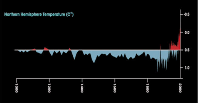
Dr Thompson's Thermometer was taken from Tropical Glacier and Ice Core Evidence of Climate Change on Annual to Millennial Time Scales (Thompson 2003). Specifically, from Figure 7d (rotated to match Al Gore's graph courtesy of Climate Audit):


While the graph was published in Thompson's paper, the actual data is a combination of Mann's hockey stick (Mann 1998) and CRU's surface measurements (Jones 1999). So Al Gore did err in attributing this graph to Thompson. What is the significance? Gore was trying to make the following point:

"As Dr Thompson’s thermometer shows, the vaunted Medieval Warm Period (the third little red blip from the left below) was tiny in comparison to the enormous increases in temperature in the last half-century - the red peaks at the far right of the graph."

Since Mann's study in 1999, there have been a number of proxy studies reconstructing past temperature, using a variety of proxy methods such as tree rings, bristle cones, stalagmites, coral, etc. The results are published in Surface Temperature Reconstructions for the Last 2,000 Years (freely available online). In summating the various studies, the NOAA came to the following conclusion (there's a lot more so it's definitely worth a read):

The similarity of characteristics among the different paleoclimatic reconstructions provides confidence in the following important conclusions:
  • Dramatic warming has occurred since the 19th century.
  • The recent record warm temperatures in the last 15 years are indeed the warmest temperatures the Earth has seen in at least the last 1000 years, and possibly in the last 2000 years.

So while Al Gore was in error attributing the Mann/Jones graph to Dr Thompson, the main conclusion that temperatures during the Medieval Warm Period were less than modern times is correct. This is an important point and seems to be overlooked in the eagerness to debunk Gore.

0 0

Printable Version  |  Link to this page

Comments

Comments 1 to 14:

  1. Other reconstructions tell a different story. See http://www.ncasi.org/publications/Detail.aspx?id=3025. By the way, is the NOAA the last word on climate of the last millenium? Why do you pick them as an authority over the NAS, for instance?
    0 0
  2. "Our conclusion is that this recent period of warming is likely the warmest in the last millennium." NAS supports '98 global warming evidence
    0 0
  3. You forgot to note that Al has his Y axis upside down and that his zero line did not go through zero. Some graph, so great is was the thematic for the IPCC?
    0 0
    Response: At the risk of repeating myself, I'll reiterate that while Al Gore's graph has some flaws, his main point that modern times are the warmest over the last millenia are backed up by multiple studies, the NAS and NOAA.
  4. "likely"? Are you going to hang our prosperity on the term "likely"? If "likely" is the best you've got then certainly more study is needed before implementing any "solutions".
    0 0
    Response: The "hockey stick" is hardly the sum of the evidence for anthropogenic global warming (in fact, a fairly minor piece of the puzzle). There are multiple lines of evidence to show humans are causing global warming including many independent climate model studies. Or if you turn your nose up at models, peruse the empirical evidence.
  5. It is "Likely" (~66%) warmer today than it was in the "MWP." That was the conclusion of the NAS, since "someone" asked. It was also the conclusion of the TAR, by way of the Hockey Stick, which is how this whole thing started. Now, setting aside the fact that MWP vs modern temperatures comparison isn't the basis for AGW theory, let's assume that AGW is only 66% probable, and not the >90% that the alarmist Saudi Arabia and Condoleezza Rice concluded in AR4. In constrast, what is the probability that your house is going to burn down? Just think of what you could do with all that money wasted on insurance. Mmm. Money. Or let's say a bunch of drinking buddies bet you to stick a gun in your face. Only one bullet in the chamber. Spin the chamber. Pull the trigger. Win a $1000 bet. Only a 17% chance of shooting yourself in the face. Just who wouldn't take that bet?
    0 0
  6. I followed your link and noted that the article mentions 14 reconstructions. I did a quick search using Google to see what relationship there might be between the authors. In a few minutes--I am no expert in doing such searches and I am not particularly familiar with who these authors are--I found that 10 of the studies were authored or co-authored by Jones, Mann or Briffa. And according to the linked article, together with the search I just did, these researchers have all co-authored papers together. I suggest other people try the same by putting these names in Google and using key words such as 'collaborators', 'global warming', etc. I have no idea if the remaining authors are collaborators or have close relationships to this group. I am sorry but how can you call this research independently replicated or verified by independent scientists? Or at least, there is some cause for concern here...
    0 0
    Response: Putting aside the fact that the attacks on Mann are overblown out of proportion, what problem do you have with Briffa, Jones or the other proxy studies that come to the same conclusion?
  7. I am curious to know why you say the attacks on Mann are overblown? Are you not concerned that he has not released substantial portions of his data so that elementary checking by other researchers could be done? Isn't replication fundamental to science? And if his work is solid, what has he got to fear? Wouldn't it be better to shut the critics up? Also, if some of the world's most qualified and respected statisticians conclude that his statistical analysis is in error, why do you regard this as a problem that is 'overblown'? I don't have any problem with proxy studies that replicate hockey sticks, so long as the studies do not disseminate from the same small group of researchers over and over again. I am not suggesting there is anything sinister here. The gold standard in scientific research is the double-blind test because everyone understands that scientists are human and subject to bias. If there is solid independent research to back up hockey sticks, why not use it? Why quote 'apparently discredited' research? Whether you feel it is discredited or not is a separate issue. My point is that quoting the same small group of controversial researchers while at the same time misleadingly asserting that the evidence thus presented is independent, is at best disingenuous and at worst dishonest. To put it more bluntly: if the science is solid, you don't need them, so don't use them. Get your hockey stick data from a true independent source and then you have a solid argument to shut the deniers up.
    0 0
  8. Mann itself was a compilation of some of the same proxy studies you are giving as independant confirmation. It so happens he made some rather significant method errors which created the exaggerated "Hockey Stick" graph. It appears that McIntyre's actual contention is that it is not possible to check Thompson's graph as the ice core data sets it was supposedly derived from have not been archived. This by definition makes them not science because they can not be independantly reproduced or checked. Mann's famous hockey stick from the IPCC 3rd report has vaninshed from the 4th report without comment but for darn good reason. It might be a good idea to admit it was incorrect and move on. While CO2 increase may be a contributor to 20th century warming, the MWP, LIA and the Holocene Maximum are all strongly supported in the paleo record unless you cherry pick like crazy. All of these events had temperature changes as large or larger than the 1975-1998 one we're all worried about, and the rate of change coming in or out of them appears to have been at least as great.
    0 0
  9. Wondering Aloud: I generally don't consider the paleoclimate stuff as important as the current physics so I don't focus on the reconstructions. However you are very clearly wrong on a couple of your points. Mann's hockeystick has not vanished from AR4. Mann's 1998 paper is mentioned at least 9 times in the Paleoclimate chapter and there is at least 1/2 page devoted to the criticisms of it. The actual diagram is also used but is combined with other reconstructions. I would also disagree with your comment about the MWP and LIA unless you are talking about regional events. The MWP seems to be most pronounced in the Western European areas. What climate reconstructions are you using to draw your conclusions? Regards, John
    0 0
  10. I can see why you think the MWP was regional some proxies don't show it as being much but others show it as larger than the current warming. It at least affected some mighty big regions. Like Europe, Greenland, North America and Asia. I don't think the LIA was regional unless our entire climate record and the explanation of the ice ages is wrong. I suppose that is a possibility. You might note that the current warming is also not universal on the regional scale.
    0 0
  11. At the risk of repeating myself, I'll reiterate that while Al Gore's graph has some flaws, his main point that modern times are the warmest over the last millenia are backed up by multiple studies, the NAS and NOAA.
    Had some flaws? Give me a break, it was bloody well completely wrong. He represented Mann's curve as if it were Thomspsons! So you are invoking the old "fake but accurate" defense? There is nothing scientific in that argument.
    0 0
    Response: "Fake but accurate" is not the argument. The argument is that multiple studies, the NAS and NOAA all confirm that modern times are the warmest over the last millenia. Obsessing over Al Gore's graph is missing that point.
  12. John Do realize that you need a mirror to read the lower graph?
    0 0
    Response: :-) That was Steve McIntyre's quick and dirty technique to compare the graph from Gore's movie to Thompson's paper. Thompson unfortunately displays the data in a vertical fashion which makes direct comparison awkward. McIntyre couldn't be bothered fixing up the axes labels and I'm even lazier, just hotlinking to McIntyre's graph. I could subtitle this post "An Inconvenient Axes Orientation" although not quite as catchy as "Inconvenient Truth". Here's the original graph from Thompson 2003:

  13. John, exactly what's skeptical about this? "So while Al Gore was in error attributing the Mann/Jones graph to Dr Thompson, the main conclusion that temperatures during the Medieval Warm Period were less than modern times is correct. This is an important point and seems to be overlooked in the eagerness to debunk Gore. " You're taking this hook line and sinker with absolutely no skeptical inquiry at all. A careful review of the evidence convinces me that the opposite is as at least as likely to be true, namely that it could have been as warm or warmer during the MWP as it is now. The IPCC summary of computer simulations you link above only go back to 1850 and blurs out problems with individual models by replacing the spaghetti curve with a grayed out region. (Errors in the simulations are highly correlated from year to year, the figure makes it seem they are not, which is false and misleading.) Furthermore, there are no reconstructions of temperatures that *don't include tree ring chronologies* that conclude that the MWP was cooler than it is now. And there is every reason to be suspicious of tree rings as proxies for temperature, given the multivariate relationship between temperature, precipitation, and CO2 fertilization on tree ring growth. Even if you ignored CO2 fertilization and precipitation as factors, there is an optimal temperature range for any plant: Presumably in their natural climate (the temperature zones for which they are optimized), you will find them near their optimal rate, otherwise you'd find the plants in a warmer climate than they are actually found. Ecology 101. Lower or *raise* the temperature, and you will see a decline in growth rate. One would certainly not expect anything approaching a linear relationship between the two. (Isotopic measurements of δ18O do not suffer from any of these problems, because they are measuring a ratio rather than an absolute quantity.) I happen to agree that CO2 is playing a role in our current warming trend, but don't agree with Al Gore that it is "appropriate to have an over-representation of factual presentations on how dangerous it is." That's just coded words for lying. And I am not nearly as infatuated with Mann's work as you appear to be. Even the plots the NAS make the answer to whether the MWP appear much less certain that you are portraying it to be: See Figure 11-1 on page 112: Most of the multi-proxy reconstructions show the modern temperature to be about 0.1-0.2 C above that of the Medieval Optimum, which is probably a smaller difference than the absolute uncertainly in the reconstructed temperature for that period. BTW, I don't think it's appropriate to hot link to other people's blogs without getting permission first. I would hope you have done so, or would make a local copy of Steve's figure with a hyperlink to his original image.
    0 0
  14. There appears to be a broken link in the body of this article. I can't see the graph. Douglas
    0 0

You need to be logged in to post a comment. Login via the left margin or if you're new, register here.


The Consensus Project Website

THE ESCALATOR

(free to republish)


© Copyright 2024 John Cook
Home | Translations | About Us | Privacy | Contact Us