Climate Science Glossary

Term Lookup

Enter a term in the search box to find its definition.

Settings

Use the controls in the far right panel to increase or decrease the number of terms automatically displayed (or to completely turn that feature off).

Term Lookup

Settings


All IPCC definitions taken from Climate Change 2007: The Physical Science Basis. Working Group I Contribution to the Fourth Assessment Report of the Intergovernmental Panel on Climate Change, Annex I, Glossary, pp. 941-954. Cambridge University Press.

Home Arguments Software Resources Comments The Consensus Project Translations About Support

Bluesky Facebook LinkedIn Mastodon MeWe

Twitter YouTube RSS Posts RSS Comments Email Subscribe


Climate's changed before
It's the sun
It's not bad
There is no consensus
It's cooling
Models are unreliable
Temp record is unreliable
Animals and plants can adapt
It hasn't warmed since 1998
Antarctica is gaining ice
View All Arguments...


Username
Password
New? Register here
Forgot your password?

Latest Posts

Archives

Animated powerpoint of the Indicators of Warming

Posted on 28 January 2011 by John Cook

A few days, I received an email from Chip Fletcher, a scientist working in the School of Ocean and Earth Science and Technology at the University of Hawaii. Chip was interested in the Indicators of a Warming World graphic. Specifically, he wondered if there was "any chance of getting it as a PPT slide where each label makes entrance with a click?" You don't ask much, do you, Chip? :-)

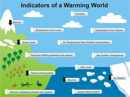
Sadly, there was no such powerpoint. But when Chip offered to create the animated powerpoint if I could supply all the individual elements, I couldn't resist the idea. So a background JPEG and 15 PNG files later, I'd shipped off all the files to Chip and before long, he'd sent back a beautifully animated Powerpoint presentation. Here's a still screenshot of the final screen, including one extra Indicator suggested by Chip (Permafrost retreating poleward):

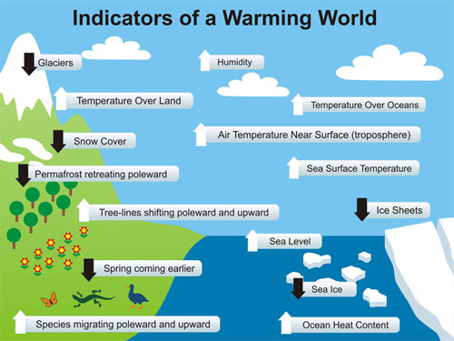
It also inspired me to make another change to our Climate Graphics resource - I've added Powerpoint Presentations to the list of options on the Indicators of Warming graphic. As with all the Climate Graphics resource, it's under a Creative Commons licence so all are welcome to use this powerpoint in your own presentations. Many thanks to Chip for both his idea and helping it take shape.

0 0

Printable Version  |  Link to this page

Comments

Comments 1 to 22:

  1. Very nice ... and a couple of suggestions: 1. one more indicator: rainfall/precipitation up; 2. and I'd be happy to put together an animated GIF if you want - no PP required, just a web browser.
    0 0
  2. chemware, rainfall suggestion doesn't work unless one counts in ENSO. I'm expecting droughts to kick in again once the el Niño phase kicks in, add to that the additional kick from the sun 11 yrar cycle some droughts might be pretty quite severely bad or hard, or something like that since the ambiguity of language is somewhat exhilarating in the world of political absolutes.
    0 0
  3. Cool, just in time for my climate presentation today! I had already featured the 'still' figure, but I'll change it now to the animated version.
    0 0
  4. hmmm, tried it in Open Office and none of the labels appeared when it was run as a slide show.
    0 0
  5. The Ville my Open Office 2.1 on linux does it. Anyways, a cross-platform format would be preferrable.
    0 0
  6. Open Office 3.1.1 running on WinXP does it too.
    0 0
  7. I have Open Office 3.2.1 on a Mac.
    0 0
  8. Nice work John. Regarding the earlier Spring, I would hazard a guess that there is also a later Fall. In which case, it might be more accurate to say 'Longer warm seasons', 'Longer summers', or I suppose, 'Shorter winters' . It is a minor difference, but it would more accurately describe the situation. For instance, there is this, Late leaf fall.
    0 0
  9. Oops, not a particularly good example. That article does not really support the point I was testing.
    0 0
  10. @The Ville, NeoOffice is a build of OpenOffice specifically for Macs. I am running NeoOffice 3.1.2 and the slide show works.
    0 0
  11. Another minor suggestion: snow cover --> summer snow cover.
    0 0
  12. You know something that would make this a much more powerful presentation? If each of those indicators had a small notation referencing a peer reviewed paper or two. That would change this from an interesting graphic into a powerful graphic.
    0 0
  13. The Ville... I got the file to work with Keynote 5.0.
    0 0
  14. Rob @13, "If each of those indicators had a small notation referencing a peer reviewed paper or two." Good idea...I second that. This graphic could be a great teaching tool.
    0 0
  15. The Ville When the presentation opens in Impress did you try the left mouse button to advance frames?
    0 0
  16. Oops, didn't think of pressing buttons! Thanks Ron. Joel. Neo Office is pretty much redundant now, it runs using X11. Open Office now have a native version for the Mac. Although maybe if you have a PowerPC Mac, you have to use Neo Office??
    0 0
  17. jyh @ 2: No, precipitation is rising globally, regardless of ENSO. See the interview with Trenbarth at Climate Progress: Exclusive interview: NCAR’s Trenberth on the link between global warming and extreme deluges This is part of an intensification of the hydrological cycle - so locally both droughts and floods will become more intense. Albatross @ 13: Ever done imagemaps ? Lots of fun :)
    0 0
  18. @John Cook I hate to spoil the party, but... 1. The location of "Permafrost retreating poleward" leaves a lot to be desired. 2. Where is "Surface Water Heat Content"? 3. Where is "Land Heat Content"? 4. Where are "Climate Refugees migrating"?
    0 0
  19. @John Cook Here's another way to graphically portray "Indicators of a Warming World" in a PowerPoint presentation. First slide: Narrative definition of the basic components of the "climate system," i.e. atmosphere, cryosphere, lithosphere, etc. [Slide header: "What do you scientists mean when they say, "Climate System"?] Subsequent slides: Graphic representations (a la your slide posted above) of the GW Indicators for each component of the slide system. One of my ongoing concerns about how climate change is discussed on public forums, including SkS, is that many people simply do not understand that the "climate system" is more than just the atmosphere and that annual mean global surface temperature is just one of a myriad of ways to measure and track climate change. That is one reason why I have suggested the above slide show. Another is that your graphic simply contains way too much information on a single slide. It works great in the print media where people can stare at it for as long as they need to.
    0 0
  20. @ John Cook: Addition to the list I started in #18: 5. Where are "Wildfires"?
    0 0
  21. General question: How do the "indicators" shown on the graphic and suggested in the comment thread relate to the "multiple lines of evidence" documented by the IPCC?
    0 0
  22. I did a youtube powerpoint video partly based on the indicators and "fingerprints" -- with JS Bach http://gryposaurus.wordpress.com/2011/01/31/bach-and-owning-climate-disruption/
    0 0

You need to be logged in to post a comment. Login via the left margin or if you're new, register here.


The Consensus Project Website

THE ESCALATOR

(free to republish)


© Copyright 2024 John Cook
Home | Translations | About Us | Privacy | Contact Us