


 Arguments


Did global warming stop in 1998?
Posted on 27 April 2008 by John Cook
The argument that global warming stopped in 1998 is making a comeback, riding on the coat-tails of global cooling since January 2007. Last year, a paper in the Bulletin of the Australian Meteorological and Oceanographic Society examined this argument. Now the author Robert Fawcett has co-published an updated version of the paper with fellow scientist David Jones at the Australian Bureau of Meteorology. It takes a similar approach to my original treatment of the subject, although in a more rigorous, peer-reviewed fashion.
Using moving averages to discern the long term trend
As we've discussed before, temperature data shows year-to-year variations independent of long term warming or cooling trends. Volcanoes cause temporary cooling over several years while the El Niño-Southern Oscillation cycle lasts around 4 to 5 years.
The easiest way to remove short term variations, revealing any underlying trend, is to plot a moving average. Figure 1 displays the 11 year moving average - an average calculated over the year itself and five years either side. They've used three different data-sets - NCDC, NASA GISS and the British HadCRUT3. In all three data-sets, the moving average shows no sign that the warming trend has reversed.
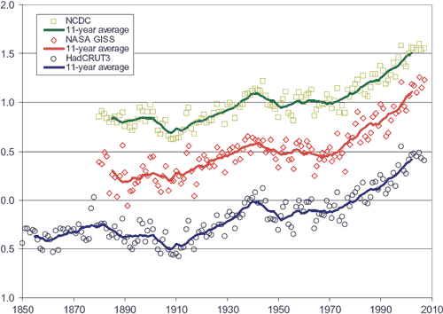
Figure 1: Globally-averaged annual mean temperature anomalies in degrees Celsius, together with 11-year unweighted moving averages (solid lines). Blue circles from the Hadley Centre (British). Red diamonds from NASA GISS. Green squares from NOAA NCDC. NASA GISS and NOAA NCDC are offset in vertical direction by increments of 0.5°C for visual clarity.
The linear trend from 1998 to 2007
Next, Fawcett and Jones look for a cooling trend in the 10 years since 1998. They find the linear trend over 1998 to 2007 is a warming trend in all three data-sets. Note that HadCRUT3 displays less warming than NASA GISS and NCDC. This is most likely due to the fact that HadCRUT data doesn't cover parts of the Arctic where there has been strong warming in recent years.
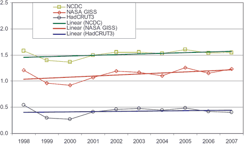
Figure 2: Linear trends (solid lines) in the three global annual mean temperature anomaly time series over the decade 1998-2007.
Removing ENSO signal from the temperature record
The reason that 1998 was such an anomalously warm year was due to a strong El Niño that year. Fawcett and Jones remove the ENSO signal by calculating a linear regression of global temperatures against the Southern Oscillation Index. A detailed description of the process is found in Fawcett 2007. The result is shown in Figure 3.
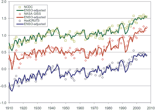
Figure 3: Three time series of globally-averaged annual mean temperature anomalies (circles) in degrees Celsius, together with ENSO-adjusted versions (lines), for the period 1910-2007.
All 3 data sets demonstrate that the anomalously hot 1998 was due to the strong El Niño of 1997/98. When ENSO-adjusted, 1998 looks much less remarkable than it does in the original data. In all 3 ENSO-adjusted data-sets, 2006 is the hottest year on record and the trend from 1998 to 2007 is that of warming.


Comments