Climate Science Glossary

Term Lookup

Enter a term in the search box to find its definition.

Settings

Use the controls in the far right panel to increase or decrease the number of terms automatically displayed (or to completely turn that feature off).

Term Lookup

Settings


All IPCC definitions taken from Climate Change 2007: The Physical Science Basis. Working Group I Contribution to the Fourth Assessment Report of the Intergovernmental Panel on Climate Change, Annex I, Glossary, pp. 941-954. Cambridge University Press.

Home Arguments Software Resources Comments The Consensus Project Translations About Support

Twitter Facebook YouTube Mastodon MeWe

RSS Posts RSS Comments Email Subscribe


Climate's changed before
It's the sun
It's not bad
There is no consensus
It's cooling
Models are unreliable
Temp record is unreliable
Animals and plants can adapt
It hasn't warmed since 1998
Antarctica is gaining ice
View All Arguments...


Username
Password
New? Register here
Forgot your password?

Latest Posts

Archives

East Antarctica is now losing ice

Posted on 24 November 2009 by John Cook

Over time, I gradually update what the science says on each skeptic argument to include new papers (or old papers I hadn't read yet). The idea is that a clearer picture will emerge as new research and data comes out. For example, skeptics used ice gain in the East Antarctic interior to prove that "Antarctica is gaining ice". The original response was that while East Antarctica was gaining ice in the interior, it was losing ice around the edges. These two effects roughly cancelled each other out, leaving East Antartica in mass balance. When you include strong ice loss from West Antarctica, the continent was overall losing ice. Last month, this was updated with the latest satellite data finding that Antarctic ice loss was now accelerating. Today, I've updated the Antarctica page yet again as the latest data shows that East Antarctica is no longer in mass balance, but losing ice mass.

The results are published in Accelerated Antarctic ice loss from satellite gravity measurements (Chen 2009) which compares two independent measurements of Antarctic ice loss. One method is the GRACE satellites which measure changes in gravity around the Antarctic ice sheet. The latest GRACE data analyses measurements from April 2002 to January 2009. Another method to determine mass balance is to combine snowfall estimates with InSAR satellites. These use radar waves to measure the speed of ice sheets as they calve into the ocean.

Figure 1 shows the change in ice mass from 2002 to 2009 over the Antarctic continent, as measured by GRACE. Dark blue corresponds to strong mass loss, light blue to moderate ice loss, green shows no change and yellow indicates mass gain. The effects of post glacial rebound, the rising of land when ice mass is removed, are filtered from the GRACE results. West Antarctica features two distinct regions with strong ice mass loss in the Amundsen Sea Embayment (Point A) and in Graham Land (point B). The mass loss from the Amundsen Sea Embayment is the dominant feature for the entire Antarctic continent. East Antartica is losing ice along the coasts, especially in Wilkes Land (point C). However, from 2002 to 2009, Enderby Land (point D) has actually been accumulating ice mass. More on this shortly.


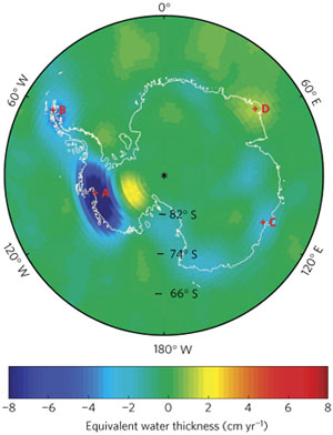
Figure 1: Change in mass over Antarctica after the Post Glacial Rebound effect is removed. Time series from four grid points (A, B, C and D) are selected for analysis (Chen 2009).

Overall, the GRACE measurements find that Antarctica is losing 190 gigatonnes of ice per year (one gigatonne is equivalent to a cube of water 1 kilometre wide, tall, and deep). This is consistent with InSAR data which finds Antarctic mass loss of 196 gigatonnes per year. As InSAR results aren't affected by post glacial rebound, they provides a useful independent confirmation of the GRACE data. These two results indicate that Antarctic ice loss has been accelerating in recent years.

How has mass loss changed in East Antarctica? Two coastal regions are examined in closer detail. Figure 2 shows time series of mass loss at Wilkes Land (Point C in Figure 1) and Enderby Land (Point D). From 2002 to 2005, Wilkes Land shows very little trend. However, from 2006 to 2009, Wilkes Land shows a strong trend of ice loss. In contrast, Enderby Land (Point D) is actually gaining ice mass from 2002 to 2005. This mass accumulation flattens after 2006, showing a slight negative trend.

 
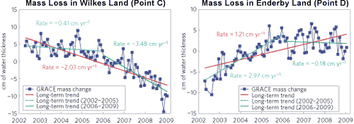
Figure 2: GRACE ice mass (blue curves with square markers) at locations C and D from Figure 1. Post Glacial Rebound effects are removed from all time series. The red lines are slopes estimated from the entire time series, and cyan and green lines are slopes determined for early (2002–2005) and late (2006–2009) periods.

Since 2006, the East Antarctic Ice Sheet has been losing ice mass at a rate of 57 gigatonnes per year. This is a surprising result (not a pleasant one). Until now, East Antarctica has been considered stable because the region is so cold. This latest result indicates that the East Antarctic ice sheet is more dynamic than previously thought. This is significant because East Antarctica contains much more ice than West Antarctica. East Antarctica contains enough ice to raise global sea levels by 50 to 60 metres while West Antarctica would contribute around 6 to 7 metres.

There's still uncertainty over the physical processes that are driving the accelerating ice loss. This is why the IPCC predictions in 2007 didn't include any possible "rapid dynamical changes in ice flow". The IPCC predicted sea level rise of 18 to 59 cm by 2100. This doesn't include the accelerating ice loss now being observed in Greenland and Antarctica. While there is uncertainty in climate predictions, when positive feedbacks and dynamic systems are involved, the uncertainty is skewed towards higher sensitivity. Thus we see the inherent flaw in the notion that we shouldn't act on climate change while there is still uncertainty.

0 0

Printable Version  |  Link to this page

Comments

Comments 1 to 18:

  1. Just to add a bit of context... Antarctica is estimated to contain some 30 x 10E6 km3 of ice; about 10,000 years worth at current rate of melt. Antartic climate is subject to high inter-annual variabilty as indicated in Ferron et al 2004 which shows steep temp rises over very short time scales in the past. As with the Greenland ice sheet, melt/calving is mostly at the edges since inland air temps are far too low to allow melt. Equally, inland precipitation is generally low for the same reason. It seems logical to me that the increase in ice loss is due to changes in sea temperatures and circulation, with possible correlation to PDO and similar southern ocean cycles. Also intersting to note that the GRACE pic shows noticeable anomalies around 0 degrees.....??
    0 0
  2. Sorry if this is answered elsewhere, is there expected behavior for Antarctic ice? For example, are there estimates for ice loss as a function of time? Is the loss due to CO2 concentration increases expected to be greater than other causes of ice variation? The reason I ask is that I can just see a time in a couple of years when the ice is growing again and the whole controversy starts again. Head it off at the pass.
    0 0
  3. The measurement of ice loss is dependant on two halves of a sum. Firstly apparent mass loss is measured (e.g. by GRACE). This mumber is then adjusted to take into account movement (rise/fall) in the rock of the antarctic, my understanding is this is called Post Glacial Rebound or GIA. Two computer models have been popular for measuring this second part of the sum, they are called IJ05 or ICE-5G. In recent years GPS sites have been setup in the antarctic. Two studies have looked at the information coming from this GPS data Bevis, M., et al. (2009), Geodetic measurements of vertical crustal velocity in West Antarctica and the implications for ice mass balance, Geochem. Geophys. Geosyst and http://rses.anu.edu.au/geodynamics/tregoning/36.pdf Both these studies suggest that the measurements of GIA are wrong. In summary the assumption has always been that antarctic was rising due to loss of ice from the last ice age when in fact the actual GPS measurements suggest stasis. The first of the papers suggest the ice mass loss for part of West antarctic is over estimated by 33Gt/yr although states that really the sums have to be done again with this new information. There is no estimate of the error in the East Acrtic data. Would you be interested to see the GRACE data analysed with glacial rebound calculated on the basis of GPS data?
    0 0
    Response: Chen 2009 takes GIA into account when calculating the mass loss from GRACE data. This is then independently confirmed by the InSAR satellite data which is not affected by GIA.
  4. #3 response With respect to InSAR data (taken from Chen 2009 reference 4) "Ice thickness, H, is deduced from surface elevation above mean sea level with reference to the GGM02 geoid". GGM02 is derived from data generated from GRACE so is it legitimate to say the Chen GRACE data is "independently confirmed" by InSAR data? Tapley, B. et al. GGM02—An improved Earth gravity field model from GRACE. J. Geodesy (2005) (doi:10.1007/s00190-005-0480-z). And still the GPS data suggests the the GIA assumptions in Chen are wrong. Do you think there is any value in the GPS data?
    0 0
  5. "Thus we see the inherent flaw in the notion that we shouldn't act on climate change while there is still uncertainty." If the changes now being detected in Antartica are a function of the fallout from the entire planet's modern industrial history, it doesnt seem like we have a lot leverage short of some very drastic "action". In the meantime, people have eat. Likewise, penguins can fend for themselves.
    0 0
  6. HumanityRules, i think we all are happy to have more and more accurate data. In the meanwhile, though, we cannot say the data are plainly wrong every time. What is needed is continuosly adjust the estimates when new and more accurate measurements becomes available. The correction for the new results on PGR appears to be significant but do not change the main conclusions. Also, keep in mind that PGR is at work on the long run and the changes in the trends are almost unaffected. The only point i see with the paper is that the data cover a limited time range and we do not have a model that can reproduce this trend with any confidence. So, altough the trend appears to be significant with respect to the interannual variability, we cannot anticipate that it's the beginning of a new long term trend. And for sure i don't want to follow the alternate claims "it's growing" and "it's shrinking" every couple of years ... :)
    0 0
  7. More about not acting when there is uncertainty. That's a completely flawed notion for risk management. To make rational choices for each alternative, you have to integrate the cost-benefit function over the stipulated pdf for the outcome, to get the expected cost of that alternative. Then, there may be enough with a relatively small probability of a very expensive outcome of an alternative to have reason to discard it as policy. So we may find some "alternatives" are not really options, after all. If you don't base decisions on such principles, you're not rational. Humanity has a long and sad record of acting non-rationally. Just to use the present situation as an example: If the present levels of radiative forcing are already enough to cause global deglaciation over time, we may already have blown it. The accelerating ice loss of Greenland and the Antarctica indicates that we now can't set the probability of that to zero. We don't know the costs, they're very much dependent on how fast it happens, but in any case, they will be huge over time. Could we have known this in advance? No. Does that lack of knowledge entitle us to set the probability of it happening at present forcing levels to zero? Absolutely no, as is evidenced by this post.
    0 0
  8. Riccardo It's not just a case of more accurate data. It's that models were developed based on the same best guess assumptions about GIA, a perfectly reasonable thing to do at the time. These models have gone on to inform almost every measurement of antarctic ice loss. Direct GPS measurements have suggested that these assumptions are wrong. Which calls into doubt the accuracy of almost all previous measurements. That is important. I'm still unsure what weight to put on the conclusions from the GPS data.
    0 0
  9. HumanityRules, The old model is wrong? Assume it is, include the new model and recalculate mass balance. What's the effect? Around 30%, fair enough. It does not change the picture, science goes a step further and we're all happy :) What i want to say is that when a single piece of a complex picture turns out to be wrong, unless it is a foundamental pillar we can not conclude that the whole picture is wrong, we need to look at the consequences before coming to conclusions. We've already seen this kind of adjustments many time before, it continuosly happen indeed.
    0 0
  10. Not sure what you mean about 30%. My understanding for East Antarctic is that there is a positive anomaly in the GRACE data. From Chen and many others this is put down to GIA i.e. the land is rising and depending on how much you believe is occuring this leads to stasis or falling ice mass. The Tregoning paper suggests using GPS data that the positive anomaly can't be put down to GIA therefore it must be due to ice/snow accumulation. It should be noted that the work was done on coastal regions. So one method says stasis followed by ice loss while another says ice gain followed by stasis. I think this does change the picture. I also think it does change a fundamental pillar of the antarctic picture.
    0 0
  11. Not sure if anybody is interested in raw data but Australia's BOM has a website were you can get historical raw climate data and plot graphs. It includes three stations in Antarctica. The website is here http://www.bom.gov.au/climate/data/weather-data.shtml I've plotted the annual mean max temps for all three stations Mawson Casey Davis No obvious trends there.
    0 0
  12. Humanity, "No obvious trends there". I disagree. Now I would have believed your claim had you plotted a linear regression and determined whether not one can reject the null hypothesis that the slope is zero? You have also chosen three locations in a continent the size of the USA. The following shows the big picture: http://earthobservatory.nasa.gov/IOTD/view.php?id=8239 Convinced now? And this is not even from the much debated Steig et al. paper.
    0 0
  13. HumanityRules, I know you're not in bad faith and i hope you'll not find me too pedantic for what i'm going to say. You should not take graphs for what they just appear; look at the tempeature scale, it's huge for the kind of difference you're looking for. I digitized the three graphs to check for trend. Casey and Davis are both increasing (0.014 and 0.019 °C/yr respectively) but the former is not statistically significant due to the few data available. Mawson is almost flat, 0.002 °C/yr not statistically significant. Doing science is a hard task and no one should draw conclusions without thinking twice and checking thrice. Or more.
    0 0
  14. #13 Pedantic is fine. I'm about to get pedantic on you! Not sure what you meant by "digitised the 3 graphs". The BOM website provides the actual numbers for each data point. Go http://www.bom.gov.au/climate/data/weather-data.shtml then fill in the appropriate fields you can get the station numbers from my linked graphs. I put those numbers in excel and added a trend line and got Mawson 0.0077/yr Davis 0.007/yr Casey 0.015/yr I agree with your last sentance. The Mawson Davis and casey data is all in the PDF below. #12 I showed 3 points because that is all the raw data the Australian website carries, I didn't choose them thats all there is. There are plenty of records for Oz as well, I thought given the site owners nationality there might be some interest for this site. I love the fact that you ask me for linear regressions and null hypothesis and then show me for comparison a map with different shades of pink!! Check the references for your article they make interesting reading. Here's one PDF http://www.scar.org/researchgroups/physicalscience/reader_turneretal.pdf . This shows a mixed picture over the continent. It appears something significant is occuring on the penninsula. But then what does that mean for the rest of the continent. They report 11 data sets rising and 7 falling. There are 3 data sets on the penninsula which means that for the rest of the continent there are 8 rising and 7 falling.
    0 0
  15. HumanityRules, i thought that "digitize a graph" was self explaining and i'm sure you understand it. Less clear to me, instead, is which data you used. I didn't notice the link to the raw data in the same page; i downloaded them and the result is the same. Which data did you use? Anyway, even with your results, Casey is warming roughly at the same rate as the global mean, the other two are warming too, even though less. No obvious trends there?
    0 0
  16. Sorry I truely don't know how to digitise graphs. Raw data Go to http://www.bom.gov.au/climate/data/weather-data.shtml You should be on historical data (right side menu) You can choose temperature from the drop down menu. Then Mean max temp Finally put the station numbers (see below) in the box then get data. This gives monthly and annual data. These tables can be imported into excel. 300000 300001 300017 The figures in the Turner paper (#14) suggests for a shorter time period. Mawson -0.11/decade Casey +0.01/decade Davis +0.03/decade Out of more general interest there are about 20-30 data sets in Australia that stretch back to 1800's and many more that go back to 1930s-1950s. They are worth a look if youhave an hour or two to search for them. I thought I recognised interesting trends but they are not relevant in this thread.
    0 0
  17. HumanityRules, i wrote in my previous comment i downloded the data and found the same trend as before. No possible confusion on the stations, there just three in Antarctica. How comes you repeted the same thing and found diferent trends this time? Are you using monthly data or annual averages as in the graphe? Or are you mixing the two as both are in the same table? I'm using the annual averages, as is the case when you look at yearly trends. It's impossible to get different trends using the same data, definitely we used a different set.
    0 0
  18. Seems like this article is very alarming that Antarctica is losing ice at an accelerating rate. And during summer!
    0 0

You need to be logged in to post a comment. Login via the left margin or if you're new, register here.


The Consensus Project Website

THE ESCALATOR

(free to republish)


© Copyright 2024 John Cook
Home | Translations | About Us | Privacy | Contact Us