


 Arguments


The history of emissions and the Great Acceleration
Posted on 7 April 2015 by Andy Skuce
This is a repost from the Critical Angle blog.
One of my pastimes is downloading data and playing around with it on Excel. I’m not kidding myself that doing this means anything in terms of original research, but I do find that I learn quite a lot about the particularities of the data and about the science in general by doing some simple calculations and graphing the numbers. There’s even occasionally a small feeling of discovery, a bit like the kind that you experience when you follow a well-trodden path in the mountains for the first time:
We were not pioneers ourselves, but we journeyed over old trails that were new to us, and with hearts open. Who shall distinguish? J. Monroe Thorington
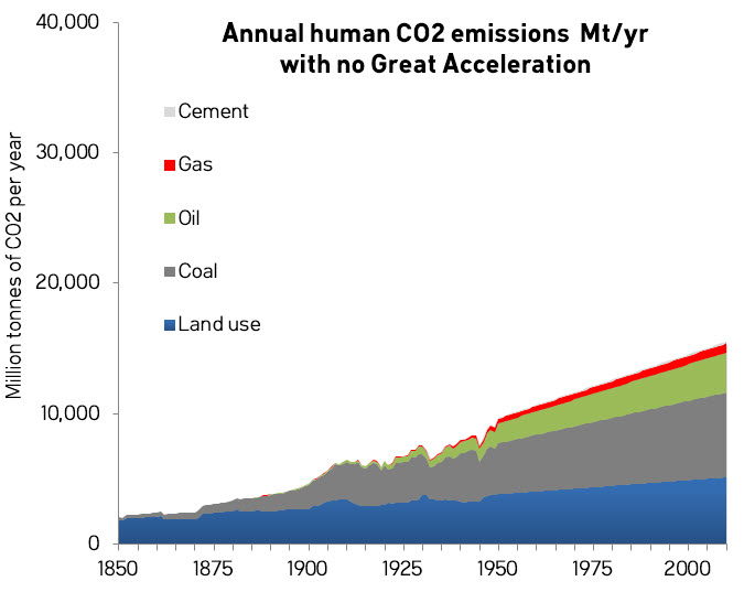
Anyway, I downloaded some historical emissions data from the CDIAC site and played around with it. To repeat, there’s nothing new to science here, but there were a few things that I found that were new to me. First, let’s look at historical emissions of CO2 from man-made sources from 1850 to 2010. Note that for all of these graphs there are no data shown for 2011-2015.
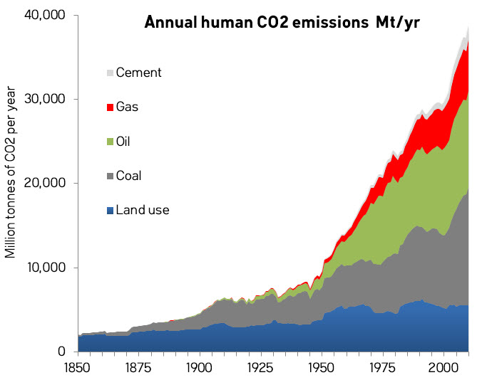
What immediately struck me—something I hadn’t fully appreciated before—was how small oil consumption was before 1950. Both world wars were carried out without huge increases in oil use, despite the massive mobilizations of armies, navies and air forces. You can make out some downward blips in coal consumption for the Great Depression (~1930) and around the end of WW2 (~1945).
It wasn’t until after 1950 that fossil-fuel consumption went nuts. Some people have taken to calling this inflection point The Great Acceleration, there’s more on this later.
What do these emissions from different sources look like as a proportion of all human emissions over this time period?
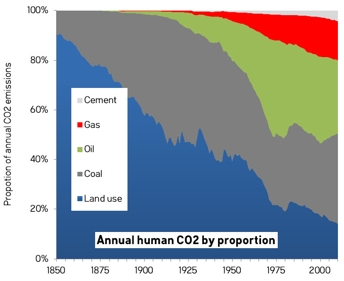
The graph shows the proportions, not the absolute amounts, of emissions in any given year attributable to one of the five main categories. Land use was the largest single source of emissions until 1915. From 1916 to 1967 coal and land use swapped positions as the leading source of CO2. 1967 was the last year that emissions from land use were bigger than those from coal or oil.
From 1968 to 2004, oil was the biggest single source of CO2, except in 1985-1988, when coal and oil emissions were nearly tied. It is only since 2005 that coal has been clearly the biggest single source of emissions, thanks mostly to the rise in consumption in China. The Great Acceleration was fuelled by oil and coal and later—and to a lesser extent—by gas.
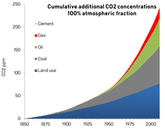
Let’s now look at the cumulative emissions of CO2 over the same period. Naturally enough, these are much smoother curves since they are integrals.
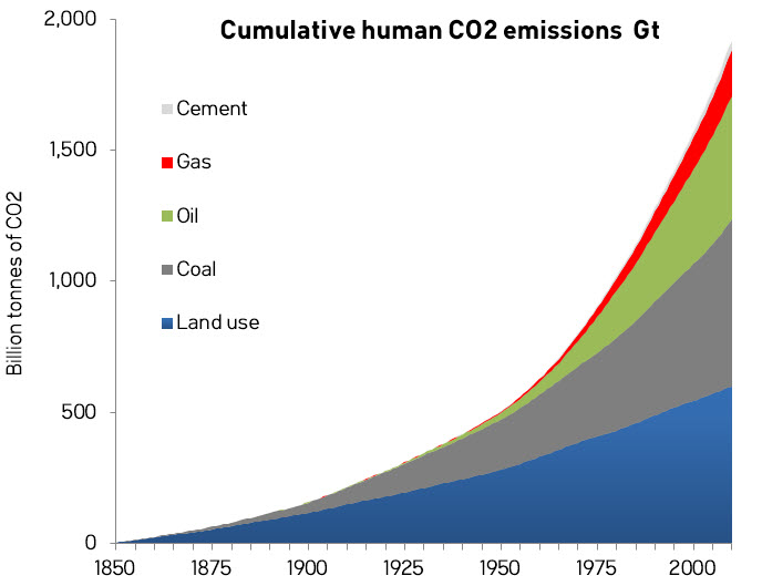
Note that the land-use emissions did not start in 1850, that’s just the date that the CDIAC land-use emissions data go back to.
Proportions of all cumulative emissions over time are shown in the next chart. For this graph, I have added in 105 billion tonnes of CO2 emissions from land use and 5 billion from coal to cover the period 1750-1850 (these are approximate numbers derived from Le Quéré et al. (2014) Table 10 and the CDIAC fossil-fuel emissions data).
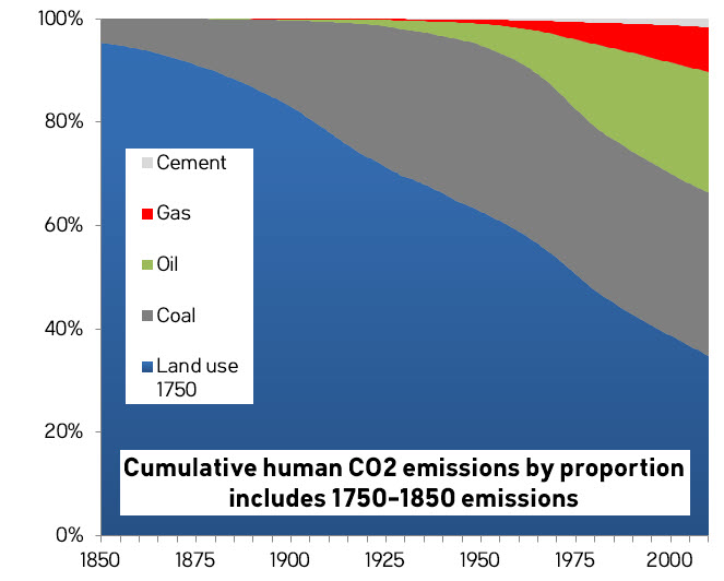
Cumulative land-use emissions exceeded all fossil-fuel and cement sources of emissions combined until 1978. The Mauna Loa Observatory had been measuring CO2 concentrations for twenty years before the majority of the post-industrial increase had started to come from fossil fuels. Up to 2010, cumulative historical CO2 emissions have come from: land use 35%; coal 32%; oil 23%; gas and flaring 9%; and cement 2%.
How much change did these emissions make to the composition of the atmosphere? The following graph shows how much the composition would have changed if all of the CO2 emissions had simply stayed put in the air. (I used an equivalence of 2.13 GtC (or 7.8 GtCO2) for one ppm by volume of CO2 in the atmosphere. See Kharecha and Hansen, 2008.) Note that these do not include pre-1850 emissions.
Before the Industrial Revolution, the total concentration of CO2 in the atmosphere was about 280 ppm about 2200 GtCO2. Assuming, for now, that all emissions stayed in the atmosphere, human emissions from 1850-2010 would have added about 250 ppm (1930 GtCO2). From 1750-1850 the additions were about an additional 15 ppm (110 GtCO2) and the amounts for 2011-2014 added about 20 ppm (165 GtCO2) again.
Therefore, the amount of CO2 that humans have emitted to the atmosphere since the Industrial Revolution (~2200 GtCO2) roughly equals the amount of CO2 that was in the air before 1750. Luckily for us, most of these human CO2 emissions have been taken up by the oceans, and by land plants and soils. Otherwise, we would have already doubled the amount of CO2 in the air.
Le Quéré et al. (2014) estimate the emissions (top) and the partitioning (bottom) as follows.
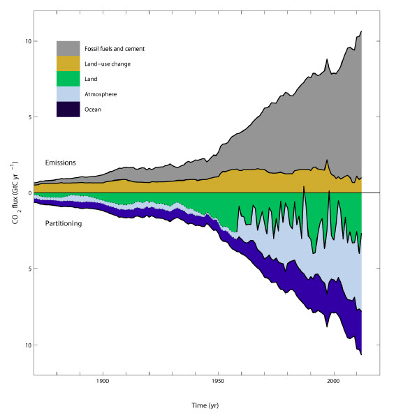
As you can see, the fraction of CO2 that remains in the atmosphere (light blue) varies a lot from year to year and depends mainly on the land fraction (green), which in turn depends in part on weather patterns that influence plant growth. The partitioning is not just a function of this year’s emissions, but a complex function that relates to the different rates of several independent processes active on land and in the ocean that run at different speeds. For cumulative emissions over the period 1870-2012, Le Quéré et al. (2014) in their Table 10 estimate the cumulative partitioning between sinks and we can calculate the atmospheric fraction as 42% (range 37-48%). Let’s assume, for the simple purposes here, a round number of 40% for the cumulative CO2 emitted over 1850-2010 that remains in the atmosphere at any given time. What we get is a graph that looks like this:
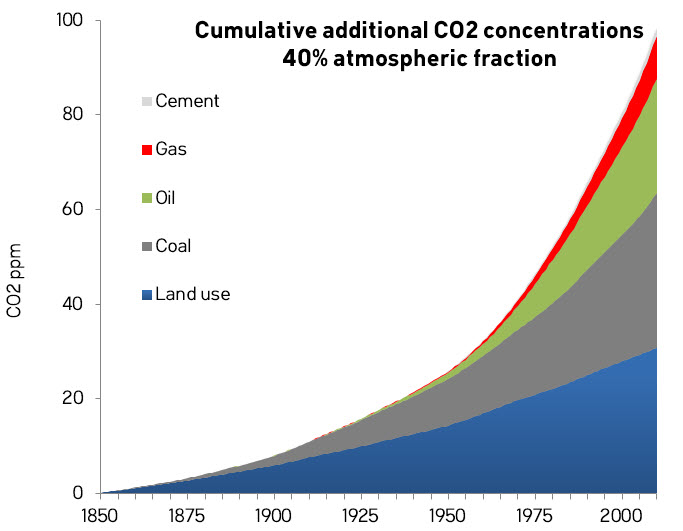
According to this, in 2010, humans should have added about 100 ppm to the atmospheric concentration of CO2 since 1850, once the portions going into the oceans and biosphere have been subtracted.
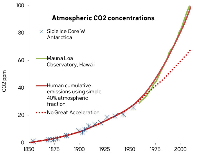
How does this compare to observations of atmospheric CO2?
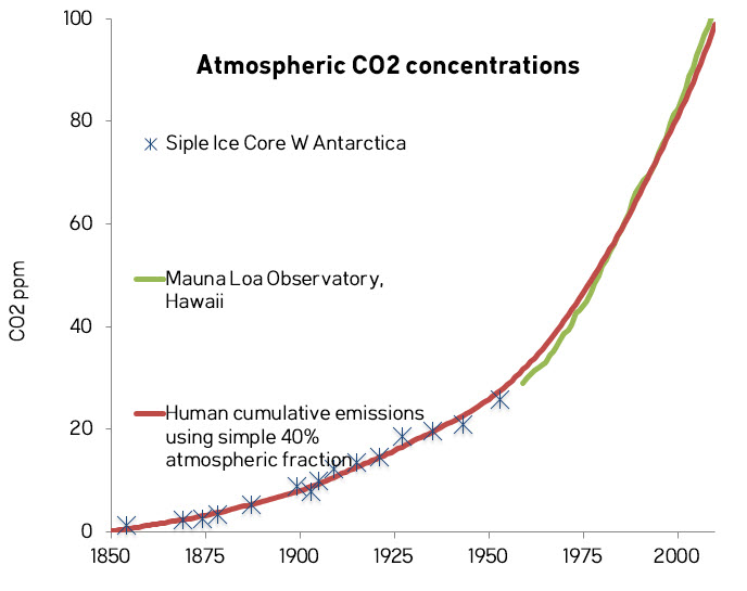
What I have done here is to plot the increase in CO2 relative to 1850 for 40% of the cumulative emissions against the CO2 observations for the West Antarctica Siple ice core and the annual observations from the Mauna Loa Observatory in Hawaii. Considering that I made some simplistic assumptions about the atmospheric fraction, the fit is pretty damned good. The good fit is not just in the magnitude of the values, but also the shape of the curve, where the observations match the inflection in the Great Acceleration.
When contrarians claim that the observed rise in CO2 came instead from some other source like volcanoes, not only are they wrong about the magnitude of the curve (volcano emissions are about 100 times too small), but the shape. If the world’s volcanoes suddenly went into high gear after 1950, we would have noticed.
There’s also the problem that if the extra atmospheric CO2 came from somewhere else, where would all the man-made CO2 have gone to? If it is supposed to have come out of the oceans, for example, as some people have suggested, we would have a big balance-sheet problem and would have to hide all of the man-made emissions somewhere else, with the only remaining place being in the biosphere on land.
The Great Acceleration
It wasn’t just fossil-fuel consumption that took off in 1950, of course. Just about everything did: population, GDP, dams, water use, international tourism, stratospheric ozone, nitrous oxide, methane, marine fish capture, coastal nitrogen, etc. Just about everything erupted like never before. Except volcanoes.
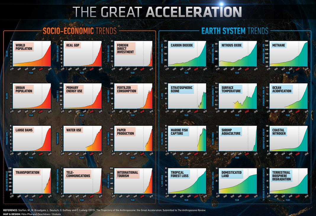
From here. The faint dotted vertical lines mark 1950. Click for big.
Something else exploded around that time.
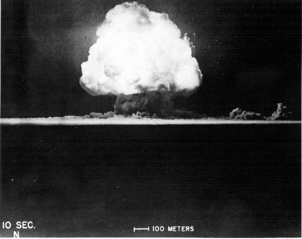
According to some, ten seconds into the Anthropocene. New Mexico, July 16th, 1945. Source
Some of the researchers looking for a suitable start date for the Anthropocene have suggested July 16, 1945, not only because the explosions of atomic bombs have produced an artificial radionuclide signature in the world’s sediments that will be useful for visiting alien stratigraphers of the distant future, but also because it coincides with the Great Acceleration.
The start date of the Anthropocene has not been settled, indeed there’s far from unanimity about whether we even need the term at all. Other contenders include dates early in the Holocene (8000 years ago), the Roman era (2000 years ago), genocides in the Americas (1570-1620) and the Industrial Revolution (~1712). Nature has a good summary.
A Great Acceleration counter-factual
What would the atmosphere look like today if the Great Acceleration hadn’t happened?
If we assume that, after 1950, emissions increased linearly, at the same rate they had done, more or less, over the previous 60 years, then emissions rates would be in a counter-factual 2010 about one-third of what they actually are today. This is what a post-WW2 economist, equipped only with a ruler and pencil, might have predicted.
CO2 concentrations would have continued to climb and in a counter-factual today they would be about 30 ppm less than they are currently, very roughly, 370 instead of 400 ppm. Even if we could go back and undo the rapid growth of the Great Acceleration, we would gain only about 20 years: the atmosphere of the counter-factual 2015 would look something like the atmosphere of 1995. Exponential growth has worsened and accelerated the climate crisis, but we would have eventually had to deal with one anyway, even if growth had followed a linear trajectory.
If we are to keep warming under two degrees, we will have to keep concentrations below 450 ppm. This will entail somehow provoking a Great Deceleration in emissions over the next few decades. That slowdown would have to be, roughly speaking, at least the inverse of the climb in emissions experienced after 1950. To stabilize the climate, we’ll have to get back to 1850s levels of emissions. Since population (certainly) and world GDP (very probably) will increase over the coming years, this will be no mean feat.
Summary
- Emissions from fossil fuels took off after 1950, after a 100 year period of fairly steady growth.
- Annual emissions from land-use changes were the biggest single source of man-made emissions—bigger than coal or oil—until as late as 1967. Annual land-use emissions were bigger than all fossil-fuel-sourced emissions combined until 1915.
- Cumulative man-made emissions have been more than 50% from land-use until 1978. From 1750 to 2010 emissions have come from: land use 35%; coal 32%; oil 23%; gas and flaring 9%; and cement 2%.
- Since 1750, we have emitted about the same amount of CO2 as existed in the entire pre-industrial atmosphere. Had it not been for natural sinks of CO2, concentrations in the air would have doubled by now.
- Using a simple atmospheric fraction of 40% gives a good fit between cumulative emissions and observations of atmospheric CO2 for the period 1850-2010.
- Postulating other major additional sources of CO2 from out-gassing from volcanoes or oceans would create major balance-sheet problems and would require a finding big new sink for man-made emissions.
- The Great Acceleration of CO2 since 1950 happened at the same time as similar sudden increases in many other factors, all of them linked to huge changes in population and economic activity.
- Had the Great Acceleration in emissions not happened, CO2 concentrations would by now lag actual values by about twenty years. Slower, linear emissions growth since 1950 would have postponed, but not cancelled the climate crisis.
It’s quite possible I that made a mistake or two. If you find any errors and point them out, I’ll gladly update this post. Remember that the numbers are approximate, have been rounded and will not always add up or compute exactly. At best, all emissions estimates are ±5%.


If I were a teacher I would definitely direct my students to your clear and fascinating examination of this topic. Thanks!
Great graphics! I was considering the Anthropocene discussion. It seems to me that the geological record will record a deposit layer of plastic and some suggest that it should be called the plasticene.
However, I believe that the biological extinction record will be clear, we have already embarked upon the 6th great extinction event. There is not a single realistic mitigation scenario that will not lead to catastrophic species declines on land in in the sea.
In view of this, instead of calling this period the Anthropocene, it seems that the short-lived duration of human existence is only a precursor to the apparently intentional decimation of, depending on our mitigation efforts, up to 95% of all life on planet earth through this process of self-consumption and the subsequent immolation of the biosphere.
With the real beginning of this extinction event happening near the mid to late 1970s, it seems appropriate to consider the teachings of the Hopi elders who saw the successful inhabitation and subsequent fall of SkyLab in 1979 as the fullest sign of the end of this age of man.
Future archeologists will know our conscious ability and see how we have destroyed this world.
The new period we have entered isn't the anthropocene, it is the deleocene.
The Latin phrase for Wipe Out is deleo. The Latin phrase deleo is defined as (deletum) to destroy, wipe out, erase.
source: http://www.nap.edu/openbook.php?record_id=12501&page=R3]http://www.nap.edu/openbook.php?record_id=12501&page=R3
Thanks for the very clear and might I say unusual display of this data. Another "must read" for my students.
Andy, what you have presented has more worth than many 'new scientific results of investigation into isolated aspects of what is going on'.
I understand why you restated that what you are presenting is not new science. However, you should not feel any need to provide that type of clarification. Developing better understanding is what matters. And that understanding comes mainly from a more holistic evaluation of the science to date. Better understanding can even develop from efforts to explain observations that are not clinically pure or part of a structured investigation.
So thank you for advancing human understanding of this important issue.
I do have one question. The reference to "Cement" seems odd. I appreciate that a significant amount of burning is associated with the production of cement powder. And cement production may stand out as significant part of fossil fuel burning. However, it seems that burning should just be included in other burning which should include the burning of fossil fuels related to wars. Which raises another question. Do the fossil fuel burning amounts reported include the burning related to war efforts? (that became two questions as I typed it).
@One Planet ...
The CO2 associated wiht cement production refers to the amount of CO2 released when limestone (CaCO3) is decomposed to form lime (CaO) and CO2. The lime from this process is used to make cement.
WRyan,
Thankyou. Now I can appreciate why there is value in research into other materials that will work like cement powder even if they may be more expensive.
Thank you for this excellent summary. I have a question:
What is an estimate of the CO2 emissions due to land use changes from the start of the agricultural revolution, say 8000BC to 1750?
The vast desert that extends from the west end of Africa as the Sahara all the way into India as the Thar desert and into China as the Gobi desert filled with the artifacts of the Egyptian, Sumerian, Babylonian, Persian, Indus Valley and Chinese civilizations, to name a few, tells the story of significant land use changes during that period.
shaileshrao:
There are some answers to your question in Howard Lee's post of several weeks ago:
When did humans start affecting the climate?
@2, JJA: Your link seems to be unsupported, its just a link to a blog, but to be fair I will look at it. My reaction to your post is not good. I feel that this is an exaggeration of data, and thus the interpretation is too dire.
We can fix the problem, but we must look at it realistically, not too rosy, not too bleak.
I'm not certain how bad the extinction factor will be, but we will get a handle on both global warming and cooling, Sea Level Rise, and CO2 concentrations. Extinction damage is just a matter of how long it takes us to take on the problem on scale.
My sense is that we in the US are coming around to reality, then we will act. Canada and Australia seemed to be ahead, but they now seem to be headed into the denial tunnel, which we are coming out of, the Brits Euros are already on the other side.
This wonderful summary of the panorama of our use of the ocean/atmosphere/biosphere system fails to acknowledge that the great acceleration in use parallels the acceleration of wealth creation, including the taming of human population growth as a product of increased wealth, health, and knowledge. Thus it obscures the necessary solution: benign energy production to continue the great acceleration.
Andy; In your last paragraph before the summary, you comment that we will need to stay below 450 ppm to stay under a 2 C increase. Where can I find he closest thing to a primary reference that discusses the assumptions (assumed transient climate response, rate of decrease of CO2 emissions needed, etc.) in this widely repeated statement? I've tried to find it in the AR5WGI technical report and it's summaries and the summaries for WG's II and III, but I can't find it there in explicit form. Probably I've just missed it.
I'd like to prepare a nice clean, concise summary for presentations of at least one scenario of exactly what society would need to do to meet the gaol of a 2 C limit, given some explicit assumptions about the science.
tcflood
I can't give you all the info you ask for, but I based that comment on graphs like this. (From here)
The concentrations are next to the little ellipses.
Of course, the exact amount of CO2 concentration (and note that the IPCC concentrations are CO2eq figures, so they include the other GHGs) that will cause 2 degrees C warming will depend on climate sensitivities, so there's considerable uncertainty. It also depends on the probability of exceeding 2 degrees that we deem acceptable as a risk.
I just meant 450ppm as a rough target. Some scientists far more qualified than me consider 350 to be the safe limit.
Andy; Thanks for your response. I forgot to mention that I had also checked out the Synthesis Report. I did see this diagram. To correct one comment I made above, the statement I have seen in several places is that we need to limit emissions to 2,900 Gtonnes of CO2 (not 450 ppm).
General audiences want to hear something specific about what percent we need to cut back on, say, use of coal each year to stay under the famous 2C increase. Diagrams such as that above seem to suggest that, given the dominant politics in the U.S. and Australia, for example, we are already way past 2C (assuming that the TCR used turns out to be anywhere near correct). Maybe there is good reason not to be too specific in presentations so as to not discourage people to the point that they choose denial.
No, I wasn't being deliberately vague. The pace of emissions reduction and the right target to aim for wasn't really the point of the post. It just struck me that the future pace that we have to reduce emissions is roughly a mirror of the history of the Great Acceleration.
Andy,
There was no subtle message in my comment about not being specific. I am struggling with the right tone to take and how much to say in public presentations. Any advice you can give me would be welcome.
I like you presentation and found it helpful and informative.
tcflood
You might also look at the AR5 WG1 Technical Summary here. Figure TFE.8 Figure 1 on page 104 - it's a bit big to reproduce here.
Based on percentages of models used 50% comes in at around 800 gTonne carbon cumulative. And we are at around 500 GTonne at present so 300 to go. To convert to GTonne CO2 multiply by 3.67 which gives around 2900 GTonnes CO2 total.
90% and the limit comes down to only 650 GTonne C - 150 to go.
At around 10 GTonnes C/yr at present that means 15-30 years, and we blow the budget. Shorter if emission rates keep climbing.
There have been emission and absorption of CO2 for eons. They were roughly in balance until industialization caused a rapid increase in the amount in which emissions have exceeded absorption. Focussing just on emissions as in this article is misleading. The figures provided are very useful if viewed in context.
I'm sorry, what was the definition of "eons" again- it would appear the skeptical science website forgot to include it in its list of vocabulary...
I really enjoyed this article as well and was interested in the analyses. But please reconsider using stacked line graphs. They look nice, but they are sooooo difficult to understand.
Although I agree with much of your article I think you overstate an acceleration in CO2 emissions. My own look at the cdiac data show that CO2 emissions from fossil fuels, cement and land use change have grown at about 2% per anum since the mid 19th century. Wars, boom and bust hardly affect this and although different fuels emissions grow at different rates at various times the collective rate always averages out at about 2%. This growth rate can be seen in the atmospheric data from the Law dome and the Keeling curve; also showing CO2 additions growing exponentially at about 2%. Did fossil fuel consumption go nuts? No. I see no great change circa 1950 just the business as usual exponential growth of 2% before and afterwards. It is still about 2% today.
mdenison
Agreed, if one does a simple growth rate calculation for the total emissions rate from Andy's first figure one does get around 2%. However the mix of contributions don't all individually appear exponential. Land use looks linear, coal might be exponential, oil harder to judge.
Equally there is a visible inflection point around the end of WWII, and possibly another around 1910. Was there an underlying growth rate that was suppressed during the Depression/Inter-War years and recovered after the war? Or is the CO2 emission rate a composite of multiple independent factors - population growth rates and changes in that, developments in medicine etc that fed into that, technology changes, economic developments etc.
Just because the cumulative impact of all these factors is roughly exponential, it doesn't follow that there is an underlying single driver of this apparent behaviour. Individual drivers can show 'accelerations'.
mdenison @19
Here is a plot showing year-to-year changes in the emissions rates. The blue line jumps around a lot, so I applied a 10 year trailing filter (ie, the 2010 figure is the average of 2001 to 2010).
There seems to be a jump after about 1950 where the annual rate of increase in emissions is roughly 400-500 million tonnes of CO2 per year. Before 1950, the change was 0-200, roughly speaking. I think that's a real step change.
Now, you might argue that what matters is not the actual growth rate but the percentage rate of growth, You would be right, an economy growing steadily at 2% per year would grow faster in dollar terms the bigger it got.
Let's look at some curve fits, before and after 1950.
I fitted an exponential curve to emissions between 1850 and 1950 and extrapolated it to 2010. I think it's obvious that this would have under estimated growth in emissions for the next 60 years. The last curve in my post showed a linear rather than exponential extrapolation, which assumption, you are right, did exaggerate the effect of the Great Acceleration. But I think it's clear that the Great Acceleration is still a real phenomenon.
For the 1951-2010 period, I found a linear function fitted best. Although I just argued that growth should ideally be exponential rather than linear, I think that applies to the economy, but not necessarily to emissions. There have been improvements in the efficiency of fossil-fuel usage and, although there is an undoubted correlation between fossil-fuel use and economic growth, increasing fossil-fuel combustion has not been the only factor driving the economy.
eksommer @18
You are correct that stacked graphs can be misleading. So, here are annual emissions and cumulative emissions graphs, unstacked. There are things that jump out of these graphs that are not obvious in the ones I presented. Thanks for the suggestion.
sailesh rao asked:
"What is an estimate of the CO2 emissions due to land use changes from the start of the agricultural revolution, say 8000BC to 1750?"
See Ruddiman(2013) doi:10.1146/annurev-earth-050212-123944 or his recent book "Earth Transformed"
sidd
In particular table 3 in ruddiman(2013) estimates 320-343 gigaton pre1850 carbon emissions
Thanks, sidd and andyskuce.
Howard Lee indicates that would be 340 Gt of Carbon, not CO2, for land use changes from prehistoric times to pre-industrial times.
As such, cumulatively, land use change dwarfs all the other contributors, which bodes well for the potential of land use changes to drawdown CO2 in the near future, if we put our hearts and minds to it.
sailshrao, excellent observation, andyskuce's graphes are really illuminating to the idea that IF we could get fresh water to convert the deserts to agriculture we could absorb massive amounts of CO2 from the atmosphere, while releasing more delicate lands, rich in biodiversity, return to nature. Change in one direction release massive amoutns of CO2, in the other it absorbes similar amounts. The deserts are a very big potential CO2 spunge.
I'm thinking of something like massive and sustainable "San Joaquin" valleys through the desert belts of the world. The only challenge is fresh water, but if you think about it, that is also the problem, there is too much water in the atmosphere as the planet heats up. Water is also a great way to convert excess heat into humidity again leading to fresh water. From my studies this is the solution. This is what I meant to say by "continuing the great acceleration" of wealth creation, while creating a "Great Absorption" of atmospheric CO2.
There are two way to get that water: 1) From the atmosphere, this produces energy while producing fresh water. 2) Diversion from the arctic rivers. While this is a potentially catastrophic on environmental disruption, it is less so than loss of Gulf Steam circulation (GSC), which such action would help to curve. There is one more action to retain it GSC but that's another story.
I know this sounds crazy, but people here know better than anyone that what we are experimenting with through geologic scale fossil fules oxidation, is much crazier.
To keep Ruddiman's view in perspective:
"The best-justified alignment of stages 11 and 1 indicates that the current interglaciation should have ended ~2000 years ago (or could end in the near future)."
from DOI: 10.1177/0959683610387172
and
" ... net early anthropogenic warming contribution of between 0.7°C and 1.2°C. This proposed early anthropogenic warming is comparable with, and likely larger than, the measured 0.85°C warming during the last 150 years. If the simulations based on the early anthropogenic hypothesis are correct, total anthropogenic warming has been twice or more the industrial amount registered to date."
and
"As summarized in Figure 3 (inset histograms) the net early anthropogenic warming of 1.2K is slightly larger than the instrumentally observed 0.85K warming of the industrial era to date. The total anthropogenic warming to date of ~2K is more than double the observed instrumental warming during the industrial era."
"These two phases of warming occurred within different contexts. The industrial-era warming has rapidly driven global temperature to a level that is poised to escape the top of its natural range over the last several hundred thousand years. In contrast, the early anthropogenic warming acted to offset part of a natural cooling but kept climate within the high end of its natural range. This natural cooling, most clearly evident at high northern latitudes, is generally ascribed to reduced summer insolation. The net effect of the natural Holocene cooling and the partially offsetting early anthropogenic warming was a small global cooling (Marcott et al., 2013)."
from
DOI: 10.1177/2053019614529263
So but for us, we would be in the beginning of a glaciation, but now we further force the climate into regimes unseen in at least a few hundred millennia well into the warm greenhouse of Kidder and Worsley described in
DOI: 10.1130/G131A.1
I'm puzzled by the land carbon accounting since 1750. It appears from Le Quere (2014) that the net carbon loss from anthropogenic land use change since 1750 is almost completely offset by the carbon uptake of land. In other words, the carbon on land has remained unchanged despite the massive changes in vegetation and soil in Asia, North America, South America, Australia, New Zealand and Africa throughout European colonization and the modern industrial era.
Can someone help me make sense of that assertion? Thanks!
saileshrao @28, that result has been known in essence since at least the late 1990s. The proof is in the balanceing of the O2/CO2 budget. Essentially, it is known that the total reduction of O2 in the atmosphere is less than the amount predicted from combustion of fossil fuels, allowing for the fact that combustion of the hydrogen in fossil fuels also reduces O2. The shortfall has to be made up by photosynthesis in excess of natural respiration, ie, of an increase in land biomass.
The sources of the excess respiration are not so easy to quantify. Part of it comes from massive reforestation in the mid to high latitudes of the NH as forests partly or completely destroyed in the 19th century regrew over the twentieth century (particularly in the US and Europe). The green revolution accounts for a further part. A further part comes from increased absolute humidity on average leading to increased plant growth. Finally, the greenhouse fertilization effect will account for some more. The first two of these should already be included in the net LUC, leaving the second two as the primary drivers of the land uptake component. Partitioning the relative contribution of the two, however, is likely to be difficult. Further, there may be other small (or even large) effects with which I am not familiar.