Climate Science Glossary

Term Lookup

Enter a term in the search box to find its definition.

Settings

Use the controls in the far right panel to increase or decrease the number of terms automatically displayed (or to completely turn that feature off).

Term Lookup

Settings


All IPCC definitions taken from Climate Change 2007: The Physical Science Basis. Working Group I Contribution to the Fourth Assessment Report of the Intergovernmental Panel on Climate Change, Annex I, Glossary, pp. 941-954. Cambridge University Press.

Home Arguments Software Resources Comments The Consensus Project Translations About Support

Twitter Facebook YouTube Mastodon MeWe

RSS Posts RSS Comments Email Subscribe


Climate's changed before
It's the sun
It's not bad
There is no consensus
It's cooling
Models are unreliable
Temp record is unreliable
Animals and plants can adapt
It hasn't warmed since 1998
Antarctica is gaining ice
View All Arguments...


Username
Password
New? Register here
Forgot your password?

Latest Posts

Archives

Hockey stick or hockey league?

Posted on 31 October 2010 by John Cook

When most people refer to the 'hockey stick', they refer to its earliest incarnation - a temperature proxy by Mann, Bradley and Hughes created back in 1998 (Mann et al 1998). But in the climate change experienced over the last 1000 years, there are many hockey sticks. The amount of carbon dioxide emitted by humans, mostly through the burning over fossil fuels, has a distinct hockey stick shape over the last 1000 years.

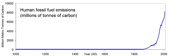
Figure 1: Human carbon dioxide emissions, measured in million metric tonnes of carbon (CDIAC).

The dramatic increase in CO2 emissions is matched by a steep rise in  atmospheric CO2 levels. CO2 levels have risen around 40% since pre-industrial levels and currently sit at around 386 parts per million, a level unseen for at least 15 million years (Tripati 2009).

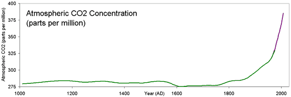
Figure 2: Atmospheric CO2 concentration. (Green - Law Dome, East Antarctica and Purple - Mauna Loa, Hawaii).

Climate forcing is a change in the planet’s energy balance - when our climate builds up or loses heat. There are various climate forcings that drive global temperature change - variations in solar output, aerosol levels and carbon dioxide have been the major drivers of long-term climate change over the last 1000 years. The combined climate forcing from these effects shows a familiar shape.

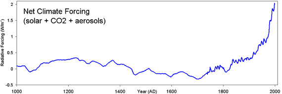
Figure 3: Combined radiative forcing from solar variations, carbon dioxide and aerosols - volcanoes are omitted (Crowley 2000).

The increase in positive climate forcing means our climate has been building up heat in recent times. Consequently, we see the corresponding shape in Northern Hemisphere land temperature:

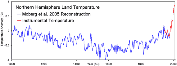
Figure 4: Northern hemisphere temperature reconstruction (Moberg et al 2005) plus a 5 year average of instrumental measurements of northern hemisphere land temperature (CRUTemp).

Over the last decade, a number of independent studies have reconstructed temperature over the last 1000 years, using a multitude of different proxy data and various data analysis techniques. They all tell a similar story.


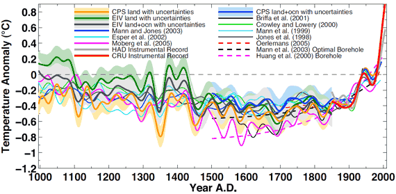
Figure 5: Various northern hemisphere temperature reconstructions (Mann et al 2008).

The original 1998 hockey stick by Mann, Bradley and Hughes didn't prove that humans are causing global warming. The evidence for man-made global warming lies in the multiple lines of empirical evidence finding human fingerprints throughout climate change. But the multitude of hockey sticks (or hockey league) do tell a story - humans have caused a profound disturbance to our climate system. To say "the hockey stick is broken" is to ignore the full body of evidence of hockey sticks throughout climate change.

1 0

Printable Version  |  Link to this page

Comments

Comments 1 to 26:

  1. For those that claim the hockey stick is wrong: The hockey stick-shape temperature plot that shows modern climate considerably warmer than past climate has been verified by many scientists using different methodologies (PCA, CPS, EIV, isotopic analysis, & direct T measurements). Consider the odds that various international scientists using quite different data and quite different data analysis techniques can all be wrong in the same way. What are the odds that a hockey stick is always the shape of the wrong answer?
    0 0
  2. Great post, John. I think it's worth keeping in mind why the deniers so viciously attack the HS and anyone who supports it. While John is obviously right in saying, "the original 1998 hockey stick by Mann, Bradley and Hughes didn't prove that humans are causing global warming", the simple fact is that if you show the HS to a climate science newcomer he/she will instantly leap to exactly that conclusion. I've seen it happen. Even if these newbies reach an accurate conclusion via faulty logic, it's still a devastatingly effective visual aid. Therefore, the deniers conclude, it MUST be neutralized, via whatever means necessary. And we've already seen them resort to some cringe-inducing means, with more to come, I'd guess.
    0 0
  3. I don't know anyone that shows THE Hockey Stick (Mann et al 1998/99) to a newcomer in order to educate them on climate change. The only reason we're talking about a 12-year old study that has been superseded (and generally corroborated) by newer studies is because the skeptics believe that the TAR graphic changed human consciousness and political will on climate change. The discussion they propagate is political, rather than scientific. Science has moved on, but they cannot.
    0 0
  4. Dr. Mandia @1 is being too modest ;) Go here to read Dr. Mandia's excellent overview of paleo reconstructions (some derived using no tree ring data or Mann's methods) all of which all have hockey-stick shapes...and that list is by no means comprehensive. Yet, more Hockey Sticks than you can, well, shake a stick at. It is almost 2011-- time for the "skeptics" to get with the times and move on. The real scientists have...and a long time ago now too.
    0 0
  5. facepalm #5: This isn't just climate change deniers, it's any conspiracy theorist. It's why you can never, ever convince them, no matter what evidence you provide. Conspiracy Theory 101: 1. Any evidence that would tend to disprove the conspiracy is fraudulent and, therefore, further proof of the conspiracy. 2. Any individual who argues against the conspiracy is, ipso facto, part of the conspiracy. So there is no hope of ever convincing any of the "It's a hoax" people. They have too much invested in it, and a mental framework that permits them to discard all contrary evidence without a second thought. The only thing we can do is provide rational evidence for rational people who simply are not yet in posession of the facts. In other words, do what Skeptical Science is doing.
    0 0
  6. Spooky!! I charted the number of photographs taken by people per year and I got the same hockey-stick graph! Now just to figure out if CO2 causes photographs or it's the other way... Seriously guys, chart pretty much anything human related and you get the same shape.
    0 0
  7. Boofy... Hmmm, what about preindustrial photograph levels? Is there a medieval photograph period? Sorry, good try but it's not the same.
    0 0
  8. But Boofy, skeptics claim that temperature is not human related.
    0 0
  9. To futher Tom Dayton's point, skeptics would have you believe that the increase in photographs was a function of previously unspecified natural processes rather than the increase in people using cameras. Any attempt to show that photographs came from cameras and that people were responsible for the action of said cameras would further be dismissed as a consequence of incomplete or biased data ("Squirrels have been growing in number with urbanization. Why have you've never determined how many photographs they take?"), improper and probably inscrupulous modeling of the interactions between electromagnetic radiation and imaging materials ("You've never considered how variations in solar radiation could affect the potential for good photographs") or not in line with what the true scientific genuises of the past understood ("Galileo never used one, so cameras must not exist!").
    0 0
  10. Boofy: "Seriously guys, chart pretty much anything human related and you get the same shape." As Tom Dayton points out, Boofy scores an own goal with that one ... Yes, Boofy, that's the point, recent warming is human-related, related to our exponential increases in CO2 emissions ...
    0 0
  11. Dhogaza: My point was that nearly everything human related has risen that way. CO2 emissions, photographs, electrical wiring, immunizations, crude oil pumped, waste landfill created. Why single out CO2?
    0 0
    Response: "Why single out CO2?"

    Because CO2 is a greenhouse gas that traps heat. So when we emit billions of tonnes of a greenhouse gas into the air, we expect to see warming occur. And it has. The fact that CO2 emissions and temperature show similar hockey sticks isn't the only case for human-caused global warming, of course. Corroborating this is many independent observations finding human fingerprints throughout climate change.

    10 Indicators of a Human Fingerprint on Climate Change
  12. You seem to be confusing correlation and cause and effect.
    0 0
    Response: Comparing hockey sticks are an example of correlation. But cause and effect are demonstrated by the many other human fingerprints. Satellite measurements of infrared radiation (commonly known as heat) being trapped at CO2 wavelengths is evidence of causation. Surface measurements of increased downward infrared radiation at CO2 wavelengths provide additional confirmation of causation. A cooling stratosphere coupled with a warming troposphere are also signatures of greenhouse warming. The falling diurnal cycle, falling annual cycle, shrinking thermosphere and rising tropopause are all further pieces that build a complete, consisten picture.

    The lesson here is that to properly understand climate, you need to consider the full body of evidence as a whole. Don't get hung up on a single bit of data like the hockey stick. That's just one piece of the puzzle amongst the many lines of evidence for human caused global warming.
  13. Boofy - no. The correlation of temperature with the known forcings is a prediction of climate theory. The "hockey stick"s are a form of validation - one of many.
    0 0
  14. Why do we have this correlation / causation argument all the time. Causation always, always involves correlation. But correlation is a weird kind of tree - only some fruit is causation, the rest of the crop is just the human propensity to see patterns.
    0 0
  15. It may help if Boofy realizes that many of the predicted patterns of climate change resulting from antorpogenic CO2 were made well before they were observed, or looked for. That's what scaddenp means when he refers to "validation" of theory. The consistency with which theoretical predictions have been borne out by observation is what underlies the current scientific consensus. It's not based on a simple appeal to correlation. All that said, a strong correlation can be very useful scientifically.
    0 0
  16. great post!
    0 0
  17. adelady #14 Why indeed. The pattern emerging from this award winning blog is a regurgitation pattern. Re-stating arguments and reproducing charts which have already been extensively discussed elsewhere. The Northern Hemisphere 'land' temperature chart exaggerates the temperature increase - a global chart which includes the oceans shows significantly less temperature rise. The Net Climate Forcing chart might also mislead when it should be noted that relative to AD1750 - radiative cooling at AD2005 is estimated at -2.8W/sq.m and rising (exponentially and negatively) with the fourth power of absolute temperature. Boofy might have a point - why not produce a chart of Chinese GDP or the population of Chinese solar panels plotted against CO2 GHG concentration. I am sure the correlation will be high.
    0 0
  18. Ken,The northern hemisphere land is used because there is the most data for that chart. I care more about the land than the ocean since I live on land and it affects my life the most. The thermal inertia of the ocean keeps it cool for the present. Eventually it will warm up and then we will really be in trouble. The radiative cooling increase is entirely due to the increase in temperature caused by AGW. How deniers can argue that the increase in radiative cooling is positive is beyond my understanding.
    0 0
  19. Actually, Ken, radiative cooling increases with the temperature but decreases with GHG forcing. The upwards slope in temperature indicates that the radiative cooling is below the solar input (imbalanced), and will stay that way until we reach a (rough) equilibrium. Radiative cooling is presently under the pre-industrial levels. Which won't change as long as we're chasing the GHG forcings - the energy imbalance causing the climate change.
    0 0
  20. KL - "why not...". Because the point of "hockey stick" reconstructions is not to show correlation but to compare temperature observations to model predictions. Its not a correlating trends that we are interested in but whether past temperatures match predictions from model forcings within the error limits of both.
    0 0
  21. #17: "The Northern Hemisphere 'land' temperature chart exaggerates the temperature increase, a global chart which includes the oceans " Or to put it the other way, the NH land chart is the temp increase of concern in the immediate term; the oceans have large thermal inertia that will respond in time. "The pattern emerging from this award winning blog is a regurgitation pattern. " And why not? The denials are mostly repetition; the rebuttals just keep on working. Case in point: relative to AD1750 - radiative cooling at AD2005 is estimated at ... Haven't we heard that before?
    0 0
  22. Ken Lambert, it may well be that you could get a good correlation between Chinese GDP & Delta T (actually, you wouldn't, because the upsurge in GDP has only been in the last 10 years-whereas the warming upsurge began in 1979, & can be traced back to 1950), but that would be insufficient; you'd then need some kind of scientific theory that showed the correlation was meaningful. In this case we have basic chemistry (burning C(x)-H(x+2) in oxygen generates CO2) & basic physics (the C-O bond in CO2 is very good at absorbing long-wave radiation as it tries to escape out into the vacuum of space). We also have the negative correlation between CO2 emissions & stratospheric temperatures-which further backs up the original positive correlation between CO2 & tropospheric temperatures. Certainly, when it comes to the regurgitation of material, the Denialist Cult has everyone beaten-hands down-& that regurgitation is usually of the same, pseudo-scientific nonsense that has been debunked elsewhere. I guess though that, in the absence of any *alternative* theory for why global temperatures are rising in the face of falling sunspot numbers, that's all the Denialist Cult actually has!
    0 0
  23. @ protestant: How is it arrogant to plot those through time to see if they agree with records of past temperature? John has explicitly defined what he means by radiative forcings in the figure, so he's not being disengenuous. He is simply making the assertion (or repeating what has been asserted in the literature) that we do understand the main drivers of climate. He then produces a time series that represents a hypotheses for patterns of past climate change based on that assertion that can be tested against paleo data. This is what science is supposed to do. Present assertions or hypotheses and test them. Are you suggesting that we don't do so for fear of appearing arrogant? That would seem to be an abrogation of responsibility and lack of concern that itself would be a far worse form of arrogance, IMO. Also, I don't think climate oscillations from air-sea interactions can be classified as climate forcings in the typical sense -- they can't drive the climate permanently in one direction of the other. Rather they are redistributions of heat back and forth between the atmosphere and ocean. They can add to variability for sure. But much of variability on that scale has been filtered out of both the temp and the proxy data sets by a 40-year smoothing filter. That is intended to allow the comparisons among the temp records and the proxy data to be more apples to apples, rather than apples to oranges. The thermometer record on the graph that alarms you is for northern temperate land records (CRUTEMP3). The proxies in this particular graph are from that region of the globe so it makes sense to compare these temps to those proxies. That record shows more change in temp (~0.8) than the global average due to it being over land and in the northern hemisphere. You can also see the HADCRUT3 records that combine land and sea surface temps and they are, predictably, lower than the CRUTEMP data. Finally, you have it backwards in the end. The proxies do not confirm the paleo record. The paleo records are consistent with the notion that we understand the main forces driving climate, and that current GHG forcing is causing that forcing (and climate) to diverge from the trend of the last 2 centuries. The fact that the proxies are indirect measures that are sensitive to local conditions and some other factors, I think it's impressive that we can recover the patterns predicted from climate forcing reconstructions (recent warming, LIA, some medieval warming).
    0 0
  24. The comment above now makes no sense...giving the offending post is now gone. My apologies.
    0 0
  25. It would be great to see this post updated to reflect recent findings, which lend further support to the argument you are making in this post. cheers
    1 0
  26. Can anyone point me to a graph of temperature reconstructions longer than 1000 years?

    0 0
    Moderator Response:

    [TD] Pages 2k for the past 2,000 years. Marcott for the past 11,000 years, Shakun for the previous years back to 20,000 years ago, shown together with recent instrumental records (click links there to get to their peer-reviewed papers, or use the Search box at the top left of this page to find more about them). But take care to not be misled by people who misinterpret or misrepresent Greenland ice core data.

You need to be logged in to post a comment. Login via the left margin or if you're new, register here.


The Consensus Project Website

THE ESCALATOR

(free to republish)


© Copyright 2024 John Cook
Home | Translations | About Us | Privacy | Contact Us