


 Arguments


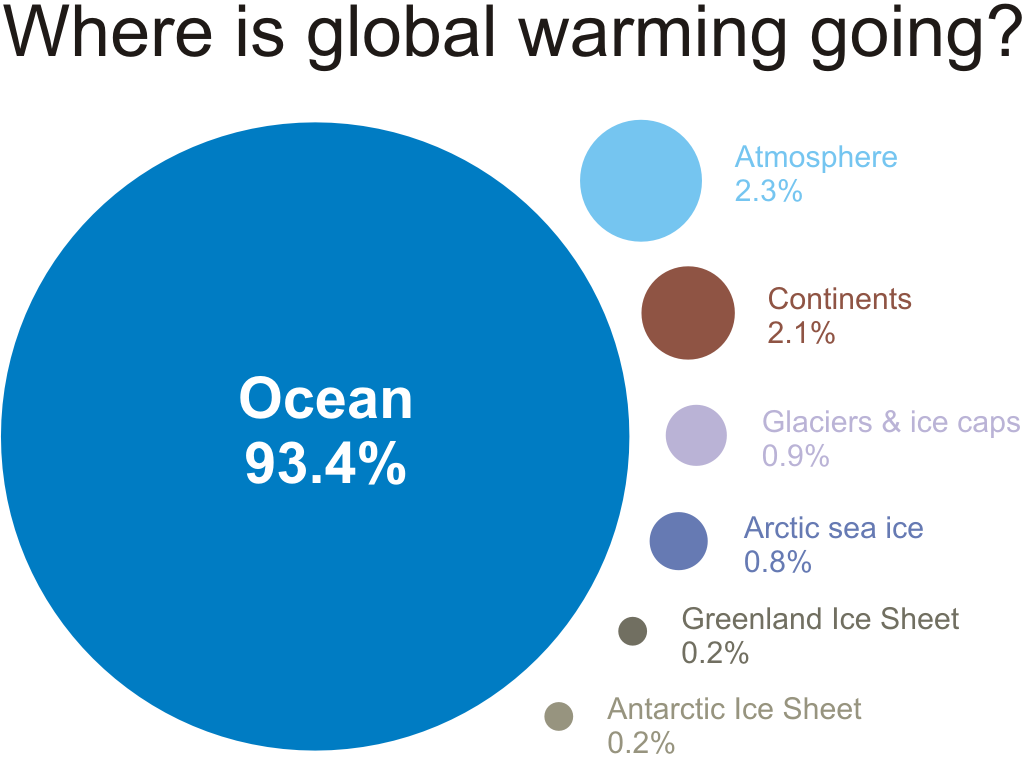
Infographic on where global warming is going
Posted on 20 January 2011 by John Cook
Scott Mandia has written an excellent article explaining climate sensitivity, clearing up a common misconception about climate change. The evidence indicates that a doubling of CO2 levels will cause 3°C warming. However, this doesn't mean that the moment CO2 levels reach 560 parts per million (doubling from the preindustrial 280 parts per million), that global temperatures will at that moment be 3°C warmer than preindustrial temperatures. Most of the heat is going into the ocean. Just as it takes time for a cup of coffee to release heat into the air, so to it takes time for the ocean to release its heat into the atmosphere.
Scott uses a Skeptical Science infographic Where is global warming going?, to illustrate that over 90% of global warming is going into the oceans. This graphic seems to have been popular - the NOAA used it in their 2009 State of the Climate Report (without attribution but who's counting? :-)

So I figure I might as well add this to our list of Climate Graphics. As with all the other graphics, this one is under a Creative Commons licence so everyone is free to use the graphic in any non-commercial use (or for commercial use, just contact me first). To get hold of the different file formats available, go to the Where Is Global Warming Going? infographic (or use the links below):
- High resolution JPEG (1024 pixels wide)
- High resolution PNG (1024 pixels wide)
- Vector (Windows Metafile WMF)
- Vector (Scalable Vector Graphic SVG)
| You are welcome to reuse these graphics in any non-commercial use with attribution. Skeptical Science is licensed under a Creative Commons Attribution-NonCommercial-NoDerivs 3.0 Unported License. For commercial use, please contact me. |


 0
0  0
0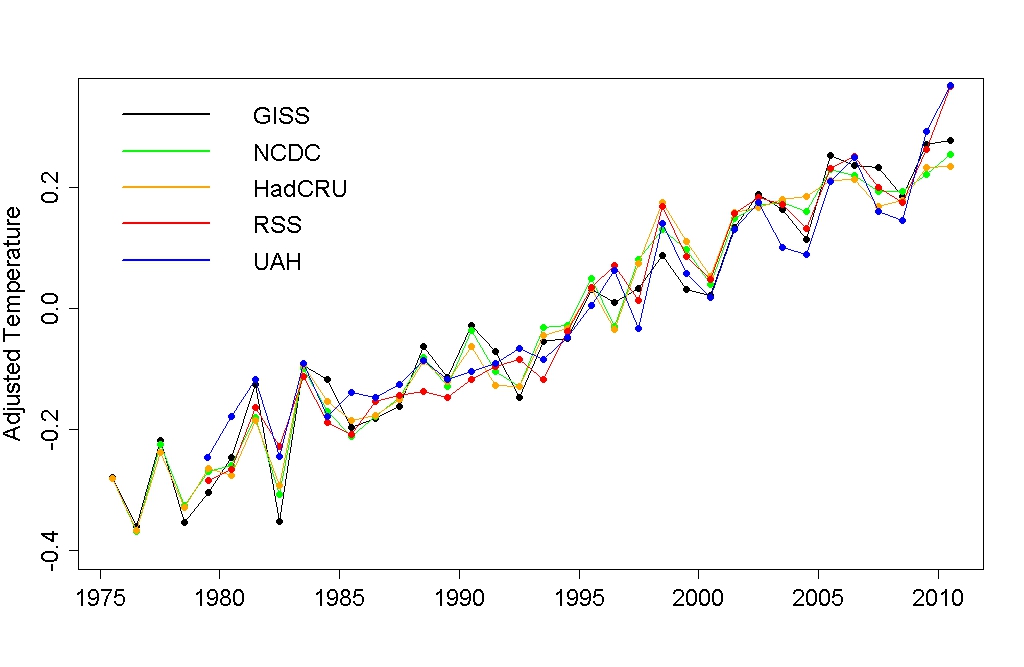 UAH proves you wrong. All the temperature records show significant warming, and that it is indeed global.
The Yooper
UAH proves you wrong. All the temperature records show significant warming, and that it is indeed global.
The Yooper

 (and yes I know it's a NH graph; I'm hiliting the cherry-pick of the question with another cherry-pick; dramatis ironae in action)
All silliness aside, the point in making adjustments for known cycles is to reduce the noise in the data to get at the signal in the data. The same principle as to why people wear sunglasses on sunny days: to see better. Let's look back to 1880 (global combined land+ocean):
(and yes I know it's a NH graph; I'm hiliting the cherry-pick of the question with another cherry-pick; dramatis ironae in action)
All silliness aside, the point in making adjustments for known cycles is to reduce the noise in the data to get at the signal in the data. The same principle as to why people wear sunglasses on sunny days: to see better. Let's look back to 1880 (global combined land+ocean):
 The overall trend is up, despite noise inherent in the signal. The point is: we have a pretty solid idea of how the system works, that it is heating up, and why that is.
Getting pretty far off-topic here. Please use the search function to find a more appropriate thread if you wish to continue this discussion.
The Yooper
The overall trend is up, despite noise inherent in the signal. The point is: we have a pretty solid idea of how the system works, that it is heating up, and why that is.
Getting pretty far off-topic here. Please use the search function to find a more appropriate thread if you wish to continue this discussion.
The Yooper


Comments